Search results for census

This morning NPR had a segment on the history of the U.S. income tax. A federal income tax was first introduced during the Civil War to make up for lost tariffs due to blocked ports and sunk ships. However, in 1895 the Supreme Court declared the income tax unconstitutional. In 1913, the states ratified the Sixteenth Amendment to the Constitution:

The Congress shall have power to lay and collect taxes on incomes, from whatever source derived, without apportionment among the several States, and without regard to any census or enumeration.

For a couple of decades, only the wealthy paid income tax. However, war — in this case, World War II — once again increased the need for taxes. The government had to convince a larger portion of the population to pay income tax. The Treasuring Department and Disney produced “The New Spirit,” a short film featuring Donald Duck. The film presented paying taxes as patriotic and essential to the war effort, and helped normalize the income tax for all workers:

For another example of World War II-era Disney propaganda in support of particular government policies, see our earlier post on Victory through Air Power, which justified bombing civilian targets.

Gwen Sharp is an associate professor of sociology at Nevada State College. You can follow her on Twitter at @gwensharpnv.

Many people look at Asian-Americans’ relatively high incomes, compared to other racial/ethnic groups, and assume this minority group has achieved the American Dream.  In fact, Census data reveal Asians have higher average incomes and are less likely to live in poverty than whites (DeNavas, Proctor, & Smith, 2011).  Numbers like this lead many to conclude Asians are free from discrimination and are a “model minority” for others to emulate.

However, these numbers regarding Asian-American economic success are misleading.  For example, after controlling for factors such as education, number of workers in a household, and regional costs of living,, Asian-Americans’ economic advantages disappear (Kim & Mar, 2007).  Like other racial minorities, because of racial discrimination Asians must work harder to get the same economic returns as whites.

But the model minority stereotype is so distracting that many completely overlook overtly racist statements about Asians.  A Saturday Night Live clip about the “Linsanity” surrounding NBA player Jeremy Lin illustrates how the racial discourse is regulated quite differently for Asian Americans in comparison to African Americans, drawing on several actual incidents and comments that appeared in coverage of Lin. In this clip, the sportscasters celebrate a headline describing Jeremy Lin as “Amasian,” laugh at signs depicting him inside a fortune cookie, and make statements such as he’s “sweet not sour” and “turned Kobe [Bryant] into Kobe beef.”   They also talk about “loving [Lin] long time,” “wax on, wax off Mr. Miyagi,” and “domo arigato, Mr. Lin-boto” as they bow while grinning widely, bang gongs, and mimic martial arts moves.  The double standard is revealed as the sportscasters criticize and then fire their peer for saying similar things about Black basketball players, including  “Kobe ordered fried chicken,”  “Amar’e Stoudemire was dancing like Maury Povich just told him he’s not the father,” and “my homey Carmelo [Anthony] rolls in late”.

In fact, Chou and Feagin argue the “model minority” stereotype makes Asians more vulnerable to racism than other racial groups because over-exaggerated notions of success lead many to dismiss prejudice against this group as innocent or harmless.  They write, “This distinctive, supposedly positive stereotyping distracts people from seeing the discrimination Asian Americans face every day” (Chou & Feagin, 2008, p. 30). The SNL clip drives home the way this played out with the Jeremy Lin case.

Relevant Reading:

Chou, R. S., & Feagin, J. R. (2008). The Myth of the Model Minority: Asian Americans Facing Racism. Boulder: Paradigm Publishers.

DeNavas, C., Proctor, B. D., & Smith, J. C. (2011). Income, Poverty, and Health Insurance Coverage in the United States: 2010. U.S. Census Bureau.

Kim, M., & Mar, D. (2007). The Economic Status of Asian Americans. In M. Kim (Ed.), Race and Economic Opportunity in the Twenty-First Century (pp. 148-279). New York, SC: Routledge.

Potter, J., & Wetherell, M. (1987). Discourse and Social Psychology. Sage.

—————

Jason Eastman is an Assistant Professor of Sociology at Coastal Carolina University who researches how culture and identity influence social inequalities.

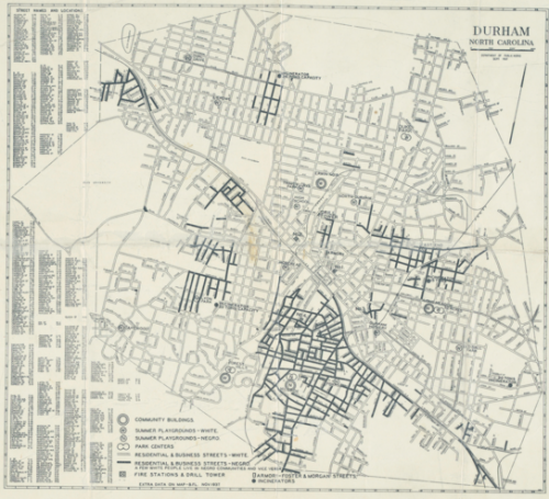
Trudi Abel, who directs the Digital Durham Project at Duke University, sent in a map she thought we might like to post. Created by the Department of Public works in Durham, NC, in 1937, the map illustrates the legal and taken-for-granted racial segregation of the time. The map indicates which parks and residential areas were for Whites and which for African Americans:

The map:

Obviously you can’t see much, other than a general idea of which parts of town each race lived in. Go to the Digital Durham website and click on the map for a version that lets you zoom in to read all the details.

You might also want to check out our posts on a 1934 redlining map of Philadelphia and 2010 Census data on segregation.

Cross-posted at Thick Culture.

As of the 2010 Census, Latinos represent 17 percent of the US population, but are woefully underrepresented in traditional forms of political participation like voting and making campaign contributions. The Pew Hispanic center reports that while Latinos represented 21% of all eleigible voters in 2010, they accounted for only 6.6% of midterm election voters.

One area where Latinos are more likely to participate when compared to non-Latino whites is in outsider forms of participation like protest activity. This form of activity became synonymous with Latino political participation during the 2006 Grand Marcha where 500,000 protesters packed streets to protest immigration bills. A 2006 CIRCLE study finds that Latino youth, while not engaged in formal types of participation were much more likely to report having engaged in a protest:

Although young Latinos are generally not as engaged as other racial/ethnic
groups, 25% said that they had participated in a protest—more than twice the
proportion of any other racial/ethnic group.

By comparison, only 11% of all youth surveyed had reported taking part in a protest. The accounts for why Latinos protest more than other groups vary but a main causal fator is the lack of access to formal political channels, particularly for non-citizens and undocumented immigrants. Lisa Martinez (2008) points out that Latinos are less likely to engage in protest activity when they live in places with high numbers of elected officials. Is the increase in Latino political engagement via protest simply the result of demographic realities (e.g. residents can’t vote) or is it a leading indicator of an overall dissatisfaction with politics?

——————————

Jose Marichal, PhD, is an assistant professor of political science at California Lutheran University. He teaches and writes about: public policy, race and politics, civic engagement, the Internet and politics, and community development.  He is founder of the blog ThickCulture.

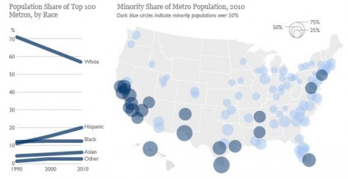
Sangyoub Park sent us a link to a post by the Brookings Institution about the changing racial/ethnic demographics of the 100 largest metro areas in the U.S. While White non-Hispanics still make up the majority in those areas (at 57% of the population), the minority population has grown rapidly in a number of cities; 22 of the top 100 metro areas are now majority-minority:

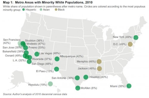
A detailed map of the majority-minority metro areas, with the largest racial/ethnic minority group in each (and the White non-Hispanic population in parentheses):

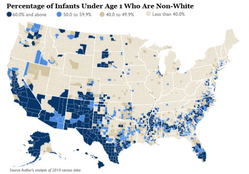
This demographic shift in metro areas should accelerate, given the racial/ethnic makeup of the population of children under age 1:

The Washington Post has an interactive map that lets you select an area and get detailed demographic information at the Census tract level (racial/ethnic makeup, household type, etc.) from 1990 to 2010.

Of course, as Sangyoub points out, being in the numerical majority doesn’t imply that a group no longer meets the definition of a minority group in a social sense. In many areas, racial/ethnic minorities continue to have less access to or control over economic resources, social prestige, and political power than do non-Hispanic Whites. Accumulated advantages do not get automatically redistributed when demographics change.

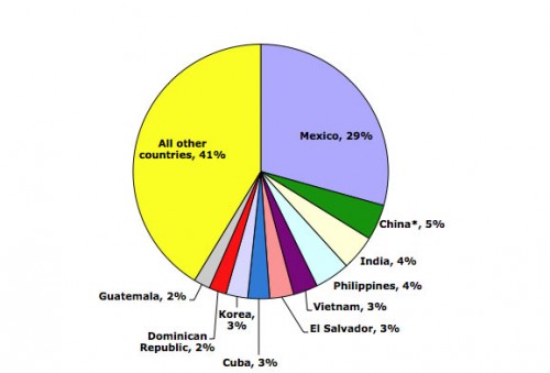
Dolores R. let us know that the Migration Policy Institute has a bunch of updated data and charts/graphs illustrating immigration trends in the U.S. through 2010 (via the KPCC website). So, in 2010, where did immigrants to the U.S. come from? As you may expect, the single largest source of immigrants was Mexico:

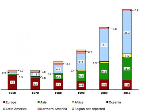
Looking at the region of birth of immigrants in the U.S. (in millions) over time reveals clear patterns:

Notice the shift over time, with fewer immigrants coming from Europe (red) but a major increase in the number of immigrants from Asian and Latin America (green and light blue), noticeable already by 1980. This reflects changes to U.S. immigration policy in 1965 that got rid of the old quota system that openly favored northern and western Europeans. The result was a major change in the demographics of U.S. immigrants.

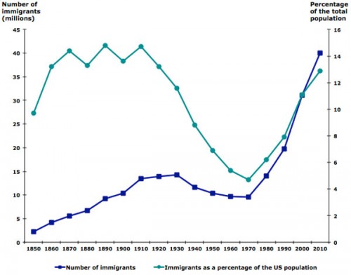
As of 2010, immigrants made up about 13% of the total U.S. population — the highest level in decades, but still not at the all-time high levels seen at several points in the late 1800s/early 1900s:

Lots more data at the MPI website, including a map where you can get very detailed information about the foreign-born population for each state. You might also want to check out our posts on U.S. immigration and geographic names, an interactive map of immigrant settlement patterns, English acquisition among U.S. immigrants, and a map of concentrations of speakers of various languages in the U.S.

Cross-posted at Jezebel.

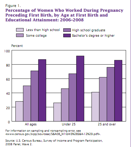
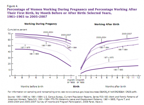
The U.S. Census Bureau recently released a report on employment and parental leave for first-time mothers. The mean age at first birth is now 25 years. And while a few decades ago the norm was for women to quit work upon getting pregnant, from 2006 to 2008, 56.1% of women worked full time during their pregnancy, leaving work only as the due date approaches. However, this varies widely by educational level, largely because women with the lowest levels of education are less likely to be working regardless:

The graph on the left below shows how many months before the birth working women left their work; the graph on the left shows how many months after the birth they returned. As we see, over time women have stayed at their paid jobs longer and returned more quickly:

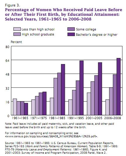
During the 2006-2008 reporting period, for the first time a majority — but a bare one, at 50.8% — of first-time mothers in the labor force used paid leave (maternity leave, sick days, etc.). Not surprisingly, access to paid leave also varied greatly by educational level, and that gap has widened significantly over time:

So nearly half of first-time mothers in the U.S. still do not have paid leave from their jobs.

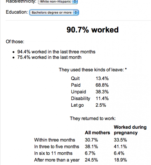
PBS created an interactive program based on the data that allows you to see the patterns more clearly. You select a race/ethnicity and educational level and get a detailed breakdown of the data. For instance, here’s the info for White non-Hispanic women with a 4-year college degree or higher:


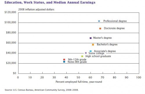
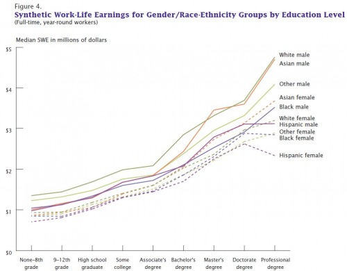
The Census Bureau posted some information about the economic payoff of a college degree on their blog, Random Samplings. A recent report indicated that educational level had a bigger impact than any other demographic factor on lifetime earnings. More education leads to both higher incomes not just because those with more education receive higher salaries, but also because they are more likely to be in full-time jobs. The x-axis here shows the % of people in full-time, year-round jobs:

Not surprisingly, the gap in earnings widens over time, especially for those with a bachelor’s or higher degree compared to those with less:

The report also estimated lifetime earnings by race/ethnicity for men and women separately. As they point out, except for a couple of cases at the very highest educational levels, men from even the most economically disadvantaged racial/ethnic groups out-earn women from the most economically advantaged ones:

Of course, not all college degrees are equal. Dolores R. sent in a link to an interactive table from the Wall Street Journal that lets you look at earnings and the unemployment rate for various majors. I sorted them by median earnings; here are the ten with the lowest median earnings:


And the ten with the highest:

The highest unemployment rate? Clinical psychology, at 19.5%.

You can also search by area (art, engineering, etc.), though it looks like the categorization may be a little sketchy — for instance, “geology and earth science” and “liberal arts” show up under the arts.

For more on college majors, earnings, and future career opportunities, see the report College Clusters: Forecasting Demand for High School through College Jobs, 2008-2018, from the Georgetown University Center on Education and the Workforce.