Search results for census

Flashback Friday.

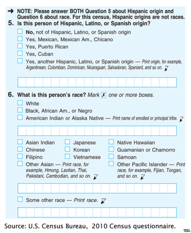
Social and biological scientists agree that race and ethnicity are social constructions, not biological categories.  The US government, nonetheless, has an official position on what categories are “real.”  You can find them on the Census:

These categories, however real they may seem, are actually the product of a long process. Over time, the official US racial categories have changed in response to politics, economics, conflict, and more. Here’s some highlights.

In the year of the first Census, 1790, the race question looked very different than it does today:

Free white males
Free white females
All other free persons (included Native Americans who paid taxes and free blacks)
And slaves

By 1870 slavery is illegal and the government was newly concerned with keeping track of two new kinds of people: “mulattos” (or people with both black and white ancestors) and Indians:

White
Black
Mulatto
Indian (Native Americans)

Between 1850 and 1870 6.5 million Europeans had immigrated and 60,000 Chinese.  Chinese and Japanese were added for the 1880 Census.

By 1890, the U.S. government with obsessed with race-mixing.  The race question looked like this:

White
Black (3/4th or more “black blood”)
Mulatto (3/8th to 5/8th “black blood”)
Quadroons (1/4th “black blood”)
Octoroons (1/8th or any trace of “black blood”)
Indian
Chinese
Japanese

This year was the only year to include such fine-tuned mixed-race categories, however, because it turned out it wasn’t easy to figure out how to categorize people.

In the next 50 years, the government added and deleted racial categories. There were 10 in 1930 (including “Mexican” and “Hindu”) and 11 in 1940 (introducing “Hawaiian” and “Part Hawaiian”).  In 1970, they added the “origin of descent” question that we still see today.  So people are first asked whether they are “Hispanic, Latino, or Spanish” and then asked to choose a race.

You might immediately think, “But what do these words even mean?”  And you’d be right to ask.  “Spanish” refers to Spain; “Latino” refers to Latin America; and “Hispanic” is a totally made up word that was originally designed to mean “people who speak Spanish.”

Part of the reason we have the “Hispanic” ethnicity question is because Mexican Americans fought for it.  They thought it would be advantageous to be categorized as “white” and, so, they fought for an ethnicity category instead of a racial one.

Funny story:  The US once included “South American” as a category in the “origin of descent” question.  That year, over a million residents southern U.S. states, like Alabama and Mississippi checked that box.

2000 was the first year that respondents were allowed to choose more than one race. They considered a couple other changes for that year, but decided against them. Native Hawaiians had been agitating to be considered Native Americans in order to get access to the rights and resources that the US government has promised Native Americans on the mainland. The government considered it for 2000, but decided “no.” And whether or not Arab American should be considered a unique race or an ethnicity was also discussed for that year. They decided to continue to instruct such individuals to choose “white.”

The changing categories in the Census show us that racial and ethnic categories are political categories. They are chosen by government officials who are responding not to biological realities, but to immigration, war, prejudice, and social movements.

This post originally appeared in 2010.

Lisa Wade, PhD is an Associate Professor at Tulane University. She is the author of American Hookup, a book about college sexual culture; a textbook about gender; and a forthcoming introductory text: Terrible Magnificent Sociology. You can follow her on Twitter and Instagram.

For the last week of December, we’re re-posting some of our favorite posts from 2012. Cross-posted at Global Policy TV and Pacific Standard.

Publicizing the release of the 1940 U.S. Census data, LIFE magazine released photographs of Census enumerators collecting data from household members.  Yep, Census enumerators. For almost 200 years, the U.S. counted people and recorded information about them in person, by sending out a representative of the U.S. government to evaluate them directly (source).

By 1970, the government was collecting Census data by mail-in survey. The shift to a survey had dramatic effects on at least one Census category: race.

Before the shift, Census enumerators categorized people into racial groups based on their appearance.  They did not ask respondents how they characterized themselves.  Instead, they made a judgment call, drawing on explicit instructions given to the Census takers.

On a mail-in survey, however, the individual self-identified.  They got to tell the government what race they were instead of letting the government decide.  There were at least two striking shifts as a result of this change:

  • First, it resulted in a dramatic increase in the Native American population.  Between 1980 and 2000, the U.S. Native American population magically grew 110%.  People who had identified as American Indian had apparently been somewhat invisible to the government.
  • Second, to the chagrin of the Census Bureau, 80% of Puerto Ricans choose white (only 40% of them had been identified as white in the previous Census).  The government wanted to categorize Puerto Ricans as predominantly black, but the Puerto Rican population saw things differently.

I like this story.  Switching from enumerators to surveys meant literally shifting our definition of what race is from a matter of appearance to a matter of identity.  And it wasn’t a strategic or philosophical decision. Instead, the very demographics of the population underwent a fundamental unsettling because of the logistical difficulties in collecting information from a large number of people.  Nevertheless, this change would have a profound impact on who we think Americans are, what research about race finds, and how we think about race today.

See also the U.S. Census and the Social Construction of Race and Race and Censuses from Around the World. To look at the questionnaires and their instructions for any decade, visit the Minnesota Population Center.  Thanks to Philip Cohen for sending the link.

Lisa Wade, PhD is an Associate Professor at Tulane University. She is the author of American Hookup, a book about college sexual culture; a textbook about gender; and a forthcoming introductory text: Terrible Magnificent Sociology. You can follow her on Twitter and Instagram.

Dmitriy T.M. sent in a Census Bureau report on transportation and commuting, providing a detailed picture of how we’re getting to work. Despite constant discussions about reducing car use and encouraging mass transportation, the vast majority of people in the U.S. get to work in a car:

Not surprisingly, there are significant differences by race and ethnicity. Non-Hispanic Whites are the most likely to drive to work alone in their own car (83.5%), while only 3.2% use public transportation. Latinos are the most likely to carpool with at least one other person (16.4%) and African Americans are most likely to use public transportation (11.5%):

These differences likely reflect a variety of factors, include social class and differences in racial/ethnic concentrations in urban vs. rural areas and in different regions of the U.S., which affects how likely a worker is to have access to reliable, efficient public transportation or to realistically be able to walk to work. In fact, there were only five metro areas where at least 10% of workers use public transportation to get to work: the regions surrounding NYC, San Francisco/Oakland, Washington D.C., Boston, and Chicago.

And as anyone who has taken part in a morning commute recently won’t be shocked to hear, leaving for work is still highly concentrated in the 5 to 8:59 a.m. period for most occupations, though departure times reflect the  wider range of normal working hours in the service industry compared to other economic sectors (note that the colors do not all represent equal amounts of time):

More on mode of transportation and commuting times by region and race/ethnicity in the full report.

I’m still totally geeking out about the Census Bureau starting to release data from the 2010 Census, so today you’re getting another post based on it. Kristina K. let us know that Salon has up maps of the 10 most racially-segregated metropolitan areas with populations of 500,000+, based on analyses from the University of Michigan’s Population Studies Center and available at CensusScope. Note that in the race categories, Hispanic is presented as a separate category; all other racial groups include only members of that race who said they were not of Hispanic origin. The Population Studies Center also has data available broken down by specific races and at the state level, though they don’t have maps for them, just the raw dissimilarity indices.

Here’s L.A., at #10:

Here, just for my friend Tony, is his hometown of Buffalo, NY, #6 on the list:

New York comes in second:

The most segregated 500,000+ metro area in the U.S.? Milwaukee:

Based on the dissimilarity index, over 81% of Milwaukee’s non-White population would have to relocate to be distributed similarly to Whites.

Interestingly, given assumptions many have about race relations in the U.S., the South doesn’t show up here. St. Louis is the most Southern city in the top 10, which is dominated by cities in the old industrial core of the North and upper Midwest/Great Lakes regions.

The U.S. Census Bureau has started releasing data from the 2010 Census. This map shows the change in the racial/ethnic minority (i.e., anything other than non-Hispanic White) population over the last decade:

Legend:

They released a report, An Overview: Race and Hispanic Origin in the 2010 Census (available here), which includes data on those who reported more than one race. Among those who reported more than one race, the vast majority listed two. Here are the most commonly reported combinations:

AIAN = American Indian/Alaska Native, NHPI = Native Hawaiian/Pacific Islander, and SOR = some other race.

Laura E. pointed out that New Geography posted some maps based on 2010 Census data. Here’s the Hispanic population as a percent of the total population, by county (notice that the legend need to be multiplied by 100 to get the percent):

The African American population (alone or in combination with another race, and again, multiply by 100):


The NYT has posted an interesting interactive map showing the results of the last slave Census taken in the U.S., in 1860, which I discovered via Jessica Brown and Jim Yocom. The map, which shows county-level data, illustrates how slave ownership varied throughout the South

The shading (a new technique at the time, according to the NYT article) indicates what percent of the entire county’s population was enslaved:

You can see the percentage for each county, which is listed on the map, more easily if you zoom in on the pdf version. The cotton-belt area along the Mississippi River clearly stands out, as does Beaufort County, South Carolina, all with over 80% of the population enslaved. The highest rate I could pick out (the map got a little blurry as I zoomed) is in Issaquena County, Mississippi, where slaves appear to have made up 92.5% of the population.

The map also included information on the overall population and % enslaved at the state level; in South Carolina and Mississippi, over half of the total state population was made up of slaves:

Also check out Lisa’s post on geology, the economy, and the concentration of slavery in the U.S.

As the NYT post points out, the map doesn’t show the dramatic increases in slavery in some areas. For instance, while Texas ranked fairly low in terms of the overall slave population, the number of slaves in the state had tripled between 1850 and 1860. The number had doubled in Mississippi between 1840 and 1860. Those growth rates make it rather hard to swallow the argument sometimes presented by those romanticizing the Confederacy that slavery was actually on the wane and would have soon been ended in the South anyway, without any need for federal interference, and wasn’t why the South seceded at all.

Jon Stewart and Larry Wilmore discussed this effort to frame discourses about the Civil War to erase the issue of slavery on The Daily Show:


In this Zócalo video, sociologist Jennifer Lee discusses the social construction of race and the history of the U.S. census with NALEO’s Arturo Vargas and the L.A. Times‘ Steve Padilla:

For more on the social construction of race, see our post on race and ethnicity in censuses around the world.

Lisa Wade, PhD is an Associate Professor at Tulane University. She is the author of American Hookup, a book about college sexual culture; a textbook about gender; and a forthcoming introductory text: Terrible Magnificent Sociology. You can follow her on Twitter and Instagram.

The American Anthropological Association website on race has a great collection of the racial and ethnic categories included on Censuses throughout the world, showing how different countries formalize different racial categories.  They illustrate just how diverse ideas about race are and challenge the notion that there is one “correct” question or set of questions.

Lisa Wade, PhD is an Associate Professor at Tulane University. She is the author of American Hookup, a book about college sexual culture; a textbook about gender; and a forthcoming introductory text: Terrible Magnificent Sociology. You can follow her on Twitter and Instagram.