Search results for census

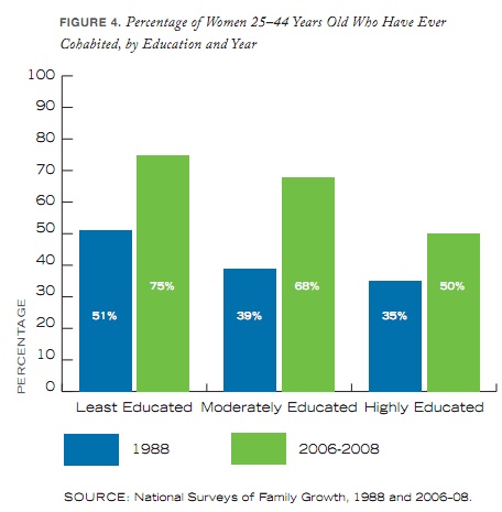
Katrin sent along a link to a Los Angeles Times article reporting on how family composition in the LA area has changed in the past decade.  The short story is that families are less “traditional” than they were ten years ago.  Only 23% of households are now made up of a married couple with kids (down 10% since 2000). Meanwhile, single-parent families, non-married partners (with and without kids), and same-sex couples (with and without kids) have all increased by 20-25%.  Married couples without kids are up too (by 4%), they’re now 26% of all households.

The maps below show the percent of households in each census tract that include an unmarried couple living together.  Darker orange means a greater percentage.  You can see that this convention-breaking isn’t evenly distributed.  I think the big orange blob underneath Burbank is Silver Lake/Echo Park, a notoriously hip part of the city where you find lots of “hipsters,” and Hollywood, where the population of same-sex couples is likely higher.

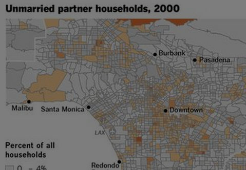
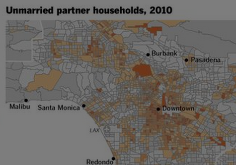
Los Angelenos, do you see anything else interesting?

See also the amusing: What Does a Traditional Family Look Like?

Lisa Wade, PhD is an Associate Professor at Tulane University. She is the author of American Hookup, a book about college sexual culture; a textbook about gender; and a forthcoming introductory text: Terrible Magnificent Sociology. You can follow her on Twitter and Instagram.

Cross-posted at Family Inequality.

I haven’t yet seen any definitive evidence that the recession has had an effect on divorce rates. But if I’m going to pick on other people for this, I should offer a few ideas.

In a previous post I cited a lot of reasons to expect divorce would increase as a result of family stress and instability. Others claim these hard times are bringing couples together in the face of adversity. And either – or both – of these influences is woven into the long term trends in divorce. Here are three graphs looking at the question.

Long-term trends

The overall divorce trend doesn’t seem to be moved much one way or the other by recessions (shown in blue), at least for the last 60 years:

That national data is only available through 2009, so a little early to see a major effect. Still, no disruption of the trend at the national level, just a continuous decline in the divorce rate. (Here’s a great recent Census report on divorce trends.)

State patterns

The official divorce rates are available from 38 states, but they’re only considered reliable through 2008 so far. By putting together two years of changes — 2006-2007 and 2007-2008 — this figure has 76 dots (two for each state), showing whether changes in divorce are related to changes in unemployment rates. This gives a rough idea of the relationship between how hard states were hit by the recession and any changes in divorce:

I made the dots larger according to the population sizes, and weighted the red trend line so that the larger states have more effect (this positive relationship is statistically significant at the 99% confidence level). This is just a start, but it leans in the direction of unemployment increasing divorces. At least it doesn’t look like the recession is driving divorce down.

Google

Finally, what about divorce on the American brain? For a glimpse inside, we turn to Google trends. If it works for the flu, it might work for divorce, too. Here are the trends for “divorce attorney” and “divorce lawyer”:

The trend for both searches looks basically flat except for seasonal variation, and some turbulence in 2008. But nothing to suggest a major trend one way or the other. (You can play with these yourself, starting with mine, here.)

My conclusion so far: no national evidence of a recession effect on divorce yet, but some suggestive hints worth keeping an eye on — leaning in the direction of recession causing more divorces — in opposition to a long-term downward trend. Maybe if and when the housing market loosens up more unhappy spouses will take the plunge and move out. The divorce rate may continue to fall, as it has been since the early 1980s, but that doesn’t mean this recession has a “silver lining” for families.

Note: Since I posted this, Philip Cohen has brought up concerns about the National Marriage Project’s data and analysis in another study. You might want to take a look at his post.

Patricia P. sent in an infographic illustrating trends in marriage, divorce, and cohabitation over the last several decades, based on data from the National Marriage Project at the University of Virginia. I found several of the images to be a bit cluttered and unclear, but this one neatly summarizes the percent of women over age 15 who were currently married, 1960-2009:

I looked through the full 2010 The State of Our Unions report. This graph, showing the percent of those aged 15 or older who were married from 1960-2009, shows that marriage has become less common for both men and women, Blacks and Whites (based on U.S. Census Data):

Of course, this is in large part because people in the U.S. are getting married later; not only do we not really expect a 15-year-old to be married, we’d be rather horrified if they were. If we look only at adults aged 35-44, we do see a significant decrease in marriage between 1960 and 2009, but still, about 2/3 were married:

The report also includes a graph of the percent chance that a couple will divorce or separate within 10 years, broken down by education, for the early ’70s and the late ’90s (for first-marriage couples only). Least educated is defined as having less than a high school diploma; the moderately educated graduated high school but have less than a 4-year college degree; and the highly educated have a 4-year college degree or more:

Note that for both the least and most educated, the risk of divorce actually went down — though those with the least education are over three times as likely to separate/divorce than the highly educated.

On the other hand, rates of cohabitation have gone up:

Perceptions of marriage, not surprisingly, also vary by educational level, with the highly educated feeling significantly more positively about marriage than the less educated population. Asked if they agreed that marriage hadn’t worked out for “most people” they know, 53% of the least educated and 43% of the moderately educated said yes, while only 17% of those with at least college degrees felt similarly:

So the overall trend appears to be a growing gap between the highly educated and those with less than a 4-year college degree, with the moderately educated looking more similar to those with less than a high school diploma in terms of their marriage, divorce, and cohabitation behaviors. If you’re interested in this topic, check out the full report.

Jessica L., a doctoral candidate in sociology at Kent State and traveling adjunct instructor at Lewis University and Indiana University Northwest, let us know that the New York Times has an interesting interactive map that uses Census data from 1880 to 2000 to show where various immigrant groups have settled. You can select area of origin (some specific, such as China, others very broad, such as “All Africa”) and see where individuals from that area were living in the U.S. for different years (because of changes in Census categories and data gathering, information isn’t available for all groups for all years).

The German-born population in 1880:

If you go to the NYT site, you can roll over the circles to get the specific population.

The Japanese-born population in 1900, indicating immigration to Hawaii and, to a lesser extent, California and Washington to work in agriculture:

The map also lets you trace the rise and fall of some immigration streams. For instance, in 1880 there were 198,595 people born in Ireland living just in Manhattan alone:

By 2000, the Irish-born population in the U.S. was tiny, and only 4,147 of them lived in Manhattan:

The Mexican-born population in 2000:

The New York Times has made available a digital copy of The Gentleman’s Directory, a guide to New York City published in 1870. The guidebook informs travelers of a particular type of local attraction: brothels. Of course, the information was for curiosity’s sake only:

Not that we imagine the reader will ever desire to visit these houses. Certainly not; he is, we do not doubt, a member of the Bible Society, a bright and shining light…But we point out the location of these places in order that the reader may know how to avoid them… (p. 6-7)

Certainly passages like this, from p. 13, make it clear that such establishments are to be avoided:

It also included pages that were simply ads for particular brothels:

Interestingly, the NYT checked the 1870 Census for the houses listed in the guide. In general, the women living there were described by Census workers as domestic servants or women who “kept house.” However, they found a few cases where the Census openly listed them as working at a “house of prostitution” or “house of assignation.”

A doctor advertised “imported male safes,” i.e., condoms:

His ad also describes an unspecified cure for women that may very well refer to abortions (at the time, products that caused abortion were often advertised as helping with menstrual regulation or any type of “menstrual stoppage”):

In addition to an article about the directory, the NYT put together a map showing the locations of the establishments it mentions (which were a small proportion of all brothels in NYC, where prostitution was illegal but widely available at the time):

scatx sent in a link to the National  Alliance to End Homelessness website, which includes a number of maps illustrating the increase in the homeless population over the past few years. The data come from community counts conducted each January of individuals in shelters as well as counts by outreach workers and volunteers of those sleeping in public places, in cars, abandoned buildings, and so on. Of course, counting the homeless will always be a challenging task, but these community counts provide at least some baseline data for those areas that take part.

This map shows the percent change in the homeless population by state:

If you go to the website, you can hover over an individual state to see the relevant data. The page also has a map of the total number of homeless individuals by state.

A more detailed interactive map lets you get information for individual communities. When you click on one of the circles on the map, a bar graph pops up underneath showing any data available for that city from 2005-2008. Here I selected Philadelphia:

A breakdown of the data shows that though most of those who are currently homeless are sheltered in some way, a significant number are living on the street, in a car, or in some other situation that wasn’t designed for human habitation:

The full report shows a striking increase in the number of people “doubled-up” — that is, staying with other families because of economic hardship (based on U.S. Census Bureau data):

While moving in with others is a common strategy, it is also often temporary; significant proportions of individuals in shelters end up there when they can no longer stay with friends or family.

The website has tons of data on homelessness — risk factors, demographics, changes, and so on — so it’s worth a look.

Back in September, I posted about some maps put together by Eric Fischer, using 2000 Census data, showing the racial/ethnic makeup of selected cities. As Jeff H., Eluned J., and Dmitriy T.M. pointed out, the NYT now has up an interactive map where you can see the racial/ethnic composition of any Census tract, using more updated Census Bureau data from 2005 to 2009. For instance, here’s a map of the neighboring cities of Midland and Odessa, Texas, which I picked for no reason other than that I just watched an episode of Friday Night Lights, which is set in a fictionalized version:

Color key:

You can zoom in to get quite detailed information about individual neighborhoods. I zoomed in as far as I could on Miami (each dot now represents 50 people):

There’s also a tab that says “View More Maps.” It allows you to select to see just the distribution of Whites, Blacks, Hispanics, Asians, or the foreign-born population. Here’s the map of the Hispanic population of Las Vegas:

As you can see, if you hover over a Census tract, you can get specific data on its racial/ethnic makeup.

The foreign-born population of Seattle (if you hover over a tract, it will tell you the % foreign-born, as well as the % increase in the foreign-born population since 2000):

A great resource. Although I tried to look up my home town, and even zooming in to the smallest scale, it’s too small to have any data available.

Dmitriy T.M. sent in a link to an interesting breakdown of the race/ethnicity and gender of guests on a number of late-night talk shows, found at Edlundart.

Edlund explains the methodology:

The data for this graphic was gathered over 6 weeks in August and September of 2010. Numbers are based on guest lists as presented on Late Night Lineups. Determining race/ethnicity can be a rather dicey and imprecise activity, and it’s also worth noting that the relationship between census and guest numbers is not a pure one – for example, some of the guests I counted as white are British white people who are visiting the United States.

Of course, a few guests were neither White, Hispanic, Black, nor Asian. These guests were left out, as their numbers were insignificant on the whole…

Edlund also points out that since The Daily Show only has one guest per night, it has a much smaller dataset than the others, so the lack of diversity may be somewhat overstated due to such a small sample.

Here are the results for race (presented as % of all guests); the small dots show the percent in the Census, the wider bars the percent on the show:

Here is the same data but for the top-billed guests only, where the over-representation of Whites goes up even more for most of the shows:

Here’s equivalent data for women:

And, again, for just top-billed guests:

As Edlund says, these data both reflect and reinforce broader cultural patterns. Given that Whites still dominate the political system, for instance, it’s not surprising that political guests would be disproportionately White; and if more movies have male stars than female stars, guest spots will reflect that as well. But at the same time, these shows include people from a range of industries/careers, and their selection of guests helps raise the profile of some individuals more than others, potentially contributing to more opportunities and star power for them. So they don’t just reflect existing realities; they amplify them.

It would be great to get more info on how an individual is selected when there are multiple possibilities — say, you have a movie with several prominent cast members. In that case, are there patterns related to race/ethnicity and gender in which person is most likely to get booked?