
Environmental sociologists have noted that environmental toxicity is most concentrated in communities that include a disproportionate proportion of poor, working class, and non-white people. The map below compares the locations of toxic release facilities (green) with the percentage of people of color in neighborhoods in and near Los Angeles (yellow = 0-40 percent people of color; red = 80-100 percent of color). The overlap is striking.
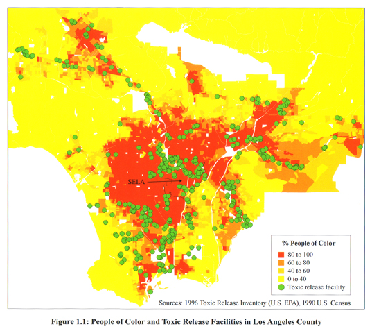
Hat tip to Jose at Thick Culture.
Also in race and the environment, check out our post on the anti-immigrant/pro-environment movement, our post on lead poisoning and poor children, and our post on the use of American Indians as environment mascots.
NEW! Katherine O. sent us a link to a Canadian study showing how poverty and pollutants overlap in the city of Toronto. A map of air pollutants released from pollutant inventory facilities in Toronto in 2005, in kilograms:
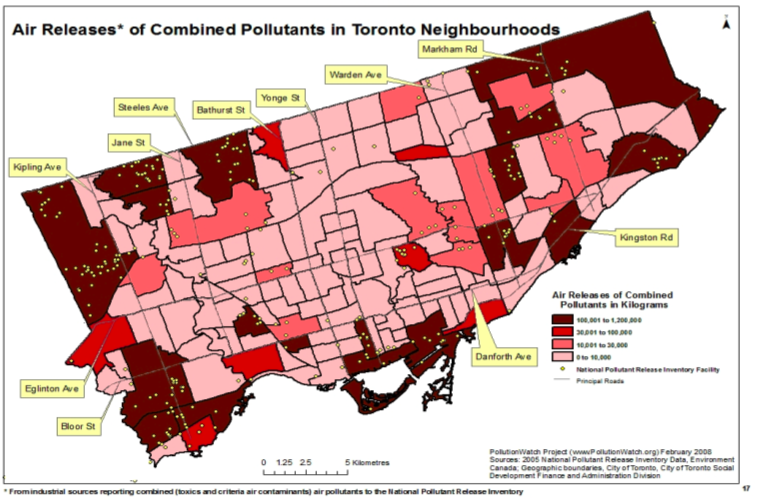
The green dots show where releasing facilities that must take part in the inventory are located; not surprisingly, there are more pollutants in areas with facilities. Of course, the siting of polluting facilities is often fraught with class and race issues, as we saw above.
There are three different measures of air pollution in the report, so you might check the others out too–this one is apparently conservative. While we can see here where there are higher levels of air pollutants, I couldn’t find in the report (which, granted, I didn’t read word-for-word) an absolute level above which pollution is considered harmful to human health, so this graph could be more helpful there.
Poverty rates in Toronto Census tracts, from 2001:
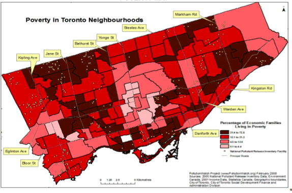
From lightest to darkest, the ranges are 0.1 to 4.4%, 4.5 to 12.0%, 12.1 to 21.3%, and 21.4 to 72.8%. The overall Canadian poverty rate at the time was 11.8%.
Finally, neighborhoods defined as high in both poverty and pollutants (in 2005):
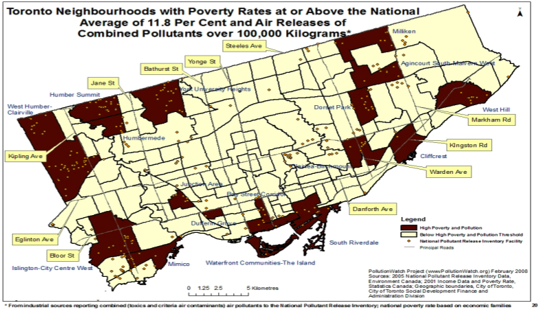
Again, there are other maps showing overlaps of poverty and pollution when pollution is measured somewhat differently–I chose a more conservative one.
Katherine says,
I would add that these areas are also ones with a high proportion of recent immigrants and racialized individuals/families, although this is not shown.
Comments 7
Gomi — April 18, 2009
The main thing I note is that, besides the cluster along the banks of what I believe is a river in the center, most of the toxic release facilities seem to sit along the edges of these communal areas. It seems that the interface between "white" and "black" neighborhoods is where most of these facilities are. Is this less a direct indication of race, and more a secondary indication of the location of industrial zones in the interstitial region between ethnic or economic communities?
Analiese’s Reading 4/23 | Quiche Moraine — April 23, 2009
[...] Sociological Images [...]
easyVegan.info » Blog Archive » easyVegan Link Sanctuary, 2009-04-23 — April 23, 2009
[...] Sociological Images: RACE AND TOXIC RELEASE FACILITIES [...]
Sociological Images » What We’ve Been Up To Behind Your Back (June 2009) — July 1, 2009
[...] updated our post about race and toxic release facilities by adding some maps showing high-poverty areas and air pollution in [...]
Health Disparities and Race | Erin V Echols — February 26, 2012
[...] thereby limiting their access to nutritious foods like fresh fruits and vegetables. In addition, the worst environmental hazards are located in impoverished black and brown neighborhoods – resulting in higher rates of illnesses like asthma and lead poisoning among African American [...]
The Rise of Autism: Social Contagion or Environmental Causation | Environmental, Health and Safety News — March 23, 2012
[...] regional differences in health and mental health can be traced to heavier environmental toxin loads. In most of those cases, though, clusters of illness occur in poor and [...]
Why do we still talk about race? | Erin V Echols — April 6, 2012
[...] more likely to actually have drugs on them when they are stopped. We wouldn’t know that the worst environmental hazards are located in impoverished black and brown neighborhoods – resulting in higher rates of illnesses like asthma and lead poisoning among African American [...]