Search results for census

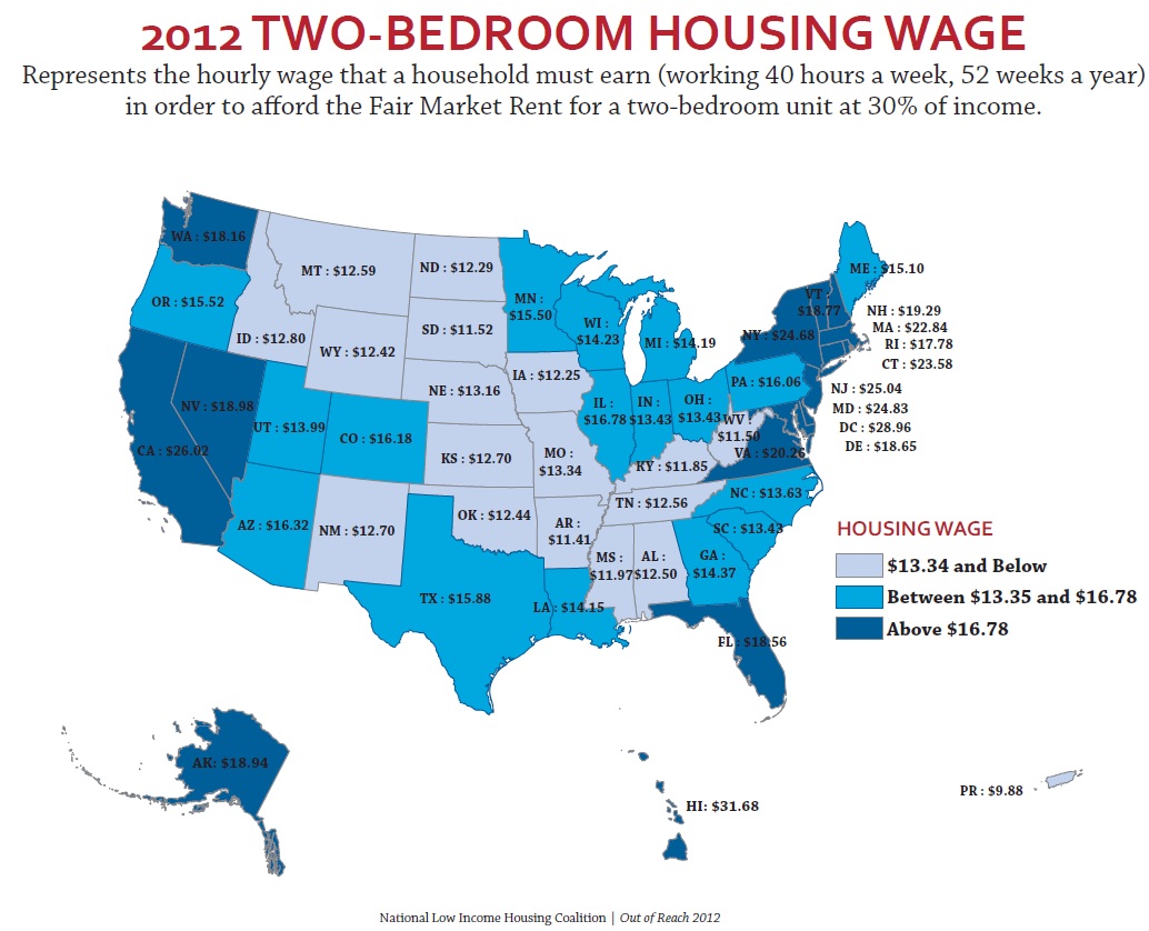
Each year the Department of Housing and Urban Development (HUD) calculates the fair market rents for apartments throughout the U.S. in order to set standards for housing assistance payments and vouchers for Section 8. Using data from the Census and the American Community Surveys, HUD figures out the average cost for various sizes of apartments. You can easily look up data for fiscal year 2012 here.

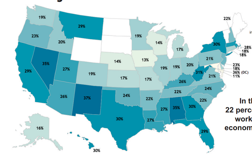
The generally-accepted standard for affordable, sustainable housing costs is that they should be about a third of a household’s income. The National Low Income Housing Coalition recently released a report on the mismatch between minimum wage — currently set at $7.25 nationally, with some states and municipalities having higher minimum wages within their boundaries — and the standard of living. The NLIHC report included this map showing the hourly wage that would be required for the HUD-calculated fair market rent to be about 30% of a full-time worker’s income:

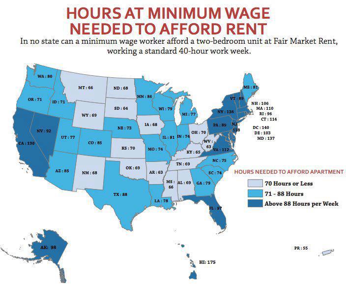
In no state does the minimum wage pay enough to hit the 30%-of-income standard of affordable housing costs. How many hours would a minimum-wage worker need to work per week to make enough that the fair market rent would be about a third of their income? A lot, from a low of 63 hours a week in West Virginia to a high of 175 in Hawaii:

Thanks to Dmitriy T.M. for the tip!

Last week, the Census Bureau announced that as of July 1, 2011, for the first time the majority (50.4%) of babies under age 1 in the U.S. were not non-Hispanic Whites. Animal New York posted a video by Jay Smooth discussing the reactions to and implications of this news:

You can see the NYT article Jay Smooth parodies here, but note that the graph is mislabeled. The line labeled “White” actually only represents the data for non-Hispanic Whites, while the line labeled “Non-White” includes births to White Hispanics, so the terminology they used doesn’t accurately reflect what the graph illustrates.

There is no one answer to the question, “How many people are lesbian, gay, bisexual or transgender?” But demographer Gary Gates, who works for the Williams Institute at UCLA’s School of Law, has compiled the results from nine surveys that attempt to measure sexual orientation — five of them from the U.S. He estimates that 3.5% of the U.S. population identify as lesbian, gay or bisexual, while 0.3% are transgender. Here is the breakdown for the different surveys:

He also points out that bisexual identification is generally more common among women than among men. Among women, more than half of the lesbian/bisexual population identifies as bisexual; among men more than half identify as gay.

As is the case with race, we may rely on self-identification when it comes to sexual orientation. But criteria external to individuals’ identities may matter as well. These include the perceptions or actions of others (such as cross-burning or job discrimination), as well as qualities measurable by impersonal means (such as phenotypical traits or genes). In the case of sexual orientation more than race, these externally-measurable qualities include behavior (such as the gender of those one has sex with). The interpretation of these qualities, and their measurement, necessarily are highly contingent on social constructions.

In the case of sexual orientation, the questions are not usually asked, so the answers are not bureaucratically normalized. If the government and other data collectors were to start asking the question regularly, the results would probably settle down, as they have with race. In Michel Foucault’s terms, you might say the population is not disciplined with regard to sexual orientation as well as it is with race. (Of course, the public is unruly when it comes to measuring race as well, especially outside those outside the Black/White dichotomy, as “Asians” and “Hispanics” often offer national-origin identities when asked to describe their race.) Settling down doesn’t mean there would be no more changes, just that variability between surveys would probably decline.

Because of this complexity, it is interesting to compare results when people are asked about their sexual behavior, and their sexual attraction. Here surveys find much higher rates of gayness. As Gates shows, for example, 11% of Americans ages 18-44 report any same-sex sexual attraction, while 8.8% report any same-sex sexual behavior.

Whether demographers, or the public, or anyone else, considers these experiences and feelings to define people as gay/lesbian or bisexual is not resolved. For example, as Gates notes in a much longer law review article that describes the methods behind his report – and the reactions to it – some media simply ignored the self-identified bisexual population, and those with same-sex attraction or behavior, declaring that the gay and lesbian population was less than 2% of Americans. Others concluded that the commonness of bisexuality implies most gays and lesbians in fact have a “choice” about their sexual orientation.

I recommend the law review article for Gates’s in-depth discussion of “the closet” issue with regard to surveys, and the problem of measuring concealed identities — which vary according to social context and sometimes change over the course of people’s lives.

I’m grateful that Gates has pursued these questions, and taken a lot of grief in the process. He concludes:

These are challenging questions with no explicitly correct answers. The good news is that strong evidence suggests that, politically at least, the stakes in this discussion are no longer rooted in an urgent need to prove the very existence of LGBT people. This progress hopefully provides the space to more critically and thoughtfully assess these issues in an environment where a sense of urgency is not paramount. Today, the size of the LGBT community is less important than understanding the daily lives and struggles of this still-stigmatized population and informing crucial policy debates with facts rather than stereotype and anecdote.

As with race, measurement of sexual orientation may be essential to legal and political responses to inequality and discrimination — even as the process helps solidify fixed identity categories we might rather do without.

Philip N. Cohen is a professor of sociology at the University of Maryland, College Park, and writes the blog Family Inequality. You can follow him on Twitter or Facebook.

Cross-posted at Brad’s Blog.

Here are a few commercials for the new MilkBite™ from Kraft. They play on stereotypes about mixed-race individuals.

[youtube]https://youtu.be/ffkDRynWAMw[/youtube]

Here is a transcription:

You didn’t think, did you? You, uh, didn’t think what life was going to be like for me — mom, dad — for your son.

In another commercial, the characters have the following conversation:

I just have a question. Your profile said you were milk.
Uh huh, yep, I am.
You just look like granola.
Granola, yeah, I know. I get that a lot. This was a mistake.
No, wait. Please don’t go. I’m kinda into it.

There are other spots on Kraft’s YouTube page, most playing on these same themes. The problem with a marketing campaign like this is that it trivializes the experience of people with multiple racial/ethnic identities who are still often met with derision and confusion. The first ad above perpetuates the self-fulfilling prophecy about “confused” identities. As a child, I remember family members telling me that they didn’t have a problem with interracial couples but worried about how others might react to their children.

In my classroom earlier this year, a young white woman expressed overt anger when I told the class that the 2010 2000 Census, for the first time, allowed individuals to check more than one racial category. “How can they do that?!!” she demanded to know. Living in a country with a president who had a black father and an white mother complicates all of this. Beyond the standard “post-racial America” narrative, Pres. Obama’s racial identity — even though he identifies only as black — means that people feel entitled to be dismissive of the problems that come with our increasingly complex constructions of race.

Anita Sarkeesian at Feminist Frequency points out that the marketers are likely fully aware of the inappropriate nature of these types of campaigns, and in fact, that is precisely why they launch them. They are seen as ironic, over-the-top, cynical, and tongue-in-cheek. It’s “they know that I know that they know” that it’s racist. It’s a virtual “wink and a nod.” Lisa Wade at SocImages points out that it’s a “no-one-will-ever-believe-we’re-serious” mindset. Sadly, not all people are in on the joke and will find their bigotry and ignorance reinforced, but the rest of us should know better than to perpetuate racism, even under the guise of humor.

————————

Bradley Koch is a sociologist at Georgia College. He is currently the co-director of the study abroad program based in Athens, Greece.  His research interests include religion, sexuality, higher education, and teaching and learning. In his free time, Brad enjoys making music and riding his road bike around rural Georgia.

P. Mae Cooper sent in a report from the Center for Economic and Policy Research that looked at economic insecurity in the U.S. Using data from the Census Bureau’s Annual Social and Economic Supplement, the authors calculate the percentage of good jobs in each state. They define a good job as one that pays at least $17/hr (the inflation-adjusted median income for men in 1979), which for a full-time year-round worker would mean an annual income around $35,000, and which provides health insurance and retirement benefits. Overall, about 1 in 4 jobs fit this definition of a good job, with quite a bit of variation by state:

The data was for 2003-2005, so this doesn’t reflect any effect of the recession on the types of jobs available.

They also calculated the % of jobs that don’t meet any of the elements of a good job — that is, they pay under $17/hr, they don’t provide health insurance, and they don’t have any retirement plan available. These are more common than good jobs, making up about a third of all jobs in the typical state:

One criticism of the official poverty line is that it doesn’t account for regional differences in cost of living, as well as supplementary forms of income supports (Social Security, unemployment, etc.). The authors used Survey of Income and Program Participation data to calculate economic insecurity by taking into account regional costs of living.

The calculations include data for 1) working families and 2) only those families that have 1 or 2 adults and o to 3 children, so it excludes families where not adults are employed or that have 4 or more children. And the data are for 2001-2003, so again, it doesn’t reflect the recession. This map shows the % of the included families whose total income is less than the basic budget standard (that is, actual market costs of essential goods and services in over 400 localities) where they live. About 22% of families were economically insecure, with a lot of variation by state:

I really hope someone updates this analysis, given the recession, but the report provides a general illustration of an important aspect of our economy, and the limitations of a measure of poverty that entirely ignores regional costs of living.

In 1970, the U.S. Census added a “country of origin” question to its demographics section, which asks respondents if they are “of Hispanic, Latino, or Spanish origin.” But a new Pew Hispanic Center report indicates that, while these might be the official terms for those from Spanish-speaking countries and/or Latin America, they aren’t the preferred or most popular labels among those they’re supposed to identify. Only about 1 in 4 use the terms Hispanic or Latino most frequently to describe themselves:

Not surprisingly, identification with different labels differs among recent immigrants and those born in the U.S. Among the first generation, country of origin is the overwhelming preference, but by the third generation, just over 1 in 4 choose that as their most common self-identifier:

Most respondents had no preference between the terms Hispanic or Latino, but for those who did, Hispanic was more popular:

White was the most commonly-chosen racial identification:

Most respondents also said that while they think it’s important that Hispanics be able to speak Spanish in the U.S., that learning English is very important for success. By the second generation, almost all rate themselves as knowing English “pretty” or “very” well:

Conversely, among third-generation Hispanics, under half say they speak or read Spanish equally well:

Check out the full report for tons of additional information on identification, language use, etc.

Recently we posted a comparison of the types of jobs Americans held in 1940 and 2010, based on Census data. Now NPR has posted an interesting image showing how spending on different categories has changed:

Source: Bureau of Labor Statistics. Credit: Lam Thuy Vo / NPR

[Note: Sorry I initially accidentally left out the link to the original NPR story!]

The change in spending on food is especially noteworthy, given the role that cost of food plays in determining the poverty line in the U.S. It is still based on a calculation developed in the 1960s, which assumed that the average family spent about a third of its income on food. To figure out how much a family needed to survive, the minimum cost of a nutritionally-complete diet for a particular family size was calculated; multiplying it by three provided the poverty line. It was then adjusted over time. This is the number generally used to determine eligibility for government assistance programs.

But since then, food prices have fallen significantly, while other necessities, such as housing and medical care, have often gotten more expensive. Many have criticized the poverty line calculation, including the National Academy of Sciences, arguing that as food has gotten cheaper, the official poverty line does a worse and worse job of capturing exactly how much it costs to survive in the U.S.

NPR also provided a more detailed breakdown of spending on a number of major categories in 2011:

Source: Bureau of Labor Statistics. Credit: Lam Thuy Vo / NPR

Thanks to my friend Kathy B. for letting me know!

Matthew Yglesias posted an image from an infographic released by the Census Bureau showing differences in the U.S. population between 1940 and 2010. This section of the graphic focuses on changes in the industries in which the U.S. workforce is employed. For instance, in 1940 23.4% of Americans worked in manufacturing, down to 10.4% in 2010:

Education, health, and social services have emerged as a major employment sector. On the other hand, while agriculture is a minor  sector today (in terms of % of people employed), in 1940 nearly 1 in 5 people worked in agriculture. As Yglesias says,

…this drives home the fact that the initial exclusion of agricultural workers from Social Security [as part of the New Deal in the 1930s] was a really major compromise.