A longer version is cross-posted at Montclair SocioBlog.
Long before the Freakonomics guys hit the best seller list by casting their economic net in sociological waters, there was Gary Becker. If you want to explain why people (some people) commit crimes or get married and have babies, Becker argued, just assume that people are economically rational. Follow the money and look at the bottom line. You don’t need concepts like culture or socialization, which in any case are vague and hard to measure.*
Becker wrote no best-sellers, but he did win a Nobel. His acceptance speech: “The Economic Way of Looking at Behavior.”
In a Wall Street Journal op-ed Friday about the recession, Becker started off Labor Day weekend weighing in on unemployment and the stalled recovery. His explanation: in a word, uncertainty.
These laws [financial regulation, consumer protection] and the continuing calls for additional regulations and taxes have broadened the uncertainty about the economic environment facing businesses and consumers. This uncertainty decreased the incentives to invest in long-lived producer and consumer goods. Particularly discouraged was the creation of small businesses, which are a major source of new hires.
There’s something curious about this. Becker pushes uncertainty to the front of the line-up and says not a word about the usual economic suspects – sales, costs, customers, demand. It’s all about the psychology of those in small business, their perceptions and feelings of uncertainty. Not only are these vague and hard to measure, but as far as I know, we do not have any real data about them. Becker provides no references. The closest thing I could find was a small business survey from last year, and it showed that people in small business were far more worried about too little demand than about too much regulation.
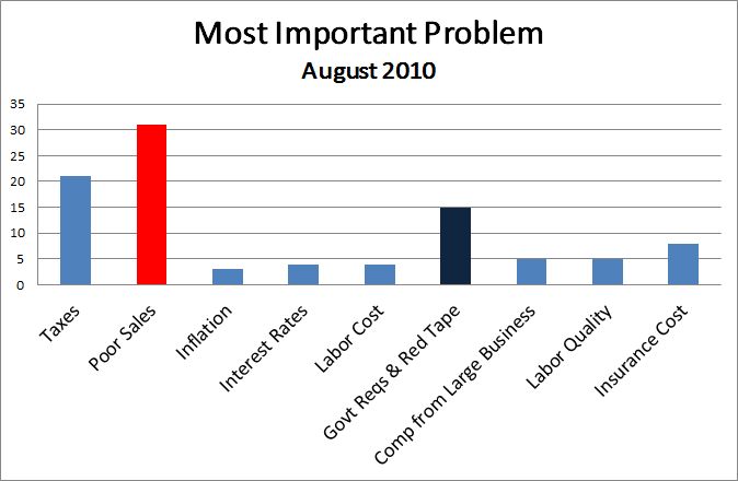
Compared with Regulation, twice as many cited Sales as the number one problem. (My posts on uncertainty from earlier this summer are here and here.)
In addition, the sectors of the economy that should be most uncertain about regulation – finance, mining and fuel extraction, and medical care – are those where unemployment is lowest.

More, as David Weidner writes in the Wall Street Journal, taxes, interest rates, and regulation at an all-time low.
[The uncertainty-about-taxes-and-regulation argument] would make more sense if, say, taxes were already high and might be going higher or regulatory burdens were heavy and might be getting heavier. But when taxes are at a 60-year low and the regulations are pretty much the same as they were in the 1990s boom, the argument makes no sense at all (Mark Thoma quoting an e-mail from Gary Burtless).
If it’s really uncertainty caused by these things that causes a reluctance to hire, the time to invest and hire should be now.
—————————
* This is an oversimplified version, but it will do for present purposes.