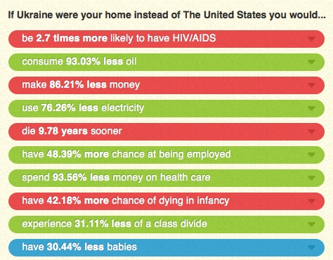
economics

Last week I posted the results of a survey that found that many beneficiaries of government programs don’t recognize themselves as participating in a federal program at all. For instance, 60% of respondents who have written off their mortgage interest on their taxes didn’t see that as a government benefit or themselves as program beneficiaries. Basically, programs and policies that are disproportionately used by the middle- and upper-classes are taken for granted. I wrote,

…allowing you to write off mortgage interest (but not rent), or charitable donations, or the money you put aside for a child’s education, are all forms of government programs, ones that benefit some more than others. But the “submerged” nature of these policies hides the degree to which the middle and upper classes use and benefit from federal programs.

Brian McCabe, over at FiveThirtyEight, recently wrote a post about who benefits from the mortgage interest tax deduction program, which remains enormously popular among the general public. McCabe says,

Commentators often talk about the mortgage interest deduction as a prized middle-class benefit that enables households to achieve the American dream of homeownership. But despite their strong support for the deduction, middle-class Americans are not the primary beneficiaries of this federal tax subsidy.

If you aren’t familiar with the program, basically when you’re doing your taxes, you are allowed to reduce your taxable income by subtracting the amount you paid in mortgage interest that year. Home ownership isn’t treated equally — the tax deduction is worth more as the price of the home, and thus the amount of interest paid, goes up. McCabe points out that in 2009, this program meant that the federal government took in about $80 billion less than it would have otherwise, making it one of the most expensive tax policies and the single most expensive deduction offered to homeowners (much more than deductions for putting in energy-efficient windows, etc.).

But this expensive program is disproportionately used by relatively wealthy individuals. For instance, about a quarter of taxpayers making $40,000 – 50,000 a year claim the deduction, while over 75% of those making above $100,000 a year do:

The differences in usage is partly because the wealthy are more likely to own* homes. In addition, those with lower incomes generally buy cheaper houses and often find that they reduce their taxable income so little by writing off the mortgage interest that they’re better off taking the standard tax deduction than to itemize.

Because wealthier individuals are more likely to use the program at all, and when they do, generally have more mortgage interest to deduct, the benefits of the program go disproportionately to those with higher incomes. This image shows the proportion of all tax filers that fall into each income category, and the proportion of the total tax deduction benefit that goes to each category:

This is similar to what we see with farm subsidies: while small- and mid-sized farms benefit, the money spent on the program disproportionately goes to the largest farms.  The mortgage interest deduction program is discussed as a method for helping the middle-class achieve the American Dream of homeownership. And certainly it does make home ownership more attractive to many middle- and lower-income individuals. But it overwhelmingly benefits upper-income home buyers, at a significant loss of tax income for the federal government.

* On a side note, I find it odd that we say someone “owns” their home when they owe a mortgage on it. The second I signed a mortgage last year, I entered the much-praised category of the home-owning citizen. Yet as my mortgage-hating farm family has made me very aware, I’m not even close to truly owning my home at this point; I’m more of a special category of rent-to-own resident whose landlord is the bank or mortgage company.

Dmitriy T.M. send in a map from National Geographic that shows the wide disparities in national per capita income levels, as well as population density. Different colors represent different income groups, while shades within each color represent population density (darker = lower density):

The map claims to be interactive, though I haven’t figured out any interactive features. They do provide a lot of data on various economic and social indicators for each income group. Of course, this type of representation hides the often wide disparities in income within countries. But it’s a striking general overview of global economic development.

Over at Reuters, Felix Salmon posted a chart I found rather stunning given that we’re hearing new warnings about the dire situation the economy is in and the slow job growth we’re experiencing. Using Bureau of Economic Analysis data, he looked at total U.S. domestic profits, as well as the proportion of all domestic profits earned by the financial sector, between 2001 and the end of 2010. And what we see is that both overall corporate profits, and the finance sector so central to the economic crisis, have bounced back quite well, returning to the levels we saw just before the peak of the boom period:

Now, one caveat here: the data are annualized quarterly figures. That means to get the total profits for the year, you don’t just add them up, as you’d expect — each annualized quarterly data point apparently represents profits for the entire year if the growth rate at that point had continued. If you really care, here’s one explanation of annualizing and why you’d do it. If you want, the BEA website allows you to look at profits annually, instead of quarterly, so you don’t have to worry about it.

Anyway! Point is, it complicates the general perception we might get from news reports that everything in the economy is awful and there are no profits to be made. Ongoing job stagnation and media focus on the negative economic news doesn’t mean all parts of the economy are suffering equally, or that as soon as corporate earnings rebound, the benefits would quickly reach workers in the form of new job opportunities.

Cross-posted at Family Inequality.

I haven’t yet seen any definitive evidence that the recession has had an effect on divorce rates. But if I’m going to pick on other people for this, I should offer a few ideas.

In a previous post I cited a lot of reasons to expect divorce would increase as a result of family stress and instability. Others claim these hard times are bringing couples together in the face of adversity. And either – or both – of these influences is woven into the long term trends in divorce. Here are three graphs looking at the question.

Long-term trends

The overall divorce trend doesn’t seem to be moved much one way or the other by recessions (shown in blue), at least for the last 60 years:

That national data is only available through 2009, so a little early to see a major effect. Still, no disruption of the trend at the national level, just a continuous decline in the divorce rate. (Here’s a great recent Census report on divorce trends.)

State patterns

The official divorce rates are available from 38 states, but they’re only considered reliable through 2008 so far. By putting together two years of changes — 2006-2007 and 2007-2008 — this figure has 76 dots (two for each state), showing whether changes in divorce are related to changes in unemployment rates. This gives a rough idea of the relationship between how hard states were hit by the recession and any changes in divorce:

I made the dots larger according to the population sizes, and weighted the red trend line so that the larger states have more effect (this positive relationship is statistically significant at the 99% confidence level). This is just a start, but it leans in the direction of unemployment increasing divorces. At least it doesn’t look like the recession is driving divorce down.

Google

Finally, what about divorce on the American brain? For a glimpse inside, we turn to Google trends. If it works for the flu, it might work for divorce, too. Here are the trends for “divorce attorney” and “divorce lawyer”:

The trend for both searches looks basically flat except for seasonal variation, and some turbulence in 2008. But nothing to suggest a major trend one way or the other. (You can play with these yourself, starting with mine, here.)

My conclusion so far: no national evidence of a recession effect on divorce yet, but some suggestive hints worth keeping an eye on — leaning in the direction of recession causing more divorces — in opposition to a long-term downward trend. Maybe if and when the housing market loosens up more unhappy spouses will take the plunge and move out. The divorce rate may continue to fall, as it has been since the early 1980s, but that doesn’t mean this recession has a “silver lining” for families.

In recent years, as states around the country have been faced with the worst budget deficits on record, funding for many social service programs has been slashed or cut entirely. A new report from the NAACP demonstrates that during these budget clashes, funding for prisons has won out over spending for education. The report argues that these “misplaced priorities” are ultimately destructive.  Expanding prisons at this point does little to reduce crime and by spending these limited budget dollars on prisons rather than education, we are condemning the next generation of kids in poor neighborhoods to this same cycle of poor education, high crime rates, and mass incarceration.

However, the NAACP report only describes the first half of the problem—the failures of schools and the expansive role of the criminal justice system. The other half of the story is the legacy of these failures—strikingly low levels of education among those who wind up in our nation’s prisons—and the fact that corrections departments today are doing a worse job than ever in providing education inside of prisons as a way out of the revolving door of corrections.

This is important because we know that over 90 percent of inmates are at some point released and roughly half of them will return to prison within the next 3 years. Slashing prison education funding may provide a very small benefit to the current budget, but it also helps to fuel the growth in prisons that has suffocated education funding in the first place.

It is simple to document the dire educational needs of prisoners.  According to the 2004 Survey of Inmates in State and Federal Correctional Facilities, over 60 percent of state inmates never made it past 11th grade in school.  Among young inmates under 25 years of age, only 20 percent have completed high school.  If G.E.D.’s are included in this measure, only 66 percent of inmates 25 years or older have completed their basic education, compared to 85 percent of adults in the non-institutionalized population.

Sadly, the programs that serve these inmates’ needs have been on the chopping block for years.  In work recently published in Law & Society Review, I show that the ratio of inmates to teachers for academic and vocational education in prisons nationwide has more than doubled since the 1970s, growing from 53 inmates per teacher in 1974 to 112 inmates per teacher in 2005. Much of this change occurred in the most recent decade: in 1990, the ratio was only 67 inmates per teacher.

These declines in staffing investments are clearly translating into declining participation in prison education programs. Between 1991 and 2004, the percent of inmates reporting past or current participation in academic classes dropped precipitously from 43 percent to 27 percent.  If the rate of high school attendance had dropped by almost 50% in the span of a decade and a half, pundits would be railing against state legislators.  But since this happened behind prison walls, there has been very little awareness (let alone outrage) about these changes.

This strategy is a flawed attempt to cut costs since we know that education is one of the more successful ways to reduce recidivism.  In study after study, inmates who participate in educational programming are less likely to commit new crimes after release and to be re-incarcerated. This is in part because basic academic education and vocational training makes it more possible for ex-felons to find the kind of employment opportunities that forestall re-incarceration.

In recent years, this disinvestment in prison education has been even more brutal. In California, state lawmakers have taken $250 million away from rehabilitation programs in the last two years and are planning to cut another $150 million in the coming year. These losses in funding translate into a third of the adult programming budget. These cuts are an ironic move after Governor Schwarzenegger’s 2004 decision to change the name of the state agency from the “Department of Corrections” to the “Department of Corrections and Rehabilitation”.

Although some states have begun looking into ways to reduce correctional populations as a more sustainable way to manage costs, in the next few years, we can expect to see even more slashes to prison education funding.  Ultimately, this strategy is likely only to cut a small percentage of states’ immediate costs and will increase the need for incarceration spending in the near future.

—————————

Michelle Phelps is a Ph.D. candidate in Sociology and Social Policy at Princeton University.  Her work focuses on the punitive turn in the criminal justice system, examining how the daily operations of prisons changed (and remained the same) during the massive recent shift in the rhetoric and politics of punishment.  Her dissertation project is on the rise of probation supervision and you can find her new blog on the strange media surrounding probation at Probation Research.

If you would like to write a post for Sociological Images, please see our Guidelines for Guest Bloggers.

Earlier this month, The New York Times and Foreign Policy both reported on the United Nations population forecast for the next 100 years. According to the report, rather than hitting 9 billion at mid-century and then leveling off, the world’s population is likely to climb to 10 million and keep going. The cause: a fertility boom in the global south –– Africa, Asia, Latin America. Such growth, according to the report, if unchecked, will have dire consequences on a world already facing shortages of food, available water and other life-giving resources.

In reporting the story, both the Times and Foreign Policy used pictures of women and their children, but the way they used the pictures was somewhat chilling. For example, the Times ran a photo of several women of color under the heading: “Coming to a Planet Near You: 3 Billion More Mouths to Feed.”

Additionally, Foreign Policy ran a photo under the sub-headline: “Why ignoring family planning overseas was the worst foreign-policy mistake of the century.” It featured a picture of dark-skinned women with a child.

These photos, paired with the headlines and the dire predictions in the stories of what’s to come should the global south’s fertility boom remain unchecked, tap into anxieties about women’s bodies and link the coming doom and gloom directly to them. The Times headline, warning of “3 billion more mouths to feed,” is combined with seven new mothers in Manila; positioned in a long row, they crowd the frame of the photograph as they are imagined to crowd the planet.  While the Foreign Policy sub-headline inspires fear, saying that allowing the burgeoning birth rate was  the “worst… mistake of the century.”  Its photo features two women and a child in the foreground.  In both cases the focus on women makes it seem as if men have no role in reproduction at all.

Whether they meant it or not, such a juxtaposition does little more than demonize women –– particularly poor women from developing countries –– as directly responsible for the problem of overpopulation and its solution. While the commentaries herald funding for family planning and education –- both great ideas –– they contain no conversation about economic systems that create or maintain poverty in certain parts of the world; how patriarchy and systems of male-centered power prevent women from being able to control their own reproduction; and how international development money too often comes with strings attached that restrict government resources for education and health care, especially for women, who too often are the ones who bear the hardest brunt of poverty and the greatest social opprobrium.

Here’s what an alternative might look like:  GOOD Magazine discussed the U.N. report and the coming population boom. Its focus: How responsible living in the United States and other wealthy countries can help ensure food for all. The photo that ran with the commentary: a photo of the planet Earth.

Barbara Yuki Schwartz is a doctoral student in the Theology, History and Ethics program at Garrett-Evangelical Theological Seminary in Evanston, Ill.  She studies postcolonial and poststruturalist theory, political theory and theology, trauma studies, and is interested in how body, community and psychic life intersect and influence theology and liturgy. She blogs regularly at Dialogic Magazine.

Dmitriy T.M. sent in a link to the website If It Were My Home. The site allows you to select two nations and then explains how your life would compare if you lived in each one in terms of rates of HIV/AIDS, employment, energy consumption, infant mortality, class inequality, and other factors (based on CIA data). As an example, Dmitriy chose to compare the U.S. and Ukraine, “the 2 greatest countries in the world, as determined by the poll conducted in my head”:

You can then choose one of the items for more details; I selected life expectancy:

The site is set up with the U.S. as one of the default comparisons, but at the top there’s a button that lets you select a non-U.S. comparison. (Note: Reader Parodie says it appears to detect whatever country you’re accessing the site from and set that as one of the default comparisons.) It’s a fun site that you can spend quite a bit of time playing around with.

UPDATE: Just a caution–a couple of readers seem to have found situations where the math doesn’t add up in the comparisons of some countries. And other readers noted that this does an enormous amount of averaging, which definitely hides the differences in quality of life in various countries, which are so extreme in some nations that “averages” might be nearly meaningless.

Over the weekend I came across an interesting video of Mike Rowe, creator and host of Dirty Jobs. Rowe recently testified before the U.S. Senate’s Commerce, Science, and Transportation Committee. He made an impassioned case for the type of difficult but essential jobs he highlights on his show, as well as the vocational and other training programs that prepare workers for them — programs facing tremendous cuts due to state budget crises. While we hear a lot about the need to increase the level of 4-year college degree completion in the U.S., Rowe argues that skilled plumbers and welders are every bit as essential to our economic development, and that such jobs are worthy of respect and public support: