Search results for The

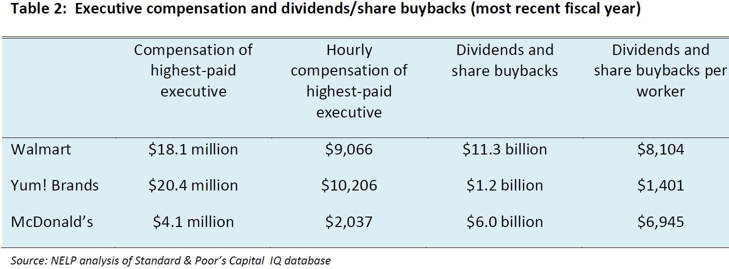
Part of the challenge of taking care of a blog involves keeping the archive alive.  One way to do that is to link readers to older posts they they might be interested in.  We do that, in part, with an automated process called Link Within.  When we publish a post, the program searches our archive for similar posts and includes a set of thumbnails at the bottom that readers can click on if they’d like to know more.

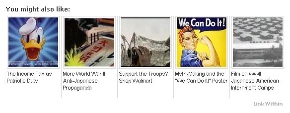
At the bottom of a recent post about the role of carrots in World War II, for example, linkwithin offered these options:


There are pitfalls to this type of program that illustrate a bigger problem involved with talking about social inequality.  A reader named Sarah C. emailed us the following observation in response the thumbnails that followed a post about the sexual objectification of women:

I wanted to point out the dissonance I feel when I spend time reading a thoughtful article about gender equality and then when I finish the bottom of the page greets me with a line of 100 x 100 px images of sexualized womens’ bodies.  They are the same kinds of images I would see browsing Cracked or College Humor, or other mainstream sites.  The Huffington Post does it too – sites claiming to be (and often actually are) more or less progressive are using sexist tactics to get people to click, or at least that’s what it seems like…

I think it’s great to include examples of objectification in your posts in order to illustrate your point.  But using those images as a thumbnail gets you the wrong attention.  It feels hypocritical, or at least incongruous with your blog’s goals.

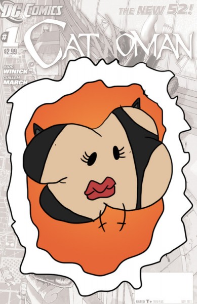
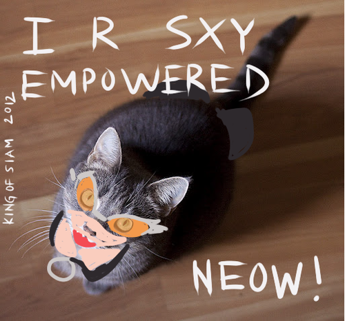
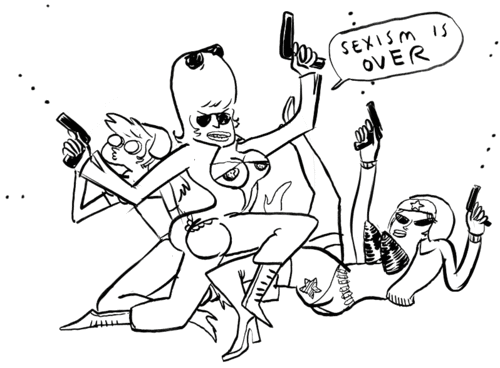
This is what Sarah saw:

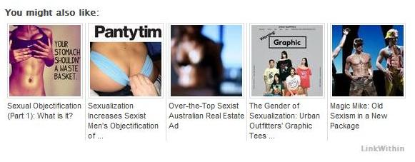
Since the thumbnails are automatically generated, we don’t actually know what the thumbnails will be until we see the published post on the site.  So, upon seeing Sarah’s screenshot of the thumbnails, I was taken aback.  I understood immediately why she felt compelled to send us an email.

The phenomenon goes far beyond thumbnails.  Even if we did away with Link Within, our posts on the sexual objectification of women would include images that sexually objectified women.  We are Sociological Images, after all.   So our posts drawing attention to and criticizing the phenomenon also reinforce it.  It’s two steps forward and one step back, plus or minus a step.

But even if we weren’t an image-based blog, even if we simply discussed sexual objectification without an accompanying visual, doing so would remind readers that women are objectified, that they need to worry about how their bodies look, and that they’re being judged by their appearance.  At least one study has demonstrated that simply being exposed to objectifying words, devoid of imagery, can increase the degree to which women self-objectify.

Talking about sexual objectification always threatens to deepen the degree to which people feel sexually objectified, even if that is the opposite of one’s intention.  This phenomenon applies just as well to other forms of oppression.  Talking about the way in which state policies help or hinder Mexican immigrants to the U.S., for example, potentially further entrenches the idea that all Latinos are “illegals.”  Pointing out under-development in parts of Africa potentially affirms the notion that all of Africa is economically backward or politically corrupt.  Referring to women’s lack of representation in math and science may make women even more anxious about pursuing these careers.

This is one of the ways that power works.  It  co-opts the strategies available for fighting back.   Power is flexible and accommodating, it controls and convinces through all possible channels, it finds ways to infiltrate all mediums.  This is why it’s so hard, in the first place, to eradicate prejudice and inequality.

Coming to our blog is, for these reasons, a scary proposition.  Because we sometimes talk about ugly things, there will be ugly things here.  Taking out the thumbnails won’t change that; neither would deleting all of the images we reproduce.  Deleting all posts that address inequality would, but then we would be silently complicit with the status quo.  So, we keep blogging, and we keep uploading, and we keep trying to engage our readers further… for better or worse.

Lisa Wade, PhD is an Associate Professor at Tulane University. She is the author of American Hookup, a book about college sexual culture; a textbook about gender; and a forthcoming introductory text: Terrible Magnificent Sociology. You can follow her on Twitter and Instagram.

Last year Lisa posted about Wonder Woman’s pose on a Justice League cover and the way it revealed performative aspects of gender. DC Comics recently released a new Catwoman series. Majd Al-Shihabi sent in a link to the cover of Catwoman #0. The cover drew a lot of attention for the degree of sexualization of Catwoman, whose unrealistic and painful-looking pose maximizes the prominence of her breasts and butt:

I tried to imagine how you’d have to hold your body to even approximate that pose, but at a certain point it hurt to even think about it.

Gamma Squad posted a number of parodies that highlight the over-the-top sexualization of this female superhero. From Josh Rodgers, of Mushface Comics:

From King of the Siams:

And some time ago Hark! A Vagrant presented Strong Female Characters, which awesomely parodies the “it’s not problematic to sexually objectify all your female characters as long as they’re able to kick ass ‘n stuff!” argument (thanks to Erin R. and Gabrielle M. for sending it in). Here’s just one panel; I recommend following the link to check out the whole thing:


Gamma Squad has several other examples, including one where someone tries to use a graphics design program to reproduce the Catwoman pose without breaking her spine. Results: can’t be done.

Opponents of abortion have long targeted the “demand side” of abortion by passing legislation aimed at dissuading patients from going through with an abortion. Examples of this type of restriction include parental consent/notification laws, waiting periods, and mandatory counseling. Research shows that targeting patients has had little impact on national abortion rates; they’ve been declining, but several factors are likely contributing to the decrease, including increased accessibility to contraceptives.

New approaches to restricting abortion have focused on the “supply side” of the abortion equation — that is, targeting the doctors and clinics that provide abortions. These regulations often require certain staffing and equipment requirements, resulting in clinics being shut down (often due to the expense of implementing the regulations). Reduced access to clinics often means that women have to travel further for an abortion — increasing costs (the procedure itself, travel, and accommodations), especially when a patient has to navigate waiting periods and counseling requirements.

Mississippi’s sole abortion clinic, for example, the focus of abortion opponents for many years, faced closure recently because of a law that changed licensing procedures. The law now requires all doctors performing abortions to have admitting privileges at local hospitals (difficult for the out-of-state doctors to acquire). The clinic was granted an extension to meet the requirements, though the law was allowed to stand.

So, does targeting the supply side of abortion work to reduce the procedure?

A recent article in the New England Journal of Medicine did a natural experiment to answer this question.  In 2004, Texas passed two new restrictions on abortion, one on each side. The “demand side” legislation required that women receive information about risks at least 24 hours before an abortion can be performed. The “supply side” legislation required that abortions after 16 weeks of gestation be performed in a hospital or an ambulatory surgical center instead of a clinic. At the time the law was passed, none of Texas’ non-hospital based clinics met the legal requirements, and very few abortions were performed in hospitals.

If the “demand side” legislation had an effect, the number of abortions would decrease at all levels of gestation. As Chart A illustrates, there was no change whatsoever in the number of abortions performed before 16 weeks — indicating that the demand side legislation had almost no impact.

If the supply-side legislation had an effect, the number of abortions provided after 16 weeks should have dropped.  In fact, Chart B shows that the number of later abortions performed dropped 88% after the legislation was implemented.

So, targeting the supply side reduced the number of abortions performed in Texas, but did the  women carry their baby to term?

No. Some of these women left the state to receive an abortion; in fact, the number of who received an out-of-state abortion more than quadrupled from 2003 to 2004. Accordingly, the average distance women had to travel to receive an abortion after 16 weeks increased from 33 miles in 2003 to 252 miles in 2004.

As has been noted on this site before, nations that have highly restrictive abortion laws do not have lower abortion rates; in fact, in those countries where abortion is illegal, many of those abortions are unsafe, resulting in high numbers of maternal deaths. Although targeting the supply-side of abortion might be appealing, it will probably not reduce the abortion rate nationwide. Instead, it likely places onerous restrictions on women with fewer resources, since they will be less able to meet the increased costs that result from having to travel for abortions.

Thanks to ­­­Jenna for the submission!

————————

Amanda M. Jungels is a PhD Candidate in the Department of Sociology at Georgia State University, focusing on sexuality, gender, and cognitive sociology. Her dissertation focuses on disclosures of private information at in-home sex toy parties. She is the current recipient of the Jacqueline Boles Teaching Fellowship, given to outstanding graduate student instructors.

A while back readers absolutely fell in love with a vintage Lego ad from 1981, featuring a red-headed befreckled girl in pigtails and overalls.  It, and two more in the series, reminded us that advertising doesn’t have to impose rigid gender stereotypes the way that most advertising today and the newest Lego marketing strategy certainly does.

Joanne M. dug up two more examples, both from Family Circle in 1978.  Feast your eyes on these happy children:

David Pickett, by the way, wrote us an amazing four part history of Lego’s (failed) efforts — or lack thereof — to reach out to girls.  It’s a truly comprehensive and fascinating story.

Lisa Wade, PhD is an Associate Professor at Tulane University. She is the author of American Hookup, a book about college sexual culture; a textbook about gender; and a forthcoming introductory text: Terrible Magnificent Sociology. You can follow her on Twitter and Instagram.

Steve Grimes, a once guest blogger who will be starting a sociology PhD program at Rutgers this fall, asked us to comment on the new “man aisle” in a grocery story in one of my old haunts, the Upper West Side of Manhattan.

The New York Post reports that the store COO and CEO conceived of the idea after reading a study showing that 31% of men now shop for their families, compared to 14% in the 1980s.  Ironically, the man aisle they designed doesn’t suggest that men are productive and useful members of their families. Instead, it reinforces the notion that men are all about leisure.  The items sold — you already know what they are — include condoms, Ramen noodles, beer, snack foods, and a surprising amount of condiments.
Because women are as likely to work for pay as men are, but continue to be held more responsible for housework and childcare, men do, in fact, enjoy more leisure time than women (in the U.S., almost 40 extra minutes a day).  Media frequently portray women as responsible for families or hard-working careerists and men as eager for nothing but a good time.  We see it in “for him” and “for her” news items and contrasting magazine content, and this idea is part of the message of the man aisle too.

Nothing about the man aisle suggests that he’s buying for anyone but himself, except insofar as  he might be stocking a man cave for his man friends.  This is unfortunate, because many men are productive and useful members of their families.  Also, some men hate beer, are allergic to wheat, are on diets, and think beef jerky is gross.  These men are invisible here too.

Meanwhile, the very presence of a single aisle for men marks the rest of the grocery store — the toilet paper, the diapers, the cleaning products, the greeting card aisle (*shudder*), the baking supplies, and the healthy food that you have to cook — as for women.

Lisa Wade, PhD is an Associate Professor at Tulane University. She is the author of American Hookup, a book about college sexual culture; a textbook about gender; and a forthcoming introductory text: Terrible Magnificent Sociology. You can follow her on Twitter and Instagram.

The National Employment Law Project (NELP) recently released a report about low-wage workers — those making less than $10 an hour. In 2011, 26% of private-sector jobs in the U.S. were low-wage jobs. These jobs were highly concentrated in a few industries. Just over half (52.1%) of all low-wage workers were employed in five sectors:

Most low-wage workers are employed by large businesses, those with more than 100 employees. NELP looked at the three largest employers of low-wage workers — Wal-Mart, Yum! Brands, and McDonald’s. All three have seen significant profit growth over the last four years:

The heads of these corporations are doing quite well, too:

Care 2 posted about the report and included additional details about low-wage workers. The relative worth of the minimum wage continues to decline, since prices for common consumer goods increase while the minimum wage is stuck at $7.25 an hour:

Finally, over at the Economic Policy Institute blog, David Cooper posted a table that provides an overview of the demographics of those who would be affected if Congress passed Senator Tom Harkin’s proposed bill that would raised the minimum wage to $9.80/hour:

Thanks to Dolores R. for the links!

If you pay much attention to politics in the U.S., especially during this presidential election year, you’ve probably heard someone assert that politics is getting more polarized — that is, that there is less consensus and fewer people in the middle, making it more difficult to agree on policies or get anything done. But is it true?

A recent Pew poll sent to us by Katrin indicates that it is. The Pew Research Center has tracked responses about 48 political values for over 25 years now. Over time, the percentage-point gap between Democrats and Republicans has nearly doubled:

Which issues do Republicans and Democrats most disagree about? Providing a social safety net, environmental protection, the role of labor unions, the role of government in ensuring equal opportunity, and the overall scope of government had particularly large gaps, and all have grown substantially since 1987:

Political scientists Keith Poole and Howard Rosenthal looked at polarization among federal legislators from the late 1800s through 2011. If we look at party means for members of the House, we see that after a decrease in polarization mid-century, the gap has increased again since the 1980s. Though Democrats have become somewhat more liberal, the change is is largely due to Republicans in the House becoming more conservative on average:

The Senate:

David Roberts posted about the trend at Grist. The changes we’re seeing in the Pew data, he argues, are not due to big value changes among the electorate. Instead, we see that people are sorting themselves politically in a more consistent fashion. The parties used to contain coalitions that united liberal and conservative voting blocs, but both parties are becoming more ideologically consistent.

There are Blue Dog Democrats, who are more conservative than the party overall, and some moderate Republicans who are fairly liberal on social issues. However, there is less and less room for these individuals. Those seeking elected office find it difficult to win primaries within their parties. Citizens increasingly associate conservatism with Republicans and liberalism with Democrats, and choose their party affiliation accordingly. Thus, without any great change in the actual values of Americans, we get a more starkly politically divided nation and federal legislature.

The U.S. Census Bureau recently posted some visualizations of data related to urbanization and the distribution of the U.S. population. One shows changes in the regional distribution of the population from 1790 to 2010. I can’t embed it, but I took a couple of screencaps, but it’s much more striking to watch it and see when various trends (say, the surge of population in the Midwest in the late 1800s) first appear, so I’d go check it out at the Census site.

In 1850, the South and Northeast had about equal portions of the population, and the West was just barely in the picture (I presume the 1850 Census data excludes Native Americans living in the West; if anyone is certain, let us know in the comments):

By 2010, we see a smaller percent of the population living in the Northeast, which has been overtaken by the West (though the Northeast is also the smallest of the four geographic areas, so it’s still overall more densely settled than the West):

There’s also an animated graph showing urbanization in the U.S. between 1790 and 1890. Here’s 1840:

And fifty years later:

Finally, there’s a map showing all cities that have ever been in the top 20 largest cities in the U.S. since 1790. If you click on a city name, you can see

Los Angeles:

And for Dmitriy T.C., here’s New Orleans:

The Census site lets you click through for the data each visualization is based on, so there’s lots to dig through if you’re really excited about this type of thing, as I am.