
The U.S. Census Bureau recently posted some visualizations of data related to urbanization and the distribution of the U.S. population. One shows changes in the regional distribution of the population from 1790 to 2010. I can’t embed it, but I took a couple of screencaps, but it’s much more striking to watch it and see when various trends (say, the surge of population in the Midwest in the late 1800s) first appear, so I’d go check it out at the Census site.
In 1850, the South and Northeast had about equal portions of the population, and the West was just barely in the picture (I presume the 1850 Census data excludes Native Americans living in the West; if anyone is certain, let us know in the comments):

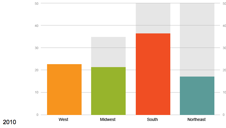
By 2010, we see a smaller percent of the population living in the Northeast, which has been overtaken by the West (though the Northeast is also the smallest of the four geographic areas, so it’s still overall more densely settled than the West):
There’s also an animated graph showing urbanization in the U.S. between 1790 and 1890. Here’s 1840:
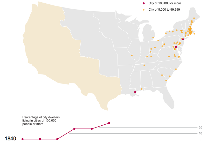
And fifty years later:

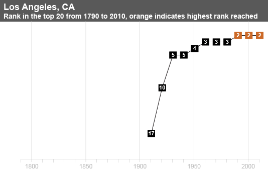
Finally, there’s a map showing all cities that have ever been in the top 20 largest cities in the U.S. since 1790. If you click on a city name, you can see
Los Angeles:
And for Dmitriy T.C., here’s New Orleans:

The Census site lets you click through for the data each visualization is based on, so there’s lots to dig through if you’re really excited about this type of thing, as I am.
Comments 4
Jane Henrici — July 20, 2012
The 1850 U.S. Census included Native Americans under the category, "Indian," but as you note those communities might have been undercounted and particularly in the west (it's also unclear to me whether all of the Mexicans still living in those territories were counted that year).
decius — July 20, 2012
Is "the West" a constant geographic area, or does it differ from census to census? In 1850, much of what we would now call "the West" was not integrated into the US, having been recently acquired. I don't think the 1850 census even had time to include the newly acquired California Purchase area at all.
Lynne Patterson — March 5, 2025
While constructing their store with sustainability and efficiency in mind, players of Monkey Mart sharpen their money management skills by expertly balancing expenses and investments.
Nulls Brawl — May 2, 2026
Nulls Brawl is a popular choice for gamers who prefer instant access to premium features. With unlimited gems and coins, players can explore every character and upgrade easily, making gameplay smoother and more enjoyable without the usual restrictions found in the original version.