Search results for survey

Counting the number of lesbian, gay, bisexual, and transgender people is harder than you might think.  I’ve written before on just how important it is to consider, for instance, precisely how we ask questions about sexuality.  One way scholars have gotten around this is to analytically separate the distinct dimensions of sexuality to consider which dimension they are asking about.  For research on sexuality, this is typically done by considering sexual identities as analytically distinct from sexual desires and sexual behaviors.  We like to imagine that sexual identities, acts, and desires all neatly match up, but the truth of the matter is… they don’t.  At least not for everyone.  And while you might think that gender might lend itself to be more easily assessed on surveys, recent research shows that traditional measures of sex and gender erase our ability to see key ways that gender varies in our society.

Gallup just released a new publication authored by Gary J. Gates.  Gates has written extensively on gender and sexual demography and is responsible for many of the population estimates we have for gender and sexual minorities in the U.S.  This recent publication just examines shifts in the past 5 years (between 2012 and 2016).  And many of them may appear to be small.  But changes like this at the level of a population in a population larger than 300,000,000 people are big shifts, involving huge numbers of actual people.  In this post, I’ve graphed a couple of the findings from the report–mostly because I like to chart changes to visually illustrate findings like this to students.  [*Small note: be aware of the truncated y axes on the graphs.  They’re sometimes used to exaggerate findings.  I’m here truncating the y axes to help illustrate each of the shifts discussed below.]

lgbt-demo-1

The report focuses only on one specific measure of membership as LGBT–identity.  And this is significant as past work has shown that this is, considered alongside other measures, perhaps the most conservative measure we have.  Yet, even by that measure, the LGBT population is on the move, increasing in numbers at a rapid pace in a relatively short period of time.  As you can see above, between 2012 and 2016, LGBT identifying persons went from 3.5%-4.1% of the U.S. population, which amounts to an estimated shift from 8.3 million people in 2012 to more than 10 million in 2016.

lgbt-demo-2-generations

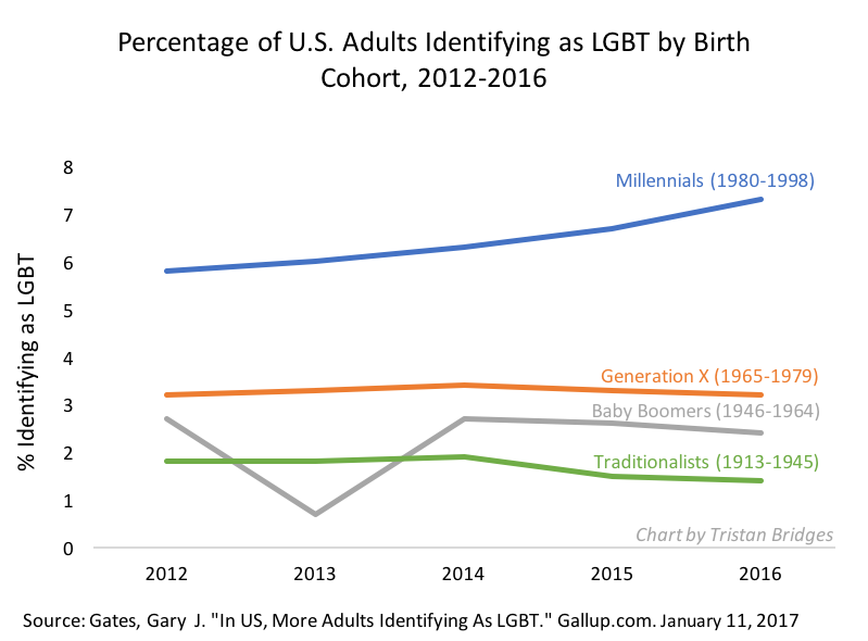
The report also shows that a great deal of that increase can be accounted for by one particular birth cohort–Millennials.  Perhaps not surprisingly, generations have become progressively more likely to identify as LGBT.  But the gap between Millenials and the rest is big and appears to be growing.  But the shifts are not only about cohort effects.  The report also shows that this demographic shift is gendered, racialized, and has more than a little to do with religion as well.

The gender gap between proportion of the population identifying as LGBT in the U.S. is growing.  The proportion of women identifying as LGBT has jumped almost a full percentage point over this period of time.  And while more men (and a larger share of men) are identifying as LGBT than were in 2012, the rate of increase appears to be much slower.  As Gates notes, “These changes mean that the portion of women among LGBT-identified adults rose slightly from 52% to 55%” (here).

lgbt-demo-3-gender-and-race

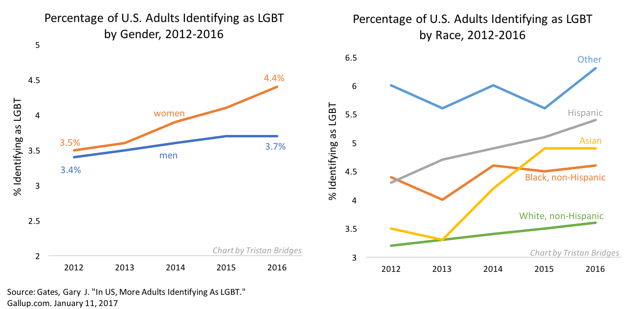
The gap between different racial groups identifying as LGBT has also shifted with non-Hispanic Whites still among the smallest proportion of those identifying.  As you can see, the shift has been most pronounced among Asian and Hispanic adults in the U.S.  Because White is the largest racial demographic group here, in actual numbers, they still comprise the largest portion of the LGBT community when broken down by race.  But, the transitions over these 5 years are a big deal.  In 2012, 2 of every 3 LGBT adults in the U.S. identified as non-Hispanic White.  By 2016, that proportion dropped to 6 out of every 10. This is big news.  LGBT people (as measured by self-identification) are becoming a more racially diverse group.

They are also diverse in terms of class.  Considering shifts in the proportion of LGBT identifying individuals by income and education tells an interesting story.  As income increases, the proportion of LGBT people decreases.  And you can see that finding by education in 2012 as well–those with less education are more likely to be among those identifying as LGBT (roughly).  But, by 2016, the distinctions between education groups in terms of identifying as LGBT have largely disappeared.  The biggest rise has been among those with a college degree.  That’s big news and could mean that, in future years, the income gap here may decrease as well.

There were also findings in the report to do with religion and religiosity among LGBT identifying people in the U.S.  But I didn’t find those as interesting.  Almost all of the increases in people identifying as LGBT in recent years have been among those who identify as “not religious.”  While those with moderate and high levels of religious commitment haven’t seen any changes in the last five years.  But, among the non-religious, the proportion identifying as LGBT has jumped almost 2 percentage points (from 5.3% in 2012 to 7.0% in 2016).

All of this is big news because it’s a powerful collection of data that illustrate that the gender and sexual demographics of the U.S. are, quite literally, on the move.  We should stand up and pay attention.  And, as Gates notes in the report, “These demographic traits are of interest to a wide range of constituencies.”  Incredible change in an incredibly short period of time.  Let the gender and sexual revolution continue!

Edit (1/17/17): The graph charting shifts by age cohort may exaggerate (or undersell) shifts among Millennials because the data does not exclude Millennials born after 1994.  So, some of those included in the later years here wouldn’t have been included in the earlier years because they weren’t yet 18.  So, it’s more difficult to tell how much of that shift is actually people changing identity for the age cohort as a whole as opposed to change among the youngest Millennials surveyed.

Tristan Bridges, PhD is a professor at the University of California, Santa Barbara. He is the co-editor of Exploring Masculinities: Identity, Inequality, Inequality, and Change with C.J. Pascoe and studies gender and sexual identity and inequality. You can follow him on Twitter here. Tristan also blogs regularly at Inequality by (Interior) Design.

Are some Trump supporters’ political views motivated by race?

One way to find out is to see whether the typical Trump supporter is less likely to support policies when they are subtly influenced to think that they are helping black versus white people. This was the root of a study by political scientists Christopher Federico, Matthew Luttig, and Howard Lavine.

Prior to the election, they asked 746 white respondents to complete an internet survey. Each person was randomly assigned to see one of two pictures at the beginning of the survey: a white man standing next to a foreclosure sign or the exact same photograph featuring a black man. Respondents were also asked whether they supported Trump. (Non-white people were left out of the analysis because there were too few Trump supporters among them to run meaningful comparative statistics.)

The first graph shows that white Trump supporters were eight percentage points more likely to oppose mortgage relief if they had seen a “black cue” (the picture featuring a black man) than a “white cue.” The opposite was true for white Trump opponents.

3

When asked if they were “somewhat angry” about the assistance, the same pattern held:

4

And likewise when asked if the beneficiaries of mortgage assistance were at least “somewhat to blame” for their situation:

5

Findings held when the researchers controlled for possible confounding variables.

These findings aren’t particularly surprising. Others have also found that priming respondents to think of black people tends to make them tougher on crime and advocate for less generous social programs, like in this study on attitudes toward CA’s three-strikes law. What’s new here is the difference between Trump supporters and opponents. For opponents of Trump, priming made them more sympathetic toward mortgage holders; for supporters, priming made them less. This speaks to a real divide among Americans. Some of us feel real hostility toward African Americans. Others definitely do not.

Lisa Wade, PhD is an Associate Professor at Tulane University. She is the author of American Hookup, a book about college sexual culture; a textbook about gender; and a forthcoming introductory text: Terrible Magnificent Sociology. You can follow her on Twitter and Instagram.

Cross-posted at Cyborgology.

Fake news among the alt-right has been central in post-election public discourse, like with Donald Trump’s dubiously sourced tweet about the “millions of illegal voters” supposedly driving Clinton’s substantial lead in the popular vote. Less attention, however, has been paid to the way “real” news is, to use the sociologist Nathan Jurgenson’s term, based in “factiness,” described as “the feel and aesthetic of ‘facts,’ often at the expense of missing the truth.”  Mainstream news gets cast as objective in part because journalists, stack of papers and obligatory pen studiously in hand, point to statistics that back up their reports. Such reliance on “data” can mask the way that humans are involved in turning things into numbers and numbers into stories. So here I present a cautionary tale.

It is a common truism that white male voters without college degrees disproportionately supported Trump in the 2016 election. Indeed, the notion that men with high school as their highest level of education were more likely to vote for Trump is an empirically supported fact. This data point spread widely throughout the campaign season, and bore out in the post-election analyses. But also in the post-election analyses — over which researchers poured in response to the statistically surprising result — another data point emerged that could have, but didn’t, change the narrative around this demographic voting bloc.

The data point that emerged was that white American men without college degrees have remained economically depressed since the 2008 recession and subsequent recovery. Although the U.S. economy has been steadily improving, the economic reality for this particular segment of the population has not. This is what Michael Moore talked about experientially (but not statistically), claiming that he knows the people who live in the rust belt, and they are struggling. He was right, the data show that they are struggling. Highlighting the economic reality for people without college degrees in the U.S. tells a very different story than highlighting the fact that they don’t have college degrees. The former renders an image of a voting contingent who, in the face of personal economic hardship that contrasts with national economic gain, are frustrated and eager to try something — anything — new. The latter renders an image of ignorance.

Data about education levels of voters is transformed by its coupling with economic trajectories. What’s been strange, is that although this coupling was discovered, it never really penetrated the larger “what happened” narrative. This is particularly strange given the meticulous and sometimes frantic search for explanation and the media’s public introspective quests to understand how so many got it all so wrong.

The transformative effect of the economic data point and its failure to effectively transform the story underlines two related things: data are not self-evident and narrative currents are hard to change.

The data weren’t wrong — people without college degrees were more likely to vote for Trump — but they were incomplete and in their partialness, quite misleading. That’s not a data problem, it’s a people problem. Data are not silent, but they are inarticulate. Data make noise, but people have to weave that noise into a story. The weaving process begins with survey construction, and culminates in analyses and reports. Far from an objective process, turning data into narrative entails nuanced decisions about the relevance of, and relationship between, quantifiable items captured through human-created measures. The data story is thus always value-laden and teeming with explicit and implicit assumptions.

Framing a contingent of Trump supporters through the exclusive metric of education without examining the interaction, mediating, and moderating effects of economic gains, was an intellectual decision bore out through statistical analyses. That is, pollsters, strategists, and commentators treated “lack of education” as the variable with key explanatory power. Other characteristics or experiences of those with low levels of education could/should/would be irrelevant.

Such dismissal created a major problem with regard to Democratic strategy. To situate a voting bloc as “uneducated” is to dismiss that voting bloc. How does one campaign to those voting in ignorance? In contrast, to situate a voting bloc as connected through an economic plight not only validates their position, but also gives a clear policy platform on which to speak.

But okay, after the election, analysts briefly shed light on the way that economics and education operated together to predict candidate preference. Why has this gotten so little attention? Why is education — rather than economics or the economic-education combination — still the predominant story?

The predominance of education remains because narrative currents are strong. Even when tied to newly emergent data, established stories are resistant to change. Narratives are embedded with social frameworks, and changing the story entails changing the view of reality. A key tenet of sociology is that people tend towards stability. Once they understand and engage the world in a particular way, they do social and psychological gymnastics to continue understanding and engaging the world in that way. To reframe (some) Trump voters as part of an economic interest group that has been recently underserved, is an upheaval of previous logics. Moreover, disrupting existing logics in this way forces those who practice those logics to, perhaps, reframe themselves, and do so in a way that is not entirely flattering or identity affirming. To switch from a frame of ignorance to a frame of economics is to acknowledge not only that the first frame was distorted, but also, to acknowledge that getting it wrong necessarily entailed ignoring the economic inequality that progressives take pride in caring so much about. Switching from ignorance to economics entails both a change in logic and also, a threat to sense of self.

Data are rich material from which stories are formed, and they are not objective. Tracing data is a process of deconstructing the stories that make up our truths — how those stories take shape, evolve, and solidify into fact. The “truth” about Trump voters is of course complex and highly variable. The perpetually missed nuances tell as much of a story as those on which predominant narratives hang.

Jenny L. Davis, PhD, is in the department of sociology at James Madison University. She studies social psychology, experimental research methods, and new and social media. She is also a contributing author and editor at Cyborgology.  You can follow her at @Jenny_L_Davis.

Originally posted at Montclair SocioBlog.

Is Donald Trump undermining the legitimacy of the office of the presidency? He has been at it a while. His “birther” campaign – begun in 2008 and still alive – was aimed specifically at the legitimacy of the Obama presidency. Most recently, he has been questioning the legitimacy of the upcoming presidential election and by implications all presidential elections.

If he is successful, if the US will soon face a crisis of legitimacy, that’s a serious problem. Legitimacy requires the consent of the governed. We agree that the government has the right to levy taxes, punish criminals, enforce contracts, regulate all sorts of activities…  The list is potentially endless.

Legitimacy is to the government what authority is to the police officer – the agreement of those being policed that the officer has the right to enforce the law. So when the cop says, “Move to the other side of the street,” we move. Without that agreement, without the authority of the badge, the cop has only the power of the gun. Similarly, a government that does not have legitimacy must rule by sheer power. Such governments, even if they are democratically elected, use the power of the state to lock up their political opponents, to harass or imprison journalists, and generally to ensure the compliance.

Trump is obviously not alone in his views about legitimacy.  When I see the posters and websites claiming that Obama is a “tyrant” – one who rules by power rather than by legitimate authority; when I see the Trump supporters chanting “Lock Her Up,” I wonder whether it’s all just good political fun and hyperbole or whether the legitimacy of the US government is really at risk.

This morning, I saw this headline at the Washington Post:

1

Scary. But the content of the story tells a story that is completely the opposite. The first sentence of the story quotes the Post’s own editorial, which says that Trump, with his claims of rigged elections, “poses an unprecedented threat to the peaceful transition of power.” The second sentence evaluates this threat.

Trump’s October antics may be unprecedented, but his wild allegations about the integrity of the elections might not be having much effect on voter attitudes.

Here’s the key evidence. Surveys of voters in 2012 and 2016 show no increase in fears of a rigged election. In fact, on the whole people in 2016 were more confident that their vote would be fairly counted.

2

The graph on the left shows that even among Republicans, the percent who were “very confident” that their vote would be counted was about the same in 2016 as in 2012. (Technically, one point lower, a difference well within the margin of error.)

However, two findings from the research suggest a qualification to the idea that legitimacy has not been threatened. First, only 45% of the voters are “very confident” that their votes will be counted. That’s less than half. The Post does not say what percent were “somewhat confident” (or whatever the other choices were), and surely these would have pushed the confident tally well above 50%.

Second, fears about rigged elections conform to the “elsewhere effect” – the perception that things may be OK where I am, but in the nation at large, things are bad and getting worse. Perceptions of Congressional representatives, race relations, and marriage follow this pattern (see this post). The graph on the left shows that 45% were very confident that their own vote would be counted. In the graph on the right, only 28% were very confident that votes nationwide would get a similarly fair treatment.

These numbers do not seem like a strong vote of confidence (or a strong confidence in voting). Perhaps the best we can say is that if there is any change in the last four years, it is in the direction of legitimacy.

Jay Livingston is the chair of the Sociology Department at Montclair State University. You can follow him at Montclair SocioBlog or on Twitter.

TW: racism  and sexual violence; originally posted at Family Inequality.

I’ve been putting off writing this post because I wanted to do more justice both to the history of the Black-men-raping-White-women charge and the survey methods questions. Instead I’m just going to lay this here and hope it helps someone who is more engaged than I am at the moment. I’m sorry this post isn’t higher quality.

Obviously, this post includes extremely racist and misogynist content, which I am showing you to explain why it’s bad.

This is about this very racist meme, which is extremely popular among extreme racists.

tumblr_n2i5w0kygo1qaeo2oo1_500

The modern racist uses statistics, data, and even math. They use citations. And I think it takes actually engaging with this stuff to stop it (this is untested, though, as I have no real evidence that facts help). That means anti-racists need to learn some demography and survey methods, and practice them in public. I was prompted to finally write on this by a David Duke video streamed on Facebook, in which he used exaggerated versions of these numbers, and the good Samaritans arguing with him did not really know how to respond.

For completely inadequate context: For a very long time, Black men raping White women has been White supremacists’ single favorite thing. This was the most common justification for lynching, and for many of the legal executions of Black men throughout the 20th century. From 1930 to 1994 there were 455 people executed for rape in the U.S., and 89% of them were Black (from the 1996 Statistical Abstract):

1996statabs-executions

For some people, this is all they need to know about how bad the problem of Blacks raping Whites is. For better informed people, it’s the basis for a great lesson in how the actions of the justice system are not good measures of the crimes it’s supposed to address.

Good data gone wrong

Which is one reason the government collects the National Crime Victimization Survey (NCVS), a large sample survey of about 90,000 households with 160,000 people. In it they ask about crimes against the people surveyed, and the answers the survey yields are usually pretty different from what’s in the crime report statistics – and even further from the statistics on things like convictions and incarceration. It’s supposed to be a survey of crime as experienced, not as reported or punished.

It’s an important survey that yields a lot of good information. But in this case the Bureau of Justice Statistics is doing a serious disservice in the way they are reporting the results, and they should do something about it. I hope they will consider it.

Like many surveys, the NCVS is weighted to produce estimates that are supposed to reflect the general population. In a nutshell, that means, for example, that they treat each of the 158,000 people (over age 12) covered in 2014 as about 1,700 people. So if one person said, “I was raped,” they would say, “1700 people in the US say they were raped.” This is how sampling works. In fact, they tweak it much more than that, to make the numbers add up according to population distributions of variables like age, sex, race, and region – and non-response, so that if a certain group (say Black women) has a low response rate, their responses get goosed even more. This is reasonable and good, but it requires care in reporting to the general public.

So, how is the Bureau of Justice Statistics’ (BJS) reporting method contributing to the racist meme above? The racists love to cite Table 42 of this report, which last came out for the 2008 survey. This is the source for David Duke’s rant, and the many, many memes about this. The results of Google image search gives you a sense of how many websites are distributing this:

imagesearch

Here is Table 42, with my explanation below:

table42-highlighted

What this shows is that, based on their sample, BJS extrapolates an estimate of 117,640 White women who say they were sexually assaulted, or threatened with sexual assault, in 2008 (in the red box). Of those, 16.4% described their assailant as Black (the blue highlight). That works out to 19,293 White women sexually assaulted or threatened by Black men in one year – White supremacists do math. In the 2005 version of the table these numbers were 111,490 and 33.6%, for 37,460 White women sexually assaulted or threatened by Black men, or:

everyday

Now, go back to the structure of the survey. If each respondent in the survey counts for about 1,700 people, then the survey in 2008 would have found 69 White women who were sexually assaulted or threatened, 11 of whom said their assailant was Black (117,640/1,700). Actually, though, we know it was less than 11, because the asterisk on the table takes you to the footnote below which says it was based on 10 or fewer sample cases. In comparison, the survey may have found 27 Black women who said they were sexually assaulted or threatened (46,580/1,700), none of whom said their attacker was White, which is why the second blue box shows 0.0. However, it actually looks like the weights are bigger for Black women, because the figure for the percentage assaulted or threatened by Black attackers, 74.8%, has the asterisk that indicates 10 or fewer cases. If there were 27 Black women in this category, then 74.8% of them would be 20. So this whole Black women victim sample might be as little as 13, with bigger weights applied (because, say, Black women had a lower response rate). If in fact Black women are just as likely to be attacked or assaulted by White men as the reverse, 16%, you might only expect 2 of those 13 to be White, and so finding a sample 0 is not very surprising. The actual weighting scheme is clearly much more complicated, and I don’t know the unweighted counts, as they are not reported here (and I didn’t analyze the individual-level data).

I can’t believe we’re talking about this. The most important bottom line is that the BJS should not report extrapolations to the whole population from samples this small. These population numbers should not be on this table. At best these numbers are estimated with very large standard errors. (Using a standard confident interval calculator, that 16% of White women, based on a sample of 69, yields a confidence interval of +/- 9%.) It’s irresponsible, and it’s inadvertently (I assume) feeding White supremacist propaganda.

Rape and sexual assault are very disturbingly common, although not as common as they were a few decades ago, by conventional measures. But it’s a big country, and I don’t doubt lots of Black men sexual assault or threaten White women, and that White men sexually assault or threaten Black women a lot, too – certainly more than never. If we knew the true numbers, they would be bad. But we don’t.

A couple more issues to consider. Most sexual assault happens within relationships, and Black women have interracial relationships at very low rates. In round numbers (based on marriages), 2% of White women are with Black men, and 5% of Black women are with White men, which – because of population sizes – means there are more than twice as many couples with Black-man/White-woman than the reverse. At very small sample sizes, this matters a lot. But we would expect there to be more Black-White rape than the reverse based on this pattern alone. Consider further that the NCVS is a householdsample, which means that if any Black women are sexually assaulted by White men in prison, it wouldn’t be included. Based on a 2011-2012 survey of prison and jail inmates, 3,500 women per year are the victim of staff sexual misconduct, and Black women inmates were about 50% more likely to report this than White women. So I’m guessing the true number of Black women sexually assaulted by White men is somewhat greater than zero, and that’s just in prisons and jails.

The BJS seems to have stopped releasing this form of the report, with Table 42, maybe because of this kind of problem, which would be great. In that case they just need to put out a statement clarifying and correcting the old reports – which they should still do, because they are out there. (The more recent reports are skimpier, and don’t get into this much detail [e.g., 2014] – and their custom table tool doesn’t allow you to specify the perceived race of the offender).

So, next time you’re arguing with David Duke, the simplest response to this is that the numbers he’s talking about are based on very small samples, and the asterisk means he shouldn’t use the number. The racists won’t take your advice, but it’s good for everyone else to know.

Philip N. Cohen is a professor of sociology at the University of Maryland, College Park. He writes the blog Family Inequality and is the author of The Family: Diversity, Inequality, and Social Change. You can follow him on Twitter or Facebook.

Originally posted at Reports from the Economic Front.

For years now the wealthy and their media have hammered on the need for lower taxes on their income, arguing that this would encourage investment, job creation, and growth.  The tax burden on the wealthy has indeed been lowered in one way or the other, but only the wealthy have benefited. In particular, our public sector and the activities it supports — public infrastructure, education, health care and human services, etc. — have suffered.

Apparently, people are starting to draw the right lesson from this experience.  As the Washington Post reports:

The results from the Public Religion Research Institute and the Brookings Institution [survey] show that 54 percent of Republicans support increasing taxes on those with incomes over $250,000 a year, an increase of 18 percentage points since the last presidential election in 2012. Among Americans as a whole, 69 percent support an increase.

tax increase

While the change in opinion was greatest for Republicans, as the figure above shows, the survey also found increased support for greater taxes on the rich among both Democrats and Independents.  The fact that this support began spiking early in the year suggests that the change is tied to the election process, although it is unclear whether the campaigns are driving the growing support for higher taxes on the wealthy or people are just taking advantage of the process to express their desire for change.

Martin Hart-Landsberg is a professor of economics at Lewis and Clark College. You can follow him at Reports from the Economic Front.

We often think that religion helps to build a strong society, in part because it gives people a shared set of beliefs that fosters trust. When you know what your neighbors think about right and wrong, it is easier to assume they are trustworthy people. The problem is that this logic focuses on trustworthy individuals, while social scientists often think about the relationship between religion and trust in terms of social structure and context.

New research from David Olson and Miao Li (using data from the World Values survey) examines the trust levels of 77,405 individuals from 69 countries collected between 1999 and 2010. The authors’ analysis focuses on a simple survey question about whether respondents felt they could, in general, trust other people. The authors were especially interested in how religiosity at the national level affected this trust, measuring it in two ways: the percentage of the population that regularly attended religious services and the level of religious diversity in the nation.

These two measures of religious strength and diversity in the social context brought out a surprising pattern. Nations with high religious diversity and high religious attendance had respondents who were significantly less likely to say they could generally trust other people. Conversely, nations with high religious diversity, but relatively low levels of participation, had respondents who were more likely to say they could generally trust other people.

5

One possible explanation for these two findings is that it is harder to navigate competing claims about truth and moral authority in a society when the stakes are high and everyone cares a lot about the answers, but also much easier to learn to trust others when living in a diverse society where the stakes for that difference are low. The most important lesson from this work, however, may be that the positive effects we usually attribute to cultural systems like religion are not guaranteed; things can turn out quite differently depending on the way religion is embedded in social context.

Evan Stewart is a PhD candidate at the University of Minnesota studying political culture. He is also a member of The Society Pages’ graduate student board. There, he writes for the blog Discoveries, where this post originally appeared. You can follow him on Twitter

One explanation for Trump’s popularity on the political right is that supporters are attracted to him because they feel invisible to “establishment” candidates and Trump, as an “outsider” is going to “shake things up.” A survey of 3,037 Americans completed by RAND, weighted to match the US (citizen) population, suggests that there is something to this.

About six months ago, RAND asked respondents if they agreed with the statement “people like me don’t have any say about what the government does.” Responses among likely Democratic voters didn’t significantly correlate with support for either Sanders or Clinton and those among likely Republican voters didn’t significantly correlate with support for Rubio or Cruz, but responses did correlate dramatically with a preference for Trump. All other things being equal, people who “somewhat” or “strongly” agreed with the statement were 86% more likely to prefer Trump over other candidates.

7

“This increased preference for Trump,” RAND explains, “is over and beyond any preferences based on respondent gender, age, race/ethnicity, employment status, educational attainment, household income, attitudes towards Muslims, attitudes towards illegal immigrants, or attitudes towards Hispanics.”

Whatever else is driving Trump voters, a sense of disenfranchisement appears to be a powerful motivator.

Lisa Wade, PhD is an Associate Professor at Tulane University. She is the author of American Hookup, a book about college sexual culture; a textbook about gender; and a forthcoming introductory text: Terrible Magnificent Sociology. You can follow her on Twitter and Instagram.