Search results for survey

Originally posted at OrgTheory.

Let us start with some basic data.

First, the Democratic party has won the plurality or majority of the Presidential vote 6 out of 7 times since 1992. Yet, they won the Electoral College only 4 out of 7 seven times.

Second, the Gallup polls shows that the Democratic party has a modest advantage in identification, with Democratic identifiers and leaners getting about 46% of the population vs. 40% for the Republicans. Yet, the Democrats only control 32% of the governorships (16 out of 50) and they control 29% of the state legislative chambers (29 out of 99). In the national Congress, Democrats do OK. Senate 48% (48 of 52) and House 44% (194 of 435). If we assume that non-party identifiers evenly split, the Democrats are somewhat under-performing, but just a little.

In terms of party control, it is only in Congress where Democrats perform as expected (or maybe slightly under-perform) but in the Presidency and the states, they really do lose more than they should.

Photo by donkeyhotey; flickr creative commons.

Why?

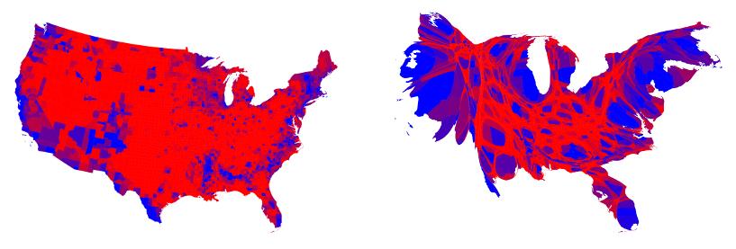
And, please, no, it is not gerrymandering – the Presidency and the governorships are not gerrymandered. Gerrymandering has a modest effect at best. There really is a consistent under-performance.

I’ve been reading a few books that shed light on this really big structural feature of American politics. Each book offers a discussion of an issue in party politics and when you piece them together, you see how the Democratic and Republican parties differ:

In Local Party Organizations, Douglas D. Roscoe and Shannon Jenkins report on a survey of 1,220 party officials at the state and local levels and they ask a number of questions about the operation of local parties.

First, how did state parties help locals? GOP advantage – website development, newspaper buys, campaign expenses, social media; Democratic advantages – computer support, record keeping, staff. Second, GOP local parties were more likely to have “clear strategic goals” and a well managed organizational culture.  Third, GOP organizations are more likely to have a complete set of officers, by laws, and headquarters, whiles Democrats are more likely to have a phone listing. Also, Democrats also tend to focus on labor intensive actions, like door-to-door and voter registration. Fourth, these activities often (but not always) correlate with electoral success.

Bottom line: GOP organizations appear to be a little more focused, organized, and strategic. Democrats seem to concentrate a bit more on things people can do (door to door, for example and record keeping).

In Asymmetric Politics, Matt Grossman and David Hopkins delve deep into the culture of the GOP and Democratic parties to argue that they are very different beasts. The GOP is ideologically driven and policy oriented, while Democrats are more oriented toward group solidarity and coalition maintenance. The book is massive and presents lots of data, such as public opinion data, voting patterns, and publications by interest groups and think tanks. Even though I disagree with some points, it is well taken. Democrats have a diffuse ideology and work on the coalition, while the GOP is more “mission oriented.”

David Ricci’s Politics without Stories is a study of political rhetoric and it has a simple message. Look at the philosophers, wonks and orators of the Democratic party and you see nuance and sophistication. Look the the GOP and you see more direct narratives. To quote the great Kieran Healy, Republicans “fuck nuance.

What do we learn from this overview?

From top to bottom, the Democratic and Republican parties show important and consistent differences. Not just ideological differences, but qualitative differences in how their parties are organized and how they behave. Democrats, to simplify, are “people oriented” and focus on social practices and ideology that fits that general perspective. In contrast, Republicans are a little more task oriented, which translates into more focused and digestible rhetoric and more of an institutional interest in concrete results. There is probably more to this story, but this is a good start.

Fabio Rojas, PhD is Professor of Sociology at Indiana University. He is the author of From Black Power to Black Studies and Theory for the Working Sociologist, and co-author of Party in the Street: The Antiwar Movement and the Democratic Party after 9/11. He has also written an advice book for graduate students and tenure track professors called Grad Skool Rulz.

Originally posted at Scatterplot.

There are few things more satisfying than finding another reason that millennials are the worst. They’re narcissistic, coddled, unpatriotic, racist, and nervous about free speech. And now, millennial men want a return to the nostalgic 1950s, with women in the kitchen, whipping up a nice quiche after a hard day on the line.

This is the story presented in Stephanie Coontz’s Friday piece in the New York Times, “Do Millennial Men Want Stay-at-Home Wives,”which reports on evidence from the Council on Contemporary Families (using the General Social Survey) and from sociologists Joanna Pepin and David Cotter (using Monitoring the Future ).

Journalists have gone a bit nuts for this millennial-as-Ward-Cleaver narrative, consistent with what we already know about garbage millennials, and stories from Quartz and Time Magazine have already popped up.

The Times piece includes this damning trend among men ages 18-25:

Picture1.png
See? Millennial men are the WORST.


But the GSS just released their 2016 data this week. 89% of men disagree or strongly disagree with the statement “It is much better for everyone involved if the man is the achiever outside the home and the women takes care of the home and family” – the highest rate among either men or women ages 18-25 in the GSS’s 40-year history. It’s also much higher than the rate reported by everyone older than 25, about 71%.

So is the story, “Clinton defeat inspires millennial men to gender equality”? Or more likely, “Garbage millennial men can’t make up their mind about women”?

I suspect it’s another, less sexy story: you can’t say a lot about millennials based on talking to 66 men.

The GSS surveys are pretty small – about 2,000-3,000 per wave – so once you split by sample, and then split by age, and then exclude the older millennials (age 26-34) who don’t show any negative trend in gender equality, you’re left with cells of about 60-100 men ages 18-25 per wave. Standard errors on any given year are 6-8 percent.

So let’s throw some statistics at it. Suppose you want to know whether there is a downward trend in young male disagreement with the women-in-the-kitchen statement. Using all available GSS data, there is a positive, not statistically significant trend in men’s attitudes (more disagreement). Starting in 1988 only, there is very, very small negative, not statistically significant effect.

Only if we pick 1994 as a starting point, as Coontz does, ignoring the dip just a few years prior, do we see a negative less-than half-percentage point drop in disagreement per year, significant at the 10-percent level.

As Columbia statistician Andrew Gelman wisely warns, none of these results account for the many, many paths the researchers could have taken to arrive at these results, which can make overreliance on any of these p-values problematic. For example, if we just looked at millennials the way they’re usually defined, as individuals ages 18-34?

The Pepin and Cotter piece, in fact, presents two additional figures in direct contrast with the garbage millennial theory – in Monitoring the Future, millennial men’s support for women in the public sphere has plateaued, not fallen; and attitudes about women working have continued to improve, not worsen. Their conclusion is, therefore, that they find some evidence of a move away from gender equality – a nuance that’s since been lost in the discussion of their work.

So what does this mean? Standard errors matter, and millennials might not always be as garbage as we think they are.

Emily Beam is Assistant Professor of Economics at the University of Vermont. She studies labor and development economics, with a particular focus on employment and education policy, migration, fertility and marriage, and the role of incomplete information and behavioral biases on individual decision-making.

I love gender and sexual demography.  It’s incredibly important work.  Understanding the size and movements of gender and sexual minority populations can help assess what kinds of resources different groups might require and where those resources would be best spent, among others things.  Gary J. Gates and Frank Newport initially published results from a then-new Gallup question on gender/sexual identity in 2012-2013 (here).  At the time, 3.4% of Americans identified as either lesbian, gay, bisexual, or transgender.  It’s a big deal – particularly as “identity” is likely a conservative measure when it comes to assessing the size of the population of LGBT persons.  After I read the report, I was critical of one element of the reporting: Gates and Newport reported proportions of LGBT persons by state.  As data visualizations go, I felt the decision concealed more than it revealed.

From 2015-2016, Gallup collected a second round of data. These new data allowed Gates to make some really amazing observations about shifts in the proportion of the U.S. population identifying themselves as LGBT.  It’s a population that is, quite literally on the move.  I posted on this latter report here.  The shifts are astonishing – particularly given the short period of time between waves of data collection.  But, again, data on where LGBT people are living was reported by state.  I suspect that much of this has to do with sample size or perhaps an inability to tie respondents to counties or anything beyond state and time zone.  But, I still think displaying the information in this way is misleading.  Here’s the map Gallup produced associated with the most recent report:

During the 2012-2013 data collection, Hawaii led U.S. states with the highest proportions of LGBT identifying persons (with 5.1% identifying as LGBT)–if we exclude Washington D.C. (with 10% identifying as LGBT).  By 2016, Vermont led U.S. states with 5.3%; Hawaii dropped to 3.8%.  Regardless of state rank, however, in both reports, the states are all neatly arranged with small incremental increases in the proportions of LGBT identifying persons, with one anomaly–Washington D.C.  Of course, D.C. is not an anomaly; it’s just not a state. And comparing Washington D.C. with other states is about as meaningful as examining crime rate by European nation and including Vatican City.  In both examples, one of these things is not like the others in a meaningful sense.

In my initial post, I suggested that the data would be much more meaningfully displayed in a different way.  The reason D.C. is an outlier is that a good deal of research suggests that gender and sexual minorities are more populous in cities; they’re more likely to live in urban areas.  Look at the 2015-2016 state-level data on proportion of LGBT people by the percentage of the state population living in urban areas (using 2010 Census data).  The color coding reflects Census regions (click to enlarge).

Vermont is still a state worth mentioning in the report as it bucks the trend in an impressive way (as do Maine and New Hampshire).  But I’d bet you a pint of Cherry Garcia and a Magic Hat #9 that this has more to do with Burlington than with thriving communities of LGBT folks in the towns like Middlesex, Maidstone, or Sutton.

I recognize that the survey might not have a sufficient sample to enable them to say anything more specific (the 2015-2016 sample is just shy of 500,000).  But, sometimes data visualizations obscure more than they reveal.  And this feels like a case of that to me.  In my initial post, I compared using state-level data here with maps of the U.S. after a presidential election.  While the maps clearly delineate which candidate walked away with the electoral votes, they tell us nothing of the how close it was in each state, nor do they provide information about whether all parts of the state voted for the same candidates or were regionally divided.  In most recent elections traditional electoral maps might leave you wondering how a Democrat ever gets elected with the sea of red blanketing much of the nation’s interior.  But, if you’ve ever seen a map showing you data by county, you realize there’s a lot of blue in that red as well–those are the cities, the urban areas of the nation.  Look at the results of the 2016 election by county (produced by physicist Mark Newman – here).  On the left, you see county level voting data, rather that simply seeing whether a state “went red” or “went blue.”  On the right, Newman uses a cartogram to alter the size of each county relative to its population density.  It paints a bit of a different picture, and to some, it probably makes that state-level data seem a whole lot less meaningful.

Maps from Mark Newman’s website: http://www-personal.umich.edu/~mejn/election/2016/

The more recent report also uses that state-level data to examine shifts in LGBT identification within Census regions as well.  Perhaps not surprisingly, there are more people identifying as LGBT everywhere in the U.S. today than there were 5 years ago (at least when we ask them on surveys).  But rates of identification are growing faster in some regions (like the Pacific, Middle Atlantic, and West Central) than others (like New England).  Gates suggests that while this might cause some to suggest that LGBT people are migrating to different regions, data don’t suggest that LGBT people are necessarily doing that at higher rates than other groups.

The recent shifts are largely produced by young people, Millennials in the Gallup sample.  And those shifts are more pronounced in those same states most likely to go blue in elections.  As Gates put it, “State-level rankings by the portion of adults identifying as LGBT clearly relate to the regional differences in LGBT social acceptance, which tend to be higher in the East and West and lower in the South and Midwest. Nevada is the only state in the top 10 that doesn’t have a coastal border. States ranked in the bottom 10 are dominated by those in the Midwest and South” (here).

When we compare waves of data collection, we can see lots of shifts in the LGBT-identifying population by state (see below; click to enlarge).  While the general trend was for states to have increasing proportions of people claiming LGBT identities in 2015-2016, a collection of states do not follow that trend.  And this struck me as an issue that ought to provoke some level of concern.  Look at Hawaii, Rhode Island, and South Dakota, for example.  These are among the biggest shifts among any of the states and they are all against the liberalizing trend Gates describes.

Presentation of data is important.  And while the report might help you realize, if you’re LGBT, that you might enjoy living in Vermont or Hawaii more than Idaho or Alabama if living around others who share your gender or sexual identity is important to you, that’s a fact that probably wouldn’t surprise many.  I’d rather see maps illustrating proportions of LGBT persons by population density rather than by state.  I don’t think we’d be shocked by those results either.  But it seems like it would be provide a much better picture of the shifts documented by the report than state-level data allow.

Tristan Bridges, PhD is a professor at the University of California, Santa Barbara. He is the co-editor of Exploring Masculinities: Identity, Inequality, Inequality, and Change with C.J. Pascoe and studies gender and sexual identity and inequality. You can follow him on Twitter here. Tristan also blogs regularly at Inequality by (Interior) Design.

A different version of this post was originally published at Timeline.

To get some perspective on the long term trend in divorce, we need to check some common assumptions. Most importantly, we have to shake the idea that the trend is just moving in one direction, tracking a predictable course from “olden days” to “nowadays.”

It’s so common to think of society developing in on direction over time that people rarely realize they are doing it. Regardless of political persuasion, people tend to collapse history into then versus now whether they’re using specific dates and facts or just imagining the sweep of history.

In reality, sometimes it’s true and sometimes it’s not true that society has a direction of change over a long time period. Some social trends are pretty clear, such as population growth, longevity, wealth, or the expansion of education. But when you look more closely, and narrow the focus to the last century or so, it turns out that even the trends that are following some path of progress aren’t moving linearly, and the fluctuations can be the big story.

Demography provides many such examples. For example, although it’s certainly true that Americans have fewer children now than they did a century ago, the Baby Boom – that huge spike in birth rates from 1946 to 1964 – was such a massive disruption that in some ways it is the big story of the century. Divorce is another.

The most popular false assumption about divorce – sort of like crime or child abuse – is that it’s always getting worse (which isn’t true of crime or child abuse, either). In the broadest sense, yes, there is more divorce nowadays than there was in the olden days, but the trend is complicated and has probably reversed.

It turns out, however, that the story of divorce rates is ridiculously complicated. For one thing, there is no central data source that simply counts all divorces. The National Center for Health Statistics used to divorces from states, but now six states don’t feel like cooperating anymore, including, unbelievably, California. Even where divorces are counted, key information may not be available, such as the people’s age or how long they were married (or, now that there is gay divorce, their genders). Fortunately, the Census Bureau (for now) does a giant sample survey, the American Community Survey, which gives us great data on divorce patterns, but they only started collecting that information in 2008.

The way demographers ask the question is also different from what the public wants to know. The typical concerned citizen (or honeymooner) wants to know: what are the odds that I (or someone else getting married today) will end up divorced? Science can guess, but it’s impossible to give a definitive answer, because we can’t actually predict human behavior. Still, we can help.

The short answer is that divorce is more common than it was a 75 years ago, but less common than it was at the peak in 1979. Here’s the trend in what we call the “refined” divorce rate – the number of divorces each year for every thousand married women in the country:

The figure uses the federal tally from states from 1940 to 1997, leaves out the period when there was no national collection, and then picks up again when the American Community Survey started asking about divorce.

So the long term upward trend is complicated by a huge spike from soldiers returning home at the end of World War II (a divorce boom, to go with the Baby Boom), a steep increase in the sixties and seventies, and then a downward glide to the present.

How is it possible that divorce has been declining for more than three decades? Part of it is a function of the aging population. As demographers Sheela Kennedy and Steven Ruggles have argued, old people divorce less, and the married population is older now than it was in 1979, because the giant Baby Boom is now mostly in its sixties and people are getting married at older ages. This is tricky, though, because although older people still divorce less, the divorce rates for older people (50+) have doubled in the last two decades. Baby Boomers especially like to get divorced and remarried once their kids are out of the house.

But there is a real divorce decline, too, and this is promising about the future, because it’s concentrated among young people – their chances of divorcing have fallen over the last decade. So, although in my own research I’ve estimated that estimated that 53% of couples marrying today will get divorced, that is probably skewed by all the older people still pulling up the rates. Typical Americans getting married in their late 20s today probably have a less than even chance of getting divorced. The divorce will probably keep falling.

Rather than a conservative turn toward family values, I think this represents an improving quality of marriages. When marriage is voluntary – when people really choose to get married instead of simply marching into it under pressure to conform – one hopes they would be making better choices, and the data support that. Further, as marriage has become more rare, it has also become more select. Despite more than a decade of futile marriage promotion efforts by the federal government, marriage is still moving up the income scale. The people getting married today are more privileged than they used to be: more highly educated (both partners), and more stably situated. All that bodes well for the survival of their marriages, but doesn’t help the people left out of the institution. If less divorce just means only perfect couples are getting married, that’s merely another indicator of rising inequality.

Putting this trend back in that long term context, we should also ask whether falling divorce rates – which run counter to the common assumption that everything modern in family life is about the destruction of the nuclear family – are always a good thing. Most people getting married would like to think they’ll stay together for the long haul. But what is the right amount of divorce for a society to have? It seems like an odd question, but divorce really isn’t like crime or child abuse. You want some divorces, because otherwise it means people are stuck in bad marriages. If you have no divorce that means even abusive marriages can’t break up. If you have a moderate amount, it means pretty bad marriages can break up but people don’t treat it lightly. And if you have tons of divorce it means people are just dropping each other willy-nilly. When you put it that way, moderate sounds best. No one has been able to put numbers to those levels, but it’s still good to ask. Even as we shouldn’t assume families are always falling apart more than they used to, we should consider the pros and cons of divorce, rather than insisting more is always worse.

Philip N. Cohen is a professor of sociology at the University of Maryland, College Park. He writes the blog Family Inequality and is the author of The Family: Diversity, Inequality, and Social Change. You can follow him on Twitter or Facebook.

Why did people march on January 21, 2017? As a team of sociologists interested in social movements, we know there are many possible answers to this seemingly simple question.

As a team of sociologists we have developed a multi-method, multi-site research project, Mobilizing Millions: Engendering Protest Across the Globe.* We want to understand why people participate in a march of this scale, at a critical historical juncture in our political landscape. Within weeks of discussion of the first march, there were already “sister” march pages national and internationally. While it is beyond the scope of this post to discuss all of the project findings thus far, the predictability of the racial tensions visible in social media or the role of men, local opportunities and challenges we do offer some early findings.

In the project’s first phase, we had team members on the ground in Washington D.C.; Austin, TX; Boston, MA; Los Angeles, CA; New York, NY; Philadelphia, PA;  Portland, OR; Santa Barbara, CA and St. Louis, MO. We are currently conducting a survey about the motivations and experiences that brought millions of people to the marches worldwide. We recruited respondents from marches in the aforementioned cities, and online. This has resulted in responses from around the world. Our preliminary findings from the observations and survey highlight that 1) there were a range of reasons people attended marches and 2) across and within sites, there were varying experiences of “the” march in any location.

One striking similarity we observed across sites was the limited visible presence of social movement organizations (SMOs). For sure, SMOs became visible in social media leading up to the event (particularly for the DC march). Unlike at social movement gatherings such as the US Social Forum or conservative equivalents, the sheer number of unaffiliated people dwarfed any delegations or representatives from SMOs. Of our almost 60-member nation-wide team across sites only a handful had encountered anyone handing out organizational material, as we would see at other protest. This is perhaps what brought many people to the march—an opportunity to be an individual connecting with other individuals. However, this is an empirical question as is what this means for the future of social movement organizing. We hope others join us in answering.

Second, while the energy was palpable at all of the marches so was the confusion. As various media sources reported, attendance at all sites far exceeded projections, sometimes by 10 times. Consequently, the physical presence of the expanded beyond organizers’ expectations, which in many places required a schedule shifted. At all marches there were points where participants in central areas could not move and most people could not hear scheduled speakers even if they were physically close to a stage.  Across the sites, we also observed how this challenge stimulated different responses. In multiple locations, people gathering spontaneously created their own sub-marches out of excitement as happened in DC when a band started playing on Madison street and people followed. Or, while waiting, waiting participants chanted “march, march.” Still, in many locations, once the official march started, people created sub-marches out of necessity because the pre-planned march route was impassable. When faced with standing for an hour to wait their “turn” to walk or create an alternative, they chose the latter.

Creativity was visible in artistic forms as well. While there were professionally printed signs (and T-shirts), there was a wealth of handmade signs at the marches. As expected, a slew that referenced phrases the president-elect had said noting, for example, “this pussy grabs back.” Yet there was also a range of other signs ranging from simple text to complicated storyboards (see below).

Across sites, we also saw many differences: including which types of organizations sponsored (or “supported” or “ were affiliated with”) that march.

At the Austin, Texas march, marchers’ signs and chants reflected a wide variety of concerns, including women’s reproductive health care, Black Lives Matter, and environmental justice. The emotional tenor was frequently celebratory, though it varied from one point in the march to another across a crowd reported to be more than 40,000. Many speeches at the rally immediately following the march connected the actions of the Texas state legislature–on whose front steps the march began and ended–to the broader national context.

Photo of Austin, TX by Anna Chatillon-Reed.

The Los Angeles March numbers suggest it exceeded DC participation. There was a noticeable presence of signs about immigration and in Spanish, which is not surprising considering the local and state demographics.

Photo of Los Angeles by Fátima Suarez.
Photo of Los Angeles by Fátima Suarez

The Philadelphia, PA march was close to bigger cities of in New York and DC. Some participants noted that due to the location it was  “competing” for marchers.

Philadelphia photo by Alex Kulick.

The Portland, OR protest also exceeded attendance expectations as marchers withstood hours of pouring rain. Holding the “sister” marches on the same day worldwide emphasized the magnitude and assists in building collective identity. Yet it also meant organizers in different locations faced vastly different challenges. Factors such as weather that might not have existed if organizers had been scheduling based solely on local norms and contexts.

Portland photo by Kelsy Kretschmer.

To help provide a preliminary sense of the motivations and continued engagement of marchers, we examined a sample of the ~40,000 tweets posted over two months. The analysis continues.

In the coming month, we are launching a separate survey to better understand a group social movement scholars are sometimes less inclined to study: people who do not participate in marches on January 21 (there are exceptions to this of course). As social movement scholars know, mobilization is actually a rare occurrence when we consider the range of grievances present in any society at any given moment. For a second phase of the project, we will conduct interviews with select survey participants.

Understanding the range of responses to grievances is critical as we move into this new era. If the first month of Trump’s presidency is any indication of the years to come, scholars and activists across the political spectrum will have many opportunities to engage these questions.

____________________

*The team Faculty collaborators are Zakiya Luna, PhD (Principal Investigator, California, DC, LA,PH and TX coordinator); Kristen Barber, PhD (St. Louis Lead); Selina Gallo-Cruz, PhD (Boston Lead); Kelsy Kretschmer, PhD (Portland Lead). The site leadership was provided by Anna Chatillon (Austin, TX); Fátima Suarez (Los Angeles, CA); Alex Kulick (Philadelphia, PA & social media); Chandra Russo, PhD (DC co-lead). We are also grateful to many volunteer research assistants.

Dr. Zakiya Luna is an Assistant Professor of Sociology at University of California, Santa Barbara. Her research focused on social movements, human rights and reproduction with an emphasis on the effects of intersecting inequalities within and across these sites. She has published multiple articles on activism, feminism and reproductive justice. For more information on her research and teaching, see http://www.zakiyaluna.com.

Alex Kulick, MA, is a doctoral student in sociology at the University of California, Santa Barbara and trainee in the National Science Foundation network science IGERT program. Their research investigates social processes of inequality and resistance with an emphasis on sexuality, gender, and race.

Anna Chatillon-Reed is a doctoral student in sociology at the University of California, Santa Barbara. She is currently completing her MA, which investigates the relationship between the Black Lives Matter movement and feminist organizations.

Protestors march in the Woman’s March on Washington D.C. Jan. 21, 2017. The Capital Mall area was the starting point of the march, hundreds of thousands of people attended. (National Guard photo by Tech. Sgt. Daniel Gagnon, JTF-DC).

Waves of pink knitted hats and protest signs packed the streets of D.C. on January 21, 2017, just one day after President Trump’s inauguration drew average crowds. The Women’s March of 2017 was the largest protest in recent history, bringing together over 500,000 people in DC- the location of the flagship march, and over 2.9 million people nationwide. Protesters came from near and far to protect a diverse set of rights that are threatened by the incoming administration. Perhaps the Women’s March can be understood as a partial response to President Obama’s declaration in his farewell address that the most important office in a democracy is “citizen,” and, thus, citizens must work to improve our society, not just when there is an election or when their own narrow interests are at stake. The march was an example of what this kind of democracy looks like. Originally proposed on social media, the idea for the march took off and a groundswell of support emerged from independent individuals and those associated with organizations.  Despite this level of support, many have speculated about who attended the march, whether they voted, the goals of protesters and their level of civic engagement. Some have discounted the protesters as only forwarding the perspectives and issues of white women and eschewing those of other groups such as people of color and/or members of the LGBTQ community.

Combatting this new era of “alternative facts,” a research team led by Dr. Dana R. Fisher, Dr. Dawn M. Dow and Dr. Rashawn Ray from the University of Maryland, College Park provides data-supported facts about participants at the Women’s March. Teams of 2 surveyed participants throughout the march (full details of sampling and methodology available upon request) to understand who was protesting and why. In total, 527 people completed the survey (representing a 92.5% response rate).

Far from using protesting as a substitute for voting, as a recent tweet from Trump suggested, initial findings from this project show that the protesters at the Women’s March voted, and overwhelmingly for Secretary Hillary Clinton. Among respondents, 90.1% reporting voting for Hilary Clinton, 2.3% voted for a third-party candidate and .2% (one person) voted for Donald Trump. Among the 1.7% who explicitly said they did not vote, nearly half were non-U.S. citizens who are not eligible to do so.

Our findings also suggest that the Women’s March has potentially lit the political fires of a new generation of activists and reactivated the political activism of others. Indeed, a third of the participants reported that the Women’s March was their first time participating in a protest ever. For over half of the participants (55.9%), the March was their first protest in 5 years (including those who had never participated before).

Respondents were also asked to identify the issues that motivated them to protest.  Our data suggest protesters were unified by a range of distinct and overlapping priorities. Given the name of the march, it is not surprising that 60.6% of respondents cited women’s rights as a motivation for protesting.  However, other social issues were also at the forefront of protesters’ minds. Nearly tied for second place, protesters cited the environment (35.5%), racial justice (35.1%), LGBTQ rights (34.7%), and reproductive rights (32.7%) as motivations to attend. Other political issues were also well represented including equality (25.1%), social welfare (23.1%) and immigration (21.6%).  Indeed, rather than representing a narrow set of interests, protesters identified multiple and diverse motivations for participating.

Historically protests focus on one social issue such as equal pay, climate change, voting rights or same sex marriage. The Women’s March was different in that its protesters were seemingly engaged in intersectional activism–a version of activism that is sensitive to how race, class, gender and sexuality complicate inequality. Perhaps the Women’s March is distinct in this way because protesters were not just motivated by concrete issues, but they were also motivated by a desire to protect and reassert a vision of America that embraces diversity and inclusion as a strength rather than a threat. This vision of America is increasingly under attack by the Trump Administration. It remains to be seen how the energy from the march will translate into change locally across the country but recent protests suggest that citizens stand ready to protect their rights and the rights of others.

Dr. Dawn M. Dow is an Assistant Professor of Sociology at the University of Maryland, College Park.  She received a PhD in sociology from the University of California, Berkeley and also earned a JD from Columbia University, School of Law.  Dow’s research examines intersections of race, class and gender within the context of the family, educational settings, the workplace and the law. Her work has been published in journals including Gender & Society, Journal of Marriage and Family and Sociology of Race & Ethnicity.  Follow her on Twitter here.

Dr. Dana R. Fisher is a Professor of Sociology and the Director of the Program for Society and the Environment at the University of Maryland. Her research focuses on environmental policy, civic participation and activism more broadly. She has written extensively on activism and social protest in articles as well as in her second book Activism, Inc. (Stanford University Press 2006).  Fisher’s work on protest builds on data collected from around 5,000 protesters at thirteen protest events in six countries. For more information, go to www.drfisher.umd.edu.  Follow her on Twitter here.

Dr. Rashawn Ray is an Associate Professor of Sociology at the University of Maryland, College Park. Ray obtained a Ph.D. in Sociology from Indiana University in 2010. From 2010-2012 he was a Robert Wood Johnson Foundation Health Policy Research Scholar at the University of California, Berkeley/UCSF. Ray’s research addresses the mechanisms that manufacture and maintain racial and social inequality. His work also speaks to ways that inequality may be attenuated through racial uplift activism and social policy. Follow him on Twitter here.


Originally posted at Everyday Sociology.

When new students move into their residence halls to start their first year of college, they become a part of an institution. In many ways, it is a “total institution” in the tradition of the sociologist Erving Goffman: an organization that collects large numbers of like individuals, cuts them off from the wider society, and provides for all their needs. Prisons, mental hospitals, army barracks, and nursing homes are total institutions. So are cruise ships, cults, convents, and summer camps. Behemoths of order, they swallow up their constituents and structure their lives.

Many colleges are total institutions, too. Being a part of the institution means that students’ educational options are dictated, of course, but colleges also have a substantial amount of control over when students eat, where they sleep, how they exercise, with whom they socialize and, pertinent to our topic today, whether and under what conditions they have sex.

Thumbnail_Press - American Hookup_with frame_978-0-393-28509-3In my newly released book, American Hookup: The New Culture of Sex on Campus, I show that hookup culture is now at the center of the institution of higher education. It’s thick, palpable, the air students breathe; and we find it on almost every residential campus in America: large and small, private and public, elite and middling, secular and religious, Greek- and sports-heavy and otherwise.My own research involves 101 students at two institutions who wrote weekly journals, tracing their trials and tribulations through a semester of their first year, but quantitative and comparative research alike supports hookup culture’s ubiquity. Anecdotally, too, students insist that it is so. “[Hookups are] part of our collegiate culture,” writes a student at the University of Florida. Up north at Connecticut College, a female student describes it as the “be-all and end-all” of social life. Oh, sure,” says a guy 2,500 miles away at Arizona State, “you go to parties on the prowl.” Further up north, at Whitman in Walla Walla, Washington, a female student calls hookup culture “an established norm.”

These comments reveal hookup culture’s pervasiveness, but these students are almost certainly overestimating the frequency of hookups on their campuses. According to the Online College Social Life Survey, a study of over 24,000 students at over 20 institutions, the average graduating senior has hooked up just eight times in four years; a third won’t hook up at all. In fact, today’s students boast no more sexual partners than their parents did at their age. But students can be forgiven for their misimpressions. Hookup culture is a powerful force, leading them to overestimate their peers’ sexual behavior by orders of magnitude.

The topic of my book, then, isn’t just hooking up; it’s hookup culture. Like other cultures, hooking up is a social reality that operates on several levels: it’s a set of widely-endorsed ideas, reflected in rules for interaction and the organization of the institution. Accordingly, hookup culture is the idea that casual sexual encounters are the best or only way to engage sexually in college, a set of practices that facilitate casual sexual encounters, and an organizational structure that supports them.

Students can and do opt out of hooking up, but few can escape hookup culture. Many of the students in American Hookup said so often and explicitly: Partying and hooking up, insisted one, “is the only way to make friends.” “Hookup culture = social life,” another concluded, simply making an equation. “If you do not have sex,” a third wrote forcefully, “you are not in the community.”

Being a part of the community means playing by the rules of hookup culture. It means bringing a certain kind of energy (up, drunken, and sexually available) to certain kinds of parties (dark, loud, and sexually charged). It means being willing to be careless about sexual contact and trying to care less about the person you hook up with than they care about you. It means following a hookup script that privileges male orgasm and a stereotypically male approach to sexuality. It means engaging in competitive sexual exploits: women against women, men against men, and men against women. And it means being stripped of the right to insist upon interpersonal accountability, enabling everything from discourtesy to sexual misconduct.

Some students thrive. About a quarter of the students in my sample truly enjoy hookup culture. Most do not. A third of my students opted out of sex altogether, deciding that they’d rather have none of it than follow hookup culture’s rules. Close to half participate ambivalently, dabbling with mixed results. More students decreased their participation over the course of the semester than increased it.

Almost to the last one, though, students were earnest, thoughtful, and good-humored. Few escaped hookup culture’s grasp, but they never failed to impress me with their insight and resilience. Hearing them tell their stories, it was hard not to feel optimistic, even when the stories did not lend themselves to optimism. I finished the book feeling hopeful. Today’s young people are open, permissive, genuine, and welcoming of diversity. They’re well-positioned to usher in a new new sexual culture.

But students need their institutions to change, too. Institutions of higher education need to put substantial resources and time into shifting cultural norms: they need to establish an ethic of care for casual sexual encounters and they need to diversify the kind of sexual encounters that are seen as possible and good. They also need to change the institutional structures that entrench the worst features of hookup culture, including those that give disproportionate power to the students on campus who most support, participate in, and benefit from it: white, class-privileged, masculine-identified, heterosexual men.

The neat thing about cultures, though, it that they exist only with our consent. We can change them simply by changing our minds. And because residential colleges are total institutions, ones that are bounded and insular, they are particularly responsive to reformation. The new sexual culture on America’s campuses can be improved—made safer, healthier, kinder, more authentic, more pleasurable, and more truly conducive to self-exploration—and faster than we might suspect. I hope that the voices in American Hookup help empower both students and administrators to do just that.

Lisa Wade, PhD is an Associate Professor at Tulane University. She is the author of American Hookup, a book about college sexual culture; a textbook about gender; and a forthcoming introductory text: Terrible Magnificent Sociology. You can follow her on Twitter and Instagram.

Originally posted at Made in America.

Explaining how such an unfit candidate and such a bizarre candidacy succeeded has become a critical concern for journalists and scholars. Through sites like Monkey Cage, Vox, and 538, as well as academic papers, we can watch political scientists in real time try to answer the question, “What the Hell Happened?” (There are already at least two catalogs of answers, here and here, and a couple of college-level Trump syllabi.) Although a substantial answer will not emerge for years, this post is my own morning-after answer to the “WTHH?” question.

I make three arguments: First, Trump’s electoral college victory was a fluke, a small accident with vast implications, but from a social science perspective not very interesting. Second, the deeper task is to understand who were the distinctive supporters for Trump, in particular to sort out whether their support was rooted mostly in economic or in cultural grievances; the evidence suggests cultural. Third, party polarization converted Trump’s small and unusual personal base of support into 46 percent of the popular vote.

Explaining November 8, 2016

Why did Donald Trump, an historically flawed candidate even to many of those who voted for him, win? With a small margin in three states (about 100,000 votes strategically located), many explanations are all true:

* Statistical fluke: Trump won 2.1 percentage points less of the popular vote than did Clinton, easily the largest negative margin of an incoming president in 140 years. (Bush was only 0.5 points behind Gore in 2000.) Given those numbers, Trump’s electoral college win was like getting two or three snake-eye dice rolls in a row. Similarly, political scientists’ structural models–which assume “generic” Democratic and Republican candidates and predict outcomes based on party incumbency and economic indicators–forecast a close Republican victory. “In 2012, the ‘fundamentals’ predicted a close election and the Democrats won narrowly,” wrote Larry Bartels. “In 2016, the ‘fundamentals’ predicted a close election and the Republicans won narrowly. That’s how coin tosses go.” But, of course, Donald Trump is far from a generic Republican. That’s what energizes the search for a special explanation.

* FBI Director Comey’s email announcement in the closing days of the election appeared to sway the undecided enough to easily make the 100,000 vote difference.

* Russian hacks plus Wikileaks.

* The Clinton campaign. Had she visited the Rust Belt more, embraced Black Lives Matter less (or more), or used a slogan that pointed to economics instead of diversity… who knows? Pundits have been mud-wrestling over whether her campaign was too much about identity politics or whether all politics is identity politics. Anyway, surely some tweak here would have made a difference.

* Facebook and Fakenews.

* The weather. It was seasonably mild with only light rain in the upper Midwest on November 8. Storms or snow would probably have depressed rural turnout enough to make Clinton president.

* The Founding Fathers. They meant the electoral college to quiet vox populi (and so it worked in John Q. Adams’s minus 10 point defeat of Andrew Jackson in 1824).

* Add almost anything you can imagine that could have moved less than one percent of the PA/MI/WI votes or of the national vote.

* Oh, and could Bernie would have won? Nah, no way, no how. [1]

Small causes can have enormous consequences: the precise flight of a bullet on November 22, 1963; missed intelligence notes about the suspicious student pilots before the 9/11 attacks; and so on. Donald Trump’s victory could become extremely consequential, second only to Lincoln’s in 1860, argues journalist James Fallows, [2] but the margin that created the victory was very small, effectively an accident. From an historical and social science point of view, there is nothing much interesting in Trump’s electoral college margin.

Trump’s Legions

More interesting is Trump’s energizing and mobilizing so many previously passive voters, notably during the primaries. What was that about?

One popular answer is that Trump’s base is composed of people, particularly members of the white working class (WWC), who are suffering economic dislocation. Because their suffering has not been addressed, they rallied to a jobs champion.

Another answer is that Trump’s core is composed of people, largely but not only WWC, with strong cultural resentments. While often suffering economically and voicing economic complaints, they are mainly distinguished by holding a connected set of racial, gender, anti-immigrant, and class resentments–resentments against those who presumably undermined America’s past “greatness,” resentments which tend to go together with tendencies toward authoritarianism (see this earlier post).

The empirical evidence so far best supports the second account. Indicators of cultural resentment better account for Trump support than do indicators of economic hardship or economic anxiety. [3]

In-depth, in-person reports have appeared that flesh out these resentments in ways that survey questions only roughly capture. They describe feelings of being pushed out of the way by those who are undeserving, by those who are not really Americans; feelings of being neglected and condescended to by over-educated coastal elites; feelings of seeing the America they nostalgically remember falling away. [4]

trump-supportersDefenders of the economic explanation would point to the economic strains and grievances of the WWC. Those difficulties and complaints are true–but they are not new. Less-educated workers have been left behind for decades now; the flat-lining of their incomes started in the 1970s, with a bit of a break in the late 1990s. Moreover, the economy has been in an upswing in the last few years; the unemployment rate was about 8 percent when Obama was re-elected in 2012, but about half of that when Trump was elected. Economic conditions do not explain 2016.

Nor are complaints about economic insecurity new. For example, the percentage of WWC respondents to the General Social Survey who said that they were dissatisfied with their financial situations has varied around 25 percent (+/- 5 points) over the last 30 years. The percentage dissatisfied did hit a high in the early years of the Great Recession (34 percent in 2010), but it dropped afterwards (to 31% in 2012 when Obama was re-elected and 29% in 2014). Economic discontent has been trending down, not up. [5] That only one-fifth of Trump voters supported raising the minimum wage to $15 further undercuts the primacy of economic motives.

To be sure, journalists can find and record the angry voices of economic distress; they do so virtually every election year. (Remember the painful stories about the foreclosure crisis and about lay-offs during the Great Recession?). There was little distinctive about either the economic distress or the economic anxiety of 2016 to explain Trump.

Some have noted, however, what appear to be a significant number of voters who supported Obama in 2008 or in 2012 and seemed to have switched to Trump in 2016 (e.g., here). Do these data not undermine a cultural, specifically a racial, explanation for Trump? No. In 2008, Obama received an unusual number of WWC votes because of the financial collapse, the Iraq fiasco, and Bush’s consequent unpopularity. These immediate factors overrode race for many in the WWC. But WWC votes for Obama dropped in 2012 despite his being the incumbent. Then, last November, the WWC vote for a Democratic candidate reverted back to its pre-Great Recession levels. [6] Put another way, Clinton’s support from the WWC was not especially low, Obama’s was unusually high for temporary reasons.

What was special about 2016 was the candidate: Donald Trump explicitly and loudly voiced the cultural resentments and authoritarian impulses of many in the WWC (and some in the middle class, too) that had been there for years but had had no full-throated champion–not Romney, not McCain, not the Bushes, probably not even Reagan–since perhaps Richard Nixon. What changed was not the terrain for a politics of resentment but the arrival of an unusual tiller of that soil, someone who brought out just enough of these voters to win his party’s nomination and to boost turnout in particular places for the general election. As one analyst wrote, “Trump repeatedly went where prior Republican presidential candidates were unwilling to go: making explicit appeals to racial resentment, religious intolerance, and white identity.”

But this is still less than half the story.

Party Polarization

To really how understand how Trump could get 46 percent of the vote, it takes more than identifying the distinctive sorts of people whom Trump attracted, because they are not that numerous. Trump won only a minority of the primary votes and faced intense opposition within his party. In the end, however, almost all Republicans came home to him–even evangelicals, to whose moral standards Trump is a living insult. The polarization of American politics in recent years was critical. Party ended up mattering more to college-educated, women, and suburban Republicans than whatever distaste they had for Trump the man.

Consider how historically new this development is. In 1964, the Republican nominee, Barry Goldwater, was considered to be at the far right end of the political spectrum. About 20 to 25% of Republicans crossed over and voted for Democrat Lyndon Johnson. (This crossover was mirrored by Democrats in the 1972 election. [7]) In 2016, by contrast, fewer than 10% of Republicans abandoned Trump–a far more problematic candidate than Goldwater–so much has America become polarized by party in the last couple of decades. [8]

Conclusions

Readings of the 2016 election as the product of a profound shift in American society or politics are overblown. In particular, notions that the WWC’s fortunes or views shifted so substantially in recent years as to account for Trump seem wrong.

What about the argument that the Trump phenomenon is part of a general rise across the western world of xenophobia? I don’t see much evidence outside of the Trump case itself for that in the United States. Long-term data suggest a decline–too slowly, for sure–rather than an increase in such attitudes.[9] And let’s not forget: Hillary Clinton won the popular vote.

The best explanation of why Trump got 46% of the ballots: Advantages for the out party in a third-term election + Trump’s unusual cultural appeal to a minority but still notable number of Americans + historically high party polarization. That Trump actually won the electoral college as well is pretty much an accident, albeit a hugely consequential one.


NOTES____________________

[1] Basically no one, including Trump, said anything bad about Bernie Sanders from the moment it became clear that Sanders would lose the primaries to Clinton. Had he been nominated, that silence would have ended fast and furiously. Moreover as the always astute Kevin Drum pointed out, Sanders is much too far to left to get elected, even way to the left of George McGovern, who got creamed in 1972. Finally, the “Bernie Brothers” who avoided Clinton would have been more than outnumbered by Hillary’s pissed-off sisters if she had been once again displaced by a man.

[2] On the other hand, economist-blogger Tyler Cowen is skeptical: If the doomsayers are right, why aren’t investors dumping equities, shorting the market, or fleeing to safer commodities?

[3] See these sources: 1, 2, 3, 4, 5, 6.

[4] For examples: 1, 2, 34.

[5] My analysis of the GSS through 2014. White working class is defined as whites who have not graduated college.

[6] Again, I used the GSS. In 2000 and 2004, the Democratic candidates, Gore and Kerry, got about 35 percent of the WWC vote, about what Bill Clinton got in his first run in 1992. Obama got substantially more, 48%, in 2008, then somewhat less, 42%, in 2012. Hillary Clinton got, according to a very different sort of survey, the exit polls, 29% of the WWC, but it is hard to compare the two methods. Note that the GSS reports of who people voted for in the previous election tend to skew toward the winners, but the point still stands that Obama’s jump in support from the WWC, especially in 2008, was quite unusual, not Hillary Clinton’s apparent slump in support.

[7] According to Gallup’s last poll before the 1964 election, 20% of Republicans were going to vote for Johnson. According to my analysis of the American National Election Survey, which is retrospective, 26% actually did. In 1972, the Democrats nominated the most left-leaning candidate of postwar era. According to Gallup data, 33% of Democrats crossed over to vote for Nixon. ANES data suggest that about 40 percent did. Whatever the specifics, there was much more cross-over voting 40 to 50 years ago, even under milder provocation.

[8] On the decline of ticket-splitting, see here.

[9] For example, one of the longest-running items in the GSS is the question, “I’d like you to tell me whether you think we’re spending too much money … too little money, or about the right amount … improving the conditions of Blacks.” In the 1970s, 28% of whites said too much; in the 2000s, 19% did. Another question was asked only through 2002: “Do you agree or disagree… (Negroes/blacks/African-Americans) shouldn’t push themselves where they’re not wanted?” In the 1970s, 74% of whites agreed; from 1990 to 2002, 15% did. More striking, in the 1970s, 11% of whites “strongly disagreed”; from 1990 to 2002, 32% did. On immigrants: David Weakliem has graphed responses to a recurrent Gallup Poll question, “Should immigration be kept at its present level, increased or decreased?”. From 1965 to the mid-1990s, the trend was strongly toward “decreased,” but since then the trend has strongly been toward “increased” (although that’s still a minority view).

Claude S. Fischer, PhD is a sociologist at UC Berkeley and is the author of Made in America: A Social History of American Culture and Character. This post originally appeared at his blog, Made in America.