economics: great recession

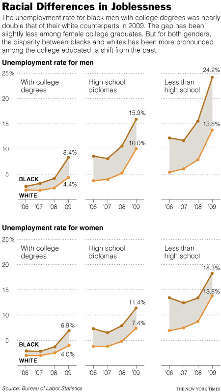
This week the New York Times featured a story about joblessness rates among black and white men and women.   As the figures below show, black men and women always face higher levels of unemployment compared to whites of the same education level; for men, the disparity increases as education level increases; and for black women, that pattern holds at least for 2009.
popup

For more detailed data on this phenomenon, see our posts on race and the economic downturn, the intersection of race and criminal record, and education and unemployment.

Lisa Wade, PhD is an Associate Professor at Tulane University. She is the author of American Hookup, a book about college sexual culture; a textbook about gender; and a forthcoming introductory text: Terrible Magnificent Sociology. You can follow her on Twitter and Instagram.

Yvonne Liu, at the Applied Research Center, told us about their report, Race and Recession, which includes a lot of useful information about the disparate effects of the economic crisis for different groups of Americans.

While an overall unemployment rate of just under 10% is bad regardless, that statistics hides the fact that Latinos and African Americans are experiencing even higher levels (note: the government agencies that the information comes from didn’t provide breakdowns for Asians or Native Americans, so the report was unable to show comparisons for those groups):

arc1

In a comment, thoughtcounts Z points out,

My immediate reaction…: the worst points (highest unemployment) on the “White” curve are generally around or below the best points (lowest unemployment) on the “Black” curve.

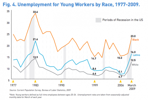
Unemployment rates for those aged 20-24:

unemployment young race

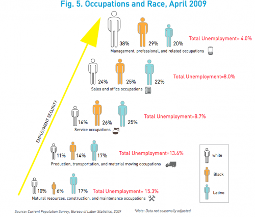
This figure indicates what % of each racial group falls into each occupational category (the median indicates that half fall above and half fall below that level):

occupations race

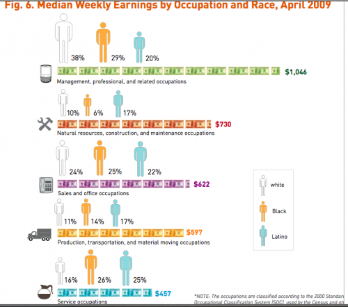
Median earnings for each occupational category (again, the figures represent the % of each race that have jobs in that category):

earnings race

So as we see, Whites are disproportionately employed in management and professional occupations, while relatively few are employed in the service industry, whereas both African Americans and Latinos are significantly more likely to be employed in services.  And while there’s a big gap between the % of Whites and Blacks in management/professional occupations, I was somewhat surprised that it wasn’t larger than it is.

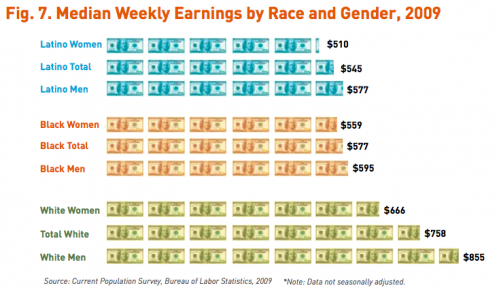
Earnings broken down by both race and gender:

earnings race gender

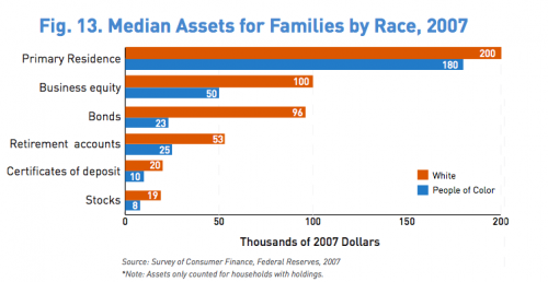
Assets by race:

assets race 2

See also: images of the downturn, job loss by region, unemployment by education level, another map of job loss by region, the dilemma of the duplex, not everyone knows there’s a recession, Detroit’s decline, job losses, gender and recession, and tips to the rich on how to be discreet during a recession.

3994497117_cbe7b2ac04_o

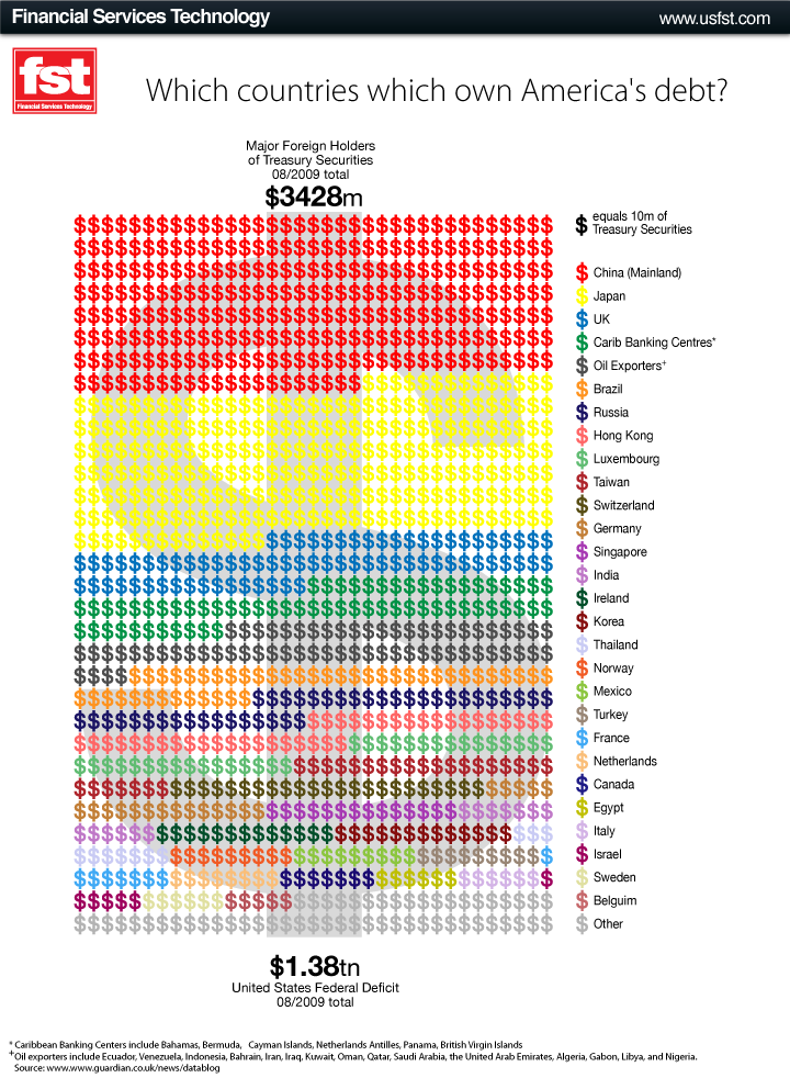
At FST, via Chartporn.

—————————

Lisa Wade is a professor of sociology at Occidental College. You can follow her on Twitter and Facebook.

Sandra H. sent us a link to a story about a field of empty container ships parked off the coast of Singapore:

Simon Parry reports that the field includes about 12 percent of the world’s container ships.  More than “the U.S. and British navies combined,” he writes.

The idle ships are another visual indication of the worldwide economic downturn, alongside the images of Detroit’s decline, unsold cars, abandoned homes, and empty malls.

—————————

Lisa Wade is a professor of sociology at Occidental College. You can follow her on Twitter and Facebook.

Lisa Wade, PhD is an Associate Professor at Tulane University. She is the author of American Hookup, a book about college sexual culture; a textbook about gender; and a forthcoming introductory text: Terrible Magnificent Sociology. You can follow her on Twitter and Instagram.
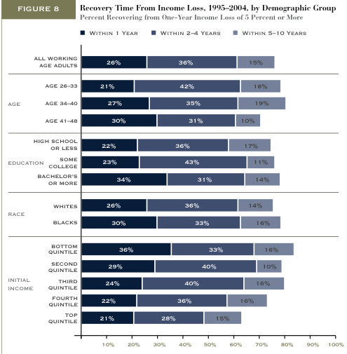
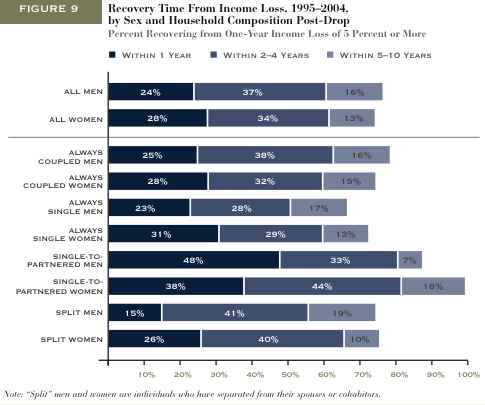
Matthew Yglesias featured two figures from the Pew Economic Mobility project.  They show how long different types of people tend to take to recover from income loss (within 1 year, 2-4 years, or 5-10 years).

This figure shows that people who are older, have more education, or are poor, working, or middle class have a harder time recovering from tough economic times:

recovery

This figure shows how marital status is related to recovery.  Most dramatically, people who get married before recovering financially (especially men), women who split with a partner, and women who are single have a more difficult time recovering.

recoverygender

Something to consider: As several commenters noted, I’m not sure how they defined “recovery” from income loss.  If you never made a lot of money to begin with, does recovery simply mean returning to a state of low income?  Then, does the income for an initially high income person need to return to its high state for it be counted as a “recovery”?

(Just FYI: I revised my interpretation of these figures.  Thanks to the early commenters who noticed I’d misinterpreted.  It was really late at night when I wrote this post!)

—————————

Lisa Wade is a professor of sociology at Occidental College. You can follow her on Twitter and Facebook.

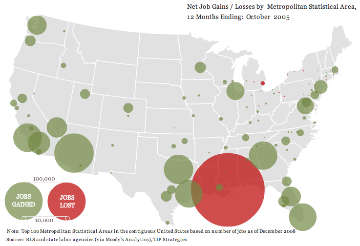
thewhatifgirl let us know about a really interesting interactive website that shows job gains and losses for the 100 largest metropolitan areas in the U.S. from the beginning of 2004 until March 2009, based on Bureau of Labor Statistics data. I took a few screenshots.

Right after Hurricane Katrina:

picture-4

From April 2006 to March 2007, the economy’s looking good for everybody but beleaguered Detroit:

picture-3

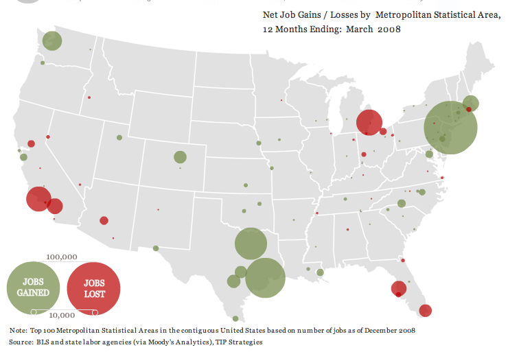
We start seeing a few more problem areas and a lot less job growth from April 2007 to March 2008:

picture-2

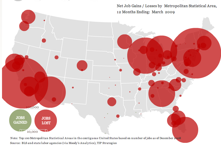
And then things go really badly. Notice the job loss circle in L.A. is so big that it got cut off on the website, and there’s not a single job growth circle [Note: eagle-eyed commenter Ali points out there are a few teensy job-gain circles, one in Louisiana, one around Austin, TX, and one way down at the tip of Texas along the border, and it’s possible there are some other small ones covered by the red]:

picture-11

UPDATE: Commenter Miss Prism cautions,

The maps could be straight out of “How to Lie with Statistics”, though.  The diameter (rather than the area) of the circles increases linearly with jobs lost, so a ten times bigger job loss gives the visual impression of being 100 times worse.

So just be aware that it’s how wide the circles are that indicates job loss.

Other posts on the economic meltdown: a county-level map, duplexes and home foreclosures, state budget shortfalls, who feels the recession?, Michigan’s economy, where stimulus money is going, U.S. household income and debt, defending private jet travel, all kinds of data from The Guardian, average stimulus dollars per person by state, unemployment rates by county, video on the credit crisis, framing the stimulus package, beer consumption, the New York Post monkey cartoon, a graph of job losses, gender and job loss, unsold cars, Hyundai’s job-loss insurance program, the economic downturn at the mall, employment/population ratio, home equity as a percent of net worth, advice to the rich: be discreet during a recession, different measures of joblessness, and changes in wages.

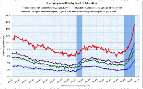
Matthew Ygelsias posted a graph showing that, for those 25 and older, education-level is correlated with rates of unemployment: the more educated you are, the less likely you are to find yourself unemployed. This relationship appears to be uninterrupted by the current recession.

Red = less than a high school diploma
Purple = high school graduate, no college
Green = some college
Blue = bachelors degree or higher

unemploymenteducation-1

—————————

Lisa Wade is a professor of sociology at Occidental College. You can follow her on Twitter and Facebook.

cork

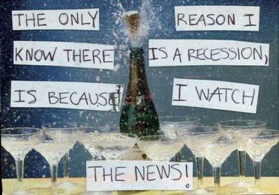
This PostSecret secret offers me an excuse to go on a rant:

Instead of an opportunity to start a national discussion about class, the recession appears to be stimulating a bunch of nationalist, and obfuscatory, rhetoric about our common condition.

If you listen to most media outlets they say that “America” is in recession.  But not everyone in America is feeling the pain of this economic downturn equally.  I, for example, have not lost my job, have not seen my pay cut, have not lost any benefits, and however much 401k money I’ve lost is rather irrelevant as I’m in my 30s and have no need for it right now.  I am not suffering in this economic depression.   In fact, I’m taking a junior sabattical next year and going half pay BY CHOICE.

Further, I keep hearing things like: “This is a great time to buy a house!” and “Stocks are cheap!  You should invest in [insert random company here]!”  (This advice is lost on a person who comes from humble beginnings and is voluntarily going half pay next year, but I digress.)

So, for many people, this economic downturn is kind of fantastic.  Houses are cheap, stocks are cheap, and companies are offering great deals just to stay afloat.  Plenty of people I know who are upper middle and upper class are considering this a great time to invest (see here for an example).  They look forward to ultimately benefitting from this economic disaster.

Lots of other people around me are suffering.  If you’re already poor or working-class, out-of-work, near retirement or retired, struggling under an adjustable rate mortgage, (and I’m sure there are others I’m forgetting), you may be screwed.

So I wish we would stop talking about how “America” is in recession.  This recession is hurting some kinds of people more than others.  On the whole, those people who were underprivileged before the downturn are taking the brunt of it.


For more on the economy, visit these posts: increases in household debt, job loss and unemployment (herehere, here, and here), cessna responds to the attack on private jet travel, Walmart encourages moms to make the difference, an animated explanation of the credit crisis, images of  the economic depression in Las Vegas (here and here), slumping car sales and overstocked lots, measuring the recession with beer sales, and changes in immigration.