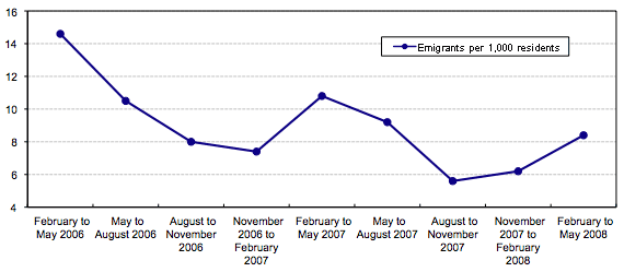
I have seen lots of graphs showing rates of immigration to the U.S. over time, but I just found this graph showing the rates of emigration from Mexico from 2006 to early summer of 2008 (from the Migration Information Source website; this is all emigrants, regardless of destination, though of course the vast majority will be to the U.S.):
A quick note on the data: Since it required someone from a family to be left in Mexico to be asked about family emigration patters, it doesn’t include those situations where an entire family left all at once; however, my understanding of immigration patterns is that this type of immigration is a minority of all movements, since most families prefer to send one or two family members to get a foothold in the host country.
As we see, there’s a general overall downward trend during that time period, which isn’t surprising given the downturn in the U.S. economy, especially the construction industry. The Mexican government reports that remittances sent back to Mexico are down this year as well.
There is also a seasonal pattern, with the period from August to February of each year being the lowpoint and then picking up again in the spring. My first thought, since I study agriculture, was that this might have something to do with the growing season and when agricultural workers are needed in the U.S., but of course it’s a stereotype that most Mexican immigrants are field workers, so that’s probably not it.
Any thoughts on what might explain that pattern?


Comments 4
Dubi — December 18, 2008
You can't really see a pattern with just two data points (for our purposes, since we're comparing fluctuations in each year, each year is a single data point describing one fluctuation pattern)... For instance, the Nov-Feb period continues the downward trend in 2006-2007 but begins the upward trend in 2007-2008. Which is it? Dunno. Need more data.
Vee — December 18, 2008
I've worked with immigrants from Mexico for years (and am the product of one such family), and I'd posit the timing of emigration in general has to do less with the type of work than with the weather and holiday season. A lot of people (individuals and groups, as able) go back during the holidays to be with the communities with whom they identify (which often changes when there's more "community" locally than back home - often built through US birth of the next generation and/or "exogamy").
The winter in the US is relatively more extreme than in most parts of Mexico and "until acclimated/acculturated" many immigrants choose to go back and return after the worst (January?) has passed. There is probably also a detectable rise from people who heard from friends and relatives about their life in the US over the holidays and decide to also try coming. Similarly, because of summer employment, there may be less work available in the summer than in the spring so it is less desirable to come in the middle of the year. The weather might also be unbearably different for the immigrant with intense heat in major employment foci - the SW and Midwest. (Contrary to Hollywood's ideas, Mexico is not just desert and beach.)
It wasn't unusual when I worked as an immigration law counselor to have a male client who'd already started the process of bringing his family from Mexico or Guatemala, to return to our offices in February to add a child born Aug.-Sep. of the previous year.
(Unfortunately as a HIV/STD prevention worker I also know there was often a rise in positive diagnoses in the MX/GTM town from the returning men.)
Sociological Images » MY RANT ON “AMERICA’S” RECESSION — April 13, 2009
[...] and here), slumping car sales and overstocked lots, measuring the recession with beer sales, and changes in immigration. tags: class, economics, nationalism/patriotism, work| Permalink| HAPPY [...]
Forward» Blog Archive » 2008 pictures of immigrant family — June 2, 2011
[...] Emigrants from Mexico, 2006-2008 В» Sociological Images Dec 18, 2008 … Emigrants from Mexico, 2006-2008 … data: Since it required someone from a family to be left in Mexico to … I've worked with immigrants from Mexico for years (and am the product … [...]