This graph, based on U.S. Bureau of Labor statistics and current as of February 6th, compares the number of jobs lost during the 1990 (blue), 2001 (red), and current (green) recessions:
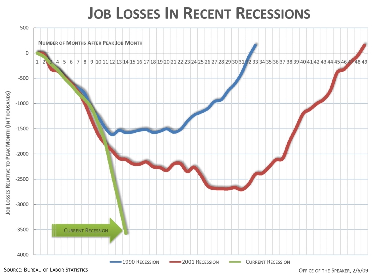
Found at The Daily Kos thanks to Jerry A.
This graph, based on U.S. Bureau of Labor statistics and current as of February 6th, compares the number of jobs lost during the 1990 (blue), 2001 (red), and current (green) recessions:
Found at The Daily Kos thanks to Jerry A.
This week in the New York Times, Catherine Rampell explained how the recession was affecting the ratio of female to male workers:
The proportion of women who are working has changed very little since the recession started. But a full 82 percent of the job losses have befallen men, who are heavily represented in distressed industries like manufacturing and construction. Women tend to be employed in areas like education and health care, which are less sensitive to economic ups and downs, and in jobs that allow more time for child care and other domestic work.
Here are the results:
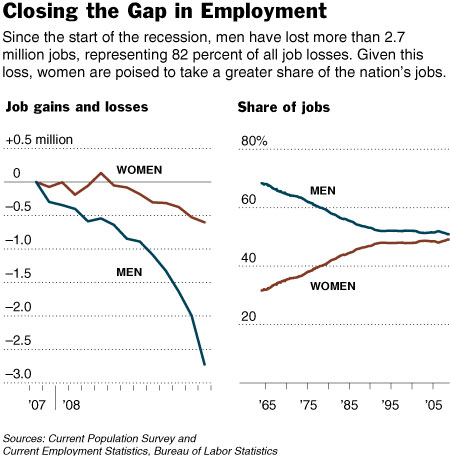
Excluding farm workers and the self-employed, women held 49 percent of the nation’s jobs as of November. Including farm workers and the self-employed, women held 47 percent of jobs.
But, Rampell reminds us:
Women may be safer in their jobs, but tend to find it harder to support a family… Women are much more likely to be in part-time jobs without health insurance or unemployment insurance. Even in full-time jobs, women earn 80 cents for each dollar of their male counterparts’ income…
If the recession continues as it has, the U.S. workforce may soon be majority female.
See also this post on job segregation.
Hyundai, like all the other automakers, experienced a sharp drop in sales. According to the Examiner Las Vegas, Hyundai sales are down 40%. In an effort to attract buyers, the company now offers what they call the Assurance Program. Here’s a commercial that explains the program:
It’s a pretty interesting program. A company is basically saying, “If you aren’t buying a new car because you worry that your financial situation is unstable and the economy sucks and it would not be a fiscally responsible decision for you, don’t worry–we’ll let you back out if you really need to.”
This brings up what appears to me to be an economic paradox. On the one hand, for the economy to improve, consumers need to buy things so businesses, factories, and other employers can put people to work. So from that perspective, this program is good: it might give consumers the confidence to go ahead and buy a car. But as an individual, it seems like in an economic downturn it’s probably in your individual interest to cut back on spending and save money in case of job loss–unless you are wealthy enough and have enough savings to really not be concerned about the downturn. From that viewpoint, buying a car, particularly a new one, is probably a poor decision, unless it is absolutely necessary. Even with the Assurance Program, you still have made a number of months’ worth of payments, plus a down payment, and have nothing to show for it.
This might be useful for a discussion of self-interest and the possible conflicts between what is good for the group (and the individual members of it) in the long term and what is best for the individuals in a more immediate sense. Should we, as consumers, reduce our financial risk by saving as much money as we can, limiting consumption and spending as a result? Or should we increase our personal risk by participating in behavior that very well may lead to better conditions, but not immediately, and possibly not for us if we end up with fewer financial reserves to fall back on in case of a job loss? How do you convince people to do something that might be good for the group when it might not appear to be in their self-interest on a personal level? And does it matter that companies are asking individuals to take possible financial risks so the company can make a profit?
On a non-sociological note, holy crap the automakers are desperate.
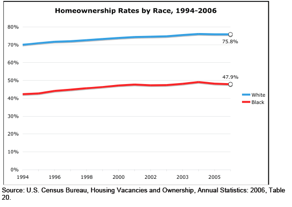
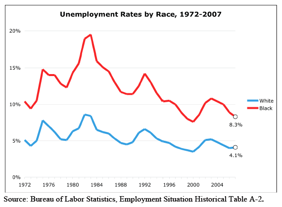
Here are some graphs on the income and wealth gap between Whites and Blacks in the U.S.

This next one shows homeownership rates. I know some people are going to point out that Blacks are more concentrated in urban areas than Whites are, and so it might make more sense to break down homeownership by area (rural, urban, suburban). While that might be a legitimately useful comparison, it also brings up the question of why African Americans would be more concentrated in urban areas, which could lead to a discussion of government programs that encourage Whites to buy homes in the suburbs after WWII while denying those opportunities to Blacks.
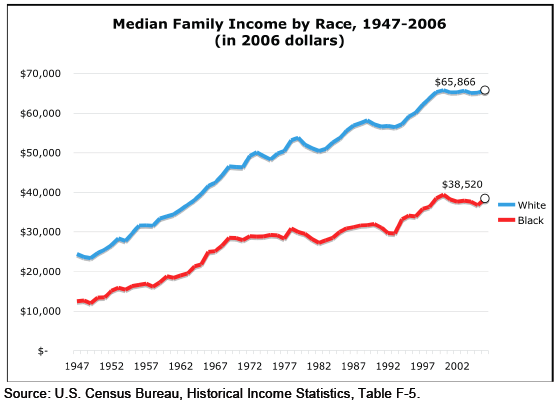
One way of explaining higher unemployment rates among Blacks is that there is some individual or cultural deficiency–African Americans are lazy, or want a hand-out, or don’t look for work, etc. etc. I like to show trend comparisons like these because they undermine those types of explanations. If African American unemployment was due to laziness, a “culture of poverty,” or other deficiencies, it would be unlikely for Black and White unemployment rates to show the same pattern (or, for that matter, any pattern–unless you believe African Americans just got a lot lazier in, say, 1982). What we see here is that Black and White unemployment rates follow a very similar pattern, but that during hard economic times, sugh as the early 1980s and around 1992, African Americans suffer disproportionately.
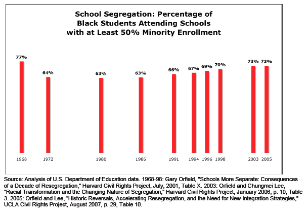
This one shows the slow but steady trend toward resegregation of our schools:
All of these were found at the Working Group on Extreme Inequality website.
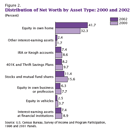
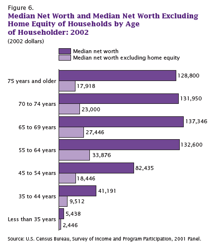
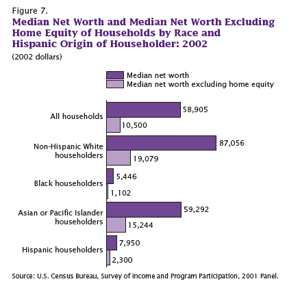
The following graphs all show how much of American’s wealth is (or, um, was) in the form of home equity. They are all based on 2002 data, several years before housing prices hit their peaks, which means by the time the housing bubble burst, home equity was an even larger proportion of all net worth.
It’s not that I didn’t already know the economy was in trouble. That’s obvious–I live in Vegas, all I have to do is drive around a little and see all the houses sitting empty. But looking at these images I kept thinking, “a good portion of that home equity wealth is just gone.” On paper, we had all this wealth, and people borrowed based on it…and a lot of it is simply gone. Just…poof. Gone!
This one shows what percent of all net worth in the U.S. falls into various categories.
Here we have median net worth in 2002 for different age groups…and then the lighter purple bar, which is median net worth if you took out home equity:
A similar breakdown, except by race, not age this time. Notice how much Blacks and Hispanics lag behind Asians, and how much they lag behind non-Hispanic Whites in terms of net worth:
On the up side, if the stock market keeps going down, then home equity as a percent of our net worth will go up again because we’ll have lost so much in stocks. So, you know, look on the bright side!
All of these graphs came from “Net Worth and the Assets of Households: 2002,” written by Alfred O. Gottschalck and published by the U.S. Census Bureau in April 2008.
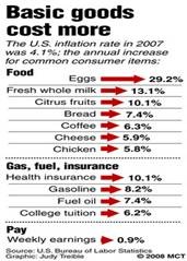
According to the U.S Bureau of Labor Statistics, weekly earnings rose 0.9 percent last year and the overall inflation rate was 4.1:
Found at Everyday Sociology. Click to enlarge.
Jay Livingston over at Montclair Socioblog reports on a report by the Pew Center. First this image:
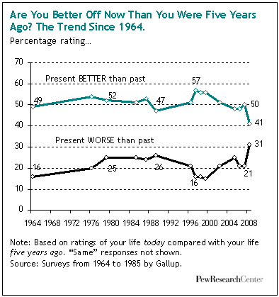
Jay writes:
When Reagan asked this question in the 1980 presidential debates, most people, according to Gallup felt that yes, they were better off – 52% vs. 25% who felt they were worse off. That’s puzzling, considering the apparent success of Reagan’s question – he won the election handily.
The interesting result from the Gallup numbers is that when Reagan left office – after the “Reagan recovery” cherished by anti-tax, anti-regulation conservatives – the numbers were identical. If you look at actual changes in median family income, you see a slight decline in the Carter years and an increase in the Reagan years. But these changes aren’t reflected in how people felt, at least not as measured by Gallup.
This year’s numbers show optimism at its lowest ebb since Gallup started asking the question in 1964. “Better off” still tops “worse off,” but by only 41% to 31%. Even more surprising to me was the proportion of these self-identified middle-class Americans who rate their quality of life as low (five or less on a ten-point scale).