economics: great recession

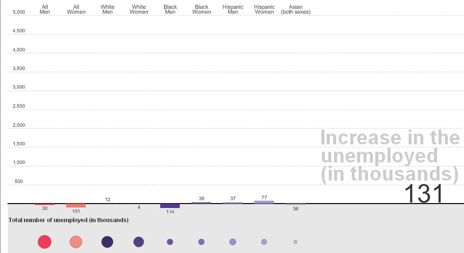
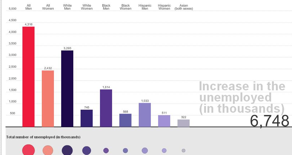
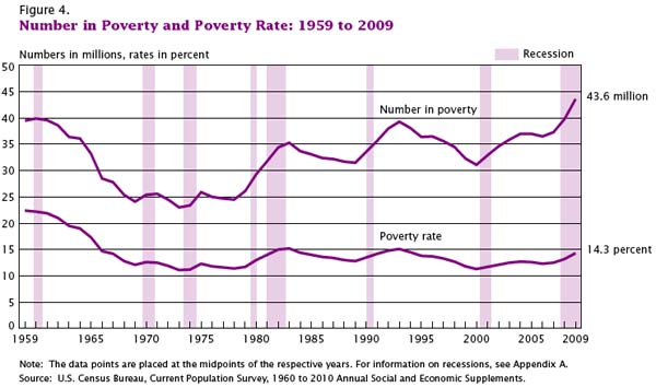
This week the U.S. Census Bureau reported that the American poverty rate has reached 14.3%, the highest it has been in 15 years:

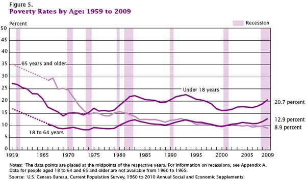
Children are over-represented among the poor; among those  less than 18-years-old, the poverty rate is 20.7%:

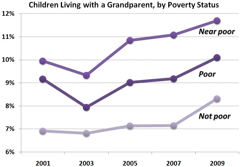
The Census report suggests that the poverty rate would be even higher if it weren’t for an increase in non-nuclear family households.  Over the last two years, an additional 11.6 percent of households now include non-family or family members from three generations or more.  Consider this data from Philip Cohen’s Family Inequality blog (and notice that the near poor are more likely to be living with a grandparent than the poor, who may not have this option):

So, the economic recession is correlated with an increase in poverty, but what does “poverty” really mean?   The New York Times reports that in 2009 it meant a pretax income of $10,830 for a single person with no dependents and less than twice that, $22,050, for a family of four.

Trying to imagine keeping a roof over my head, sufficient food in my belly, and clothes on my back on that amount of money is difficult.  But even if this was possible, human beings  need more than food, shelter, and clothes.  Try to imagine, with this amount of money, maintaining friendships and romantic partnerships, nurturing your children’s emotional health and educational potential, having pride and comfort in your home and personal appearance, finding the resources to invest in your own human capital, or giving yourself a modicum of leisure.  Poor people are human too and these numbers only begin to scratch the surface of the kind of deprivation many Americans suffer every day.

Images borrowed from Graphic Sociology.

Lisa Wade, PhD is an Associate Professor at Tulane University. She is the author of American Hookup, a book about college sexual culture; a textbook about gender; and a forthcoming introductory text: Terrible Magnificent Sociology. You can follow her on Twitter and Instagram.

Rachel sent in a link to a post about the recession by Tim Cavanaugh at Reason that led me to an interactive graphic at the Wall Street Journal that lets you track job loss by either sector or by race/ethnicity and sex from December 2007 to August 2010.

Here is the race/ethnicity and sex data for January 2008 (for reasons I cannot understand, Asians are not separated out by sex, and as usual, American Indians aren’t included):

And here’s the breakdown for January 2010:

Unfortunately, the numbers aren’t weighted by the number of total workers per category, so we don’t have any way to know how these raw numbers translate into percentages of workers losing their jobs.

By economic sector, for January ’08:

January ’10:

[On a nitpicky note, the sector graphs show job losses in negative numbers, which would work if it showed total change in # of jobs. But I think we’d be thrilled if we had -8… thousand job losses, as the graph is labeled. Just a small sloppy labeling issue.]

As the data show, and as we’ve discussed before, the economic recession has disproportionately affected men. But Cavanaugh cautions that it might be a little soon to declare men an at-risk species or lament the bad luck of being born male. Presumably, if men’s over-representation in construction, for instance, has meant they suffered more than women from the real estate bust, if you felt like it you could turn it around and argue that perhaps they disproportionately benefited from the boom that preceded it. Additionally the employment sectors are pretty broad; “retail” or “finance” will include some specific occupations that are fairly gender balanced, some that are dominated by men, and some dominated by women. And overall loss in retail jobs doesn’t tell us if the losses are spread equally across occupations within the sector.

Should we care about the suffering of men and their families in the recession? Of course. And to the degree that men are disproportionately represented in occupations that are prone to boom/bust cycles, we’re likely to continue to see greater volatility in their employment rates than women’s, sometimes to their advantage, sometimes not. But we might want to be a little careful and look at some more in-depth data before we declare, as some commentators seem to want to do, that women have basically escaped the recession. If nothing else, men and women aren’t islands; lots of us share household expenses, and a woman whose husband loses his job but keeps her own doesn’t exactly avoid any negative consequences of the recession.

Related posts: more comparisons of joblessness, race and recession, unemployment and education level, not everyone suffers during a recession, the gender employment gap,

I’m back! I was in the middle of moving and just overwhelmed with everything. Anyway. Talking Points Memo posted a link to an article at Slate about income inequality in the U.S., and particularly the increasing proportion of total U.S. income earned by the very rich. Timothy Noah refers to the “great compression” as a time period when income concentration among top earners dropped significantly, and argues that in the past three decades we’ve seen a “great divergence,” with increasing income inequality hitting levels not seen since the Great Depression:

A slideshow accompanies the article, providing more info on the changes Noah discusses. A few examples (the slideshow provides the data source used to create each image):

Even among the very rich, we see increasing divergence, with the super-ultra rich, the top 0.1% of earners, now making 8% of all U.S. income:

A comparison to some other countries (I don’t know why these specific nations were chosen for the comparison):

Keep in mind, this data includes only income. Wealth — the worth of all assets, including retirement and savings accounts, stocks, homes, cars, and anything else of value — is much more unequally distributed.

Congress is about to be embroiled in a major debate about whether to extend the tax cuts on high incomes; as both sides weigh in, here’s some context to keep in mind:

The effective tax rate is what people actually pay, as opposed to what their tax rate theoretically is. While we’ve certainly seen a large drop since the late ’70s, Noah argues that, compared to other economic changes, the effective tax rate hasn’t affected the rise in income inequality much. It plays a role, yes, but changing the tax rate on the very rich doesn’t affect the overall distribution of income a huge amount, in part because the effective rate, what people end up actually paying, generally ends up being smaller than what they theoretically owe based on the stated tax rate, once you take into account deductions, write-offs, loopholes, and so on.

So…happy post-Labor Day!

U.S. unemployment numbers only begin to describe how U.S. workers have suffered in this recession.  The Pew Research Center has some additional data on this experience.

Twenty-six percent of full-time workers who became re-employed currently only work part-time.  Thirteen percent moved from part-time to full time work.  So, among the employed, there are 13 percent fewer full-time workers.

Americans who lost their jobs and became re-employed during this recession say that they’re making about the same, that the benefits are about equal, and many like their new job better:

Still, the re-employed are more likely than the still-employed to say that they are overqualified for their current job:

People that moved from full- to part-time work are significantly less likely to be satisfied with their new position:

Forty-seven percent of part-time workers would like a full-time job:

The term “underemployed” refers to this 47 percent of the population.   Men, young people, the less educated, lower income, and non-whites are more likely to be underemployed:

Lisa Wade, PhD is an Associate Professor at Tulane University. She is the author of American Hookup, a book about college sexual culture; a textbook about gender; and a forthcoming introductory text: Terrible Magnificent Sociology. You can follow her on Twitter and Instagram.

Martin Hart-Landsberg, at Reports from the Economic Front, offers a provocative hypothesis.  He observes that job loss in the U.S. has been tremendous. One in 20 jobs has disappeared.  Still, Congress drug its feet approving an extension of unemployment benefits.  The extension has been approved, but benefits are hardly generous (on average, $309 a month week).  Further, millions of unemployed people are not collecting unemployment because they’re not eligible under current policy.

Hart-Landsberg asks why there is a lack of “meaningful national efforts” to address the suffering of workers and their families?

His hypothesis:  Economic policy is not responsive to workers’ needs.  Instead, it is heavily driven by what is best for corporations.  And, it turns, out, corporations are doing swimmingly during the recession.  They took a beating at first, but their profits are up.  Downsizing appears to have benefited them.  Consider this chart from the Economic Policy Institute (EPI):

The EPI concurs with Hart-Landsberg.  Looking at this data, Lawrence Mishel concludes:

When employers are able to recover their profits many years before their employees can even hope to attain the income and employment levels they had  prior to recession’s devastation, economic policy is clearly skewed in favor of corporations and not workers.

Lisa Wade, PhD is an Associate Professor at Tulane University. She is the author of American Hookup, a book about college sexual culture; a textbook about gender; and a forthcoming introductory text: Terrible Magnificent Sociology. You can follow her on Twitter and Instagram.

While I was at my grandma’s house this week I read Buying In: What We Buy and Who We Are, a fascinating book by Rob Walker. There will be more posts to come in the next few weeks, but for starters, I was struck by the results of a 2006 survey Walker mentions by the Pew Research Center. The survey asked people if various items were luxuries or necessities. Here are the results from 2006 and 1996:

Clearly, over time we’re defining more and more items as necessities rather than luxuries:

A breakdown of some results by age:

If I had to guess, I’d think the fact that younger people are less likely to say a TV is a necessity than older people is due not to less concern about TV but more willingness to watch content online. Does that seem reasonable? Other explanations?

The survey found that the higher a person’s income, the more items they define as a necessity:

The biggest differences by income were for dishwashers, cell phones, computers, and high-speed internet, which are more likely to be defined as a necessity as income increases.

The Pew Center’s website has links to more detailed breakdowns, as well as full info on the question wording, methodology, etc. And as the authors say in the summary, the results show only a one-way change: in no case did they find that the overall percent defining something as a necessity decreased between 1996 and 2006. As they put it,

The old adage proclaims that “necessity is the mother of invention.” These findings serve as a reminder that the opposite is also true: invention is the mother of necessity. Throughout human history, from the wheel to the computer, previously unimaginable inventions have created their own demand, and eventually their own need.

The income data would seem to back this up: what we have, we often come to define as necessities.

I would love to see an international comparison of some sort. I’ll see what I can find.

UPDATE: I haven’t found an international comparison yet, but I discovered that the Pew Research Center conducted the survey again in 2009 to see if attitudes had changed during the recession. Quite a striking change for several items:

d

Keeping a trend in perspective.

The sociologist down the hall pointed out that yesterday’s chart gave the impression of a whopping increase in TANF (Temporary Assistance to Needy Families) support for poor families. But I have been complaining since December 2008 that the welfare system is not responding adequately to the recession’s effects on poor single mothers and their children. I wrote then:

We now appear headed back toward a national increase in TANF cases. But the restrictive rules on work requirements and time limits are keeping many families that need assistance out of the program…. If the government can extend unemployment benefits during the crisis, why not impose a moratorium on booting people from TANF?

So it does seem contradictory that I would post a chart yesterday showing a huge increase in TANF family recipients, and continue the same complaint. So let me put it in better perspective. It’s a good lesson for me on the principles of graphing data, which I have made a point of picking on others for.

Height and width

There were two problems with yesterday’s chart. First, the vertical scale only ran from 1.6 million to 1.9 million families. Second, the horizontal scale only ran for 26 months. I’ll correct each aspect in turn to show their effects. Here’s yesterday’s chart:

It sure looks like a dramatic turnaround. And any turnaround is a big deal. I wrote last year:

What should be striking in this is that the rolls are increasing even as the punitive program rules continue to pull aid from families according to the draconian term limits dreamed up by Gingrich, ratified by Clinton and endorsed by Obama — 2 years continuous, 5 years lifetime in the program. The current stimulus package includes more money for TANF, to help cover an expected growth in families applying — but no rule change to permit families to keep their support in the absence of available jobs.

But, run the vertical axis down to zero, and the same trend is not so dramatic:

Now the big bounce since July 2008 is put in perspective. We’ve seen a 16% increase since that bottom point, but the response seems much more modest in light of the size and impact of the Great Recession we’ve come to know.

In fact, though, the longer-term view underscores how paltry that response has really been. Back the chart up to 1996, and you can see how small the increase has been compared with the pre-draconian reform period:

All three images are correct, but their emphasis is different. To me, the important take-home message from this trend is, “That’s it? The greatest economic recession since the Great Depression, and our welfare response was that measly uptick? Our system really is a shambles.”

One important issue remains, however, and that is some measure of the need for welfare. So consider the number of single-parent families below the poverty line, compared with the number of families receiving TANF (formerly AFDC):

Now the story is much more clear.

After welfare reform in 1996, the number of families receiving welfare was cut by half in just a few years. At the same time, however, the number in poverty dropped. Since then, as the number in poverty has increased, the number on welfare has not. The two trends appeared to be uncoupled through most of the 2000s. In the last year we’ve seen the first increase in TANF numbers since 1996, but nowhere near enough to meet the increase in poor single-parent families.*

It is still the case that, although the stimulus bill allocated more money to TANF, the punitive rules and term limits have not been changed. So the system does not address longer-term poverty — something we should expect to see much more of in the next few years.

*We don’t have the official 2009 poverty rates yet, since they are compiled from a survey done in March 2010, to be released this fall.

Philip Cohen, PhD, is a professor of sociology at the University of North Carolina at Chapel Hill, where he teaches classes in demography, social stratification, and the family.  You can visit him at his blog, Family Inequality, and see his previous posts on SocImages here, here, and here.

Lisa Wade, PhD is an Associate Professor at Tulane University. She is the author of American Hookup, a book about college sexual culture; a textbook about gender; and a forthcoming introductory text: Terrible Magnificent Sociology. You can follow her on Twitter and Instagram.

Sanguinity sent in an interesting, if disheartening, report by Insight Center for Community Economic Development. The report looks at the assets owned by women of color and the wealth gap between them and men of different racial/ethnic groups.

An overview of wealth (the value of all assets minus the value of debts) broken down by race/ethnicity and type of household:

Of course, the most striking finding there are the major disparities by race, particularly how much wealth White non-Hispanics have compared to all other groups (largely due to owning more valuable homes). Notice that single White men and women have higher median household wealth than married Black or Hispanic couples. This is astounding.

Blacks and Hispanics are more likely than Whites to have no wealth at all, or to have debts outweigh all assets; again, unmarried Whites are better off in this regard than are married Blacks and Hispanics:

Among single parents, women appear to bear a disproportionate amount of the financial hardships of caring for children. White single mothers with children of any age (second column) have only 57% as much wealth as White single fathers; the equivalent ratio for Blacks is 0.4% and for Hispanics, 5%. Read that again: 0.4% and 5% as much wealth as single fathers from the same race! And take a look at the actual cash value: median wealth for Black women is $100, and for Hispanic women, it’s $120!

But then look at that third column! If you’re a single mother and have children under the age of 18 — who are more likely to be living with you than with their father — your financial picture is pretty dismal. Black and Hispanic women with children under age 18 have a median wealth of zero, meaning half have no wealth at all or owe more than all their assets combined are worth. Even White women, who are absolutely wealthy by comparison, have only 14% as much wealth as White single fathers with children under age 18.

Thinking about the implications of those numbers — the very meager financial resources available to many families, the particularly difficult situation of single mothers of all races, what this means for a family’s ability to cope with a crisis such as a car breaking down or a medical emergency, the ability to come up with deposits for an apartment — is mind-blowing.

The report has quite a bit of other information too, so if you’re interested in this topic, go check it out.