Search results for pink

Eric Stoller sent us a photo he took at Borders recently of two doodle books, one targeting boys and one targeting girls:

3540853922_5e9f9b178a

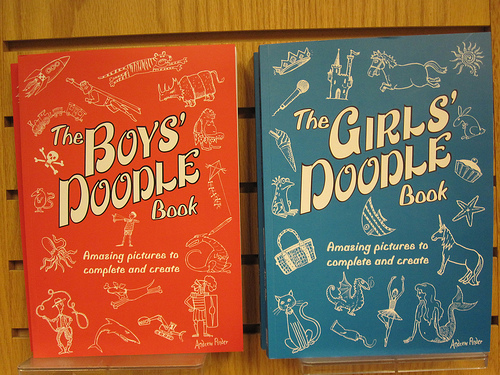
In Eric’s post about the books at his blog, he says,

The Boys’ Doodle Book features the following images on its cover: triceratops, ogre, tiger, superman, rocket, skull & crossbones, octopus, boy w/slingshot, mouse, train, kite, dragon, knight, shark, excavator, dog and a cowboy.

The Girls’ Doodle Book in comparison has a different cover color and a variety of differing images than the Boys cover including: crown, pony, castle, sun, microphone, ice cream cone, frog/prince, purse/bag, rabbit, cupcake, starfish, unicorn, fish, cat, toothpaste, dragon, ballerina and a mermaid.

I’m surprised that the Girls’ Doodle Book didn’t have a pink colored cover given the overall stereotypical and gendered nature of the doodles on the cover. Boys like fire, machines, spikes and death, while Girls like food, animals typically associated with non-violence, dancing/arts and hygiene. I’m not saying that there is anything inherently wrong with any of the doodles. What I am saying is that gender-based stereotypes are being perpetuated in overt contrast with these two books.

Thanks for sending the image along, Eric!

NEW! Laurel O. found another example, the Girls’ and Boys’ versions of How to Be the Best at Everything:

51pWbTEBJ3L._BO2,204,203,200_PIsitb-sticker-arrow-click,TopRight,35,-76_AA240_SH20_OU15_

Picture 1

Laurel’s kids’ school sent home an order form for books. The descriptions of these two:

The boys’ book description says “Learn how to lasso like a cowboy, juggle one-handed and more” whereas the girls’ book says “Design your own clothes, host the best sleepover, and lots more.”

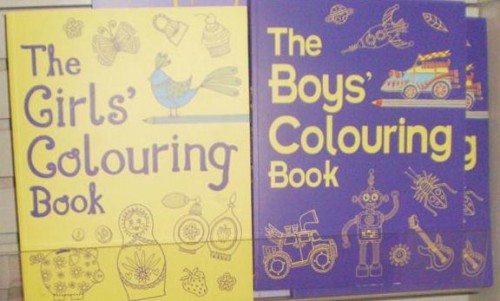
NEW! (July ’10): Gaby K sent in an example of British coloring books aimed at boys and girls. We see a lot of the typical gendered stuff: girls like cupcakes and perfume and butterflies, while boys like trucks and bugs and rockets. Gaby also points out that the girls’ version has a passive Russian nested doll while the boys’ has a robot with apparently movable joints:

An extended version of this post also appeared at Ms.

I’ve been taking photographs of breast-cancer-research-and-prevention-branded products for a few months now. I was first driven to do so when I saw this at the Million Aire (private plane terminal) at the Burbank airport:

cimg1256

That’s right. You are looking at pink chocolate chips cooked into cookies to signify a commitment to reducing breast cancer-related morbidity and mortality.

Anti-breast cancer messages are, I think inarguably, the most widely product-linked disease-related message ever.  I am constantly shocked by how many products have a breast cancer version. Here are some pictures I’ve taken over the last few months.

Cream cheese:

lisa-cimg2124

Padlock:

lisa-cimg2186

Cat food:

cimg1637

Gum:

cimg1706

Golf balls and tees:

cimg1953

Pots and pans:

cimg2005

Steve W. sent in this picture of a pink “ladies night out” breast cancer-themed limo (note the pink ribbon hanging from the rear view mirror):

cimg3549

NEW (May ’10)! Renée Y. sent along this photo of breast cancer-awareness-themed grape tomatoes.  I repeat: grape tomatoes.

We’ve discussed the commodification of activism extensively (see here, here, here, here, and here) and so I’m going to skip this point.  Instead, I’d like the ask the following:

What does it mean when awareness of and funding for disease is subject to marketing?  Is this really the most efficient or rational way to set health care priorities?  I did a bit of research.

According to the CDC (2005 seems to be the latest available data), cancer is not the leading cause of death.  Heart disease is the leading cause of death.  Granted, cancer is a close second.  In 2005, 652,091 people died of heart disease and 559,312 died of cancer.  But not breast cancer, all cancers.  In 2005, 49,491 people died of breast cancer.  More than 10 times as many people died of heart disease.

And, if you want to prioritize cancers, more people are diagnosed with prostate cancer than breast cancer (source) and more people die from lung cancer (159,292), colon, rectal, or anal cancer (53,252), and lymphoid/hematopoietic cancers (55,028) (source).

So why such an emphasis on breast cancer?   I’m not sure why.  Certainly there is a massive social movement organization behind this anti-breast cancer marketing and people in charge have made a decision to take this approach.   I think, also, the body parts and the presumed cause of disease matter.   Do we have less sympathy (and would, therefore, a similar marketing campaign be less effective) for lung cancer because we think that lung cancer patients are to blame for their own disease?  Would we find colo-rectal-anal cancer-themed cream cheese somehow less appetizing?  Or prostate cancer-themed gum?  Do lymphoid and hematopoietic cancers affect parts of the body that are simply less iconic?

saveteepink

“Save the lymph nodes” just doesn’t have quite the same ring?

I’m not trying to suggest that raising awareness of and funding research for breast cancer isn’t important, but I am interested in the strategies by which being “against” breast cancer is (literally) sold to us.  And I’m curious about how this affects treatment and research funding, if at all, and the rationality of our resource distribution given the application of a marketing approach to (some) diseases (and not others).  (Also in breast cancer marketing, see here, here, here, here, and here.)

 —————————

Lisa Wade is a professor of sociology at Occidental College. You can follow her on Twitter and Facebook.

Abby J. sent in some photos she took at Toys ‘R’ Us of a bunch of classic board games that are now marketed specifically to girls. We know they’re for girls because they’re all pink:

3520573334_beb11ee74a

3520711464_705643d4c4

Of course the girls’ version of Scrabble would spell “fashion.” I assume the boys’ version spells “motorcycle” or something of the sort…though probably with fewer letters, I guess.

The Monopoly game (called the Boutique Edition) looks like a jewelry box:

3520712872_89165de5e9

I don’t know what Mystery Date is all about–I mean, I can guess, but I’m not familiar with the game, and not actually sure I’d want to encourage kids to go on mystery dates, but whatever. Both Abby and I found the pink Ouija board odd. I didn’t know they really still sold them. My grandma came across an old one when they were cleaning out my great-grandma’s stuff a couple of years back and she took it and gave it to my teen-aged cousin. My aunt took great offense and sent it back. My grandma, who is a devout Christian, took offense at my aunt taking offense (and implying that Grandma was giving her grandchildren satanic toys) and now keeps it around and lets kids play with it at her house. She also declared my aunt “no fun” and “too churchy.” If you knew my grandma, or had ever sat there and watched her call out to Jesus to help her find her missing spatula (he complied and made it appear in the drawer where she always keeps the spatulas), you would understand why I nearly choked on my food when she referred to someone else as “too churchy.” Now she’s decided that the Harry Potter movies are not, as so many people she knows had told her, satanic but are instead quite funny.

Anyway, that’s a long rambling unimportant point for a post that just illustrates how much we identify girlhood today with pink and feel the need to make gender-specific version of games where a single version seemed to work perfectly well in the past.

Reader Rachel sent in this photo she took of Legos being clearly marked as “boys’ toys”:

3453691914_2a64dfff3a

NEW! Sara P.-S., Liz, and Danielle F. sent us links to the new “girlz” version of the PSP (Playstation Portable) because, as Sarah says, it is apparently so “skewed towards boys that they have to specifically advertise the fact that girls [can] play with it”:

omglilacpsp-670x355

NEW (Apr. ’10)! Sunlight Snow sent in a version of Jenga aimed at girls called “Girl Talk” Jenga. Not stopping at the pinkification of the game, the producers decided to add sharing and gossip to it. Each plank now offers a question that girls are supposed to discuss. Apparently precipitous balancing and impending collapse is not fun enough, girls must add desperate crushes and dreams of becoming a veterinarian!

Gwen Sharp is an associate professor of sociology at Nevada State College. You can follow her on Twitter at @gwensharpnv.

NEWS!

In addition to friending us on Facebook, you can now follow us on Twitter!

FROM THE ARCHIVES:

April last year:  This fascinating Italian anti-immigrant poster suggests that, if immigration to Italy is allowed, immigrants will persecute the native Italians like U.S. colonizers did American Indians.  It’s a pretty amazing tactic.

NEWLY ENRICHED POSTS (bottom of post may not be safe for work!):

Total Drek revised an xkcd cartoon on the difference between causation and correlation.  So we added it to our original post.


Sex sells ‘n stuff:

Sarah Haskins makes fun of euphemistic references to female genitalia.  We added her video to our post on our efforts to avoid using the real terms.  

Related to discomfort with women’s genitalia, Taylor D. sent in a link to even more vintage ads for Lysol as a douche, which we added to this post.

We added a vintage ad to our sex sells post.  This one tells men that if they don’t buy Firestone tires, they won’t get laid.  Women?  Well I guess they don’t drive.  

Also in sex sells, we updated our post on the sexualization of food, this time with a Max Factor ad and a not-to-be-missed Hardee’s commercial featuring Padma Lakshmi having quite the sensual experience with a bacon burger (scroll all the way to the bottom). 

We also added another image to our post with examples of sex as “scoring.”

Now to sperm: We added three more images affirming the idea that we were all once a mighty sperm (eggs, apparently, just add nutrition, if that) to this post on the weird ways in which sperm are socially constructed.  In one of them, a condom ad suggests that one condom could have prevented the holocaust by dressing a sperm up as Hitler.  Another example dates back to the beginning of the idea in 1694.


On race and ethnicity:

We added material to two posts in our series on how and why people of color are included in ads aimed at white people.  First, we added a set of photographs taken by Joshua B. at Office Max to our post showing how people of color are often portrayed as being more, eh em, colorful.  Second, we added an image to our post on how people of color are literally background or arranged so that the focal point (visually or through action) is the white person or people in the ad.

We added images of sculptures that comically/stereotypically (depending on your point of view) represent European countries to this post about stereotyping nationalities. The installation was supposedly by 27 different artists, but it turns out to be a hoax; all of them were created by a single Czech artist.

Also in ethnic stereotypes, we added a cartoon from Life magazine suggesting that monkeys are insulted by being given Irish names.  We added it to our collection of anti-Irish sentiment from the 1800s.

And visit this post to see our newest example of using the notion of the “savage” to sell in the 1950s.

Miguel sent us an image of a “White” Obama, which we added to our post that asks “What do Black and White look like, anyway?”

Philip D. sent us a set of Crown Royal ads that reportedly target a “general” and a specifically African American audience, respectively, which we added to our post about marketing products to different groups. 

On gender: 

Elizabeth M. sent us a link to fashion designer Nina Ricci’s new line of shoes.  They’re high high HIGH heels!  We added it to some other real hobblers here

Women cannot be counted on to hold it together in the face of low calorie sweets… or at least that’s what another commercial tells us. 

Ben O. sent us a link to a company that makes pink protective gear for female construction workers.  We added it to our post featuring pink handcuffs for cops.  

There’s now another image up from the Evan Williams bourbon “The Longer You Wait” ad campaign

Keely W. sent in a link to the new Fling candy bar, just for girls.  We added it to our post on gendered candy marketing.

The Daily Show spoofed the obsession with Michelle Obama’s clothes.  Andrea G. sent in the link and we added it to our collection of examples of this obsession.  We also added a picture of the cover of a new book: Michelle Style: Celebrating the First Lady of Fashion.

We added a picture of a sink that looks like a woman’s lower half to our post about urinals shaped like women’s bodies

And, finally, does a month go by where we don’t update our BOOBS! post?  Rarely.  This time, though, we’ve got something special: Jezebel offered us a photo essay of a boob shaped milk cartoon, from fridge to trashcan.  Visit our updated post here (scroll to the bottom) and enjoy this teaser:

0041

Chris S. sent in a link to a post at Korea Beat about a town in South Korea that now has parking spots designated for women only. My first thought was that maybe they were for pregnant women–when I lived in Utah I’d sometimes see parking spots that were reserved for expectant mothers. But no. These are just for women in general. Here’s a photo:

090402_09_1

Part of the English translation of the original article, from Korea Beat:

The “pink lines”, painted pink, are 2.5 meters wide rather than the standard 2.3, offering aid to women drivers unskilled at parking.

This in a city chosen by a South Korean official as “the first woman-friendly city.”

I wonder if there’s any evidence that female drivers in South Korea are involved in more accidents or have a harder time parking than men. What, exactly, led to this? I don’t know a ton about South Korean culture; for those of you who do, is there a good reason we’d expect women to be less skilled at driving/parking than men? Are women generally discouraged from driving or something? Insights will be greatly appreciated.

NEW! (July ’10): Majd Al-Shihabi sent us a photo of similar parking spaces in Croatia. They are next to the parking spaces for those with disabilities and are about 50% wider than standard spaces:

SocProf, from The Global Sociology Blog, has an interesting post about gender in the public sphere. Here is a photo (from Echidne of the Snakes) of the “first spouses” of the G20 nations (that is, the spouses of the political leaders of the G20):

g20_glamour_spouses_expires_1

Except…someone’s missing. Two of the G20 countries (Germany and Argentina) have heterosexual, married female leaders, and their husbands aren’t in the photo. I don’t know why–were they not invited to the event? Did they choose not to come? SocProf asks, “Would the husbands have looked out of place here? Would this have been embarrassing to them?”

But SocProf points out that a different disappearing act recently occurred in Israel:

…look what happened in reverse in a group photo of the newly-formed Israeli cabinet. On top is the traditional cabinet group photo, at the bottom is the “touched-up” version that appeared in [the ultra-Orthodox newspaper Yated Neeman]… notice the difference?

30-world_160567s

Indeed, the two female Cabinet members have been photoshopped out.

SocProf says,

[In the G20 photo]…the men are not visibly absent. It is their presence that would be noticeable. And also note the setting in which the women pose, the soft colors, pink carpet and sofa with pastel background. It looks like a somewhat formal yet a little domestic setting.

The bottom photo is formal, no pink or pastel there! Icy grey with flags and orderly pose…It is a perfect illustration of the gendered domains: where men belong and where women belong.

Taken together, the three images, though taken for different purposes in different places, provide a great illustration of how we often make people who don’t fit cultural gender norms invisible…sometimes very literally.

Also see our post on an ultra-Orthodox newspaper that airbrushed girls out of a photo of children.

UPDATE: Commenter Liz says,

I object to the use of the word ‘airbrushing’, because that’s not what happened: those photos were edited, manipulated, or fabricated, but airbrushing is a specific photoshop tool for minor modification. You can’t completely change the reality of a photograph with an airbrush, unless someone would like to tell me that those two male stand-ins are actually just drawings made with photoshop.

If you use the same word (airbrushing) for taking out a model’s cellulite as well as removing heads of state from photographs, you trivialise what’s been done. Digital editing is only going to become more and more common, and it’s important to find the right words to explain how a photo has been altered.

Good point–thanks for pointing the language issue out. I didn’t know what airbrushing referred to, exactly, and had just heard it used to describe altering an image in general.

NEWS:

Last month Lisa posted about some interesting, if subtle, differences in a Spanish- and English-language pamphlet for pregnant women at Kaiser.  Siobhan O’Connor at GOOD put up her own blog post about the pamphlets and called Kaiser to see what was up.  A representative, Socorro Serrano, visited our site and replied in the comments.  Check out her reply, now in the post, here.  Thanks for chiming in, Socorro!

Join our fandom at our Facebook page!

NEW FEATURE!  FROM THE ARCHIVES:

Sometimes we get nostalgic for our old posts.  So, each month we’re going to resurrect a post from one year ago.  (In July we turn two-years-old and we’ll start resurrected two!)

From March 2008:  The marketers behind the Brazilian yogurt ads in this post counted on their viewers being disgusted by, gasp, fat women!  But some of us thought the women looked great.  What do you think?

NEWLY ENRICHED POSTS:

We added another Postsecret postcard to our post on confessions of true feelings about interracial sex.  Also in race and sex:  We updated our post on Resident Evil 5 again, this time adding an image of an African woman from the game attired in a sexualized animal-print outfit.

Nearly a year ago we argued that a promo poster for Gossip Girl represented the “pornification” of everyday life.  The stars are on the new cover of Rolling Stone and, well, we still think it’s pretty porny.  Speaking of: Breck C. sent us another image of things shaped like boobs, which we added to our extensive boobs post.

We published a post about a Dutch bus-stop bench that is a also a scale and publicly displays your weight when you sit on it.  We went back and added images of a design for a toilet seat that does the same thing

We added images of a man’s electric back hair shaver and a Nads commercial about a woman whose life was transformed when she was able to wax away her beard to this post about our growing disgust with body hair, even on men.  Also in hygiene: Kim D. sent us in another vintage Lysol douche ad, which we added to a post with several others.

Bri a sent in four ads to add to one of our posts discussing how people of color are included in ads aimed primarily at white people.  See the whole series starting here or check out the newly enriched post that discusses how people of color are used to represent “spice,” “flavor,” and, literally, “color.”

Bri also sent us an awesome Ralph Lauren ad that romanticizes colonialism, we added it to a previous fashion spread that did the same.  Relatedly, to our post about using third world people in fashion ads, we added a set of images advertising Suit Supply, sent in by Geerte S.

Matt W. sent us a map that overlaid concentrations of rural poverty with rates of religious adherents, and we added it to our post about religion and geography.

We added a floral-print hammer to this post about gendering products.  Speaking of gendering products: We added another strip from the Sheldon Comics “Make-up But for Dudes” series and an SNL sketch about make-up for men to this post.

We added an advertisement for Cessna’s fleet of private jets to this post in which private air travel is linked with ideal fatherhood.

Our post on what “organic” means now has a link to the Cornucopia Institute’s photo gallery, which has lots of photos from large containment livestock facilities that sell to Horizon and other companies.

We, of course, had a new ad for our post on sexualizing food, this time a Three Olives vodka ad about your “O Face” sent in by Tiffany L.  We also added more images of how the green “female” M&M is sexualized (sent in my Kristi) to this post.  Also related to food: We added a link to the mock commercial for Powerthirst 2 to our original post about this hilarious send-up of energy drinks and masculinity.

Finally, to our post about various companies trivializing women’s power, we added print ads for Nuvaring (“Let Freedom Ring”) and Spanx’s new “power panties.”   We also added another image of women sexually dominating men to our post on the theme.  It’s a doozy, too.

 Here is an ad from the “Most Interesting Man in the World” ad campaign by Dos Equis:

dos-equis

This ad, which is a clear attempt to harken back to the halcyon days of unfettered masculinity, is a cautionary tale against the feminizing effect of men shaving their body hair.  Contrast this message with that of the following ad for the Schick Quattro:

razor

Since the razor is pink, we can safely assume that it’s intended for women to use when converting their spiky brambles into beautiful flowers.

So, men aren’t supposed to shave below the neck, but women are required to.  Specifically, women are supposed to shave their “flowers” (in a nod to vulva-as-flower imagery?).

This may be helpful in discussions about social norms related to the removal of pubic hair. Of particular interest is whether the expectation of women’s pubic hair removal is objectively different from the expectation that they will remove other body hair.  Although pubic hair is considered more “private,” it’s difficult to make the argument that the impact of removing it is more sexual than that of, say, removing armpit hair (given that women’s attractiveness is partially predicated on the illusion of hairlessness).  Also, some men are beginning to remove their pubic hair (and the Most Interesting Man in the World be damned). Is this a positive shift, suggesting some parity in beauty standards, or is it a negative shift, in that superficial cosmetic norms now have the power to leapfrog over the traditional bastion of masculinity?