
 Dr. Bethany Pope sent in a segment from a National Geographic show about animals’ sexual behavior. The clip is an amazingly gendered discussion, describing animals’ motivations and behaviors through the lens of what is considered normative masculine and feminine sexual behavior, the correct place of males and females in the social hierarchy, and the assumption that males and females are locked in a zero-sum game. The anthropomorphizing of other species begins at the outset, when we learn female hyenas want “more than equal rights, they want to beat males at their own game.” In fact, “Africa’s plains are among the most macho places on earth…they’re testosterone-fueled battlefields,” filled with “swaggering” males. Bethany sums up the tone regarding hyenas, saying, “The documentary presents them as an abomination, usurping male gender roles.” Indeed, at about a minute in we learn that hyenas “seem mixed up.” A hyena “swaggers,” “confident” and “cocksure,” its penis swinging “low and proud.” But what’s this? The swaggering, cocksure hunter “has a secret”! That’s not a penis, it’s an enlarged clitoris; our hero is a she! Not only that, there’s not a penis anywhere to be found, as this is an all-female pack; “these female are some of the most masculine in the world — and they like to sniff each other an awful lot, too. Compounding the “confusion,” they have a “bulging” sac, like a scrotum. And not only are female hyenas masculinized, but the poor males are emasculated, reduced to being “subservient, servile, and scared.” It is rather stunning example of anthropomorphizing the natural world and applying gendered norms of sexuality to other species, and worth sitting through the full six minutes to get the full effect (the video might not be safe for some workplaces; there are a lot of lingering shots of penises and clitorises. A lot.):
Cross-posted at Ms.
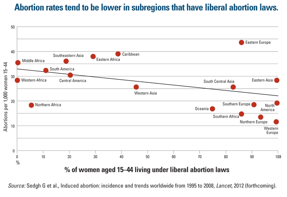
Andrew S. let us know that The Lancet has just released a study on global trends in abortion, focusing on overall rates, access to safe vs. unsafe abortions, and how the legal status of abortion impacts abortion rates. The results shed some interesting light on the effects of efforts to reduce abortion by outlawing or restricting access to it. Looking at data from 1995 to 2008, the authors found that abortion rates were actually lower in areas of the world with less restrictive abortion laws:
[Via ThinkProgress.]
The Guttmacher Institute provides a full summary of the article. Not surprisingly, the more restrictive abortion laws are, the higher the proportion of unsafe abortions (with Eastern Europe being a significant outlier, with the highest global abortion rates). About half of all abortions are unsafe, leading to the deaths of roughly 47,000 women each year, or 13% of all global maternal deaths — almost entirely in developing nations, where restrictive abortion laws are more common and access to contraception and medical care are generally lower.
UPDATE: A couple of commenters pointed out that I was sloppy with my wording, and it seems like I’m making a direct causal argument (i.e., fewer restrictions leads to fewer abortions). The situation is more complicated than that; the very fact that some nations have more restrictions than others likely reflects a variety of issues that themselves influence the abortion rate, so that while there might be *some* causation, it’s also probable that laws on abortion and abortion rates are both influenced by other variables. I don’t think that getting rid of all restrictive laws in, say, Southeastern Asia, without making any other change at all, would necessarily lead to a dramatic shift in abortion rates. That said, what I find more interesting is the opposite proposition: the idea that imposing restrictions on abortion will automatically reduce abortion rates, which doesn’t seem true, at least on a global level.
I’ve posted in the past about differences I’ve noticed in the language used in signs in the girls’ and boys’ clothing sections at Target, which seemed to reinforce the idea that boys are rough and rowdy while girls are sweet. Eric B. sent in another example that he recently saw in Target’s infants’ department. The store he went to had five aisles; each aisle had a set of large signs along the top. Three of the five were focused on boys, and they all emphasize activities:

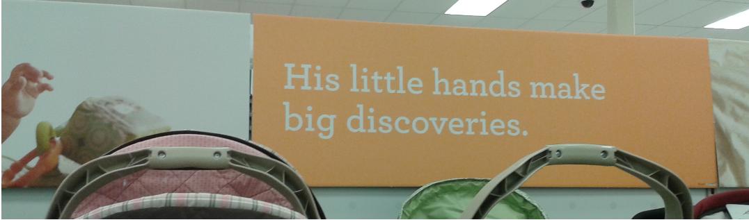

So boys actively do things (they play, they learn to feed themselves, they discover) that merit adult attention and admiration. What about girls?
Oh, they sleep:

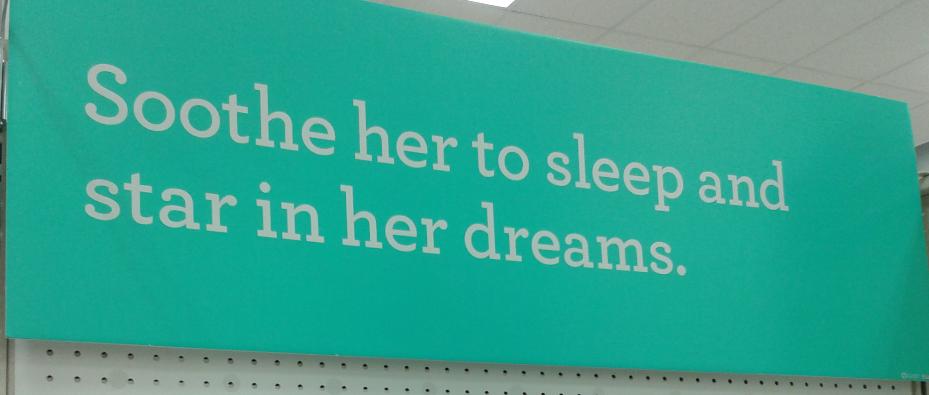
For other examples of how we reinforce the boys are active/girls are passive binary, see our posts on the binary in Lego City, in kids’ meal toys, and in magazines.
The NYT posted an interesting interactive graphic showing the occupations of the wealthiest 1% of U.S. households, broken down further by industry. You can hover over a rectangle to see how many people in a particular type of job in each industry are in the top 1%, as well as what percent of people in that job/industry are in the top 1%. For instance, 27.2% of physicians in offices or clinics (not hospitals) are in the top 1%:
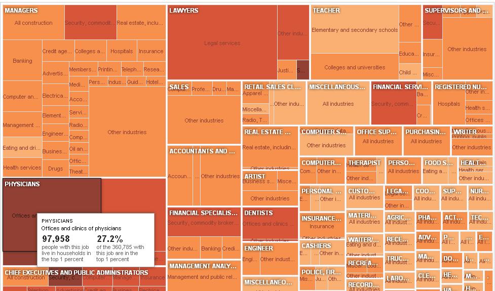
The relative size of the rectangle tells you how many people in that category are in the top 1% (so overall, the single largest occupational group of the top 1% is management), while the color indicates the % of people in each occupation/industry who are in the top 1% (lightest = less than 1%, darkest = over 20%). Definitely worth going over to the NYT post and playing around for a little while.
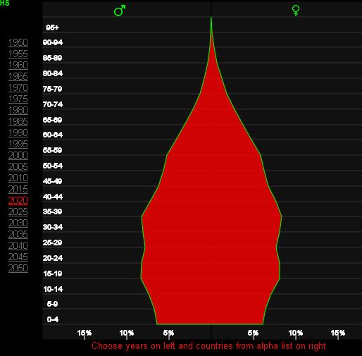
If you’re looking for basic global demographic information, World Health Rankings provides a great overview, using World Health Organization, World Bank, UNESCO, and other data. The website allows you to select a country, then provides a detailed breakdown of many demographic details, such as population pyramids (you can select different years in the past, or look at predictions for the future), leading causes of death, etc. Here’s the 2010 population pyramid for the U.S.:

You can also easily access all the age pyramids here. The 2020 projections for Brazil show the changing demographics due to the dramatic decrease in the fertility rate, which Lisa posted about this weekend:
There’s an interactive map of the top 15 causes of death in the U.S., allowing you to look at variations by county. Here’s the map of deaths due to heart disease, with Clark County, Nevada, highlighted:

You can also look at life expectancy for different nations for every decade between 1960 and 20101, a “real-time” clock that tracks global deaths (you can look at how many have died in the last year or month, or you can click “now” and reset the clock and watch as the clock estimate how many people die of various causes of death worldwide), and maps showing the prevalence of various causes of death around the world. Lots of neat representations of rather depressing information.
Also, as I wrote this post I realized that now every time I see a population pyramid of the U.S., Community‘s song “Baby Boomer Santa” is going to play through my head.
 Cross-posted in Portuguese at Conhecimento Prudente.
A lot of readers were taken with the new parody video, “Fotoshop by Adobé,” that has been making it’s way around the internet. Created by filmmaker Jesse Rosten, the video parodies beauty product commercials that play on and encourage insecurities while promising women magical transformations that will allow them to attain entirely unrealistic beauty standards overnight due to ground-breaking science-y sounding ingredients and processes (“pro-pixel intensifying fauxtanical hydro-jargon microbead extract”). Enjoy!
Thanks to Jessica B., Kate A., Rex S., Emma M.H., Jessica W., finefin, Bernardo, Robin D., Priyanka Mathew (who posts at Culture+Marketing+Politics), runbotrun, Dmitriy T.M., Lots of Models, Tom Megginson, and my colleague Pete La Chapelle for sending it in!
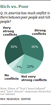
Recently the Pew Research Center released the results of a survey of 2,048 individuals about their perceptions of class conflict in the U.S., which are quite interesting in light of the Occupy Wall Street protests and the current attacks on Mitt Romney’s work with Bain Capital, which wouldn’t be that surprising except that they’re coming from other GOP presidential hopefuls (including Rick Perry referring to “vulture capitalism”). In the Pew survey, 2/3 of participants reported that there are “strong” or “very strong” conflicts between the rich and poor, with only 7% saying there are no conflicts:
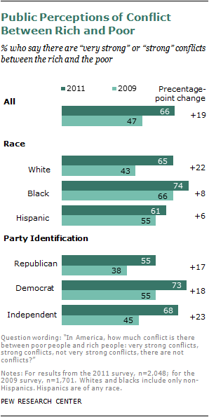
This indicates an increase in perceived class conflict since 2009, where under half said there were “strong” or “very strong” conflicts between rich and poor. We also some difference by race, with African Americans perceiving more conflict than Whites or Hispanics, and Democrats and Independents seeing more than Republicans:
While I think these findings are interesting, I’m also struck by the language. Since Americans tend to define themselves as middle class, regardless of income, the wording here (“rich” vs. “poor”) would seem to ask Americans about their perceptions of conflict between groups that they likely do not identify with personally (though many may interpret “rich vs. poor” as shorthand for general economic inequality, of course). I just wonder what the results would be if we had a survey that asked about conflicts between the rich and the middle class, or “the rich and people like you” (and the same questions about the poor).
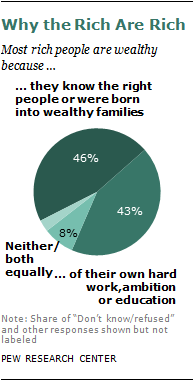
Regardless, increasing perceptions of class-based conflict doesn’t mean respondents necessarily think the wealthy are unfairly well-off. They were almost evenly split on whether the rich got their wealthy because of connections (family or otherwise) or because of their own hard work and effort:
The NYT has an article about the survey as well, with additional graphics. Thanks to Shamus Khan for the tip!
Way back in 2008 we posted about the conflation of food with women’s bodies — that is, presenting women’s bodies as food, and presenting food items as sexualized women, an issue covered in depth by Carol Adams. Two readers sent in additional examples. Sarah noticed this ad for canned tuna fillets, which have apparently sprouted heels-wearing legs:

And Whitney R. pointed out that Ludacris’s 2003 album, Chicken-n-Beer, presents a woman’s disembodied leg as the equivalent of fried chicken, ready to be consumed:

For many more examples — including a bikini-clad pin-up turkey — see our original post.