
The NYT posted an interesting interactive graphic showing the occupations of the wealthiest 1% of U.S. households, broken down further by industry. You can hover over a rectangle to see how many people in a particular type of job in each industry are in the top 1%, as well as what percent of people in that job/industry are in the top 1%. For instance, 27.2% of physicians in offices or clinics (not hospitals) are in the top 1%:
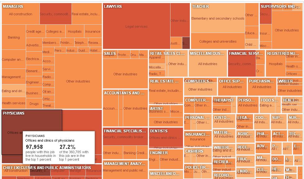
The relative size of the rectangle tells you how many people in that category are in the top 1% (so overall, the single largest occupational group of the top 1% is management), while the color indicates the % of people in each occupation/industry who are in the top 1% (lightest = less than 1%, darkest = over 20%). Definitely worth going over to the NYT post and playing around for a little while.
Comments 22
John — January 17, 2012
This is interesting, but can be misleading. It would be interesting to see a chart that also incorporates the percent of wealth in each of these professions.
Muscat — January 17, 2012
Now next they should do one on the top .1%
MPS17 — January 17, 2012
The big problem here is these are jobs of individuals in top 1% households, the issue being a top 1% household often contains one high-income earner and other, more regular-income earners. So this DOES NOT give a reflection of what are the highest paying jobs. It does, however, I think, give information of sociological value.
The Occupations of the Top 1%; Undoing Math Gender Stereotypes;Database of World Demographic Info « Welcome to the Doctor's Office — January 18, 2012
[...] THE OCCUPATIONS OF THE TOP 1% by Gwen Sharp [...]
Anonymous — January 19, 2012
Note: The chart counts the number of individual workers living in
households with an overall income in the top 1 percent nationwide.
Keep in mind that if households in the top 1% have as many people as the average household, a value of 1% is exactly average for every occupation. I suspect that households in the top 1% overrepresent multi-income households, since I guess that multi-income households have higher earnings in general.
Laura Norén — January 23, 2012
As a graphic, I find this one at the Economist to do a better job of presenting an overview perspective.
http://www.economist.com/node/21543178It indicates change over time - the financial services sector saw the largest increase in its representation in the 1% but other workers in medicine, law, and business still combine to wallop the representation by financial workers.
Why has Occupy Wall Street targeted finance so narrowly when businessmen, lawyers, and doctors are contributing just as much or more to the increasing inequality in America? The Economist graph brings that question up right away, but the boxes and the hovering in the New York Times graph bogs down in details what is better explained at a macro-level.
Laura — January 25, 2012
Just spotted a little oddity. In the bottom right there is a tiny box that says "Doctors" - surely physicians and doctors are similar if not the same?