The Paris School of Economics has posted a database, compiled by Facundo Alvaredo, Tony Atkinson, Thomas Piketty, and Emmanuel Saez, of the distribution of top incomes in a number of nations, with more on the way. Using income tax records, they provide a quick glance at concentration of income among the wealthy over decades (and in some cases, data extends back over a century). As the authors point out, there are limitations to using tax info to measure inequality, so it’s important to be aware of the limitations of this data series. Most obviously, individuals may take steps to hide their income to evade taxes, and the very wealthy may be particularly able to do so through the use of tax havens, etc. Also, tax policies change, so what counts as “income” at one point might not at another. The authors also had to contend with differences in the taxation unit (households vs. individuals) in different countries to provide some level of comparability.

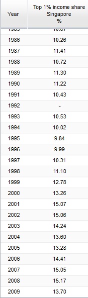
The database allows you to select a country, a time period, and a variable (top 5% income share, etc.), and get a table showing the results for all years in which data were available. Here, for instance, is part of the table for the share of income earned by the top 1% in Singapore:

Of course, this includes only data on income. In many countries, including the U.S., wealth (value of all assets) is significantly more concentrated than income.

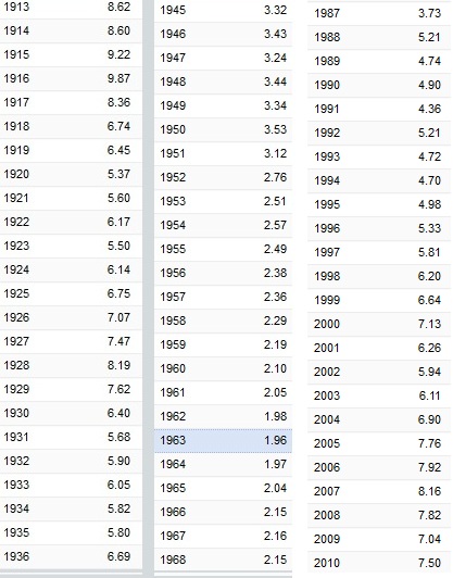
Looking at the dataset, you can see patterns over time. For instance, here’s part of the data from the U.S. (notice there are time gaps between the end of each column and the beginning of the next–I was just grabbing some illustrative screencaps), showing how the percent of income earned by the top 0.1% decreased significantly starting in the 1940s, but began creeping up again by the late 1980s and has grown since then:

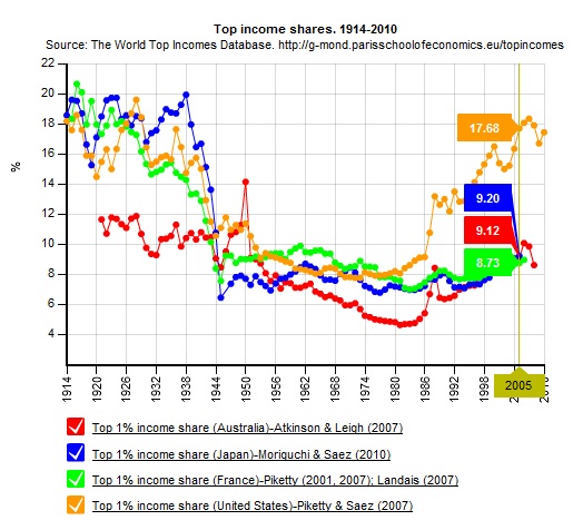
The site also allows you to create graphs. They provide a comparison of the share of income earned by the top 1% in 2005 in the U.S., Japan, Australia, and France, but you can look at data for individual nations:

It’s worth playing around a bit, but keeping in mind the caveats about what these data do and don’t tell us. Thanks to Shamus Khan for the tip!

Behold, I present to you a video parody of Lady Gaga’s “Bad Romance,” rewritten as “Bad Romance: Women’s Suffrage,” an account of the fight to get voting rights for women in the U.S.:

I just wanted you to know that this exists.

Lyrics and info available here. Thanks to Kristina Killgrove for the tip!

Gwen Sharp is an associate professor of sociology at Nevada State College. You can follow her on Twitter at @gwensharpnv.

Trudi Abel, who directs the Digital Durham Project at Duke University, sent in a map she thought we might like to post. Created by the Department of Public works in Durham, NC, in 1937, the map illustrates the legal and taken-for-granted racial segregation of the time. The map indicates which parks and residential areas were for Whites and which for African Americans:

The map:

Obviously you can’t see much, other than a general idea of which parts of town each race lived in. Go to the Digital Durham website and click on the map for a version that lets you zoom in to read all the details.

You might also want to check out our posts on a 1934 redlining map of Philadelphia and 2010 Census data on segregation.

We’ve had a number of submissions of examples of gendering food, so I thought I’d post a few that illustrate connections between food and masculinity. Edd T. saw this commercial from New Zealand that presents wine as an insufficiently manly drink which all men should reject as a matter of course:

Even beer isn’t without risk, though; a man must choose carefully. Roger B. sent in several Miller Lite commercials that connect masculinity to drinking the right beer. Men in these ads are ridiculed for wearing tight jeans and singing the wrong songs at karaoke:

As Roger points out, “the female bartender is implied to have a masculinity that the man in the commercial doesn’t possess (due to her knowledge of beer and, presumably, her policing of masculinity), and…this is treated as part of the joke (as if a woman possessing more masculine traits were inherently absurd).”

So what can men eat and drink? Well, apparently fried chicken is so masculine it can even compensate for a pink sweater, according to this Australian KFC ad sent in by Katrin:

And anything that includes lots and lots and lots of food is inherently for men. Tyler R. saw a notice for a buffet on a BC Ferries vessel that travels between Victoria and Vancouver, British Columbia. Women apparently need to know about the ingredients and dishes. Men just need to know food is available, in unlimited quantities:


Gwen Sharp is an associate professor of sociology at Nevada State College. You can follow her on Twitter at @gwensharpnv.

A while back, we featured a post by Mary Nell Trautner and Erin Hatton about the gap in depictions of men and women on Rolling Stone covers. Their study found that women on the cover are not just sexualized, but are generally hypersexualized, whereas men are generally not sexualized at all, and this gendered trend has grown over time.

An anonymous reader sent in an example that highlights this pattern. The British version of GQ is putting out a comedy issue in April. The issue has two covers, one featuring actress Olivia Wilde (via):

The fully-dressed men are “kings of comedy,” while Wilde is a “fantasy figure.” Notice also that the cover on the right that the four female comedians at the bottom are introduced as “sexy.” While these women may be funny, it’s clearly essential that they be hot while being funny; comedic skills alone just won’t do.

GQ created a trailer featuring some of the comedians in the issue. The video consists of 17 male comedians. One woman does make it into the video; at 0:14, Wilde jiggles her boobs:

Because apparently none of those female comedians are worth including as representatives of comedy in the same manner as the men, but only in an explicitly sexualized manner.

It’s a Leap Year for those using the Gregorian calendar, noteworthy because we get an extra day in February to correct the slight difference between our calendar year (365 days) and the actual amount of time it takes the Earth to revolve around the sun once (365 days, 5 hours, 48 minutes, and 46 seconds). Over the last few days I’ve heard several news stories about the Leap Day tradition of gender norms being inverted, so that women are able to ask out or propose to men. I was either entirely unaware of this or perhaps I learn it and promptly forget it every four years, but Laura E. sent in a link to a set of vintage postcards posted at Slate that illustrate the existence of this idea in the early 1900s. The postcards present this upending of the accepted gender script as a terrifying situation for men, who become prey to suddenly emboldened husband-hunters:


Text:

“John! I have some thing to ask you. Don’t be in a hurry.”

“Ah, say Mabel, please let me go home?”

The dog: “Poor John. I see his finish.”

In a recently-published article on this tradition, Katherine Parkin points out that women in such postcards are often presented as larger, brawnier, and more aggressive than their poor male prey; the women empowered to ask men to marry them are inherently unfeminine:

For more on portrayals of gendered dating/proposal norms and the Leap Year exception, see the full Slate slideshow and Parkin’s article. Now excuse me, I’m going to go see about ambushing myself a husband.

[Full cite: Katherine Parkin. 2012. “Glittering Mockery: Twentieth-Century Leap Year Marriage Proposals.” Journal of Family History 37(1): 85-104.

London filmmaker Michael Story sent in a short video he made about the mismatch between crime as presented in TV reports and the reality of crime in the UK. TV reports, Michael argues, misrepresent how common crime is, where it occurs, and who is most likely to be involved in violent crime; in so doing, they reinforce stereotypes about race, ethnicity, class, and criminality:

London’s 66,000 guns – by Michael Story from chichard41 on Vimeo.

Yesterday I posted the results of an L.A. Times study on the demographics of the Academy voters who decide who receives Oscars. What about the movies they’ll be voting on this year? The always-awesome Anita Sarkeesian, of Feminist Frequency, produced a short video applying the Bechdel test — the simple measure of even minimal representation of women in film — to the 2012 Oscar nominees, as well as a racial version of the Bechdel test that looks at how non-Whites are included. The results are not encouraging: