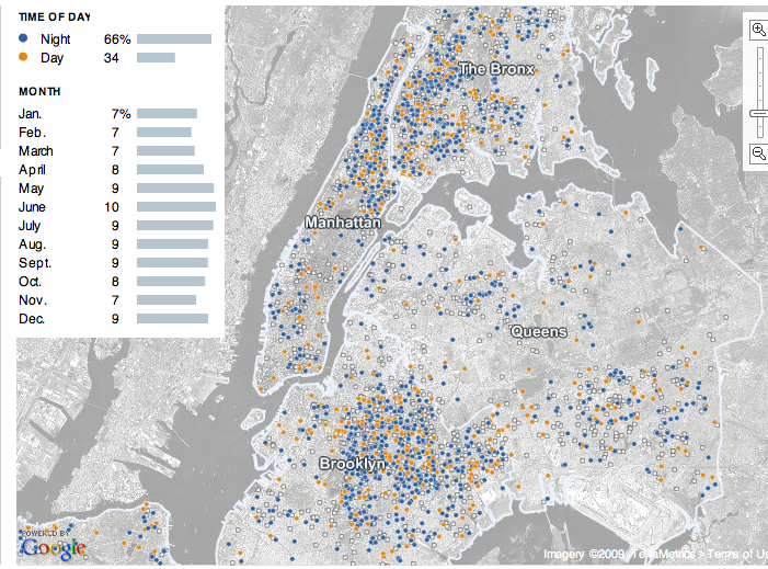
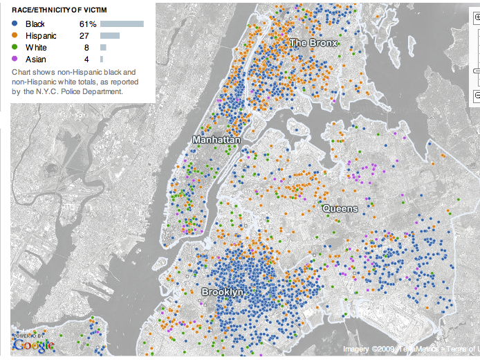
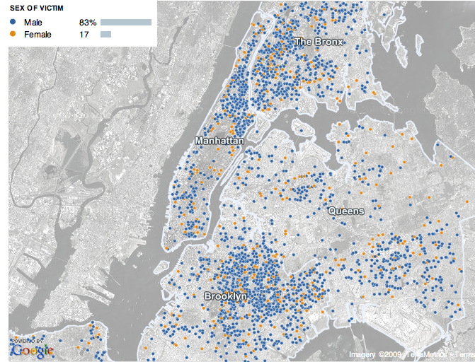
Miguel of El Forastero told us about an interactive map at the New York Times that presents data on murders in New York City from 2003 to today, broken down in various ways. The data come from NYPD reports, and of course there are definitely issues with taking police reports as a measure of actual crime, but my understanding is that while police reports on things like theft and rape are a poor measure of how often those crimes actually occur, they’re considered much more accurate regarding murder. In each map below, I include all murders from 2003 to 2009, but you can select particular years as well.

As many of us would suspect, the majority of murders occur at night (though the site didn’t specify exactly what hours are defined as “night” and “day”):
 picture_1

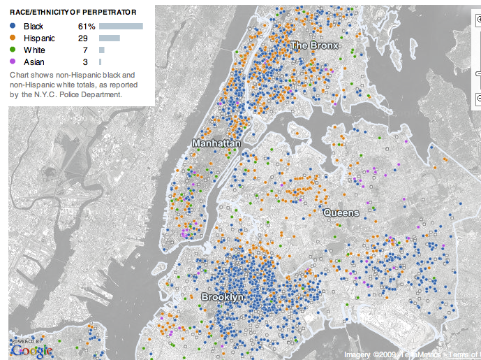
The racial breakdown of both victims and perpetrators are extremely similar:
picture_2

picture_3

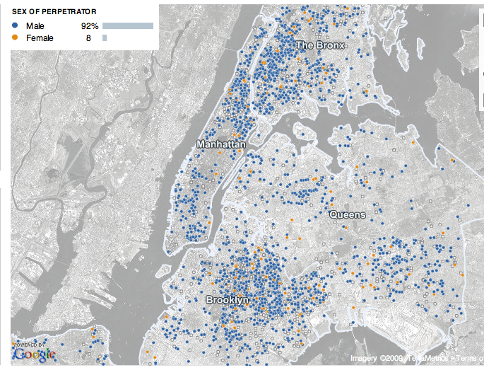
The next two maps show that murder is an overwhelmingly male activity. When I discuss crime with my students, they usually assume most perpetrators are male, but because their ideas of assult and murder often relate to domestic violence or rape, they are always very surprised to find out that most victims of murder are also male. As we see, women are more likely to be victims than they are to be perpetrators, but still, the vast majority of murder victims are men:
picture_4

picture_5

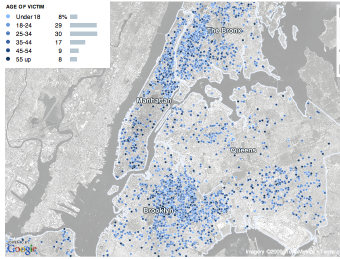
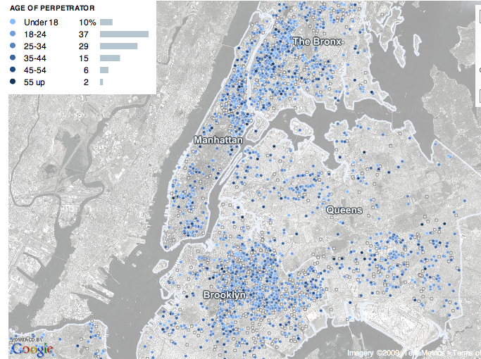
Murder is also linked to age, with 18 to 34 year olds being most likely to be murdered or to murder someone else:
picture_6

picture_7

I found the accompaning article in the NYT rather interesting as an example of overemphasizing the likelihood of murder. Here are the first two paragraphs:

A young boxer was shot dead outside a Bronx bodega at 3:30 a.m. on a Saturday last August. Weeks later, a 59-year-old woman was beaten to death on a Saturday night on the side of a Queens highway. On the last Sunday in September, violence exploded as five men were killed in a spate of shootings and stabbings between midnight and 6 a.m.

Seven homicides in New York City. None connected in any way but this: They happened during the summer months, when the temperatures rise, people hit the streets, and New York becomes a more lethal place.

A few paragraphs down:

Still, the prime time for murder is clear: summertime. Indeed, it is close to a constant, one hammered home painfully from June to September across the decades. And the breakdown of deadly brutality can get even more specific.

Only in paragraph 6 do we get this information:

Of course, the dominant and most important trend involving murder in New York has been the enormous decline in killings over the last 15 years, to levels not seen since the early 1960s.

From reading the first several paragraphs, the impression is that NYC is awash in a “spate” of murders, making it a “lethal” place full of “deadly brutality.” Only in one small section do they acknowledge that, in fact, murders are down significantly. Now, of course, that doesn’t take away from the horror of the murders that do occur, but it feels like a bit of fear-mongering. This is a common trend in the mass media–newscasts often give a lot of coverage to crimes, particularly murders and assaults, for instance–and it gives the public the idea that crime is common (and increasing) and the world is a dangerous place.

The emphasis on how dangerous summer is also seemed a bit disproportionate. As the first map above illustrates, yes, a higher percentage of murders occur June through September, but given the language of the article, you’d expect a much bigger difference between those months and other times of year.


Christopher F. brought our attention to how the release of the four Chinese Uighurs from Guantanmo is being framed in the media. Uighurs are a minority group in China, often facing persecution for being Muslim. These three men had fled China as a result and were detained after the U.S. invaded Afghanistan. They were found innocent in 2003. Now, after years at Guantanamo, they were released and resettled in Bermuda, since there were fears that they could not safely be returned to China. Some images of them in their new home (from USA Today):

6a00d83451b46269e201157114d51b970b1

6a00d83451b46269e20115711526a2970b

What brought Christopher’s attention to the coverage of the Uighurs was a news segment he saw on MSNBC. The Huffington Post has a video of the segment (I can’t figure out how to embed it) and quotes part of the discussion by Tamron Hall:

But first from Gitmo to Bermuda, should former detainees, the ones you’re looking at there, be living what seems to be a pretty good life on one of the most beautiful islands some say in the world?

Another MSNBC host, Andrea Mitchell, said the following in a segment earlier in the day:

Let me talk about Guantanamo: you raised the point about the murky legal situation, one upshot of that is that we’ve got four Uighurs who are Muslim minority from China who are now basically getting ice cream and lolling about on the white sand beaches of Bermuda. It’s sort of incongruous! To see these four men in their polo shirts, from Guantanamo, eating ice cream in Bermuda…I mean, look at that picture! I’m not sure you can see it, but one of the Uighurs is swimming in the ocean. The first time, we’re told, that they had ever been to the ocean. Is this a good outcome?

Over on The Daily Show, Jon Stewart echoed some of these ideas:

The Daily Show With Jon Stewart Mon – Thurs 11p / 10c
Guantanamo Baywatch – Uighur, Please
thedailyshow.com
Daily Show
Full Episodes
Political Humor Jason Jones in Iran

Christopher says, about the photos above,

These images humanize something that has been, for the past 7 or so years, totally inhuman and alien. I find it highly disturbing that even the image of these former detainees enjoying their deserved freedom (we have know for a while now that these people were not complicit in any plot against the United States) is somehow anathema.

Indeed. These are men who were falsely imprisoned as a supposed threat and then remained at Guantamo for years since they were declared innocent and no threat to the U.S. Why are images of them enjoying themselves and living in a nice house and eating ice cream so problematic and offensive? You know, this is just my thought, but if you imprison someone for years for no good reason, really, the least you can do is give them a nice place to live where they won’t be persecuted. And it’s not like they chose Bermuda: when you imprison people for supposed links to terrorist groups, it turns out that when you release them, other countries aren’t eager to take them (and clearly, they can’t be released in the United States because…well, because people in the U.S. still consider them threatening, despite what the government might say). Bermuda was one of the few places that would agree to take them. How the particular house or luxurious ice cream was chosen, I don’t know.

There seems to be an underlying feeling here that the Uighurs simply don’t deserve such nice living conditions, even if we did arrest them, fly them around the world, and detain them for years. Instead of focusing on the fact that several innocent people were released, and that they remained in Guantanamo for six years after the U.S. said they weren’t actually a threat, there’s concern that they were released in a place so nice. If most American citizens don’t live like that, why should they get to? I can’t help but wonder how the coverage might have been different if they were resettled in a poor nation and were shown living in a run-down house.

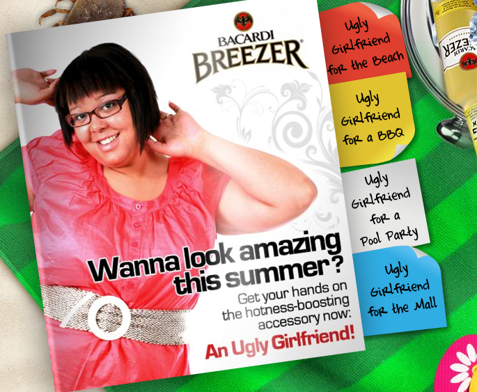
Kristin W., Brad W., and Deb G. sent us the Bacardi Breezers “Get an Ugly Girlfriend” ad campaign, discussed over at Jezebel. The message? Ladies, if you want to look better, get an ugly female friend to stand next to:

picture-12

There are profiles of the various ugly girlfriends you can get:

picture-21

picture-31

picture-41

picture-5

Of course this ad campaign suggests to women that the most important thing about them is how they look. But, more insidiously, as Sweet Machine points out, it places women “in competition with other women for male attention” in a world where “self-esteem is a zero-sum game.”

This is how patriarchy creates in-fighting among women: If men have the power, and the only way to get power is to get men, then women feel compelled to try to get (the attention of) a man (or men).  Other women are their competition.

Women are stereotyped as bitchy and catty as if it is an inherent feature of femininity when, in fact, women’s subordination to men creates the conditions that force them into competition.

We see it happen live in this horrendous clip from Battle of the Bods.

More examples of cultural endorsements of the idea that women and girls are always in competition with one another here, here, and here.

UPDATE: Commenter Joanne pointed out an update, via Shapely Prose:

Sean-Patrick Hillman of bacardi.com comments below:

June 21, 2009

Thank you for taking the time to post your story regarding Bacardi Breezer.

The campaign you are referring to ran in 2008 for two months in Israel. Even though Bacardi Breezer is not sold or distributed in the United States, we immediately notified the appropriate Bacardi affiliate and had this website shut down.

Bacardi proudly celebrates diversity and we do not endorse the views of this site.

We sincerely apologize to anyone who was offended by this site and thank you for bringing it to our attention.

I’m a bit confused, though–I did a quick google search, and Bacardi Breezer seems to be sold in a lot of places, including Canada and the U.S., but maybe they’re imported by a third party and not directly by Bacardi? I know I’d heard the name Bacardi Breezer before I saw these ads. Apparently I’m going to have to go on a tour of local liquor stores to see. What a horrible life I lead.

And I also agree with several of the other commenters–how awful must it be to be cast as an “ugly” person?

Toban B. sent in a link to a clip of a 1935 Department of the Interior movie that includes a scene with African American conservation workers. I couldn’t find an embed code, so you have to click over, but the clip clearly illustrates the “happy-go-lucky,” dancing and singing stereotype of Blacks common to the era. The person who posted the clip says,

The racial stereotyping in this clip is appalling, but not surprising for a 1935 production. Hollywood films of that era also portrayed African-Americans purely for laughs. It was a rare film that showed black people as more than two-dimensional, and when they did – as Hattie McDaniel demonstrated in Gone With The Wind – Hollywood was ready to pat itself on the back.

Of course, Spike Lee’s movie “Bamboozled” implied that this type of stereotypical Black-man-as-happy-man-child-entertainer trope is still alive and well. He’s been criticized for his portrayal, of course, but it’s food for thought.

Genderkid sent in a link to a story in The Morning News about the Teen and Transgender Comparative Study, an art installation by Charlie White at the Hammer Museum in L.A. A description from the story:

The series is a correlation of two stages of transformation, pairing teen girls (12-14) with like adult [transgender] male-to-female…

More from The Morning News:

In the images in White’s series, both figures are blossoming into womanhood, though each along a different path. As observers, however, we have been taught to view the subjects in much the same way: with sheer terror.

For just as the original 1950s Invasion of the Body Snatchers warned of Communism’s impending doom, and stories of men with hooks were concocted to frighten young girls from riding in cars with boys, so often have Hollywood summer comedies acted as cautionary tales for the male who would cast his desire toward either the pubescent or transgendered woman. Because in the right skirt or the right application of makeup, each has proved alluring to our hero…

Indeed, both sexy underage girls and transgender women who “fool” unsuspecting men are often portrayed as threats to (straight, adult) men. The “Lolita” figure is long-standing, and portrayals such as the Ally McBeal plotline in which a man falls in love with a transgender woman without knowing she is trans present the possibility of men being “fooled” into having sexual or even long-term romantic relationships with a transgender woman. Both teen girls and trans women are threatening and can get a guy in trouble.

Of course, we’re more accepting of one of these types of trouble than the other, and we shouldn’t be surprised that trans individuals who are “discovered” may face dire consequences for “fooling” men who have an intense investment in a rigid type of heterosexual identity and fear ridicule by peers, such as the three men who killed a transgender teen in California. (And I don’t mean to imply here that women don’t ever feel uncomfortable with or attack trans individuals, but the murders I’m aware of all included male perpetrators.)

Anyway, it’s a pretty fascinating set of images. Thanks, genderkid!

UPDATE: Commenter EGhead says,

This analysis also neglects that society insistently refuses to acknowledge transgendered women as women, even though they are, while insistently acknowledging girls as women, even though they aren’t.

Fair enough–I think that’s a good point.

Gwen Sharp is an associate professor of sociology at Nevada State College. You can follow her on Twitter at @gwensharpnv.

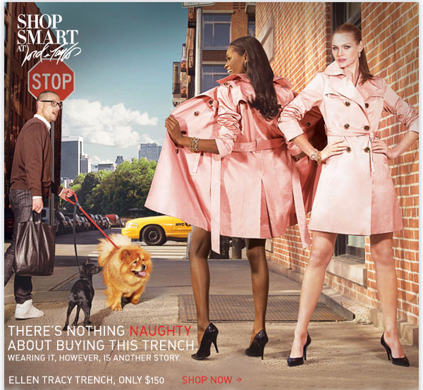
Way back in April Taylor sent in a link to a post at Media Assassin about some interesting depictions of Black women in a couple of ads. This one is for Lord and Taylor:

3623v2_01

Apparently the Black woman just can’t control her naughty self.

The rest of the post is not safe for work–the first image mildly so, the second one definitely not safe.

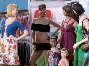
A screenshot from an Old Navy TV commercial, in which the Black model’s dress is torn off to show how in-demand the dresses are:

screen51-300x224

A United Colors of Benetton ad from the 1980s:

2546

About that ad, Benetton says,

Two images of the campaign for equality between black and white caused the strong reaction of the black community in the US: that of a black woman breastfeeding a white baby – which represents the most-awarded image in Benetton’s advertising history – and one featuring two male hands, one black, one white, handcuffed together.

Yes. I can really see how an image of a Black woman’s bare breast as she nurses a White baby would increase equality between the races. Because there’s no history of Black women caring for and nursing White children in a context of exploitation and…oh, wait. Right.

A recent ad for Michael Kors, sent in by Captain Crab:

1

In another post, Media Assassin quotes Kimberly Wallace-Sanders, author of Skin Deep, Spirit Strong: The Black Female Body in American Culture:

Images of Black women that are in fact “national, racial, and historical hallucinations” have been ingrained into the collective conscience of the United States since slavery. Black women have been depicted as either naked, generally in an ethnographic context, or as laborers, usually domestic, their social status playing a crucial role in the development of visual identity. With rare exceptions, representations of the Black woman in art and photography have followed these prescribed lines. (p. 182)

There are, of course, ads and other images that do not depict Black women in this manner, but it’s curious that we continue to see so many that do. For another discussion of the ways non-White women are often portrayed, check out Reading National Geographic by Catherine Lutz and Jane Collins.

[Apparently there was a problem with these links, but they’re fixed now.] Also check out our posts on vintage Jezebel-themed products, Black women portrayed as animals, Black women tending White women, and images of Condoleeza Rice.

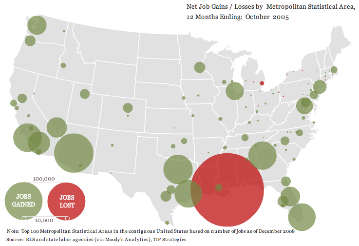
thewhatifgirl let us know about a really interesting interactive website that shows job gains and losses for the 100 largest metropolitan areas in the U.S. from the beginning of 2004 until March 2009, based on Bureau of Labor Statistics data. I took a few screenshots.

Right after Hurricane Katrina:

picture-4

From April 2006 to March 2007, the economy’s looking good for everybody but beleaguered Detroit:

picture-3

We start seeing a few more problem areas and a lot less job growth from April 2007 to March 2008:

picture-2

And then things go really badly. Notice the job loss circle in L.A. is so big that it got cut off on the website, and there’s not a single job growth circle [Note: eagle-eyed commenter Ali points out there are a few teensy job-gain circles, one in Louisiana, one around Austin, TX, and one way down at the tip of Texas along the border, and it’s possible there are some other small ones covered by the red]:

picture-11

UPDATE: Commenter Miss Prism cautions,

The maps could be straight out of “How to Lie with Statistics”, though.  The diameter (rather than the area) of the circles increases linearly with jobs lost, so a ten times bigger job loss gives the visual impression of being 100 times worse.

So just be aware that it’s how wide the circles are that indicates job loss.

Other posts on the economic meltdown: a county-level map, duplexes and home foreclosures, state budget shortfalls, who feels the recession?, Michigan’s economy, where stimulus money is going, U.S. household income and debt, defending private jet travel, all kinds of data from The Guardian, average stimulus dollars per person by state, unemployment rates by county, video on the credit crisis, framing the stimulus package, beer consumption, the New York Post monkey cartoon, a graph of job losses, gender and job loss, unsold cars, Hyundai’s job-loss insurance program, the economic downturn at the mall, employment/population ratio, home equity as a percent of net worth, advice to the rich: be discreet during a recession, different measures of joblessness, and changes in wages.

Andrew Gelman, over at FiveThirtyEight, presents a graph from data put together by Jeff Lax and Justin Phillips regarding opinions about various policies affecting gays and lesbians:

gay1

In another post, Nate Silver asks how public opinion about same-sex marriage might change if polls worded the question somewhat differently. Instead of asking “should the government allow same-sex couples to marry?”, we could just as well ask “should the government prevent same-sex couples from marrying?” He suggests that pro-gay-marriage groups might also frame the issue in this way–of keeping the government from taking away rights that people presumably already have rather than as the government giving new rights. It’s an interesting thought, and illustrates the role that question wording can play in affecting how survey respondents think about an issue.

UPDATE: Well, I was taken to task for not providing a better explanation of the graph. However, commenter Christopher explains it pretty well:

For each state, the status of seven public policies is listed as either pro- or anti-gay with seven colored circles which are either filled or empty with respect to the status. In addition, the position of the circle reflects the status of public opinion for each policy.

That is, each color represents one of the policies listed in the legend in the upper-left corner, so, for instance, red = public support for same-sex marriage. If the dot is filled in, it means gay-friendly legislation about the issue was actually passed in the state. If the dot is an empty circle, it means no gay-friendly legislation exists in the state. And the position of the circle tells you what percent of people in each state support each policy.