Miguel of El Forastero told us about an interactive map at the New York Times that presents data on murders in New York City from 2003 to today, broken down in various ways. The data come from NYPD reports, and of course there are definitely issues with taking police reports as a measure of actual crime, but my understanding is that while police reports on things like theft and rape are a poor measure of how often those crimes actually occur, they’re considered much more accurate regarding murder. In each map below, I include all murders from 2003 to 2009, but you can select particular years as well.
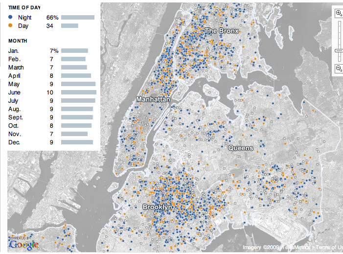
As many of us would suspect, the majority of murders occur at night (though the site didn’t specify exactly what hours are defined as “night” and “day”):
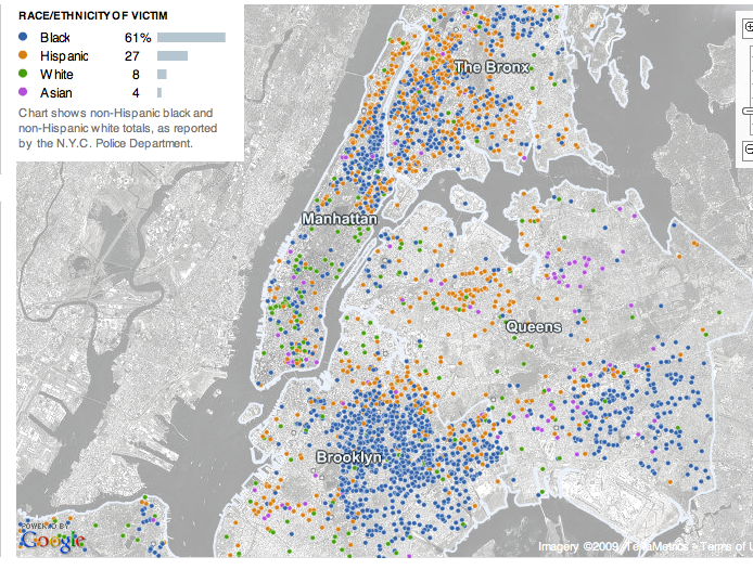
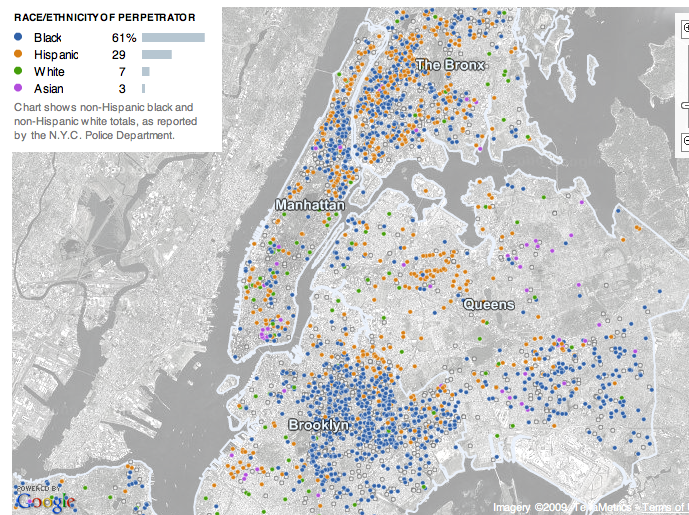
The racial breakdown of both victims and perpetrators are extremely similar:
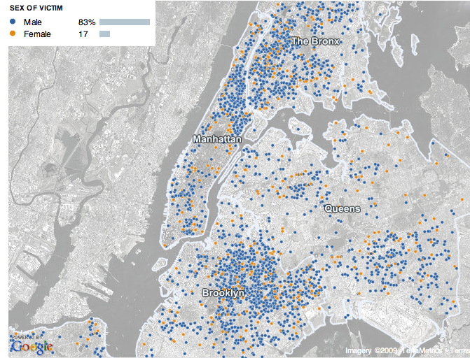
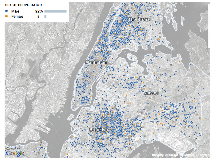
The next two maps show that murder is an overwhelmingly male activity. When I discuss crime with my students, they usually assume most perpetrators are male, but because their ideas of assult and murder often relate to domestic violence or rape, they are always very surprised to find out that most victims of murder are also male. As we see, women are more likely to be victims than they are to be perpetrators, but still, the vast majority of murder victims are men:
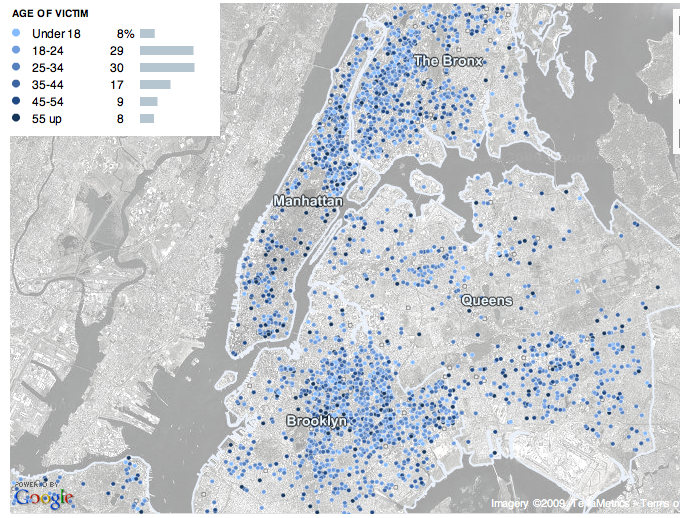
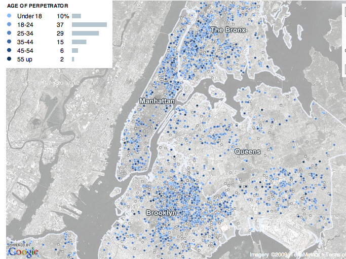
Murder is also linked to age, with 18 to 34 year olds being most likely to be murdered or to murder someone else:
I found the accompaning article in the NYT rather interesting as an example of overemphasizing the likelihood of murder. Here are the first two paragraphs:
A young boxer was shot dead outside a Bronx bodega at 3:30 a.m. on a Saturday last August. Weeks later, a 59-year-old woman was beaten to death on a Saturday night on the side of a Queens highway. On the last Sunday in September, violence exploded as five men were killed in a spate of shootings and stabbings between midnight and 6 a.m.
Seven homicides in New York City. None connected in any way but this: They happened during the summer months, when the temperatures rise, people hit the streets, and New York becomes a more lethal place.
A few paragraphs down:
Still, the prime time for murder is clear: summertime. Indeed, it is close to a constant, one hammered home painfully from June to September across the decades. And the breakdown of deadly brutality can get even more specific.
Only in paragraph 6 do we get this information:
Of course, the dominant and most important trend involving murder in New York has been the enormous decline in killings over the last 15 years, to levels not seen since the early 1960s.
From reading the first several paragraphs, the impression is that NYC is awash in a “spate” of murders, making it a “lethal” place full of “deadly brutality.” Only in one small section do they acknowledge that, in fact, murders are down significantly. Now, of course, that doesn’t take away from the horror of the murders that do occur, but it feels like a bit of fear-mongering. This is a common trend in the mass media–newscasts often give a lot of coverage to crimes, particularly murders and assaults, for instance–and it gives the public the idea that crime is common (and increasing) and the world is a dangerous place.
The emphasis on how dangerous summer is also seemed a bit disproportionate. As the first map above illustrates, yes, a higher percentage of murders occur June through September, but given the language of the article, you’d expect a much bigger difference between those months and other times of year.

Comments 19
Dmitriy — June 25, 2009
I am little surprised at how little crime there is in Central Park.
Duran — June 25, 2009
Gwen, do you or your students delve into why they are surprised to find out that so few victims are female?
Gwen Sharp, PhD — June 25, 2009
Yes--as I said, when they think "assault" and, to a slightly lesser degree "murder," they connect it to domestic violence, which they then assume is always men hitting/hurting women. So there's a lot to pick apart there.
Duran — June 25, 2009
Why do you think they "assume it's always men hitting/hurting women"? Do you think the media or any of various social movements have anything to do with that?
Morag — June 25, 2009
I'm wondering if the students expectation of more female victims is partly due to the way violence or the threat of violence against women is still a common plot element in film and tv, including the news.
A female character can be threatened or scared in a way that may be seen as weakening a male character. A female character is strong if she is terrified but escapes and runs away - a male character has to at least fight off his assailants to get the same level of screen dignity. The male characters can be distressed by the threat to a woman or child, but if they are overly concerned for their kidnapped male friend it is a bit humiliating for the friend. And there's obviously the titillation element. My young cousins desperately wanted to see the latest X-Men, the first big action film I've seen for years. It was upsetting to see how the old cliche of sleazing onto/killing the girlfriend to hurt the guy was still going strong, despite superficially more active female characters.
Everyone knows action films and TV dramas are unrealistic, but they obviously colour our perceptions of who a victim is. And when a relatively wealthy, beautiful, white woman or girl is a victim of murder, they get so much more media attention than a poor black murdered man, so that just reinforces the image in the back of our heads.
Christopher — June 25, 2009
I would really like to see these maps weighted by population density (residences + jobs). That way, one could see where the murder rates are disproportionately high. That is, in my opinion, much more interesting.
Links of the Day (6/25/09) | my five year plan. — June 25, 2009
[...] Sociological Images Analyzes the NYC Homicide Map [...]
Hank — June 25, 2009
What's special about Queens that there are so few murders there?
Michael — June 25, 2009
I think the age graphs could be reworked a bit. To me, the darker colors stand out more than the lighter ones (so I can tell older victims/perpetrators more than the younger ones). I'd rather see the dots colored distinctly, like red/orange/yellow/green/blue.
Also, would it be possible to combine the perpetrator maps with their corresponding victim maps? Something like having the left half a circle tell information about the perpetrator and the right half having information about the victim. It would be interesting to see how many murders are committed across age or racial categories.
lgreen — June 25, 2009
I thought it was interesting that, at least in my neighborhood, people generally kill people like themselves (at least in superficial age/gender/ethnicity ways). But we're so afraid of the "other". Weird.
Dubi — June 25, 2009
A. Morag - is it only TV and films? Our culture generally treats women as more prone to becoming victims. It's not unrealistic, when you consider that being raped is, in more than one aspect, worst than being murdered. For instance, where I live, at least, buses will stop between stops at night, but only for women. So the perception that men needn't be afraid of violence is supported by many cues from society, not only from popular culture.
B. Trivia: do you know what year started the decline in murder rate in the US? 1994. Know what else happened in 1994? The video game Doom came out (actually, it was December 1993, same thing). QED.
lgreen — June 25, 2009
Hank - Queens is awesome. But also, the word "Queens" is right over a huge park, and a lot of the empty area around it is other parks and neighborhoods with a lot of single-family homes (so, less populated). The rest of Queens looks pretty much comparable to the northern Bronx and south Brooklyn,. I want to see this related to population density too.
Patrick Inglis — June 25, 2009
It's surprising to me that there's scarcely any discussion here about socioeconomic class. Check out the murder rates in the Upper West and Upper East Sides, for instance, or the murder rates in Park Slope, Brooklyn, and then compare with Spanish Harlem or Bed Stuy and Crown Heights in Brooklyn. If you're familiar with New York City, just to look at the interactive maps is to see a pattern. The murder rate is higher in typically poor and working class neighborhoods than in wealthier neighborhoods. Heat is one thing, density another, and race yet one more, but these are distractions, I think, from class, which appears to be the biggest predictor of all. I write more about this at my website: http://www.patrickinglis.com/main/2009/06/murder-in-new-york.html. Would love to hear more about what others think.
Peter — June 26, 2009
Are these derived from geocoded street addresses from crime reports? That would explain the apparent lack of crime in parks, re: dimitry's comment.
Fernando — June 26, 2009
I don't undestand how people would be surprised that most murder victims are also male.
I've never been new york, and I don't know much about NY, but my guess is that those areas with the most crimes are where poor populations concentrate, and probably most of the murders are related to drug dealing. That's pretty much how it is for a lot of major cities.
Alyssa — June 26, 2009
It's too bad that the map cuts off half of Brooklyn, including my neighborhood.
Morag — June 26, 2009
Dubi - I find it a bit disturbing that they'll only stop for women, but I have seen subtler forms of that. My friends will often ask for a text to say I got home safe, if I leave a party on my own. I doubt they'd ask my male partner in the same situation. I'm not sure how much of it is an expectation that I'm more likely to meet with violence, more that as a woman they think I will be able to defend myself less.
As for rape being worse than murder - absolutely no. I've been a victim of pretty serious sexual assault, when I was working as a bartender and got a lift to a party from a friend of the manager. Bitterly enough, my co-workers had suggested it for my safety rather than walking to the bustop. It was hard, both what happened and the court case. I was only 21 and was stunned by my sense of shame, despite knowing it was not my fault. BUT I'm not dead, and while it was a horrible horrible experience, it didn't ruin my life.
(In fact, 10 years on, I can't really think of any lasting impact its had on me. I don't really have any emotional connection to it when I think about it. Some of it even seems funny - like he was trying to get my trousers off me by force, but was genuinely shocked that I swore at him, because that was unladylike.)
Verlinkenswertes (KW 26/09) | Criminologia — June 27, 2009
[...] Maps of Homicides in NYC (Sociological Images, 25.06.2009) [...]
Ben — June 28, 2009
In the piece you say the racial make up of the perp/victim graphs are quite similar. The actual figures are broadly similar - which you would expect - but they distributions are subtly different I think.
For example, the places where white people are likely to be victims (Manhattan), are not the same places where white people are most likely to be perps (broad distribution). I would imagine that these reflect class differences within the sub-group 'white' so more socio-economic data might clear that up.