nation: United States

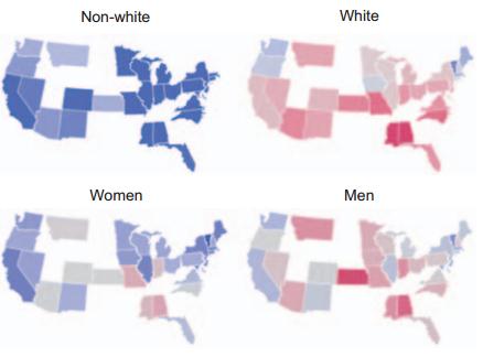
Philip Cohen, at Family Unequal, used FBI crime reports to put together this telling graph:

1

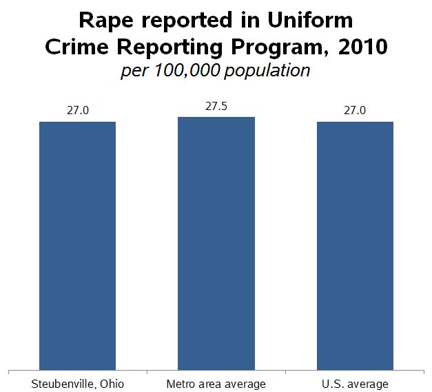
We need to remember that Steubenville is us and we are Steubenville.

Lisa Wade, PhD is an Associate Professor at Tulane University. She is the author of American Hookup, a book about college sexual culture; a textbook about gender; and a forthcoming introductory text: Terrible Magnificent Sociology. You can follow her on Twitter and Instagram.

While some austerity advocates really fear (although incorrectly) the consequences of deficit spending, the strongest proponents are actually only concerned with slashing government programs or the use of public employees to provide them.  In other words their aim is to weaken public programs and/or convert them into opportunities for private profit. One measure of their success has been the steady decline in public employment.  Floyd Norris, writing in the New York Times notes:

For jobs, the past four years have been a wash.

The December jobs figures out today indicate that there were 725,000 more jobs in the private sector than at the end of 2008 — and 697,000 fewer government jobs. That works into a private-sector gain of 0.6 percent, and a government sector decline of 3.1 percent.

In total, the number of people with jobs is up by 28,000, or 0.02 percent.

How does that compare? It is by far the largest four-year decline in government employment since the 1944-48 term. That decline was caused by the end of World War II; this one was caused largely by budget limitations.

The chart below, taken from the same post, also reveals just how weak private sector job creation has been over the past 12 years (compare the top three rows — the presidencies of Obama and Bush — w job changes This graphic from the New York Times highlights just how significant the decline in public employment has been in this business cycle compared with past ones.  Each line shows the percentage change in public sector employment for specified months after the start of a recession.  Our recent recession began December 2007 and ended June 2009.   As you can see, what is happening now is far from usual.

1

It is also worth noting that despite claims that most Americans want to see cuts in major federal government programs, the survey data show the opposite.  For example, see the following graphic from Catherine Rampell’s blog post. economix-22pewwhattocut-blog480 As Rampell explains:

In every category except for “aid to world’s needy,” more than half of the respondents wanted either to keep spending levels the same or to increase them. In the “aid to world’s needy” category, less than half wanted to cut spending.

Not surprisingly, this assault on government spending and employment will have real consequences for the economy and job creation. All of this takes us back to the starting point — we are talking policy here.  Whose interests are served by these trends?

Martin Hart-Landsberg is a professor of economics at Lewis and Clark College. You can follow him at Reports from the Economic Front.

Cross-posted at Montclair SocioBlog.

The Washington Post has provided some data on medical costs across a selection of countries (Argentina, Canada, Chile, and India in grey; France, Germany, Switzerland, and Spain in blue; and the U.S. in red). The data reveal that American health care is very expensive compared to other countries.

1

No wonder the US spends twice as much as France on health care.  In 2009, the U.S. average was $8000 per person; in France, $4000.  (Canada came in at $4800).  Why do we spend so much?  Ezra Klein quotes the title of a 2003 paper by four health-care economists:  “it’s the prices, stupid.”

And why are US prices higher?  Prices in the other OECD countries are lower partly because of what U.S. conservatives would call socialism – the active participation of the government.  In the U.K. and Canada, the government sets prices.  In other countries, the government uses its Wal-Mart-like power as a huge buyer to negotiate lower prices from providers.  (If it’s a good thing for Wal-Mart to bring lower prices for people who need to buy clothes, why is it a bad thing for the government to bring lower prices to people who need to buy, say, an appendectomy? I could never figure that out.)

There may also be cultural differences between the U.S. and other wealthy countries, differences about whether greed, for lack of a better word, is good.  How much greed is good, and in what realms is it good?  Klein quotes a man who served in the Thatcher government:

Health is a business in the United States in quite a different way than it is elsewhere.  It’s very much something people make money out of. There isn’t too much embarrassment about that compared to Europe and elsewhere.

So we Americans roll along, paying several times what others pay for medical procedures, doctor visits, and drugs.

Jay Livingston is the chair of the Sociology Department at Montclair State University. You can follow him at Montclair SocioBlog or on Twitter.

Cross-posted at Reports from the Economic Front.

While newspapers give a lot of ink to arguments about whether reducing the budget deficit will boost or reduce growth, they seem to have little interest in the related issue of whether economic growth really benefits the great majority.

David Cay Johnston, the Pulitzer Prize winning financial journalist, recently addressed this issue drawing on the work of economists Emmanuel Saez and Thomas Piketty:

In 2011 entry into the top 10 percent… required an adjusted gross income of at least $110,651. The top 1 percent started at $366,623.

The top 1 percent enjoyed 81 percent of all the increased income since 2009. Just over half of the gains went to the top one-tenth of 1 percent, and 39 percent of the gains went to the top 1 percent of the top 1 percent.

Ponder that last fact for a moment — the top 1 percent of the top 1 percent, those making at least $7.97 million in 2011, enjoyed 39 percent of all the income gains in America.

So, 81 percent of all the new income generated from 2009 to 2011 was captured by the top 1 percent income earners, where income is defined as adjusted gross income, which refers to income minus deductions or taxable income.  In other words, growth, even accelerated growth, is not going to do the majority much good if the economic structure remains the same.

Johnston highlights the problem with our existing economic model with perhaps an even more shocking example.  He compares the average income growth of the bottom 90 percent with the average income growth of the top 10 percent, 1 percent, and top 1 percent of the top 1 percent over the period 1966 to 2011.

It turns out that the average income of the bottom 90 percent rose by a miniscule $59 over the period (as measured in 2011 dollars).  By comparison, the average income of the top 10 percent rose by $116,071, the average income of the top 1 percent rose by $628,817, and the average income of the top 1 percent of the top 1 percent increased by a whopping $18,362,740.  In short, growth alone means little if the great majority of people are structurally excluded from the benefits.

In an effort to highlight this extreme disparity in adjusted income growth rates, Johnston suggests plotting the numbers on a chart, with $59, the amount gained by the bottom 90 percent, represented by a bar one inch high.  As the chart below shows, the bar representing average gains for the top 10 percent would be 163 feet high, that for the top 1 percent would be 884 feet high, and that for the top 1 percent of the top 1 percent would be 4.9 miles high.

1

In sum, the real challenge facing the great majority of Americans is not figuring out how to make the economy growth faster.  Rather, it is figuring out how to create space for a real debate about how to transform our economy so that growth will actually satisfy majority needs.

Martin Hart-Landsberg is a professor of economics at Lewis and Clark College. You can follow him at Reports from the Economic Front.

Cross-posted at Montclair SocioBlog.

Jeb Bush told CPAC that the Republican party had an image problem.

Way too many people believe that Republicans are anti-immigrant, anti-woman, anti-science, anti-gay, anti-worker.

People have good reason to believe those things.  But the “way too many” suggests that the GOP’s problem is not image or brand, it’s demography.  For five years or longer, the Republican faithful have been complaining that “their” country was being taken away from them, and they were going to take it back (e.g., see my “Repo Men” post).

They were right.  Their country, a country dominated by older white men, is fading in the demographic tide.  The groups whose numbers in the electorate are on the rise don’t look like them.  Andrew Gelman (here) recently published these graphs as an update to his 2009 Red State, Blue State.  They reveal the tendency for different groups to vote more Democratic (blue) and Republican (red):

1

(The exit poll the data are based on sampled only in the 30 most competitive state. Texas and Georgia are large, and they have significant non-White populations. But demographic changes there are unlikely to have much effect on which party gets their electoral votes.)

Unfortunately for the GOP, the non-White proportion of the electorate will continue to grow. The female proportion may also increase, especially as education levels of women rise (more educated people are more likely to vote than are the less educated).

The key factor is party loyalty.  And, at least in presidential elections, people do remain loyal. I think I once read, “If you can get them for two consecutive elections, you’ve got them for life.”  Or words to that effect.  If that’s true, the age patterns of the last two elections should be what the Republicans are worrying about.

2

Trying to make themselves more attractive to younger people will not be easy.  Oldsmobile tried it not so long ago (a post on that campaign is here).  “This is not your father’s GOP” might have similar lack of success.  But insisting that this is still your father’s GOP (or more accurately, some white dude’s father’s GOP) seems like a formula for failure.

Jay Livingston is the chair of the Sociology Department at Montclair State University. You can follow him at Montclair SocioBlog or on Twitter.

Last week many media outlets were busy celebrating the Dow Jones record high, suggesting that it was indicative of the United States’ recovery from the greatest economic downturn since The Great Depression.  The graph below comes from a New York Times story with the headline “As Fears Recede, Dow Industrial Hits a Milestone.”

However, another story buried in the Business section of the New York Times, titled “Recovery in U.S. Is Lifting Profits, but Not Adding Jobs,” contains a graph illustrating how the supposed economic recovery is bitter-sweet at best:

2

The second graph uses data from the Bureau of Economic Analysis to highlight the fact that corporate profits and stock prices are at record highs, but the share of profits workers have taken home has steadily dropped since the early 1980s.  Some of the steepest declines have come during the last few years, or during the supposed “recovery.”

These two graphs illustrate that while ”The Market” is probably considered the go-to indicator of economic well-being, stock indexes are not always indicative of the economic reality experienced by non-investors.  If businesses and corporations were increasing their stock value by investing to expand productivity, thereby creating good-paying jobs and opportunities for workers, rising markets would be a sign good of economic times for all.  But this data suggests that is not what is happening; instead, as the twin charts show, rising corporate profits are at least partly the result of wage suppression.

Jason Eastman is an Assistant Professor of Sociology at Coastal Carolina University who researches how culture and identity influence social inequalities.

Emma K. submitted a sobering illustration of wealth inequality in the U.S.  It compares American ideal distributions of wealth, with what they think it is and what it really is. Suffice to say, Americans wish for more equal distributions, but the reality far outpaces their worst nightmare.

Here’s a snapshot:

1

A worthwhile 6 minutes:

Lisa Wade, PhD is an Associate Professor at Tulane University. She is the author of American Hookup, a book about college sexual culture; a textbook about gender; and a forthcoming introductory text: Terrible Magnificent Sociology. You can follow her on Twitter and Instagram.

The  International Society of Aesthetic Plastic Surgeons has released new data on the incidence of invasive and non-invasive cosmetic procedures.  The U.S. leads in sheer numbers of procedures but, accounting for population, we fall into 4th place.  South Korea leads for the number of procedures per person, followed by Greece and Italy.

1

By far the most common kinds of surgical cosmetic procedures are lipoplasty and breast augmentation.  Along with fat, breasts seem to be a particular concern: breast lifts and breast reductions for both men and women are also in the top ten.  Abdominoplasty, nose jobs, eyelid surgeries, and facelifts are as well.

2

The incidence of these surgeries is strongly related to everything from the gender binary to global power dynamics.  In 2008 we reported that male breast reductions were the most common cosmetic surgery for 13-19 year olds (boys and girls combined). You would be shocked at what counts as excess breast tissue and how little the before and after photos look.  Boys and men getting breast reductions, alongside women getting augmentations, is obviously about our desire for men and women to be different, not naturally-occurring difference.  See The Story of My Man-Boobs for more.

Likewise, we’ve posted about surgeries that create an epithelial fold, a fold of skin in the eyelid more common in people with White than Asian ethnic backgrounds.  This surgery is a trend among Asians and Asian-Americans, as colonization has left us with an association between Whiteness, attractiveness, and power.

The Economist summarizes some other trends:

Breast augmentation, the second biggest surgical procedure, is most commonly performed in America and Brazil. Buttock implants are also a Brazilian specialty, as is vaginal rejuvenation. Asia is keen on nose jobs: China, Japan and South Korea are among the top five nations for rhinoplasty.

More on where and how many procedures are being performed, but nothing on why, at the ISAPS report.

Image at The Economist; via Global Sociology.

Lisa Wade, PhD is an Associate Professor at Tulane University. She is the author of American Hookup, a book about college sexual culture; a textbook about gender; and a forthcoming introductory text: Terrible Magnificent Sociology. You can follow her on Twitter and Instagram.