nation: United States

Cross-posted at Racialicious and Family Inequality.

Trying to summarize a few historical trends for the last half century, I thought of framing them in terms of diversity.

Diversity is often an unsatisfying concept, used to describe hierarchical inequality as mere difference. But inequality is a form of diversity — a kind of difference. And further, not all social diversity is inequality. When people belong to categories and the categories are not ranked hierarchically (or you’re not interested in the ranking for whatever reason), the concept of diversity is useful.

There are various ways of constructing a diversity index, but I use the one sometimes called the Blau index, which is easy to calculate and has a nice interpretation: the probability that two randomly selected individuals are from different groups.

Example: Religion

Take religion. According to the 2001 census of India, this was the religious breakdown of the population:

1.jpg

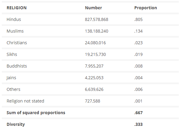
Diversity is calculated by summing the squares of the proportions in each category, and subtracting the sum from 1. So in India in 2001, if you picked two people at random, you had a 1/3 chance of getting people with different religions (as measured by the census).

Is .33 a lot of religious diversity? Not really, it turns out. I was surprised to read on the cover of this book by a Harvard professor that the United States is “the world’s most religiously diverse nation.” When I flipped through the book, though, I was disappointed to see it doesn’t actually talk much about other countries, and does not seem to offer the systematic comparison necessary to make such a claim.

With our diversity index, it’s not hard to compare religious diversity across 52 countries using data from World Values Survey, with this result:

2

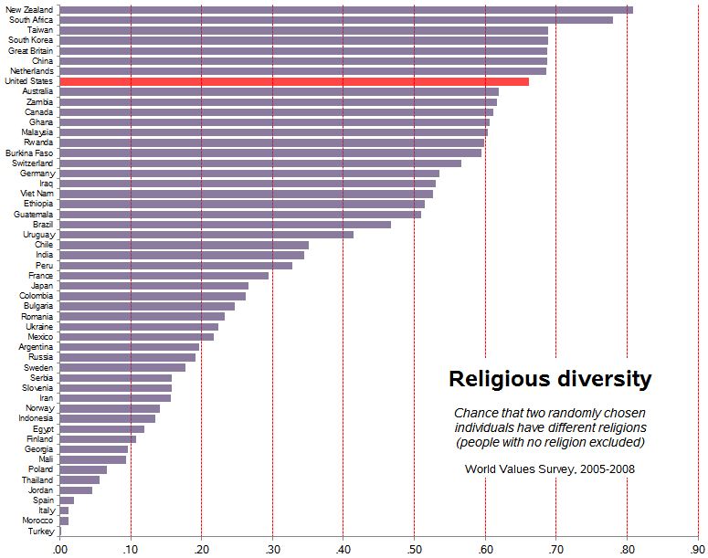
The U.S. is quite diverse — .66 — but a number of countries rank higher.


Increasing U.S. Diversity

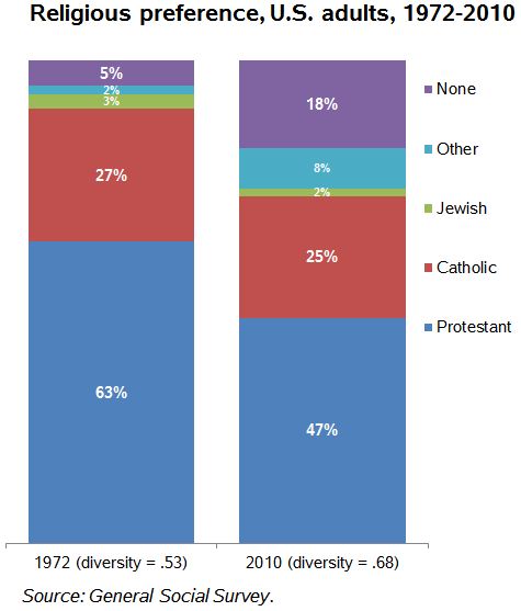
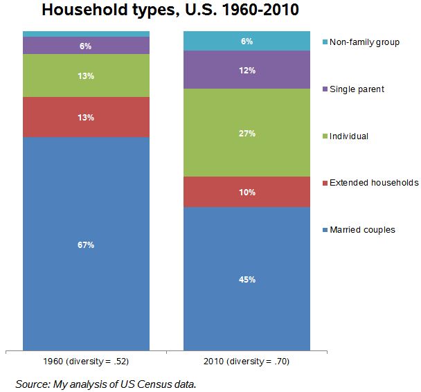
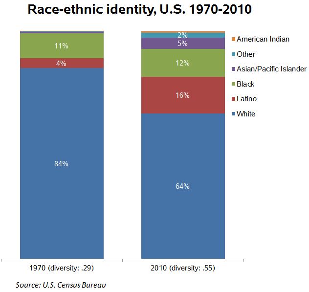
Anyway, back to describing the last half century in the U.S. On four important measures I’ve got easy-to-identify increasing diversity:

3

5

4

6

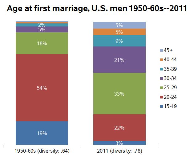
The last one is a little tricky. It’s common to report that the median age at marriage has increased since the 1950s (having fallen before the 1950s). But I realized it’s not just the average increasing, but the dispersion: More people marrying at different ages. So the experience of marriage is not just shifting rightward on the age distribution, but spreading out. Here’s another view of the same data:

7

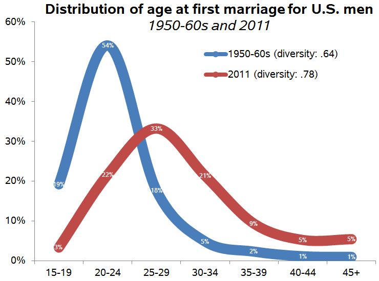
I calculated these using the Panel Study of Income Dynamics from 1968 (for those married in the years 1950-1968) and comparing it with the 2011 American Community Survey for those married in the previous year. There might be a better way, of course.

I have complained before that using the 1950s or thereabouts as a benchmark is misleading because it was an unusual period, marked by high conformity, especially with regard to family matters. But it is still the case that since then diversity on a number of important measures has increased. Over the period of several generations, in important ways the people we randomly encounter are more likely to be different from ourselves (and each other).

Philip N. Cohen is a professor of sociology at the University of Maryland, College Park, and writes the blog Family Inequality. You can follow him on Twitter or Facebook.

In 2009, 470,000 15-year-olds in 65 developed nations took a science test.  Boys in the U.S. outperformed girls by 14 points: 509 to 495.  How does the U.S. compare to other countries?

The figure below — from the New York Times — features Western and Northern Europe and the Americas (in turquoise), Asia and the Pacific Islands (in pink), and the Middle East and Eastern and Southern Europe (in yellow).  The line down the middle separates societies in which boys scored higher than girls (left) and vice versa (right).

Notice that the countries in which boys outscore girls are overwhelmingly Western and Northern Europe and the Americas.

This data tells a similar story to the data on gender and math aptitude.  Boys used to outperform girls in math in the U.S., but no longer.  And if you look transnationally, cultural variation swamps gender differences.  Analyses have shown that boys outperforming girls in math is strongly correlated with the degree of inequality in any given society.

One lesson to take is this: any given society is just one data point and can’t be counted on to tell the whole story.

Via The Global Sociology Blog.

Lisa Wade, PhD is an Associate Professor at Tulane University. She is the author of American Hookup, a book about college sexual culture; a textbook about gender; and a forthcoming introductory text: Terrible Magnificent Sociology. You can follow her on Twitter and Instagram.

The current political discourse is so focused on a single form of government revenue, that the word taxes has become essentially synonymous with just one tax in particular; the federal income tax.  In fact, unless there is a foreign policy crisis, the federal income tax usually dominates most political discussion given how the federal budget (or increasingly the federal debt) relates to almost anything and everything the federal government does (or does not do in more and more instances).

For example, during the closing months of 2012 we watched how a fight over a sunset of the Bush Tax Cuts almost shoved the United States over a fiscal cliff.  Just prior to this near crisis, the most discussed difference between 2012 presidential candidates was their disagreement about a 4 point increase in the highest federal income bracket.  Also, Mitt Romney will likely be remembered mostly for his disparagement and disregard of “The 47% of United States Citizens who pay no federal income tax.”

However, limiting discussion about government funding and spending to just the federal income tax and ignoring the other types of payments we make to the treasury is not without consequence, especially given how the federal income tax is actually a very unique kind of tax.  Unlike excise taxes, payroll deductions, sales taxes and most property taxes that are regressive or require the poor to pay a larger proportion of their resources than the wealthy; the federal income tax is one of the few progressive taxes in the United States because at least on paper (I say that because these marginal rates often do not equate the larger effective rates given that the wealthy are afforded more loopholes, deductions, and lower rates on investment income), the rich pay larger marginal rates than the middle-class and poor.   Thus, with our political discussion largely limited to the federal income tax, it should come as no surprise conservatives are so easily able to frame “The State,” especially the federal government, as a perverse Robin Hood who steals from the rich (the makers as they are being called now) to give to the poor (the takers).

The non-profit, non-partisan Institution on Taxation and Economic Policy recently released its research on the taxes families in the United States paid in 2010.  These findings reveal when the focus is taken off the federal income tax and the entire tax system is examined, cumulative household taxes in nearly every state are regressive because the less money a family makes, the larger proportion they pay to the different levels of government.  As the graph below shows, the cumulative tax system is regressive because sales, excise and property taxes offset progressive income taxes at both the state, and federal levels.

The tax system as a whole is largely regressive because the higher one’s class standing, the lower the proportion of total taxes they pay.  While the report provides great details in the variations across each state, the graph below shows that on average, the lowest 20% of earners pays an overall tax rate that is more than twice of what the top 1% of earners pay.

While many citizens perceive the U.S. tax code as inherently unfair because the wealthy have higher marginal rates on their federal income tax (the only one anyone ever seems to talk about); an examination of the entire system reveals the opposite as cumulatively, the poor pay a larger proportion of their income to local, state, and the federal governments.

—————————

Jason Eastman is an Assistant Professor of Sociology at Coastal Carolina University who researches how culture and identity influence social inequalities.

For 100 years Valentine’s Day was not only associated with sweet sentiments, but was an occasion to send a cruel and biting message to someone you didn’t like.  These cards — called “vinegar valentines” — were popular from 1840 to 1940 in both America and the U.K.

1Annebella Pollen, an art and design historian who talks about the valentine’s at Collector’s Weekly, explains that there was a valentine for many types of people and occasions:

 You could send them to your neighbors, friends, or enemies. You could send them to your schoolteacher, your boss, or people whose advances you wanted to dismiss. You could send them to people you thought were too ugly or fat, who drank too much, or people acting above their station. There was a card for pretty much every social ailment.

23

Pollen insists that people did send them to one another, albeit anonymously, and they were not meant to be jokes. Instead, they were meant to say: “Your behavior is unacceptable.”  For much of the 1800s there was no such thing as a pre-paid stamp, so the person who got the mail paid for it, so often they were forced to buy their own insults, a twist of the knife from the sender.

4

Many, many more vinegar valentine’s at Collector’s Weekly, where I also stole this great title.  Via BoingBoing.

Lisa Wade, PhD is an Associate Professor at Tulane University. She is the author of American Hookup, a book about college sexual culture; a textbook about gender; and a forthcoming introductory text: Terrible Magnificent Sociology. You can follow her on Twitter and Instagram.

An expanded version of this post is cross-posted at Montclair SocioBlog.

Six years ago, I wrote that the Pittsburgh Steelers had become “America’s Team,” a title once claimed, perhaps legitimately, by the Dallas Cowboys.

Now Ben Blatt at The Harvard College Sports Analysis Collective concludes that it’s still the Cowboys:

…based on their huge fan base and ability to remain the most popular team coast-to-coast, I think the Dallas Cowboys have earned the right to use the nickname  ‘America’s Team’.

To get data, Blatt posed as an advertiser and euchred Facebook into giving him some data from 155 million Facebook users, about half of the US population.  Blatt counted the “likes” for each NFL team:

It’s Superbowls X, XIII, and XXX all over again – Steelers vs. Cowboys.  And the Cowboys have a slight edge.  But does that make them “America’s Team”? It should be easy to get more likes when you play to a metro area like Dallas that has twice as many people as Pittsburgh.  If the question is about “America’s Team,” we’re not interested in local support.  Just the opposite: if you want to know who America’s team is, you should find out how many fans it has outside its local area.

Unfortunately, Blatt doesn’t provide that information. So for a rough estimate, I took the number of Facebook likes and subtracted the metro area population.  Most teams came out on the negative side. The Patriots, for example, had 2.5 million likes. but they are in a media market of over 4 million people.  The Cowboys too wound up in the red  3.7 million likes in a metro area of 5.4 million people.

Likes outnumbered population for only five teams.  The clear winner was the Steelers.

Jay Livingston is the chair of the Sociology Department at Montclair State University. You can follow him at Montclair SocioBlog or on Twitter.

Cross-posted at Reports from the Economic Front.

The media continues to direct our attention to deficits and debt as our main problems.  Yet, it does little to really highlight the causes of these deficits and debts.

The following two figures from the Center on Budget and Policy Priorities help to clarify the causes.  It is important to note that the projections underlying both figures were made before the recent vote making permanent most of the Bush-era tax cuts.

Figure 1 shows the main drivers of our large national deficits: the Bush-era tax cuts, the wars in Iraq and Afghanistan, and our economic crisis and responses to it.  Without those drivers our national deficits would have remained quite small.

10-10-12bud-f1

Figure 2 shows the main drivers of our national debt. Not surprisingly they are the same as the drivers of our deficits.

10-10-12bud-f2

Significantly, the same political leaders that scream the loudest about our deficits and debt have little to say about stopping the wars or reducing military spending and are the most adamant about maintaining the Bush-era tax cuts.  That is because, at root, their interest is in reducing spending on non-security programs rather than reducing the deficit or debt.

Some of these leaders argue that the tax cuts will help correct our economic problems and thereby help reduce the deficit and debt.  However, multiple studies have shown that tax cuts are among the least effective ways to stimulate employment and growth.  In contrast, the most effective are sustained and targeted government efforts to refashion economic activity by spending on green conversion, infrastructure, health care, education and the like.

While Republicans and Democrats debate the extent to which taxes should be raised, both sides appear to agree on the need to rein in federal government spending in order to achieve deficit reduction.  In fact, federal government spending has been declining both absolutely and, as the following figure from the St. Louis Federal Reserve shows, as a share of GDP.

government-spending-as-a-percent-of-gdp

In reality, our main challenge is not reducing our deficit or debt but rather strengthening our economy, and cutting government spending is not going to help us overcome that challenge.  As Peter Coy, writing in BusinessWeek explains:

It pains deficit hawks to hear this, but ever since the 2008 financial crisis, government red ink has been an elixir for the U.S. economy. After the crisis, households strove to pay down debt and businesses hoarded profits while skimping on investment. If the federal government had tried to run balanced budgets, there would have been an enormous economy wide deficit of demand and the economic slump would have been far worse. In 2009 fiscal policy added about 2.7 percentage points to what the economy’s growth rate would have been, according to calculations by Mark Zandi of Moody’s Analytics. But since then the U.S. has underutilized fiscal policy as a recession-fighting tool. The economic boost dropped to just half a percentage point in 2010. Fiscal policy subtracted from growth in 2011 and 2012 and will do so again in 2013, to the tune of about 1 percentage point, Zandi estimates.

or02_GDPChart_405

If we were serious about tackling our economic problems we would raise tax rates and close tax loopholes on the wealthy and corporations and reduce military spending, and then use a significant portion of the revenue generated to fund a meaningful government stimulus program.  That would be a win-win proposition as far as the economy and budget is concerned.

—————————

Martin Hart-Landsberg is a professor of Economics and Director of the Political Economy Program at Lewis and Clark College.  You can follow him at Reports from the Economic Front.

Cross-posted at Reports from the Economic Front.

Considering the enormous time spent debating tax policy, it is easy to imagine that the U.S. must have one of the high tax rates in the world.  Well, that is not the case.

The Atlantic has a great post which includes Business Insider graphs drawn from a KPMG report on global tax rates.

Here is one of them.  It shows the personal tax rate paid by people making the equivalent of $100,000 a year in 2012.  The U.S. is the 55th ranked country out of 114 in terms of tax rates.

tax rates ranking 100k (1)

The next graph shows the same thing but for those earning the equivalent of $300,000 a year.  The U.S. ranking is similar for this upper income group, 53rd highest out of 114.

tax rates world ranking 300k

 Moreover, as Derek Thompson, the author of the Atlantic post, notes:

But these numbers might understate how low taxes have been in the U.S. Unlike most advanced economies, the U.S. don’t supplement personal income taxes with a national sales tax, or value-added tax (VAT). Consumption taxes accounted for about a fifth of total U.S. revenue in 2008 (mostly at the state and local level) compared to an OECD average of 32 percent. In other words, the U.S. relies uniquely on personal tax rates to raise revenue — and we have relatively low personal tax rates.

Finally, here is a look at the U.S. ranking among OECD countries for taxes as a share of GDP in 2008.

The-Numbers-Jan-2012-International_1

So, given that the U.S. doesn’t seem to be a high-tax rate country, why is tax policy so contentious?  No doubt the answer has a lot to do with who actually pays the taxes and, perhaps even more importantly, what the revenue is used for.

—————————

Martin Hart-Landsberg is a professor of Economics and Director of the Political Economy Program at Lewis and Clark College.  You can follow him at Reports from the Economic Front.

On this day in 1916 the U.S. government passed the 18th amendment prohibiting the “…manufacture, sale, or transportation of intoxicating liquors.”  The rest is history.  But where did all the existing booze go and how did the feds dispose of alcohol confiscated in the years it was illegal?  Retronaut has a series of photos with the answer to this question.  It looks as if liquor fed the fishes and the daisies, marking an unintentionally intoxicating period of American history.

More at Retronaut.

Lisa Wade, PhD is an Associate Professor at Tulane University. She is the author of American Hookup, a book about college sexual culture; a textbook about gender; and a forthcoming introductory text: Terrible Magnificent Sociology. You can follow her on Twitter and Instagram.