media: marketing

Speaking as a 30-year-old who still cherishes a threadbare, 29-year-old specimen, I can personally testify that teddy bears are objects highly charged with affect in modern U.S. bourgeois white society. Along with blankets, stuffed animals are frequently given to young children to play with. Many times, children grow attached to their animals and blankets, naming them, talking to them, sleeping with them and taking them everywhere.

In 1951, Donald Winnicott called such stuffed animals and security blankets “transitional objects.” I’m probably grossly simplifying this, but he posited that transitional objects occupy an important position in children’s emotional lives as mechanisms by which they soothe themselves as they differentiate their identities from those of their parents. Parenting advice emphasizes that transitional objects are part of a “normal and healthy phase of development” and even a “good thing” that parents may want to voluntarily introduce to anxious children.

In short, modern middle-class bourgeois white society associates teddy bears with a deep emotional connection between people. Teddy bears symbolize comfort and a nurturing parent-child bond. To many, they are images of love.

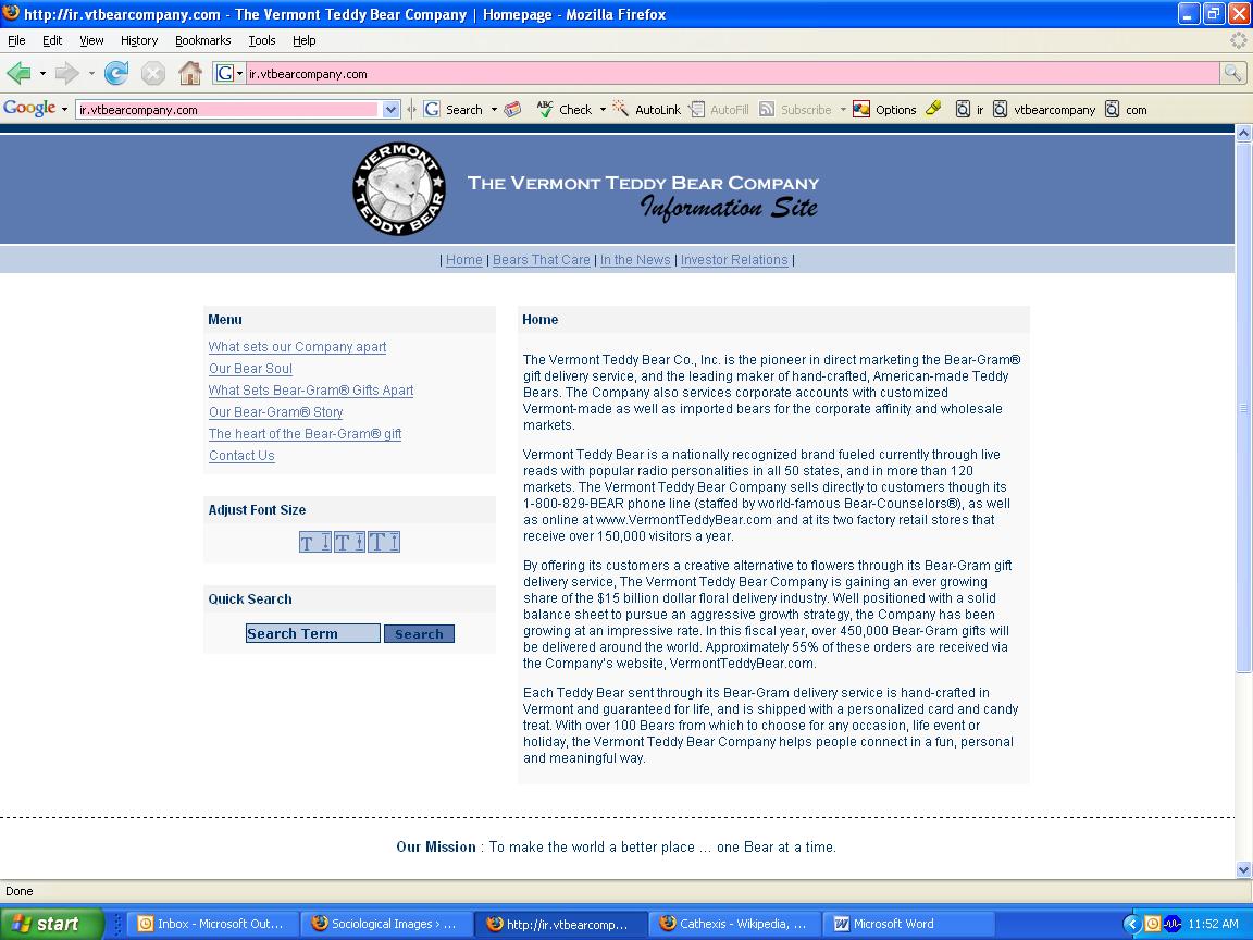
Over on its Web site for investors, Vermont Teddy Bear literally capitalizes on the “bears=love” connotations by couching its business in terms that suggest relationships and closeness. In this screenshot from the investor relations home page, for example, you can see that the over-the-phone sales staff are called “Bear Counselors,” suggesting that they give advice and mentoring about relationships.
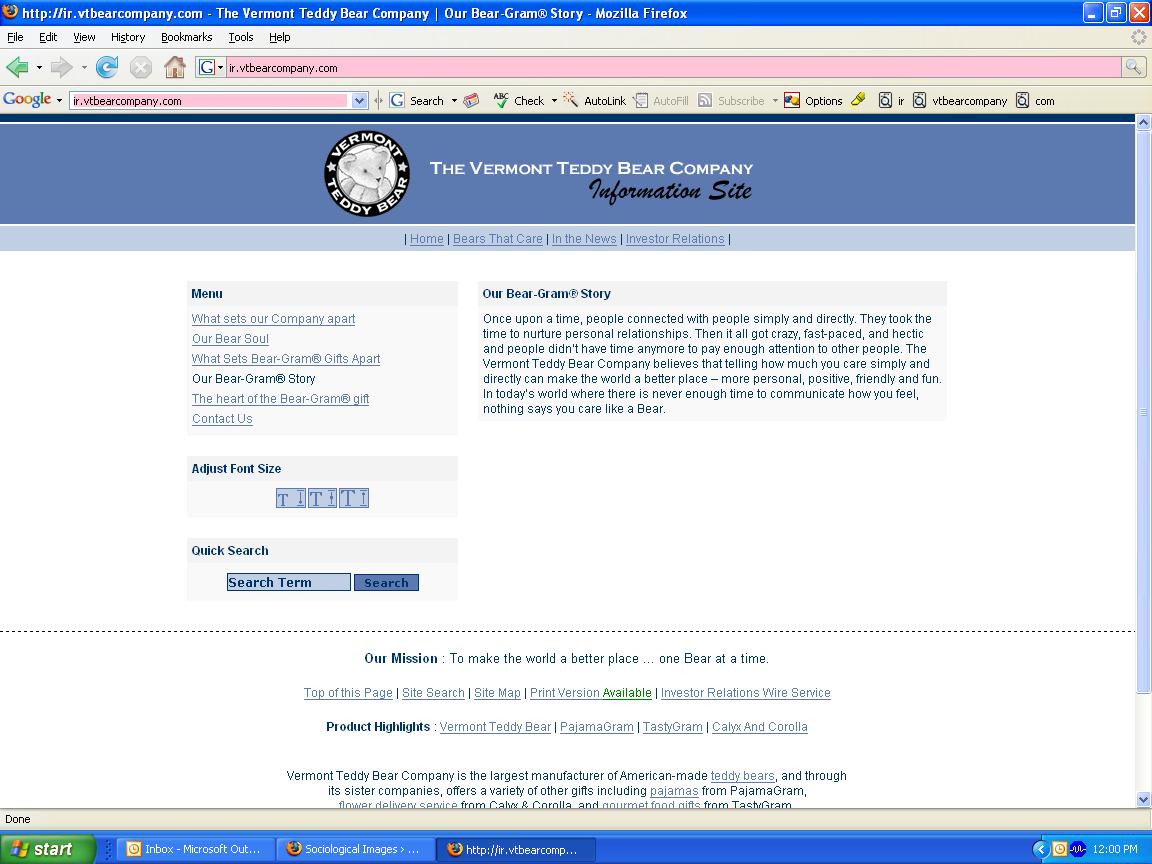
On the page entitled “Our Bear-Gram Story,” Vermont Teddy Bear positions its product as equivalent to the emotional work of creating and sustaining authentic relationships. The “story” says:

Once upon a time, people connected with people simply and directly. They took the time to nurture personal relationships. Then it all got crazy, fast-paced, and hectic and people didn’t have time anymore to pay enough attention to other people.

Of course, the thought that it was so good back in Ye Olde Non-Hectick Tymes is problematic, but so is the thought that teddy bears will suffice instead of “pay[ing] attention to other people.” Why expend all that effort relating to someone when you can just toss him or her a teddy bear instead?

On the company’s site for customers, the same association between the toys and love appears, as evidenced by this banner proclaiming the teddy bears as “heartfelt,” an adjective usually used to describe significant declarations of sentiment:

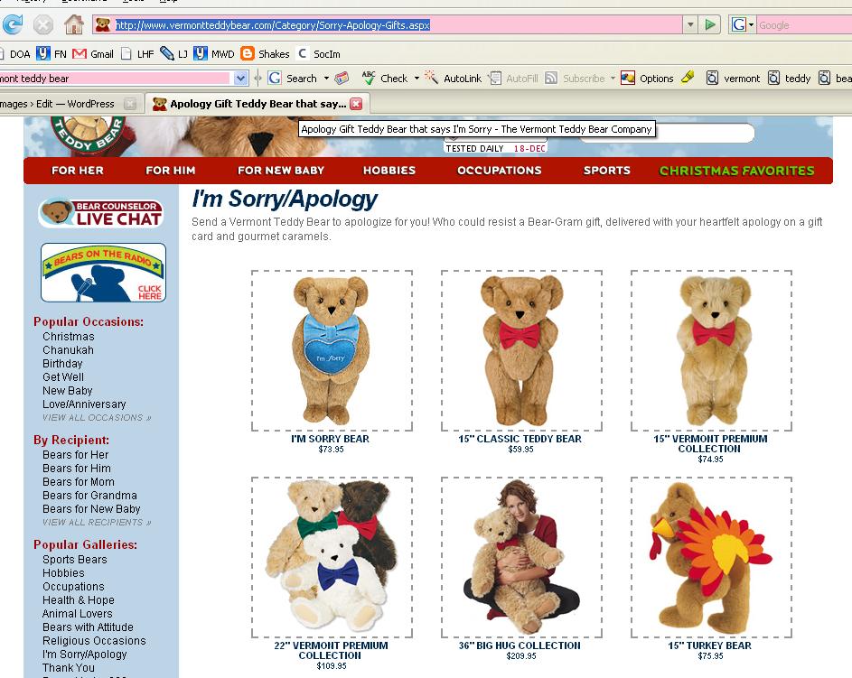
For occasions that require difficult, emotionally draining “relationship work,” there’s even a whole category of “I’m Sorry/Apology” bears available to send.

The I’m Sorry Bear comes with the following descriptive copy:

Whether you’ve broken their heart or their favorite coffee mug this Bear has got it covered. Holding a light blue pillow embroidered with the an “I’m Sorry” message and wearing a matching light blue bowtie, this Bear is a sure way to earn their forgiveness.

Ah, what price forgiveness?

Well, it’s $73.95. [Shipping and handling excluded. Insurance and rush orders extra. Please ask for international rates. Customs taxes may apply outside U.S. Order early to insure delivery by Christmas!]

I suppose that Vermont Teddy Bear’s deployment of a stuffed animal to do your emotional work for you is in the same category as ad campaigns for diamonds and credit cards that promise viewers intimacy through purchase of the products. However, Vermont Teddy Bear’s use of the “objects will fulfill you” trope is slipperier in part because a substantial number of potential consumers have experience with teddy bears as transitional objects that did [or still do] make them feel happy and calm.

In an amusing postscript, I grew up in Vermont, where we were kind of expected to support Vermont Teddy Bear Company. But when someone gave my younger brother a Vermont Teddy Bear as a gift, he never touched it. Finding the bear stiff and kind of lumpy, he preferred to drag around smaller and more squishable stuffed animals. No one else in the family was impressed with its cuddlability, not even me, and I was the one who collected stuffed animals to line the edges of my bed every night. The bear is now sitting on my mom’s desk as a display item, having not created an emotional connection at all.

In this series I have offered five explanations of why people of color are included in advertising. Start with the first in the series and follow the links to the remaining four here.

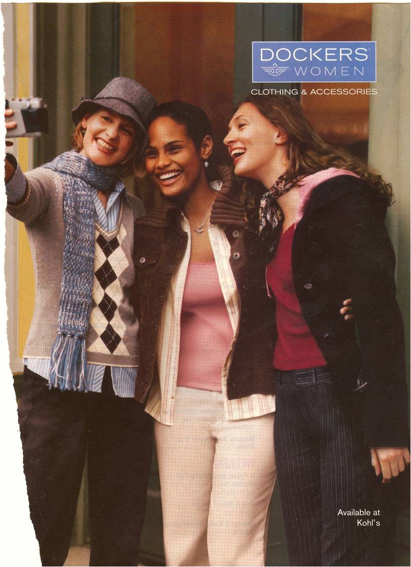
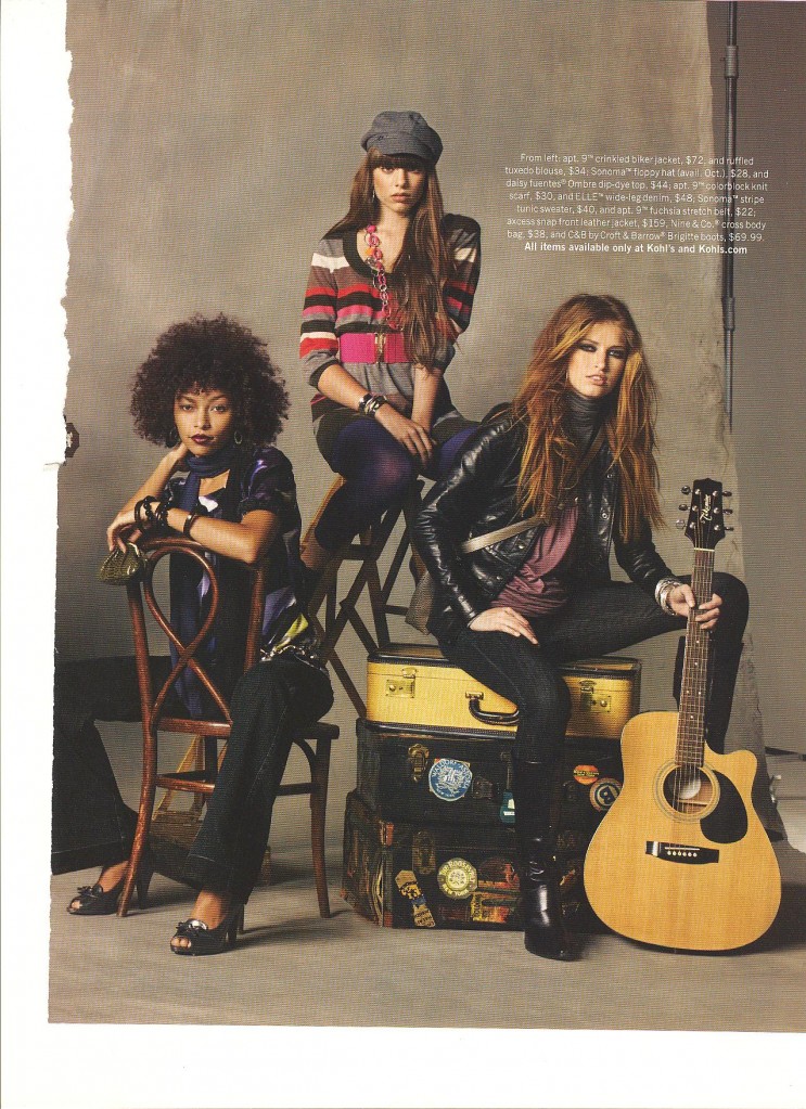
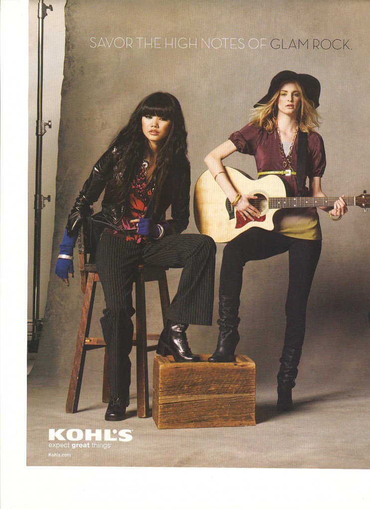
I am now discussing how they are included.  Already I have shown how people of color are whitewashed. Here I show that, when people of color are included, they are often chaperoned. That is, people of color are usually outnumbered by white people. Here are some examples:


NEW!  This is a two-page ad for Kohls:

03-02103-022

I speculate that, if there are more white people than people of color in an advertisement, the inclusion of a non-white person does not threaten the status quo (that whiteness is mainstream and normative) and the product is still clearly marked as mainstream and normative (i.e, white).

Next up: Subordination.

Also in this series:
(1) Including people of color so as to associate the product with the racial stereotype.
(2) Including people of color to invoke (literally) the idea of “color” or “flavor.”
(3) To suggest ideas like “hipness,” “modernity,” and “progress.”
(4) To trigger the idea of human diversity.
(5) To suggest that the company cares about diversity.

How are they included?
(6) They are “white-washed.”

Lisa Wade, PhD is an Associate Professor at Tulane University. She is the author of American Hookup, a book about college sexual culture; a textbook about gender; and a forthcoming introductory text: Terrible Magnificent Sociology. You can follow her on Twitter and Instagram.

Michael Kimmel argues that, for contemporary Americans, science is a superstition.  Scientific explanations are comforting and often accepted without critical thought.  The word “natural” rolls off our tongue and frequently gets conflated with “good.”  We are obsessed with finding the biological origins of sexual orientation, gender difference, political proclivities, happiness… everything.  Once a biological basis is found, it is considered the whole explanation.  It is as if biology is more fundamental and more true than things like culture or society. 

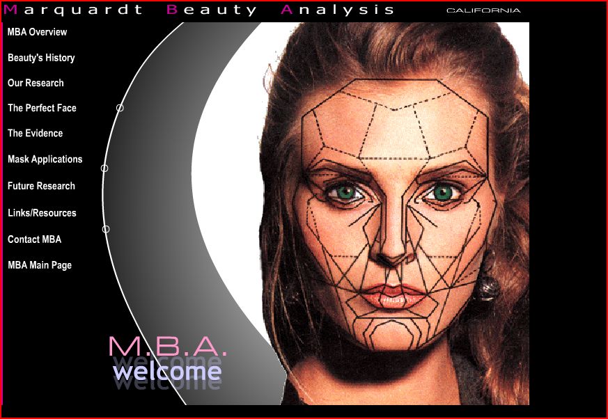
Our “faith” in science, then, is useful to marketers insofar as they can claim that their product is objectively tested, engineered, or otherwise scientifically sound.  This brings me to this Marquardt Beauty Analysis website, sent in by Kiran D.  The website explains the science behind beauty.  The main page includes a woman’s face overlaid with complex geometric shapes:


Here is part of the mission statement (emphasis mine):

MBA is dedicated to proactively researching human visual aesthetics, including its biological and mathematical bases, and to utilizing the results of that research to develop and provide information and technology with which to analyze and positively modify (i.e. improve) human visual attractiveness.

MBA further is dedicated to tailoring and formatting this technology to specific uses for direct applications in the fields where human attractivenss is a factor or parameter (i.e. those fields interested in human visual attractiveness) including medicine, dentistry, psychology, anthropology, biology, anthropometry, the arts, cosmetic makeup, and fashion, as well as for direct use by the individual consumer.

Notice how they use scientific buzzwords like “bases,” “formatting,” “applications,” and “parameter.”

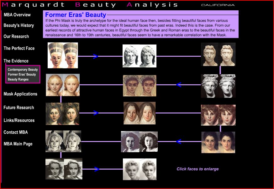
Here is a screenshot showing how they have tried to “scientize” beauty and make their endeavor look like legitimate science:


On the page below they claim that their formula works across history (elsewhere they also claim it works across race), so they argue that their science is objective and not culturally or historically contingent:

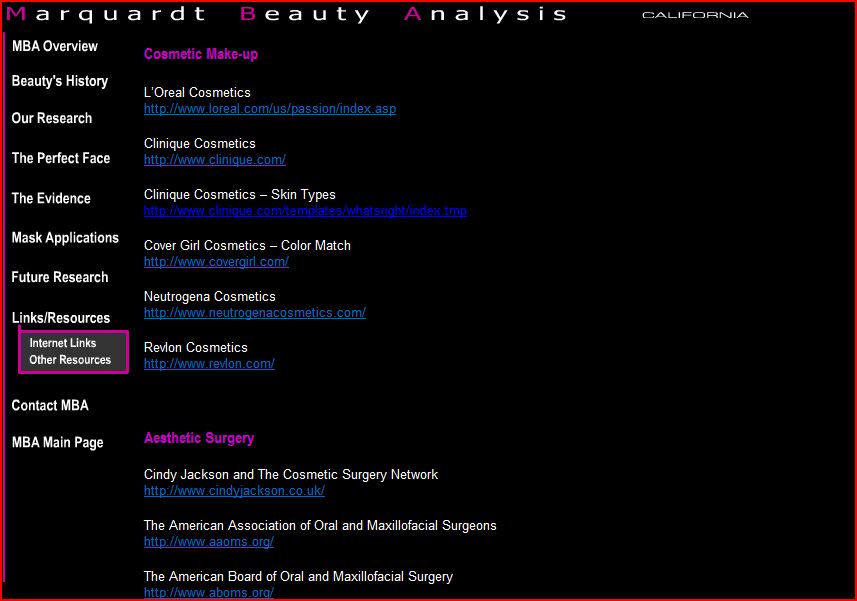
The website, of course, is not really about research on beauty; it’s a mechanism with which to sell make-up, cosmetic surgery, and other products.  Here is a screenshot of the first part of the links page:

The page includes links to L’Oreal, Clinique, Cover Girl, Neutrogena, and Revlon; five “aesthetic surgery” links; three “aesthetic dentistry” links; and a handful of academic-y sounding links.

Thanks Kiran!

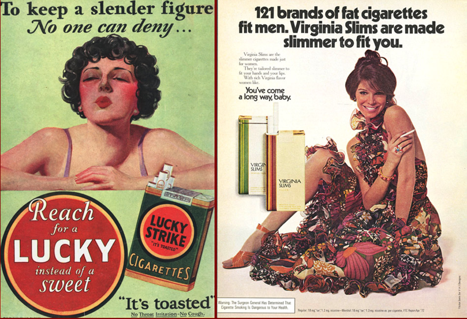
This archive of cigarette commericals, sent in by Kay W., makes some interesting comparisons of vintage and contemporary cigarette ads.

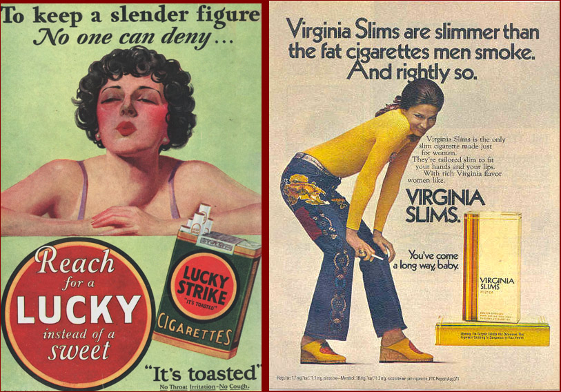
First, they compare vintage ads that try to sell cigarettes by pointing to the fact that they suppress your appetite with contemporary-ish Virginia Slims ads which seem to suggest so indirectly.

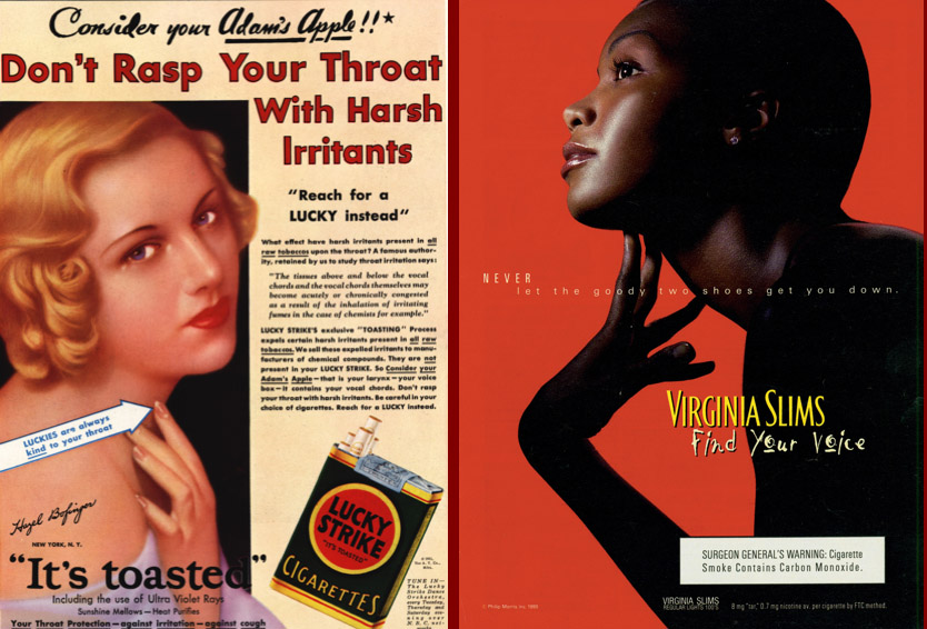
Second, they compare vintage advertisements that argue that some brands are smooth and good for your voice with the contemporary “Find Your Voice” campaign:

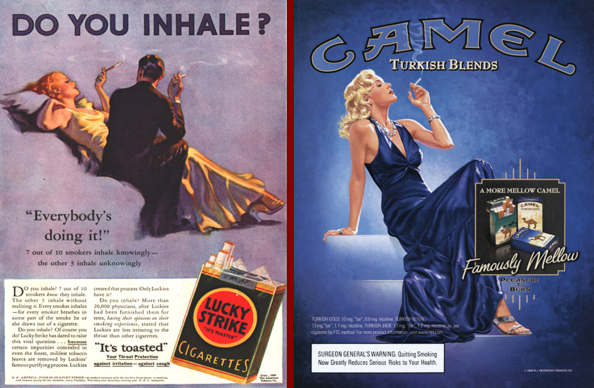
Third, this set of ads nicely shows how the association of glamour with cigarette smoking has transcended history:


MissCegenation (see her take over at Reciprocal Crap Exchange), Miguel E. (of El Forastero), Breck C. (also of Reciprocal Crap Exchange), Rachel N., Laura M.D., and Z. (of It’s the Thought that Counts) all sent in links to Burger King’s “Whopper Virgins” viral video campaign (we’ve never had so many people send in the same thing; clearly it touched a nerve):

There are several interesting things going on here. One is the exoticization of the “whopper virgins.” The taste tests were conducted in Thailand, Romania, and Greenland. We’re clearly supposed to find it charmingly cute that they’re unfamiliar with hamburgers. They don’t even know how to eat them! We get to see people taking their “first bite of a hamburger,” and wonder at their unfamiliarity with how to pick one up and eat it. This short video about the Thailand taste tests illustrates this with the dramatic voiceover about people who have “never even seen a burger. Who don’t even have a word for burger.”

There’s also a certain level of ethnocentrism here; note the comment that these are people who “really live outside of things.” That all depends on what you mean by “things,” which here seems to be defined by exposure to TV and hamburgers. The implicit understanding, of course, is that these are people who live in a backward, “traditional” culture, which is fascinating to outsiders but, ultimately, very bizarre. However, I am sure that if asked these people would feel they live “inside of” many things, just not the things considered important to this marketing team.

You might also use this to talk about the pervasiveness of advertising. As the video makes clear, they went to Thailand, Romania, and Greenland in hopes of finding people who hadn’t been exposed to Burger King or McDonald’s advertising, since it would be “impossible” to find such people in the U.S.

I also think the documentary element to the video is fascinating. I’m assuming the teams did travel to these areas, and the video claims they are all “real people,” not actors (who are, apparently, imaginary). But I have a suspicion that some elements were staged. Of course the taste-tests were staged, but I notice that almost everyone in the videos is wearing “traditional” clothing. I might be wrong, but it doesn’t strike me as the type of clothing people would wear every day–they seem like pretty fancy clothes that you’d wear for special occasions, but maybe I’m wrong. If anybody knows more about how people in these areas usually dress, let me know. Of course, it’s entirely possible that people dressed up in their fancier clothes entirely on their own because they wanted to look nice when being filmed. But I wonder if they were encouraged to dress in clothing that would make them seem more exotic, rather than showing up in a t-shirt (which is, by now, fairly universal, though I’m certain there are still groups who have not adopted t-shirts).

The second half of the video, where the Burger Team goes to villages in each country and makes them Whoppers, is also interesting in the way it portrays the team as philanthropists giving these communities a unique cultural experience. I mean, I guess they are, and I don’t want to fall into the trap of romanticizing “traditional” groups and implying that they should be shielded from “modern” innovations because it would ruin their culture. And it doesn’t seem like the marketing team is really trying to build brand loyalty, since it’s unlikely they’re going to be opening stores in any of these areas (although they do make sure to wrap the burgers in Burger King wrappers). It does, on the other hand, make the video seem more like a documentary and less obviously like a commercial, which adds to its effectiveness as a viral ad. I dunno. Maybe this is just an example of a corporation doing something nice, and I can’t get over my general distrust of marketers.

Another interesting angle you might bring up in discussion is the spread of fast-food culture and standardized, relatively cheap production processes in general, often referred to as “McDonaldization.” There’s also an entire book on the subject of McDonald’s in Asia, called Golden Arches East: McDonald’s in East Asia (edited by James L. Watson). I sometimes assign the chapter “McDonald’s in Hong Kong: Consumerism, Dietary Change, and the Rise of a Children’s Culture” in my intro classes to talk about cultural change; it’s fascinating how McDonald’s is to some degree undermining parental authority by appealing directly to children and empowering them to demand their favorite meals.

Laura sent us a link to a story about criticism of the campaign, found here.

And just an aside here: What’s the difference between a “village” and a “small town”? The word village seems to bring up certain assumptions about both quaintness and backwardness (and cultural isolation). I grew up in a town of slightly less than 300 people. Nobody ever called it a village. Is it a village if you don’t have paved roads, and a small town if you do? I’m just askin’.

Thanks to everybody who sent the video in!

Bern K. and Megan P. sent us another example of androcentrism (see herehere, here, and here), one that is nicely combined with the representation of women as annoying naggers, and the social construction of diamonds as men’s best friend.  Bern writes:

It starts off with promise, showing that it’s ridiculous for a man to buy his wife a vacuum cleaner for their anniversary. It finishes, unfortunately, by suggesting that the only way to get out of the doghouse is to buy his wife diamonds.

In the 5-minute commercial, men are punished by their wives for being insensitive or insulting by being sent to the “doghouse.”  In this five minute advertisement for JC Penney, men who have been sent to the doghouse are punished by being forced to do feminine tasks: fold laundry, eat quiche, and drink chai lattes.  There is some irony in that the main dude was sent to the doghouse for buying his wife a vacuum for their anniversary.  Apparently he wouldn’t want to be caught dead vacuuming… which is exactly why the gift might be considered insulting.  After all, when you give a woman a cleaning product for a gift, it means you think it’s HER JOB.

The video:

The website include the sound of a woman nagging and giving inconsistent orders (“speak less,” “talk more”).

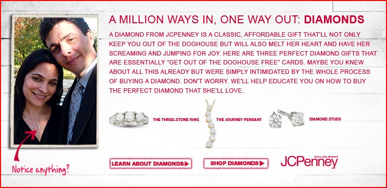
How to get out of the doghouse? Buy your wife diamonds (at JC Penney):

I like how it says that she’ll be “screaming and jumping for joy.”  Gah, women are so shallow and annoying.

There’s more!  The website is interactive.  You can actually put people in the doghouse.  If you are on Facebook, you can upload someone’s profile picture and have it show up on the website.  A fascinating new way to merge advertising and social networking sites.

NEW (Jan. ’10)!  JC Penney apparently thought this campaign was so delightful that they updated it. Joel P. sent us the link. It’s really quite obnoxious (for all the reasons discussed above):

[youtube]https://www.youtube.com/watch?v=_U45oxUyiMc[/youtube]

Jezebel also has a nice analysis.

Lisa Wade, PhD is an Associate Professor at Tulane University. She is the author of American Hookup, a book about college sexual culture; a textbook about gender; and a forthcoming introductory text: Terrible Magnificent Sociology. You can follow her on Twitter and Instagram.

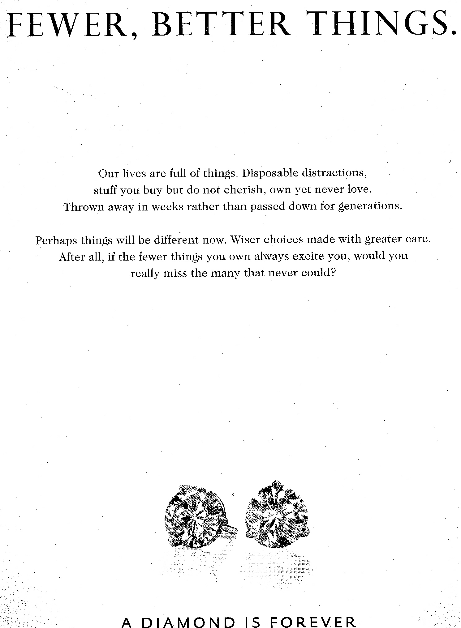
I found this ad for the De Beers diamond company in the New Yorker:

It uses the fascinating strategy of selling diamonds, an unnecessary luxury item made very expensive because the De Beers company has a monopoly on diamond mines and makes sure to keep supply artificially low, by criticizing consumerism based on buying unnecessary items. The message here is that we should stop buying so much unnecessary stuff…but that diamonds don’t fall into the category of unnecessary. Rather, diamonds are “better” things you should cherish “forever.” Of course, this anti-consumerist, buy-less-stuff message is also useful for De Beers because buying fewer things might be the only way, in a struggling economy, for people to save up to buy one or two more expensive items that can become family heirlooms to be “passed down for generations”…such as, say, diamonds.

Honestly, this is one of the most interesting ads I’ve seen in a while. I mean, it takes some nerve to sell luxury jewelry by telling people to stop wasting money on unimportant things.

UPDATE: Commenter Barbar pointed me to this interesting article in The Atlantic about the history of the diamond market.

Thus far in this series I have offered five explanations of why people of color are included in advertising: (1) to associate the product with a racial stereotype, (2) give a product “color” or “flavor,” (3) invoke ideas of “hipness” or “modernity,” (4) trigger the idea of human variation itself, or (5) suggest that the company cares about racial equality.

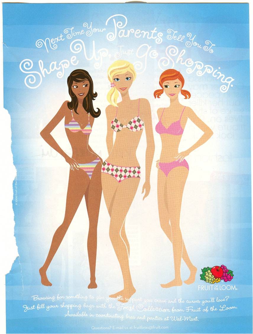
With this post, I begin illustrating how they are included. Here I show that, in many cases, people of color are included, but they are made to blend in with whiteness such that they vary only by the color of their skin.  This is related to two things (at least).

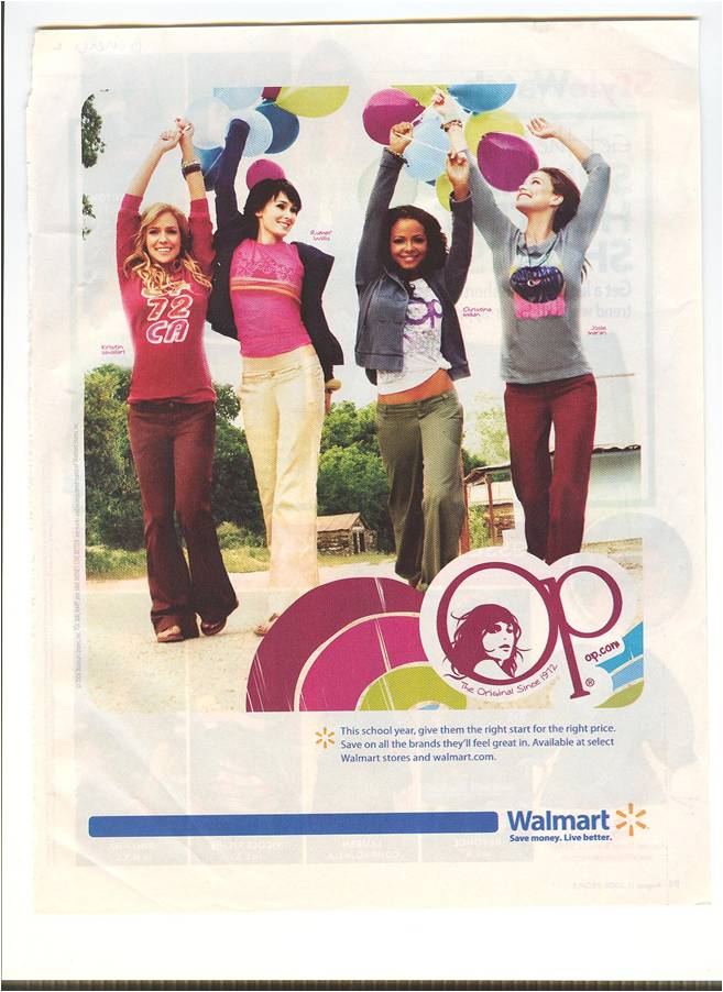
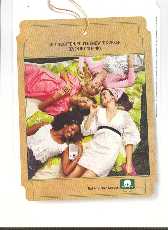
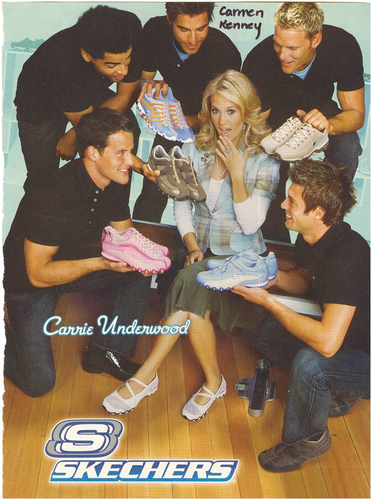
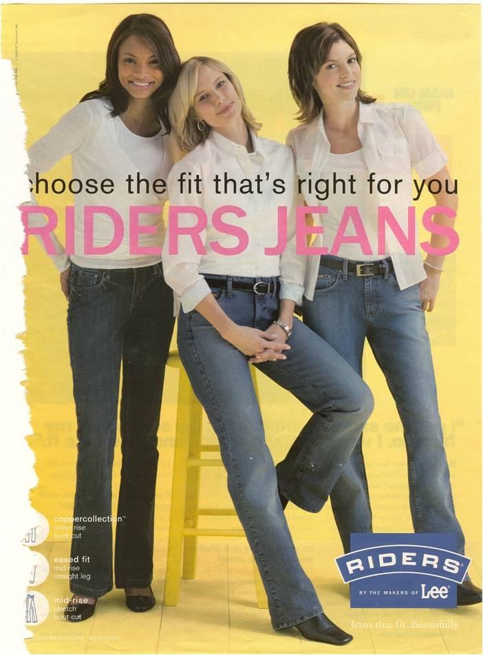
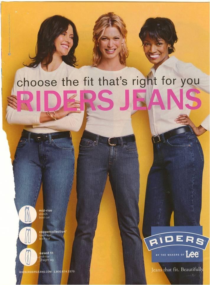
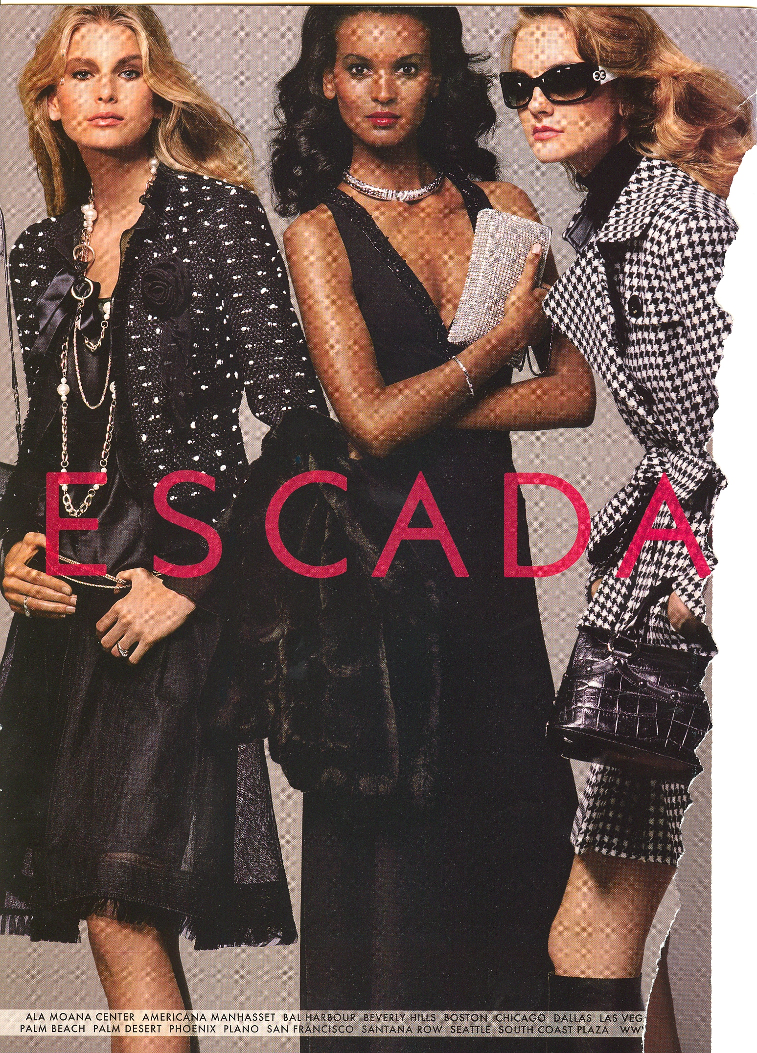
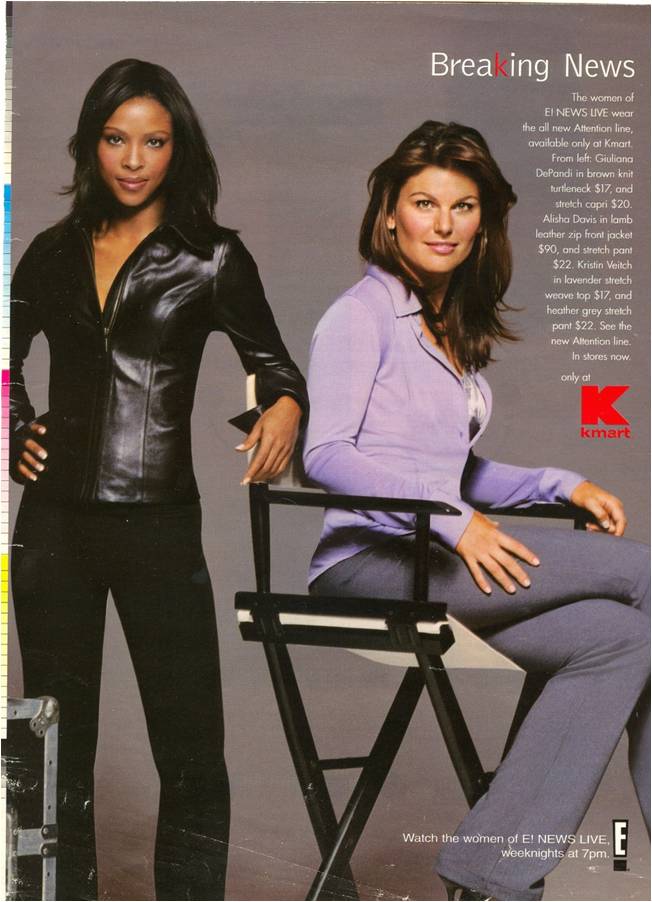
First, beauty is racialized such that what makes some darker-skinned women distinctive from some lighter-skinned women ( e.g., hair texture, nose shape, skin color) also makes them less beautiful according to mainstream cultural standards in the U.S.  When women of color are included in advertising, then, they often look very similar to the White women they are with, varying only by a few degrees (eg., straightened hair [sometimes lightened], slightly darker skin, slightly wider nose).  Check out these terrific examples.

Second, when women of color don’t conform to white standards of beauty, it is often interpreted as resistance to assimilation to whiteness and, thus, threatening.  For example, when The New Yorker wanted to parody the rumor that the Obamas were Muslim terrorists, they put an afro on Michelle.  So an advertiser will often choose women of color who look more-or-less white because to do otherwise is to send a message of non-conformity or resistance.  This is often done strategically, but if they don’t want to send this message, they will include a woman of color who look assimilated.

Here are some examples:

Next up: Chaperoning.

Also in this series:
(1) Including people of color so as to associate the product with the racial stereotype.
(2) Including people of color to invoke (literally) the idea of “color” or “flavor.”
(3) To suggest ideas like “hipness,” “modernity,” and “progress.”
(4) To trigger the idea of human diversity.
(5) To suggest that the company cares about diversity.