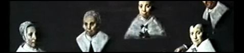
Reel Injun, a new documentary about the portrayal of American Indians in U.S. movies, has been earning high praise and notice from bloggers and film critics. About the film:
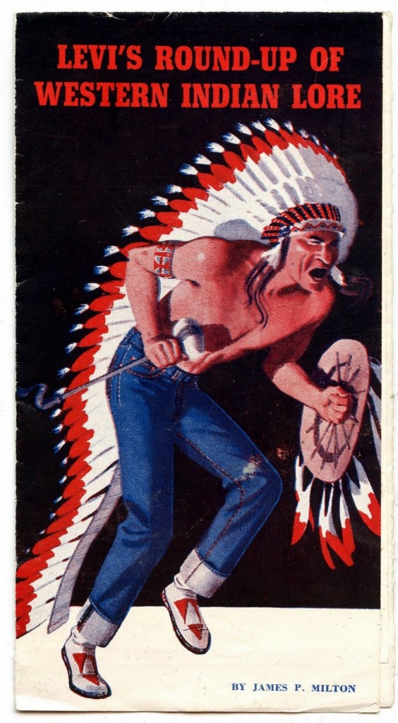
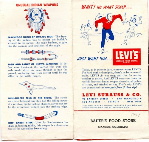
Hollywood has made over 4000 films about Native people; over 100 years of movies defining how Indians are seen by the world...
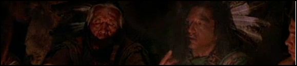
Travelling through the heartland of America, Cree filmmaker Neil Diamond looks at how the myth of “the Injun” has influenced the world’s understanding – and misunderstanding – of Natives.
With candid interviews with directors, writers, actors and activists, including Clint Eastwood, Jim Jarmusch, Robbie Robertson, Sacheen Littlefeather, John Trudell and Russell Means, clips from hundreds of classic and recent films, including Stagecoach, Little Big Man, The Outlaw Josey Wales, One Flew Over the Cuckoo’s Nest, and Atanarjuat the Fast Runner, Reel Injun traces the evolution of cinema’s depiction of Native people from the silent film era to today.
I can’t wait to see it.
The trailer:
Lisa Wade, PhD is an Associate Professor at Tulane University. She is the author of American Hookup, a book about college sexual culture; a textbook about gender; and a forthcoming introductory text: Terrible Magnificent Sociology. You can follow her on Twitter and Instagram.