history

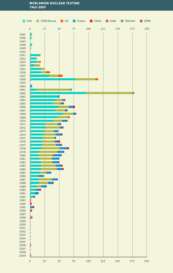
Dimitriy T.M. and Keith Marszalek sent in a video by Isao Hashimoto, posted at Wired. The video, titled 1945-1998, shows the location of all known nuclear tests during that period, as well as the nation conducting the tests. It starts off slowly (with the U.S. test during World War II and the two bombs dropped on Japan), and the U.S. has a monopoly on nuclear weapons for several years. By the early 1950s the number of tests starts to increase and the U.K. and Soviet Union start testing. By the late 1’50s and through the ’80s, the flashes indicating tests (with different sound effects to indicate different nation) are pretty much constant, and then drop off quite a lot by the ’90s.

The Wired article points out that there have been two more nuclear tests since 1998 (when the video ends), both by North Korea.

I found this graph over at the Comprehensive Nuclear Test-Ban Treaty Organization website:

Broken down by type of test; since 1963 almost all testing has been underground:

They also have an interactive map that includes information such as who has signed the test-ban treaty, where tests have occurred, and locations of facilities under the international monitoring system. Here’s a map showing the status of the test-ban treaty; green nations have ratified it, light blue ones have signed but not ratified it, and red ones haven’t signed it (sorry I couldn’t quite fit the whole map on my screen at once, so the screenshot cuts off some areas):

Gwen Sharp is an associate professor of sociology at Nevada State College. You can follow her on Twitter at @gwensharpnv.

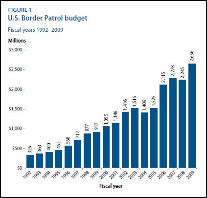
The Center for American Progress released a report detailing the state of border policing and the projected impact of immigration policies.  First, notice that spending on border patrol and the number of border patrol agents in the southwest have increased significantly between 1992 and 2009:

Still, despite this, the number of people illegally crossing the border has increased:


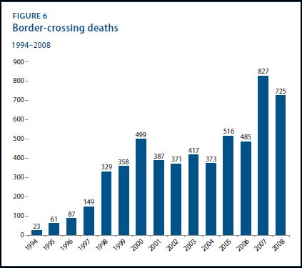
So the policing hasn’t deterred a rise in disallowed border crossings, but it has made it more dangerous:

So, the U.S. is spending a lot of money trying to keep undocumented non-citizens out.  Is it worth it?

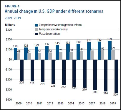
The report also discusses projected changes in the GDP under three different scenarios: immigration reform, allowing temporary workers only, and mass deportation.

The figure suggests that undocumented workers are making a substantial contribution to the well-being of the U.S. economy, one that would decrease under conditions of mass deportation.  Temporary workers are helpful, but real immigration reform that would bring in greater numbers of permanent and temporary workers is the best thing for America.

Hat tip to Graphic Sociology.

Lisa Wade, PhD is an Associate Professor at Tulane University. She is the author of American Hookup, a book about college sexual culture; a textbook about gender; and a forthcoming introductory text: Terrible Magnificent Sociology. You can follow her on Twitter and Instagram.

Talking Points Memo posted a campaign ad for Rick Barber, a Tea Party-aligned Republican running for Congress in Alabama. In the ad, Barber first speaks briefly to George Washington about taxes. Then he turns to Abe Lincoln and makes a comparison between funding social services and slavery. The screen then flashes photographs of slaves, prisoners in Communist work camps, and Nazi concentration camps…because paying taxes and those historical events are all basically the same, you know:

Aside from the trivialization of some of the most horrendously cruel acts against humans in modern history, it’s rather ironic that Barber says, “We shed a lot of blood in the past to stop that, didn’t we?” I understand there were many conflicting allegiances in both the North and the South during the Civil War; I have ancestors who owned slaves and sided with the Confederacy and others who fought for the Union. You certainly can’t paint all Southerners with a broad brush. However, it still seems odd to have a guy running for office in a state that seceded from the nation, whose platform emphasizes opposition to social programs that disproportionately help non-Whites (that is, Whites are the majority of recipients, but non-Whites are represented at rates higher than their proportions in the U.S. population as a whole), co-opting the anti-slavery position, which certainly wasn’t a mainstream attitude among Southern conservatives at the time. [Note: I am not implying that opposing social programs is the same as slavery, but only that because the discourse around opposition to them is so often racialized — think the “welfare queen” stereotype — that it makes a jarring companion to associations with ending slavery.]

In another re-writing of history, the ad ignores the following (from the TPM post):

…Lincoln was a lifelong champion of the traditional Whig policies of “internal improvements” — that is levying taxes, usually through tariffs, to fund infrastructure projects throughout the country, and incorporating the principle of central banking. In addition to prosecuting the Civil War, Lincoln’s administration put all of those policies into effect, as his Republican Party’s political coalition was built upon the foundation of the northern Whigs.

Also, Lincoln was president when Congress passed the first income tax, implemented to raise money for the Civil War (U.S. Treasury):

When the Civil War erupted, the Congress passed the Revenue Act of 1861, which restored earlier excises taxes and imposed a tax on personal incomes. The income tax was levied at 3 percent on all incomes higher than $800 a year.

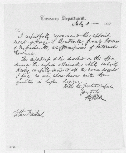
Here’s a letter from the Treasury Secretary to President Lincoln recommending someone for the new position of Commissioner of Internal Revenue (Library of Congress):

It’s a great example of the re-writing of, or ignoring huge parts of, history (which certainly both Democrats and Republicans do) to suit current political positions. Lincoln is useful as a symbol, not as a complex figure whose policy positions (including ambivalence about ending slavery) actually matter.

Related posts: MTV PSAs reference Holocaust, PETA’s Holocaust on Your Plate ads, romanticizing picking cotton, different ways of remembering national tragedies, Mammie souvenirs, Black women tend to White women, and the corporate plantation.

This 1937 ad for United Airlines boasts a “miracle” improvement in air travel in just 10 years. In 1927, when commercial flight was initiated, it took 33 hours and 14 stops to fly from coast to coast. By 1937, one could fly the same distance in just 15 and 1/3 hours! With only three stops!

The ad certainly puts into perspective my own frustration at what a time-suck air travel can be.

Source: Vintage Ads.

Lisa Wade, PhD is an Associate Professor at Tulane University. She is the author of American Hookup, a book about college sexual culture; a textbook about gender; and a forthcoming introductory text: Terrible Magnificent Sociology. You can follow her on Twitter and Instagram.

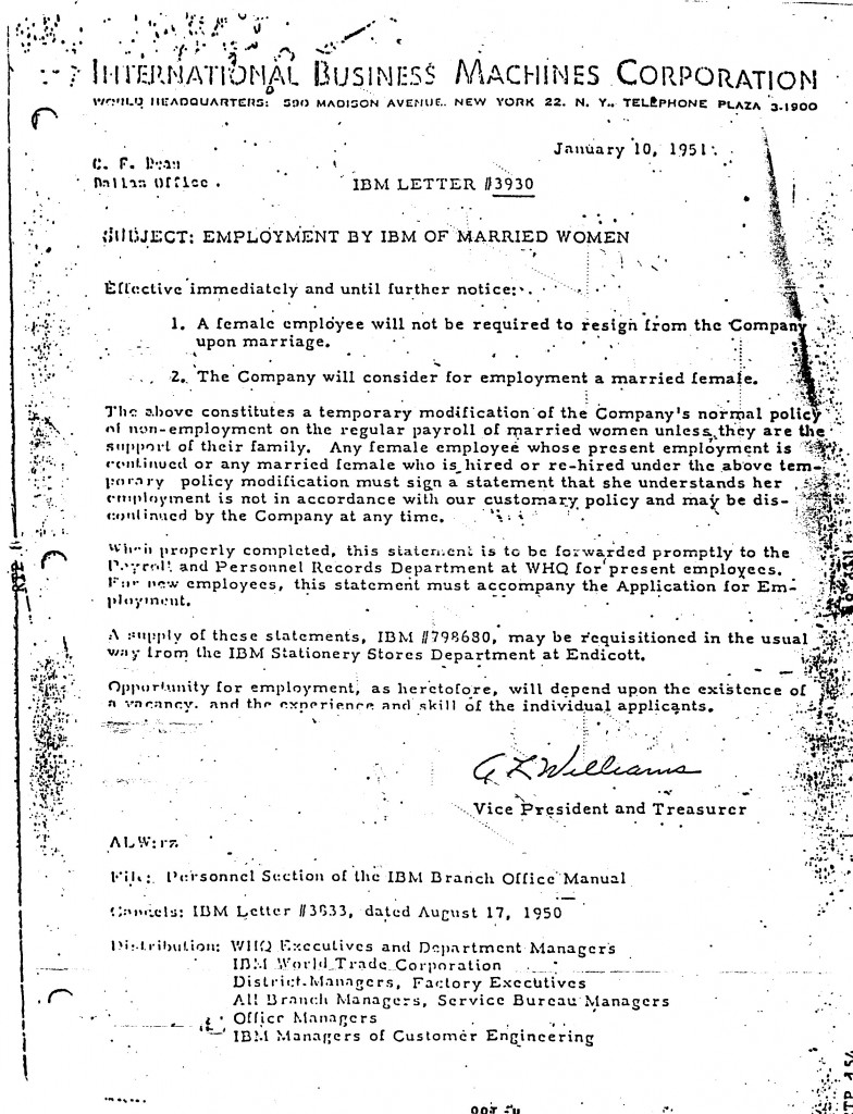
Marc Sobel sent in this IBM memo from 1951 that announces a “temporary modification” of corporate policy to allow married women to work at the company:

This is the type of thing that often turns out to be a hoax so I spent some time searching, but I can’t find any evidence that it isn’t authentic.

Also see: reasons not to hire women and if you don’t fire women, men have to be bums.

The movement to de-normalize tobacco smoking has been quite successful in the U.S., especially when it comes to the intersection of smoking and children.   Advertising directly to children, or in ways that might be interpreted as appealing to children, is illegal.  Smoking while pregnant is taboo and smoking around your children, especially indoors, is also heavily stigmatized, at least among some American populations.

A collection of vintage cigarette advertising at the Stanford School of Medicine, however, suggests that these attitudes are quite new.  The site, sent in by Kristyn G., displays a wide array of advertising with kids.

Marlboro, for example, used cute babies to sell their cigarettes:

Many companies used kids by suggesting that cigarettes are the perfect gift:

I’m not even really quite sure what this ad is trying to say:

Text:

This ad suggests that smoking is an excellent way to bond with your small child:

This ad suggests that your baby was delivered 15 minutes late because the stork was taking a smoke break:

And apparently there used to be a “boy scout” brand of cigarettes:

Lisa Wade, PhD is an Associate Professor at Tulane University. She is the author of American Hookup, a book about college sexual culture; a textbook about gender; and a forthcoming introductory text: Terrible Magnificent Sociology. You can follow her on Twitter and Instagram.

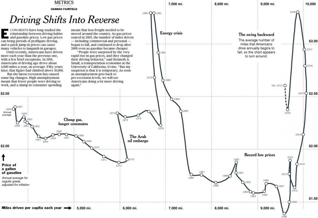
To me this New York Times graphic showing the relationship between gas prices and the average number of miles driven powerfully suggests that gas prices actually have little to do with how much driving Americans do.  The vertical axis is gas prices and the horizontal axis is the number of miles driven.  The line inside the figure is time.

Basically the illustration shows that the number of miles per year Americans drive has been climbing since 1956.  Despite short-term gas price fluctuations, something is driving us to drive more and more every year.

When gas prices do shoot up — such as during the oil embargo, the energy crisis, and the most recent peak — Americans show a  modest drop in driving, but it’s not a very large one and we recover rather quickly.  During the oil embargo, Americans shaved 210 miles a year off of their driving.  During the energy crisis, only 156.  The recent reduction in the number of miles driven per year is attributed by the New York Times writer to the fact that so many people are unemployed and, therefore, no longer need to drive to work.

Driving, then, shows only a modest response to high prices.  Perhaps the jumps in prices during these peaks — 43 and 106 cents per gallon respectively —  weren’t really worth slowing down for?  Or perhaps driving is so culturally meaningful that Americans are willing to pay to stay in their cars regardless?  Or maybe driving, and driving farther, has become increasingly important over time such that people can’t reasonably reduce the amount of driving they do?

It seems to me that the problem is at least partly infrastructural.  I wonder how average miles driven responds, or would respond, to enhancing and investing in public transportation?  If we started building denser neighborhoods and got rid of suburbs?

Flowing Data.

Lisa Wade, PhD is an Associate Professor at Tulane University. She is the author of American Hookup, a book about college sexual culture; a textbook about gender; and a forthcoming introductory text: Terrible Magnificent Sociology. You can follow her on Twitter and Instagram.

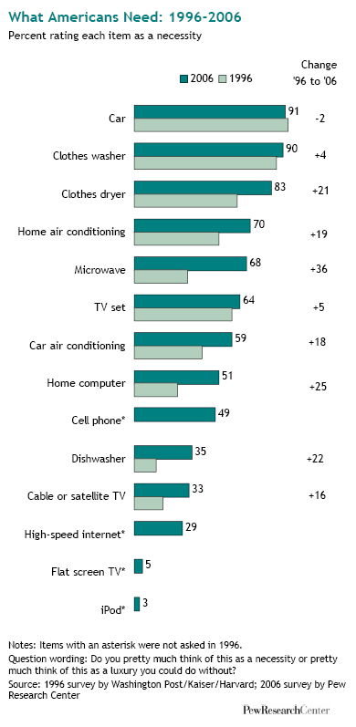
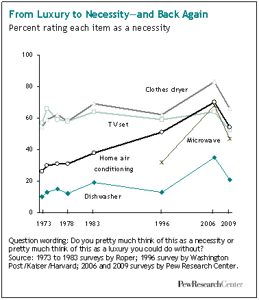
While I was at my grandma’s house this week I read Buying In: What We Buy and Who We Are, a fascinating book by Rob Walker. There will be more posts to come in the next few weeks, but for starters, I was struck by the results of a 2006 survey Walker mentions by the Pew Research Center. The survey asked people if various items were luxuries or necessities. Here are the results from 2006 and 1996:

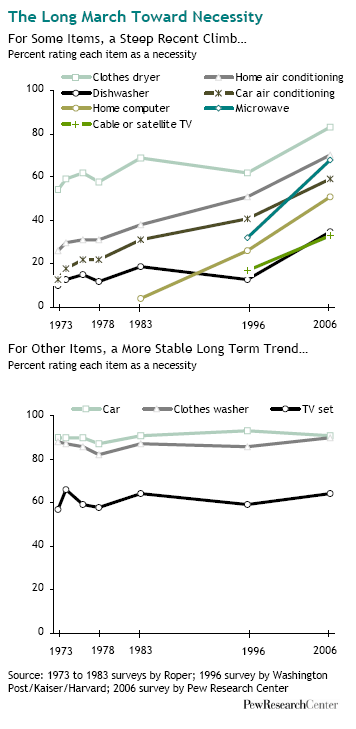
Clearly, over time we’re defining more and more items as necessities rather than luxuries:

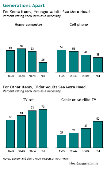
A breakdown of some results by age:

If I had to guess, I’d think the fact that younger people are less likely to say a TV is a necessity than older people is due not to less concern about TV but more willingness to watch content online. Does that seem reasonable? Other explanations?

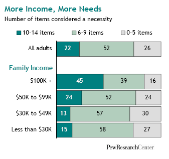
The survey found that the higher a person’s income, the more items they define as a necessity:

The biggest differences by income were for dishwashers, cell phones, computers, and high-speed internet, which are more likely to be defined as a necessity as income increases.

The Pew Center’s website has links to more detailed breakdowns, as well as full info on the question wording, methodology, etc. And as the authors say in the summary, the results show only a one-way change: in no case did they find that the overall percent defining something as a necessity decreased between 1996 and 2006. As they put it,

The old adage proclaims that “necessity is the mother of invention.” These findings serve as a reminder that the opposite is also true: invention is the mother of necessity. Throughout human history, from the wheel to the computer, previously unimaginable inventions have created their own demand, and eventually their own need.

The income data would seem to back this up: what we have, we often come to define as necessities.

I would love to see an international comparison of some sort. I’ll see what I can find.

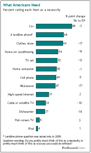
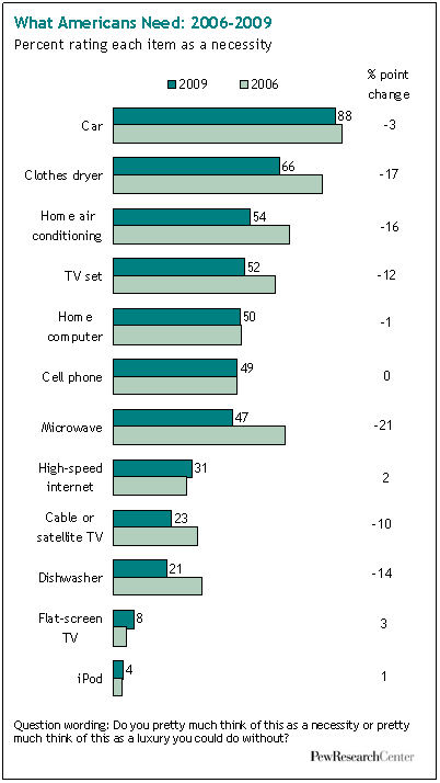
UPDATE: I haven’t found an international comparison yet, but I discovered that the Pew Research Center conducted the survey again in 2009 to see if attitudes had changed during the recession. Quite a striking change for several items:

d