economics

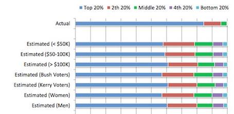
Dmitriy T.M. let us know that Matthew Yglesias posted an interesting graph that compares the actual distribution of wealth in the U.S. compared to what different groups estimate the distribution to be:

As Yglesias says, it’s striking not just that we underestimate how much wealth the top 20% control, but how little the poorest Americans do. Americans imagine the poor to have many, many more financial resources than they actually do.

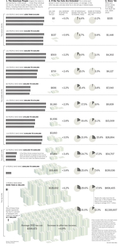
American politicians are currently wrangling over whether to extend the Bush tax cuts of 2001 and 2003. Word on the street is that extending these cuts will cost the U.S. treasury $2.7 trillion over the next ten years.  A graphic from the New York Times shows how much people with different incomes benefited from these tax cuts. If you look at the far right column you’ll see the average number of dollars left in people’s pockets between 2004 and 2010; the dollar amount rises from the poorest 29% of Americans (top with $355) to the richest 1% (bottom with $2,326,607).

Click over for a larger image; via BoingBoing.

—————————

Lisa Wade is a professor of sociology at Occidental College. You can follow her on Twitter and Facebook.

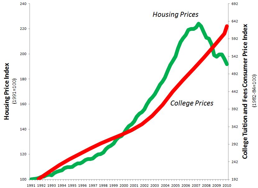
At Family Inequality, Philip Cohen argues that the rising cost of higher education may be directly related to the cost of homes. In the figure below, he shows that housing prices and college tuition have risen in tandem, at least until recently:

Cohen doesn’t chalk this up to simple inflation influencing both trends. Instead, he argues…

…the connection between home wealth and college attendance was sometimes direct, as when experts advised parents to use home equity loans to send their kids to college (advice you don’t hear so much these days). But even without home equity loans, the wealth stored in middle-class homes — for most such families their largest asset — underwrote millions of college educations.  I guess you could say the federal policies promoting homeownership were big boons for the higher education industry, not just the GIs and mostly-white suburbanites who landed inside the picket fences.

That is, rising home prices meant that people who could afford those homes could pay more for their children’s college educations.  The price of college, then, could afford to increase without pricing out all those middle- and upper-class families.

Cohen asks for ideas about what will happen now that home prices have dipped and the cost of higher education continues to rise.

Lisa Wade, PhD is an Associate Professor at Tulane University. She is the author of American Hookup, a book about college sexual culture; a textbook about gender; and a forthcoming introductory text: Terrible Magnificent Sociology. You can follow her on Twitter and Instagram.

One thing we’ve been interested in, and posted various images about, here at Soc Images is the different ways people experience the current economic crisis. Obviously people will suffer more or less depending on their personal situations — if they had any savings, if they lose their jobs or not, if there are other wage-earners in the household, and so on. While we’re all affected by the recession at least indirectly, for some it’s a much more immediate personal problem than for others. And demographic factors outside our control, such as race/ethnicity, gender, and so on, play a large role in the distribution of the negative impacts (or, for some, the positive ones) of the recession.

Dmitriy T.M. sent in a story from the NYT that looks at the particular hardships faced by older workers. I’m interested in the graph on the left below, which shows historic jobless rates for those over age 55:

On the one hand, the unemployment rate for that group (7.3%) is certainly higher than at any point since the mid-’70s. On the other hand, the jobless rate for 55+ -year-old workers is lower than the overall unemployment rate right now, which is still hovering at about 9.6% (Bureau of Labor Statistics). It’s a case of the decontextualized graph: one that isn’t technically misleading, and that presents data in a straightforward manner, but that, without providing comparisons to other groups, makes it hard to know what to think about the data.

That’s not to discount the difficulties experienced by workers over age 55; it’s surely not comforting to know that the unemployment rate for your age group is below the national average if you, yourself, lose your job. And the graph on the right presents another aspect of joblessness: how long it lasts. When workers over 55 lose their jobs, it tends to take them quite a bit longer to find a new one. As the NYT article points out, with the overall higher rates of unemployment for all age groups, that gap becomes increasingly important: “because it will take years to absorb the giant pool of unemployed at the economy’s recent pace, many of these older people may simply age out of the labor force before their luck changes.” At the same time, the hits many retirement accounts have taken is pushing more people over age 65 to look for work, while others are forced into early retirement simply because they can’t find jobs.

More on race, age, gender, and the recession here.

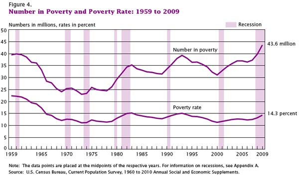
This week the U.S. Census Bureau reported that the American poverty rate has reached 14.3%, the highest it has been in 15 years:

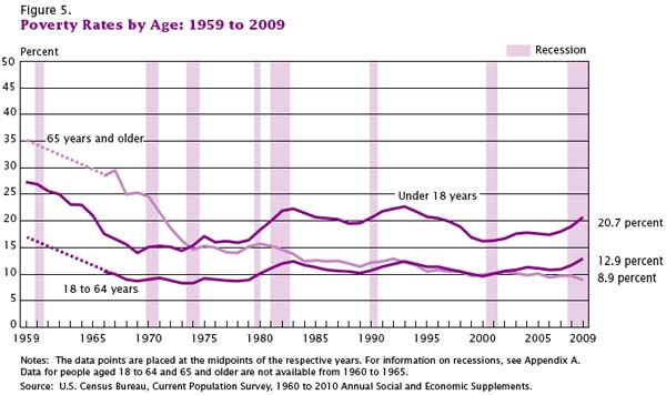
Children are over-represented among the poor; among those  less than 18-years-old, the poverty rate is 20.7%:

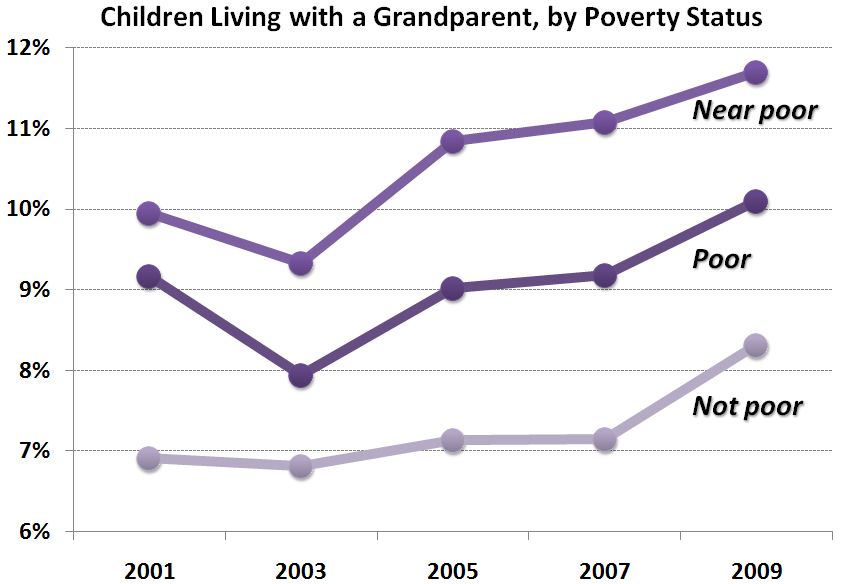
The Census report suggests that the poverty rate would be even higher if it weren’t for an increase in non-nuclear family households.  Over the last two years, an additional 11.6 percent of households now include non-family or family members from three generations or more.  Consider this data from Philip Cohen’s Family Inequality blog (and notice that the near poor are more likely to be living with a grandparent than the poor, who may not have this option):

So, the economic recession is correlated with an increase in poverty, but what does “poverty” really mean?   The New York Times reports that in 2009 it meant a pretax income of $10,830 for a single person with no dependents and less than twice that, $22,050, for a family of four.

Trying to imagine keeping a roof over my head, sufficient food in my belly, and clothes on my back on that amount of money is difficult.  But even if this was possible, human beings  need more than food, shelter, and clothes.  Try to imagine, with this amount of money, maintaining friendships and romantic partnerships, nurturing your children’s emotional health and educational potential, having pride and comfort in your home and personal appearance, finding the resources to invest in your own human capital, or giving yourself a modicum of leisure.  Poor people are human too and these numbers only begin to scratch the surface of the kind of deprivation many Americans suffer every day.

Images borrowed from Graphic Sociology.

Lisa Wade, PhD is an Associate Professor at Tulane University. She is the author of American Hookup, a book about college sexual culture; a textbook about gender; and a forthcoming introductory text: Terrible Magnificent Sociology. You can follow her on Twitter and Instagram.
Stephanie L. and Amie A. both sent in screen shots of the MSN tabs “for him” and “for her.”   It’s not particularly surprising that MSN segregates its content by sex, but the gendered themes were interesting, especially given that Stephanie and Amie captured two moments in time.

First, notice that the information MSN chose as relevant to him is almost always leisure related:

The two lists above include how to build a man cave (where men escape daily responsibilities), the new Nikes, technological innovation and great inventions to read about, sports news, dating advice, and wacky stories about cocaine, $100,000 dollar bills, catching lobster, and urine.  Except for a non-leisure-related, health story, all are either about leisure activities or a way to provide leisure with wacky, weird or fun news.

What about for her?

Her stories are about work (male careers), sexual harassment, babies (breastfeeding and baby talk), teenagers, the economy, and food (superfoods and allergy labels).  The video on wildlife, the story about Chelsea Clinton, the piece on Mad Men, the new hospital gown design (???)  can be interpreted as leisure-related in that they’d be fun to read.

Overall, then, the material aimed at men is almost entirely related to leisure, whereas the material aimed at women is heavily tilted towards her responsibility for work and the family and serious topics like sexual harassment and the economy.   Perhaps MSN knows what it’s doing.  In fact, men do have more leisure time than women.  So this is a structural problem related to how we organize work and family, as well as a cultural problem in how we represent and relate to men and women.

Lisa Wade, PhD is an Associate Professor at Tulane University. She is the author of American Hookup, a book about college sexual culture; a textbook about gender; and a forthcoming introductory text: Terrible Magnificent Sociology. You can follow her on Twitter and Instagram.
One in every 31 American adults is under control of the correctional system.   The U.S. imprisonment rate is astronomical; it is six times that of many European countries.  This rather new reality is directly the product of the American war on drugs initiated by Reagan in the ’80s.

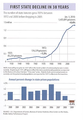
The Pew Center on the United States reports that the 1.4 million strong state prison population dropped in 2009, the first decrease since 1972.

Professor Chris Uggen, at Public Criminology, summarizes the causes identified by the report:

Pew attributes the drop to greater diversion of low-level offenders and probation and parole violators from prison; stronger community supervision and re-entry programs; and, a quicker release of low-risk inmates who complete risk reduction programs. State budget problems have likely played an important role in accelerating each of these trends.

The decrease is certainly better than an increase, but Uggen notes that it is quite small.  The prison population dropped by only 0.4%, or 5,739 inmates.  Further, the decrease in the state prison population was outpaced by the increase in the federal prison population, which went up by 6, 838 inmates.  Even so, Uggen argues, this is significant: “…any change in direction is meaningful after four decades of unabated growth.”

Lisa Wade, PhD is an Associate Professor at Tulane University. She is the author of American Hookup, a book about college sexual culture; a textbook about gender; and a forthcoming introductory text: Terrible Magnificent Sociology. You can follow her on Twitter and Instagram.
Rachel sent in a link to a post about the recession by Tim Cavanaugh at Reason that led me to an interactive graphic at the Wall Street Journal that lets you track job loss by either sector or by race/ethnicity and sex from December 2007 to August 2010.

Here is the race/ethnicity and sex data for January 2008 (for reasons I cannot understand, Asians are not separated out by sex, and as usual, American Indians aren’t included):

And here’s the breakdown for January 2010:

Unfortunately, the numbers aren’t weighted by the number of total workers per category, so we don’t have any way to know how these raw numbers translate into percentages of workers losing their jobs.

By economic sector, for January ’08:

January ’10:

[On a nitpicky note, the sector graphs show job losses in negative numbers, which would work if it showed total change in # of jobs. But I think we’d be thrilled if we had -8… thousand job losses, as the graph is labeled. Just a small sloppy labeling issue.]

As the data show, and as we’ve discussed before, the economic recession has disproportionately affected men. But Cavanaugh cautions that it might be a little soon to declare men an at-risk species or lament the bad luck of being born male. Presumably, if men’s over-representation in construction, for instance, has meant they suffered more than women from the real estate bust, if you felt like it you could turn it around and argue that perhaps they disproportionately benefited from the boom that preceded it. Additionally the employment sectors are pretty broad; “retail” or “finance” will include some specific occupations that are fairly gender balanced, some that are dominated by men, and some dominated by women. And overall loss in retail jobs doesn’t tell us if the losses are spread equally across occupations within the sector.

Should we care about the suffering of men and their families in the recession? Of course. And to the degree that men are disproportionately represented in occupations that are prone to boom/bust cycles, we’re likely to continue to see greater volatility in their employment rates than women’s, sometimes to their advantage, sometimes not. But we might want to be a little careful and look at some more in-depth data before we declare, as some commentators seem to want to do, that women have basically escaped the recession. If nothing else, men and women aren’t islands; lots of us share household expenses, and a woman whose husband loses his job but keeps her own doesn’t exactly avoid any negative consequences of the recession.

Related posts: more comparisons of joblessness, race and recession, unemployment and education level, not everyone suffers during a recession, the gender employment gap,