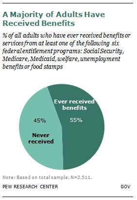
As politicians negotiated regarding the fiscal cliff, they debated whether to cut social programs aimed at alleviating poverty and deprivation. Most of us imagine that these programs help a minority of the population. In fact, the Pew Research Center reports that more than half of the population has received government benefits from one of the six most well-known programs:
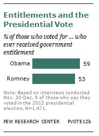
This isn’t the so-called 47% that Romney claimed would vote for a Democrat no matter what. In fact, people who received one of these six benefits were only slightly more likely to vote Democratic:
In fact, receiving benefits is pretty well spread out among the population. Except for people over 65, there seems to be significant consistency in the receipt of at least one benefit:
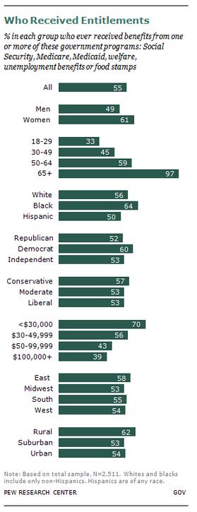
Notably, these programs also go to help the poor, women (largely because they end up single with young children), and people in rural areas.
Interestingly, many of us who have benefited from targeted government programs (“targeted” because we all benefit from programs like, oh, transportation initiatives and environmental protection and [insert dozens more here]) don’t know that we do. In a previous post, we showed that large proportions of people who’ve benefited from social programs don’t recognize that they have unless their thinking is sparked by asking them about specific programs. (It’s kind of like responding “No I don’t do drugs” and then being asked specifically about marijuana and saying, “Oh yeah, well that one I guess!”).
Since it is indeed the majority of Americans who benefit from targeted programs, it shouldn’t be too hard for politicians to find it in their hearts to support these programs. That 57% of conservatives and 52% of Republicans have used them suggests that the political right is more interested in purporting an ideology than serving its constituency.
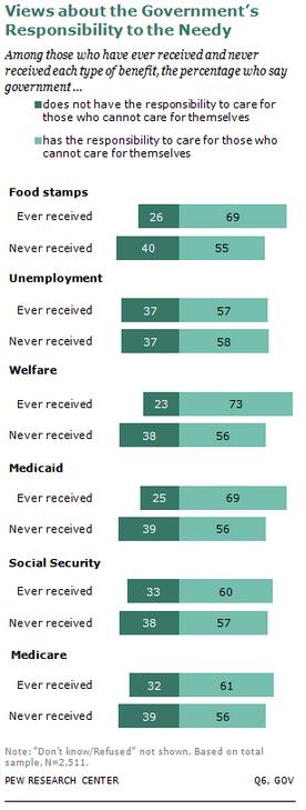
Alternatively, they realize that a certain proportion of benefit recipients also believe that the government “does not have the responsibility to care for those who cannot care or themselves.” About a third of people who hold onto this principle have used benefits:
It seems that data like this might be very useful for what we really need: an educational campaign designed to help Americans understand what social programs do and who benefits from them. Maybe then we could have sensible policy discussions.
Lisa Wade, PhD is an Associate Professor at Tulane University. She is the author of American Hookup, a book about college sexual culture; a textbook about gender; and a forthcoming introductory text: Terrible Magnificent Sociology. You can follow her on Twitter and Instagram.