economics

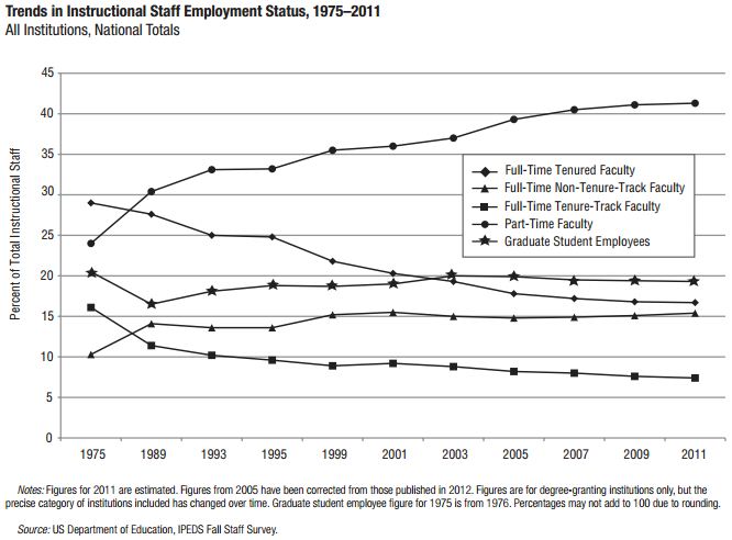
While the stereotype of the college professor might still be an elbow-patched intellectual cozied up in an office, it might be more accurate to place him in his car.  A new report from the American Association of University Professors finds that more than 40% of college instructors are part-time, often driving from campus to campus to cobble together enough classes to enable them to pay rent.  These types of employees far outnumber tenured and tenure-track faculty, who make up less than a quarter.

1

This data suggest that the term “precariat” applies well to a significant proportion of college and university professors. Coined by economist Guy Standing, the term is meant to draw attention to the economic fragility of many lower wage workers in today’s labor market.  It’s a combination of the word “precarious” and “proletarian,” a word that is used to refer to the working class under capitalism.

Part-time faculty count as part of the precariat because their jobs are contingent (renewed semester to semester), low paid, and bring little or no benefits.  Let me put it this way.  I just finished my first year as a tenured professor after six years on the tenure track.  I teach five classes.  An adjunct at a public research university would have to teach more than twenty-three classes to earn my salary (average pay is $3,200/class); someone teaching at community colleges would have to teach more than thirty-three (at $2,250/class).  Of course, my salary also reflects research and institutional service, but my hourly wage is obviously far out-of-proportion to that of part-time faculty.  Plus I get a wide range of benefits; adjuncts usually get nothing.

When government funding of higher education shrinks, colleges and universities respond by cutting corners where they can.  Hiring adjuncts is one way to do that.  It’s important to remember, then, that funding cuts hurt not only students; they also hurt jobs.

See also How Many PhDs are Professors?

Via Jordan Weissman at The Atlantic. Cross-posted at Pacific Standard.

Lisa Wade, PhD is an Associate Professor at Tulane University. She is the author of American Hookup, a book about college sexual culture; a textbook about gender; and a forthcoming introductory text: Terrible Magnificent Sociology. You can follow her on Twitter and Instagram.

Cross-posted at Montclair Socioblog.

We got another reminder last week that despite complaints about federal government programs that give money to the poor, when it comes to taxes, the government is much more generous to the wealthy.  The news came from a report from the Congressional Budget Office on tax expenditures.

These are the ways that the government uses the tax system to give money to people. Some expenditures are tax credits, which can take the form of cash payments.  Others are tax breaks — taxing people less than the going rate. For example, if I am in the 35% tax bracket, but the government charges me only 15% on the $100,000 I made playing the stock market, the government is giving me $20,000 it could otherwise have had me pay in taxes. That’s an expense. The preferential rate for my luck in the market costs the government $20,000.

The justification for these expenditures is that they are a way the government can encourage people to do something that it wants them to do.  With tax breaks, the government is basically paying people by not charging them full tax fare — encouraging them to buy a house or give to charity or get health insurance at their work.  Similarly with the tax credits that go mostly to the poor. We want people to hold a job and to care for their kids.  The child tax credit gives people more money to care for their children.  The Earned Income Tax Credit pays them for working, even at jobs that pay very little.  By the same logic, the government is paying me to invest my money in companies — or put another way, to play the stock market.

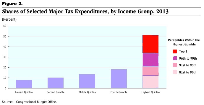
This government largesse, however, benefits some people more than others:

1

About half of all tax expenditures go to the top quintile (top 20% of income earners).  The bottom 80% of earners divide the other half.  And within that richest quintile, the top 1% receive 15% of all tax expenditures (this distribution of tax breaks roughly parallels the distribution of income). Were you really expecting Sherwood Forest?

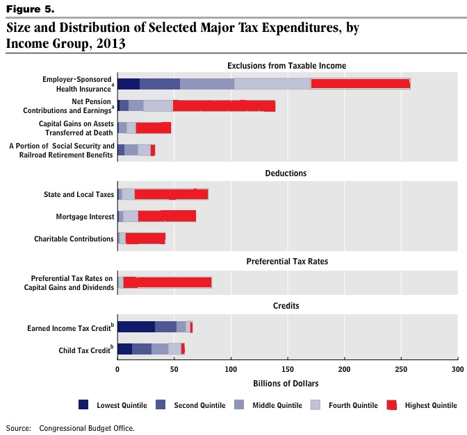
Here is a breakdown of the costs of these different tax expenditures:

2

The Earned Income Tax Credit, which benefits mostly the poor, costs less than $40B.  The tab for the low tax on investment income (capital gains and dividends) is more than twice that, and nearly all of that goes to the top quintile.  More than two-thirds goes to the richest 1%.

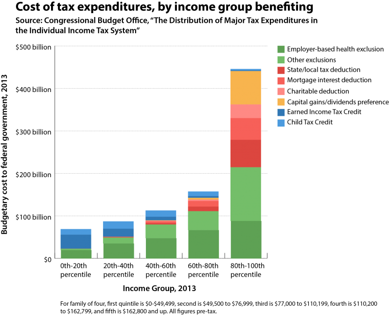
Dylan Matthews at the Washington Post WonkBlog regraphed the numbers to show the total amounts overall plus the amounts in each category for each income group:

3

The point? People complain about government payments to the poor, but tax breaks are also payments, though less obviously so, to the rich.  And those tax breaks cost the government a lot more money.

Jay Livingston is the chair of the Sociology Department at Montclair State University. You can follow him at Montclair SocioBlog or on Twitter.

American companies that once looked to places like Mexico and China for cheap labor are bringing those jobs back to the U.S.  Why? Because prison labor is much, much cheaper.  Paid between 93¢ and $4.73 per day, and collecting no benefits, prisoners are a cheap labor source for about 100 companies (source).

What does this have to do with you?

If you have insurance, invest, use utilities, have a bank, drive a car, send a child to school, go to a dentist, call service centers, fly on planes, take prescription drugs, or use paper, you might be benefiting from prison labor.

If you’ve bought products by or from Starbucks, Nintendo, Victoria’s Secret, JC Penney, Sears, Wal-Mart, K-Mart, Eddie Bauer, Wendy’s, Proctor & Gamble, Johnson & Johnson, Fruit of the Loom, Motorola, Caterpiller, Sara Lee, Quaker Oats, Mary Kay, or Microsoft, you are part of this system.

When prisoners are in state and federal prisons, the U.S. taxpayer is subsidizing low wages and corporate profits, since they are paying for prisoners’ room, board, and health care.  When prisoners are in private prisons, prison labor is a way to make more money off of the human beings caught in the corrections industry.  In other words, prison labor is an efficient way for corporations to continue to increase their profits without sharing those gains with their employees.

For an extensive list of the companies contracting prison labor, click here.  You might also find interesting the video clips, embedded in this news story, of promotional videos by prison corporations that attempt to sell the idea of prison labor to companies:

Lisa Wade, PhD is an Associate Professor at Tulane University. She is the author of American Hookup, a book about college sexual culture; a textbook about gender; and a forthcoming introductory text: Terrible Magnificent Sociology. You can follow her on Twitter and Instagram.

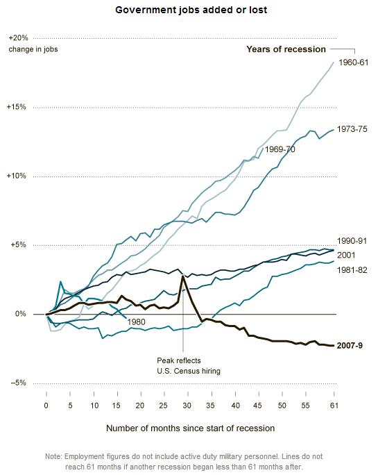
While some austerity advocates really fear (although incorrectly) the consequences of deficit spending, the strongest proponents are actually only concerned with slashing government programs or the use of public employees to provide them.  In other words their aim is to weaken public programs and/or convert them into opportunities for private profit. One measure of their success has been the steady decline in public employment.  Floyd Norris, writing in the New York Times notes:

For jobs, the past four years have been a wash.

The December jobs figures out today indicate that there were 725,000 more jobs in the private sector than at the end of 2008 — and 697,000 fewer government jobs. That works into a private-sector gain of 0.6 percent, and a government sector decline of 3.1 percent.

In total, the number of people with jobs is up by 28,000, or 0.02 percent.

How does that compare? It is by far the largest four-year decline in government employment since the 1944-48 term. That decline was caused by the end of World War II; this one was caused largely by budget limitations.

The chart below, taken from the same post, also reveals just how weak private sector job creation has been over the past 12 years (compare the top three rows — the presidencies of Obama and Bush — w job changes This graphic from the New York Times highlights just how significant the decline in public employment has been in this business cycle compared with past ones.  Each line shows the percentage change in public sector employment for specified months after the start of a recession.  Our recent recession began December 2007 and ended June 2009.   As you can see, what is happening now is far from usual.

1

It is also worth noting that despite claims that most Americans want to see cuts in major federal government programs, the survey data show the opposite.  For example, see the following graphic from Catherine Rampell’s blog post. economix-22pewwhattocut-blog480 As Rampell explains:

In every category except for “aid to world’s needy,” more than half of the respondents wanted either to keep spending levels the same or to increase them. In the “aid to world’s needy” category, less than half wanted to cut spending.

Not surprisingly, this assault on government spending and employment will have real consequences for the economy and job creation. All of this takes us back to the starting point — we are talking policy here.  Whose interests are served by these trends?

Martin Hart-Landsberg is a professor of economics at Lewis and Clark College. You can follow him at Reports from the Economic Front.

Cross-posted at Montclair SocioBlog.

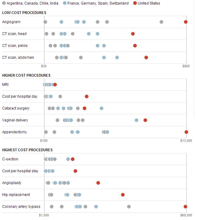
The Washington Post has provided some data on medical costs across a selection of countries (Argentina, Canada, Chile, and India in grey; France, Germany, Switzerland, and Spain in blue; and the U.S. in red). The data reveal that American health care is very expensive compared to other countries.

1

No wonder the US spends twice as much as France on health care.  In 2009, the U.S. average was $8000 per person; in France, $4000.  (Canada came in at $4800).  Why do we spend so much?  Ezra Klein quotes the title of a 2003 paper by four health-care economists:  “it’s the prices, stupid.”

And why are US prices higher?  Prices in the other OECD countries are lower partly because of what U.S. conservatives would call socialism – the active participation of the government.  In the U.K. and Canada, the government sets prices.  In other countries, the government uses its Wal-Mart-like power as a huge buyer to negotiate lower prices from providers.  (If it’s a good thing for Wal-Mart to bring lower prices for people who need to buy clothes, why is it a bad thing for the government to bring lower prices to people who need to buy, say, an appendectomy? I could never figure that out.)

There may also be cultural differences between the U.S. and other wealthy countries, differences about whether greed, for lack of a better word, is good.  How much greed is good, and in what realms is it good?  Klein quotes a man who served in the Thatcher government:

Health is a business in the United States in quite a different way than it is elsewhere.  It’s very much something people make money out of. There isn’t too much embarrassment about that compared to Europe and elsewhere.

So we Americans roll along, paying several times what others pay for medical procedures, doctor visits, and drugs.

Jay Livingston is the chair of the Sociology Department at Montclair State University. You can follow him at Montclair SocioBlog or on Twitter.

Cross-posted at Reports from the Economic Front.

While newspapers give a lot of ink to arguments about whether reducing the budget deficit will boost or reduce growth, they seem to have little interest in the related issue of whether economic growth really benefits the great majority.

David Cay Johnston, the Pulitzer Prize winning financial journalist, recently addressed this issue drawing on the work of economists Emmanuel Saez and Thomas Piketty:

In 2011 entry into the top 10 percent… required an adjusted gross income of at least $110,651. The top 1 percent started at $366,623.

The top 1 percent enjoyed 81 percent of all the increased income since 2009. Just over half of the gains went to the top one-tenth of 1 percent, and 39 percent of the gains went to the top 1 percent of the top 1 percent.

Ponder that last fact for a moment — the top 1 percent of the top 1 percent, those making at least $7.97 million in 2011, enjoyed 39 percent of all the income gains in America.

So, 81 percent of all the new income generated from 2009 to 2011 was captured by the top 1 percent income earners, where income is defined as adjusted gross income, which refers to income minus deductions or taxable income.  In other words, growth, even accelerated growth, is not going to do the majority much good if the economic structure remains the same.

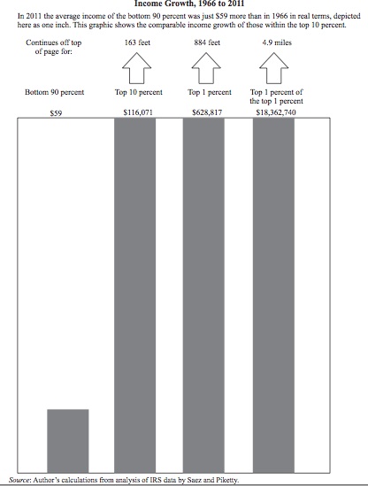
Johnston highlights the problem with our existing economic model with perhaps an even more shocking example.  He compares the average income growth of the bottom 90 percent with the average income growth of the top 10 percent, 1 percent, and top 1 percent of the top 1 percent over the period 1966 to 2011.

It turns out that the average income of the bottom 90 percent rose by a miniscule $59 over the period (as measured in 2011 dollars).  By comparison, the average income of the top 10 percent rose by $116,071, the average income of the top 1 percent rose by $628,817, and the average income of the top 1 percent of the top 1 percent increased by a whopping $18,362,740.  In short, growth alone means little if the great majority of people are structurally excluded from the benefits.

In an effort to highlight this extreme disparity in adjusted income growth rates, Johnston suggests plotting the numbers on a chart, with $59, the amount gained by the bottom 90 percent, represented by a bar one inch high.  As the chart below shows, the bar representing average gains for the top 10 percent would be 163 feet high, that for the top 1 percent would be 884 feet high, and that for the top 1 percent of the top 1 percent would be 4.9 miles high.

1

In sum, the real challenge facing the great majority of Americans is not figuring out how to make the economy growth faster.  Rather, it is figuring out how to create space for a real debate about how to transform our economy so that growth will actually satisfy majority needs.

Martin Hart-Landsberg is a professor of economics at Lewis and Clark College. You can follow him at Reports from the Economic Front.
Last week many media outlets were busy celebrating the Dow Jones record high, suggesting that it was indicative of the United States’ recovery from the greatest economic downturn since The Great Depression.  The graph below comes from a New York Times story with the headline “As Fears Recede, Dow Industrial Hits a Milestone.”

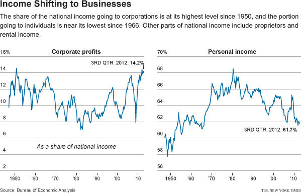
However, another story buried in the Business section of the New York Times, titled “Recovery in U.S. Is Lifting Profits, but Not Adding Jobs,” contains a graph illustrating how the supposed economic recovery is bitter-sweet at best:

2

The second graph uses data from the Bureau of Economic Analysis to highlight the fact that corporate profits and stock prices are at record highs, but the share of profits workers have taken home has steadily dropped since the early 1980s.  Some of the steepest declines have come during the last few years, or during the supposed “recovery.”

These two graphs illustrate that while ”The Market” is probably considered the go-to indicator of economic well-being, stock indexes are not always indicative of the economic reality experienced by non-investors.  If businesses and corporations were increasing their stock value by investing to expand productivity, thereby creating good-paying jobs and opportunities for workers, rising markets would be a sign good of economic times for all.  But this data suggests that is not what is happening; instead, as the twin charts show, rising corporate profits are at least partly the result of wage suppression.

Jason Eastman is an Assistant Professor of Sociology at Coastal Carolina University who researches how culture and identity influence social inequalities.

Emma K. submitted a sobering illustration of wealth inequality in the U.S.  It compares American ideal distributions of wealth, with what they think it is and what it really is. Suffice to say, Americans wish for more equal distributions, but the reality far outpaces their worst nightmare.

Here’s a snapshot:

1

A worthwhile 6 minutes:

Lisa Wade, PhD is an Associate Professor at Tulane University. She is the author of American Hookup, a book about college sexual culture; a textbook about gender; and a forthcoming introductory text: Terrible Magnificent Sociology. You can follow her on Twitter and Instagram.