economics

Our favorite economist, Martin Hart-Landsberg, has written a detailed account of what is causing the rise of income inequality around the world.  Here I’d like to highlight just one of his really interesting observations.

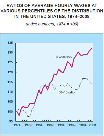
While we usually think that rising income inequality is caused by the rich getting richer and the poor getting poorer, a more complex picture is emerging.  The graph below plots the hourly wages of the 90th percentile (Americans who make more than 89% of the population) relative to the wages of the 50th percentile (the purple line) and the wages of the 50th compared to the 10th percentile (the dotted blue line).

In English: it asks how quickly the richest people (90th) are pulling away from the average person (50th) and how quickly the average person is pulling away from the poorest (10th).  The answer?  Income inequality has been increasing since the 70s but, since the late ’80s, rich people have continued pulling ahead of the average American, but the average American has not been gaining on the poor.

Wage-ratios

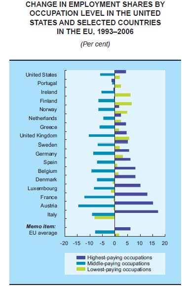
Another indicator that the middle class is shrinking is changes in the share of jobs that are low-, middle-, or high-paid.  The next graph shows that, across a wide range of countries, high- and low-paying jobs are on the rise, but middle-paying jobs are on the decline.  So, middle income jobs are disappearing, but there are more of both high- and low-income jobs.

Jobs (1)

Hart-Landsberg suggests that the reason for this shift in the economy involves the globalization of production.  For more, visit Reports from the Economic Front.

Lisa Wade, PhD is an Associate Professor at Tulane University. She is the author of American Hookup, a book about college sexual culture; a textbook about gender; and a forthcoming introductory text: Terrible Magnificent Sociology. You can follow her on Twitter and Instagram.

The Trouble with Apple

Suicide at Foxconn. Poisoned workers. Colluding to inflate the price of e-books. Tax evasion (albeit, legal). Shady suppliers who can’t toe the line of labor or environmental laws in China. Apple’s reputation has taken a hit in recent years. Or, so it seems it should have. But, despite the fact that news reports on the company’s behavior and supplier relationships have been more negative than positive since 2012, Apple’s revenue has continued to climb and break records.

In fact, while the press has illuminated terrible labor conditions in the supply chains for iPhones and iPads (with the most recent revelations coming via China Labor Watch’s report on Pegatron sites where the “cheap iPhone” is in the works), sales of these products in particular have soared, and now account for the majority of the company’s revenue. Apple has jockeyed with ExxonMobil for the world’s most valuable company over the last few years, and currently stands second to the oil giant with $413.9 billion. Remarkably, Apple amassed $156 billion in revenue in 2012 without being the industry leader in any of its product sectors (in terms of unit sales), due to the very high profit margins on iPhones and iPads.

Screenshot_1

How does Apple maintain this economic dominance in light of negative press that should be bad for its bottom line? How do we, the highly educated consumer base of the company, remain invested in Apple products when work conditions in China and the clever skirting of tax liability grate against our progressive sensibilities? As a sociologist who focuses on consumer culture, I suspect that it is Apple’s brand power that keeps us eating its fruit, and the company afloat. With its iconic logo, sleek aesthetic, and promise of creativity, excitement, and greatness embedded in its products and message, Apple successfully obscures its bad behavior with its powerful brand.

“Emotional Branding”

1

Marketing and branding experts describe a brand as a vision, a vocabulary, a story, and most importantly, a promise. A brand is infused throughout all facets of a corporation, its products, and services, and is the ethos upon which corporate culture, language, and communication are crafted. A brand connects the corporation to the outside world and the consumer, yet it’s intangible: it exists only in our minds, and results from experiences with ads and products.

To understand Apple’s brand and its significance in our contemporary world, I have embarked on a study of the company’s marketing campaigns. I started with a content analysis of television commercials, and with the help of Gabriela Hybel have analyzed over 200 unique television spots that have aired in the U.S. between 1984 and the present. One of the key findings to emerge is that Apple, and the ad firms it contracts with, are exceptionally talented at what the marketing industry calls emotional branding.

In his book named for this approach, Marc Gobé argues that understanding emotional needs and desires, particularly the desire for emotional fulfillment, is imperative for corporate success in today’s world. After studying Apple commercials, one thing that jumps out about them is their overwhelmingly positive nature. They inspire feelings of happiness and excitement with playful and whimsical depictions of products and their users. This trend can be traced to the early days of the iMac, as seen in this commercial from 1998.

An iPod Nano commercial that aired in 2008 takes a similar approach to combining playful imagery and song:

In a more recent commercial, actor and singer Zooey Deschanel, known for her “quirky” demeanor, performs a playful spin on the utility of Siri, the voice activated assistant that was introduced with the iPhone 4S in 2011.

Commercials like these — playful, whimsical, and backed by upbeat music — associate these same feelings with Apple products. They suggest that Apple products are connected to happiness, enjoyment, and a carefree approach to life. To tip the sociological hat to George Ritzer, one could say that these commercials “enchant a disenchanted world.” While Ritzer coined this phrase to refer to sites of consumption like theme parks and shopping malls, I see a similar form of enchantment offered by these ads. They open up a happy, carefree, playful world for us, removed from the troubles of our lives and the implications of our consumer choices.

Importantly, for Apple, the enchanting nature of these ads and the brand image cultivated by them act as a Marxian fetish: they obscure the social and economic relations, and the conditions of production that bring consumer goods to us. Now more than ever, Apple depends on the strength of its brand power to eclipse the mistreatment and exploitation of workers in its supply chain, and the injustice it has done to the American public by skirting the majority of its corporate taxes.

Next: Sentimental Consumerism, the Apple Way.

Nicki Lisa Cole, Ph.D. is a lecturer in sociology at Pomona College. She studies the connections between consumer culture, labor, and environmental issues in global supply chains. You can follwer her at 21 Century Nomad, visit her website, and learn more about her research into Apple here.

Any improvement in living and working conditions in the United States is going to require far more than tinkering at the margins.  The fact is that U.S. economic dynamics have undergone a major transformation.

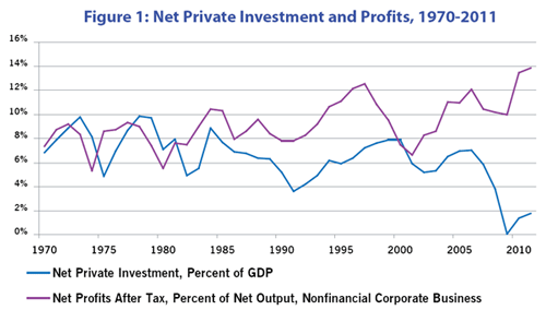
Figure 1, taken from an article by Gerald Friedman, shows that profits and investment are no longer positively related.  Since the early 2000s, profits have soared as a percent of GDP and net private investment has plummeted.  Even during the 1990s, when high-technology was celebrated as the engine of never-ending growth, net investment as a share of GDP remained below 1970s and 1980s highs.

Figure 1: Net Private Investment and Profits, 1970-2011

Our leading companies, the ones that shape government policy, are now able to make healthy profits without spending on plant and equipment much beyond replacement.  Their profits are now largely secured by globalizing manufacturing production, financialization, intensification of work, wage suppression, and government tax-breaks and subsidies.  Of course, that means that their quest for profits will continue to lead to policies likely to undermine progress in reversing negative trends in majority living and working conditions.

A case in point is their aggressive push, supported by the Obama administration, for new free trade agreements: the Trans-Pacific Partnership Free Trade Agreement and the Trans-Atlantic Free Trade Agreement. President Obama took the lead in securing passage of the Korea-U.S. Free Trade Agreement, arguing that it would improve our trade balance with Korea and by extension U.S. jobs.  Well, the returns are in, and in line with the record of past agreements, the outcome is the exact opposite.

The Eyes on Trade blog offers the following summary:

April [2013] was another record-breaking month for U.S. trade with Korea under the U.S.-Korea Free Trade Agreement (FTA).  The monthly U.S. trade deficit with Korea soared to its highest point in history, topping $2.5 billion for the month of April alone.

According to a ratio used by the Obama administration, the unprecedented deficit surge implies 13,500 U.S. jobs lost to trade with Korea in just thirty days.  April’s trade deficit with Korea was 30% higher than in April 2012 — the first full month of FTA implementation — and 90% higher than in April 2011, before the FTA took effect.

The deficit increase owes largely to a dramatic drop in U.S. exports to Korea since enactment of the FTA.  U.S. exports to Korea in April once again fell below the levels seen in any given month in the year before the FTA took effect.  The sorry track record defies the promise (FTA = more exports) that the Obama administration used to pass the FTA.  Undeterred by the facts, today the administration is using the same worn-out promise to sell the Trans-Pacific Partnership.

April 2013

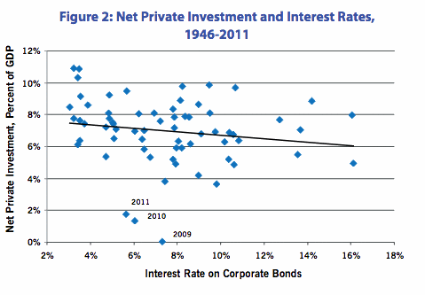
Unwilling to pursue policies that directly threaten corporate interests, the Obama administration has relied on monetary policy, or more specifically lower interest rates, to boost investment and employment.  As Figure 2 from Friedman’s article makes clear, while lower rates generally boost investment, data points for 2009, 2010, and 2011 strongly suggest that monetary policy has lost its effectiveness.

Figure 2: Net Private Investment and Interest Rates, 1946-2011

President Obama can talk all he wants about the need for more investment and better jobs, but unless he is pushed to pursue dramatically different policies, it is hard to see any real gains for working people over the next decades.

Martin Hart-Landsberg is a professor of economics at Lewis and Clark College. You can follow him at Reports from the Economic Front.

McDonald’s has distributed a pamphlet showing employees how to make a budget and stick to it.  As you can see, the pamphlet is a joint effort by McDonald’s, VISA, and (apparently said with a straight face), Wealth Watchers International.  The “key to your financial freedom,” they say, is keeping a budget journal.

Screenshot_1

Here’s the sample budget McDonald’s uses:

Budget 1 pg

The budget is encouraging, to say the least.  With an income of $2060 a month, a 2-earner family can save $100 each month.

But do you notice anything missing?  Food, for example. Presumably, that comes out of the $27 a day in spending money.  Transportation costs? Car payments are included, but not gasoline or upkeep. On an income of $24,000 a year, will this family have a car that needs no maintenance?  And if the two earners have only one car, it’s likely someone will have to take public transportation to work.  Oh, wait  – maybe they both work at the same McDonald’s. And they never buy clothes.

I’m not sure how McDonald’s employees get health insurance for $20.  Or home heating for free.

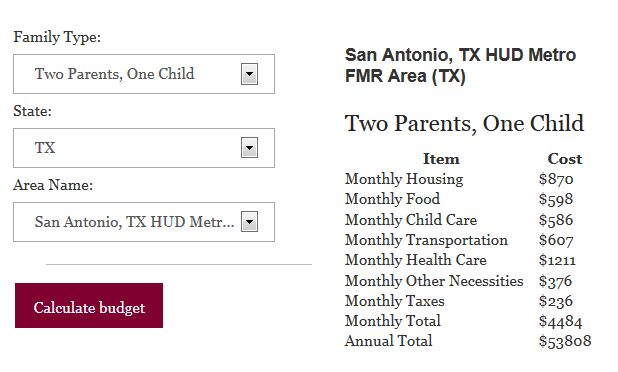
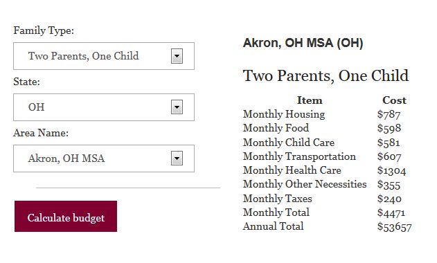
I compared this budget with those found at the The Economic Policy Institute, which has a “Family Budget Calculator.”  You enter the location and the number of adults and children, and it shows the budget for “a secure yet modest living standard.”  Since McDonald’s used a 2-earner family, I imagined a family with two adults and one child.  Here’s what they would need in San Antonio.

Budget SanAntonio

Here’s a northern city, Akron.

Budget Akron

Both cities require a monthly income of $4400 for a modest living, more than double what McDonald’s envisions for its employees.  The big difference is health care – $1200 a month is a lot more than $20.  Then comes transportation ($600 vs. $0).  Then there’s the $580 for childcare, an item that is also absent from the McDonald’s budget.  (Apparently, workers at Golden Arches are part of that low-fertility problem that some observers in the Wall Street Journal worry about – here for example).

As for daily spending, food alone, at $600, more than wipes out what the McDonald’s budget suggests. Perhaps McDonald’s assumes that the family eats most of their meals on site, taking advantage of the 50% employee discount.

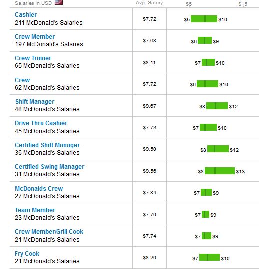
So much for the spending part of the McDonald’s budget.  What about the income part?  The Glass Door  posted these pay ranges for various positions.

Budget wages

Workers might get as little as $6 or even $5 per hour.  The average seems closer to $7.  Fast food is not covered by federal minimum wage, but let’s use that $7.25 as a default estimate.  A forty-hour week, four weeks a month, comes in at $1160 – very close to the $1105 in the McDonald’s sample budget. So that side of the balance sheet is fairly realistic.

That annual income of just under $24,720 is above the official poverty line – $19,530 – but not by all that much.  Given the omissions in the expense column, I would think that a family would find it very hard to live on that little.  And I doubt they could sock away $100 in savings, no matter how much “journaling” they did.

Cross-posted at Montclair SocioBlog.

Jay Livingston is the chair of the Sociology Department at Montclair State University. You can follow him at Montclair SocioBlog or on Twitter.

Cross-posted at Reports from the Economic Front.

Wealth data is not easy to get.  Still for three years now, Credit Suisse Research Institute has published an annual Global Wealth Databook which attempts to estimate global wealth holdings.  The most recent issue includes data covering 2012.  According to Credit Suisse, the goal “is to provide the best available estimates of the wealth holdings of households around the world for the period since the year 2000.”

According to the publication, global household wealth was $222.7 trillion in mid-2012, equal to $48,500 for each of the 4.6 billion adults in the world.  Wealth is defined as “the marketable value of financial assets plus non-financial assets (principally housing and land) less debts.”

Not surprisingly, as the figure below shows, average global wealth varies considerably across countries and regions.

picture wealth

Also significant are the values of the mean vs the median wealth in each of the countries.  Mean or average wealth is calculated by dividing the total wealth of a country by its adult population.   Median wealth is the wealth holdings of the adult in the middle of the wealth distribution. The median is generally considered a far more reliable indicator of wealth because it is less sensitive to extremes at the top or bottom of the distribution.  The greater the divergence of mean and median wealth, the greater is the wealth inequality.

The table below provides mean and median wealth estimates for those countries with generally reliable data. As you can see, the U.S. ranks high in terms of mean wealth, trailing only 5 countries.  Things are quite different when it comes to median wealth; the U.S. trails 26 countries!  Not surprisingly, then, the U.S. is No. 1 when it comes to the mean/median wealth ratio, or wealth inequality.

global wealth

We clearly dominate in the number of millionaires and the upper global wealth categories.  Are we a wealthy country? Definitely.  Is that wealth concentrated in relatively few hands?  Definitely.

Martin Hart-Landsberg is a professor of economics at Lewis and Clark College. You can follow him at Reports from the Economic Front.
Cross-posted at Montclair SocioBlog.

According to an op-ed in the Times, America is the global leader in broadband, with high speeds and great service. And it’s all because the government restrained “onerous” regulation and let companies like Verizon do what they want and charge what they want.

It was written by the CEO of Verizon, Lowell McAdam.

I pay Mr. McAdam’s company about $115 each month for my land line, wi-fi, and cable (all FIOS).  Mr. McAdam compares the U.S. favorably with Europe, “where innovation and investment in advanced networks have stagnated under an onerous regulatory regime.”  I asked a friend who lives in Paris what he pays for his FIOS phone, wi-fi, and cable.  The monthly bill:  39.90€ ($52) or half of what I pay Verizon.  Maybe there’s an upside to stagnant and onerous.

There’s nothing wrong with getting what you can afford, and it occurred to me that U.S. broadband is the best because we can afford more.  Onerous regulations or no, most other countries are not as rich as the U.S.  What if you looked at broadband and per capita GDP?

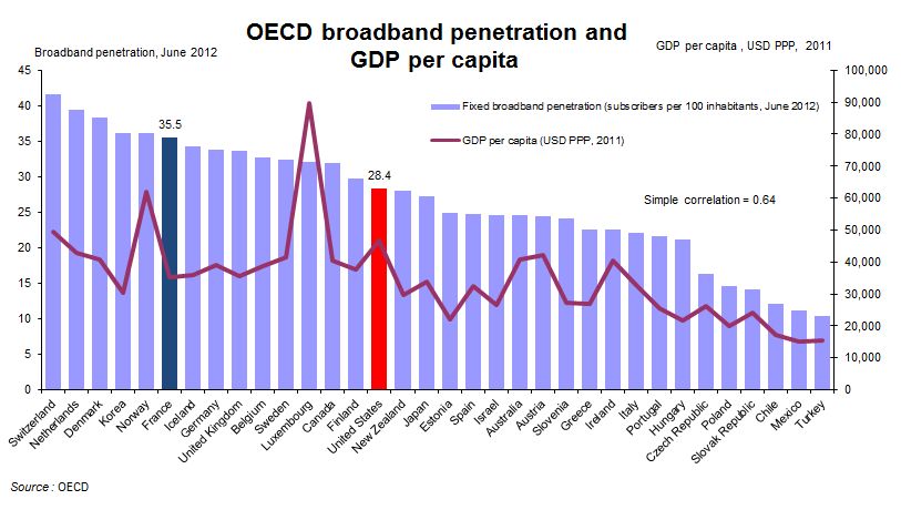
The OECD did just that with data from June 2012 (their several spreadsheets on this are here). The purple bars are broadband penetration and the bumpy red line is GDP per capita. Do you see a correlation?

1

Consider France: As of a year ago, the country had greater broadband penetration despite a lower per capita GDP than the U.S. ($35,133 vs. $46,588); that’s 25% more broadband on 33% less income and at half the cost to consumers.

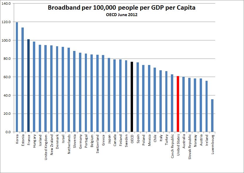
If you re-rank the OECD countries factoring in per capita GDP, the line-up changes.  Notably, the U.S. and Luxembourg drop well below the OECD average, despite being among the wealthiest countries.

2

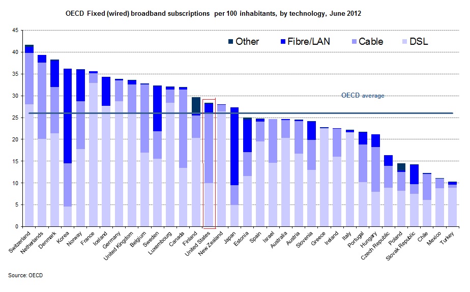
Of course, not all broadbands are equally broad.  Verizon sold me on fiber-optic with their assurance that it was dazzlingly faster than their DSL that I had been clunking along on. This graph breaks down broadband into its various incarnations.

3

The U.S. is slightly above average on all broadband, but when it comes to a high fibre diet, we are ahead of several other countries that have greater total penetration.  On the other hand, the Scandinavian countries are ahead of us, as are, impressively, the Asian countries.

This is not to deny U.S. advances.  TechCrunch summarizes more recent data from Akamai on these changes:

the U.S. is currently second in the price of broadband for entry-level users. The nation is also third in network-based competition, second in the fiber-optic installation rate, first in the adoption of next-generation LTE, ahead of Europe in broadband adoption, and doing quite well in Internet-based services.

Still, the U.S. lags behind other, less wealthy countries.  InnovationFiles, using Akamai data for different variables, has a less congratulatory view.

  • The U. S. has picked up one place in the “Average Peak Connection Speed” that’s the best measurement of network capacity, rising from 14th to 13th as the measured peak connection speed increased from 29.6 Mbps to 31.5 Mbps.
  • In terms of the “Average Connection Speed,” widely cited by analysts who don’t know what it means, the U. S. remains in 8th place world-wide. but we’re no longer tied for it as we were in the previous quarter; Sweden is right behind us on this one.
  • In terms of “High Speed Broadband Adoption”, the proportion of IP addresses with an Average Connection Speed greater than 10 Mbps, we remain in 7th place, but now we’re tied with  Sweden.

The title of CEO McAdam’s op-ed is “How the US Got Broadband Right.”  Given the content, I  guess “We’re Number 13!” wouldn’t have been appropriate.  Even “We’re Number Seven (Tied With Socialist Sweden)!” doesn’t quite have that affirmative zing.

Jay Livingston is the chair of the Sociology Department at Montclair State University. You can follow him at Montclair SocioBlog or on Twitter.

In the early 1990s, Bill Moyers began following two Milwaukee families, the Neumanns and the Stanleys, as they struggled to keep a foothold in the middle class in the face of economic changes that largely destroyed the city’s decently-paid, unionized manufacturing jobs. An earlier documentary, Surviving the Good Times, showcased the two incredibly hard-working families’ efforts to adapt to the new economic reality. Their stories highlight the difficulty of trying to achieve the American Dream on a series of jobs that rarely pay a living wage or offer any benefits.

And how about now? Twenty years after he first started following their lives, Moyers returned to Milwaukee to see how they had fared during the housing bubble and subsequent economic crisis. Two American Families shows the increasing economic precariousness each family experiences over two decades and the impacts this has on the opportunities they can provide their children. It’s a heartbreaking look at the effects of large-scale economic changes on individual families.

PBS has also posted interviews with a few of the family members about why they participated in the new film, as well as an update on how they’re doing since they were last filmed. And you can find a number of charts on the changing economy and its impacts on families here, and some data about Milwaukee specifically here.

Gwen Sharp is an associate professor of sociology at Nevada State College. You can follow her on Twitter at @gwensharpnv.

Cross-posted at Reports from the Economic Front.
Media and policy-makers seem anxious to convince us that the economy is in strong recovery mode, therefore, no further significant policy interventions are needed.

Their optimism appears to rest heavily on the recent acceleration in consumer spending.  After all, there are strong reasons for concern with the other major sources of growth:  government spending on all levels is being cut, exports face a weakening world economy, and business investment remains largely stagnate.

But there are also strong reasons to challenge this optimistic view of consumer spending as a growth engine.  The charts below, from a Wall Street Journal article, highlight some of the most important.

As we see below, while consumption spending is indeed accelerating, after tax personal income is falling.  In other words, there appears little reason to believe that there is a solid foundation for sustaining this trend.

1

Additionally, after four years of recovery we still have 2.4 million fewer jobs than we had at the start of the recession.  Moreover, as we see below, there has been no real wage growth.  In fact, real average wages have fallen for most of the so-called expansionary period.

2

Yes, housing values are finally starting to rise and household debt payments as a share of after-tax income are declining.  But to a large extent the new burst in consumption spending has more to do with renewed borrowing than solid gains in job creation and income.

Unfortunately, there is little reason for us to have confidence that the economy is gathering strength in ways that will be sustainable or benefit the great majority of working people.

Martin Hart-Landsberg is a professor of economics at Lewis and Clark College. You can follow him at Reports from the Economic Front.