demography

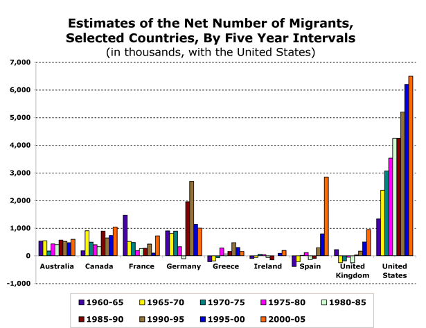
I found this graph illustrating levels of migration to several countries from 1960-65 to 2000-05 at the Migration Policy Institute:
picture-12

Keep in mind, these are total numbers, not weighted by the size of the population of each country, so a country with a relatively small number of migrants compared to other countries may have a much larger percent of the population made up of migrants. But it is interesting to see the increases and decreases of migration over time in each country. The large increase in immigration to Spain especially caught my attention; see also our post on Spain’s voluntary return policy.

Other posts on immigration: the “Muslim demographic threat”, immigration and spouses, volunteer U.S. border guards, the “Battle for Britain”, refugees, immigration streams to the U.S., a horrid Border Patrol video game, Asian Americans and marriage, refugees in the U.S., anti-Puerto Rican statehood movement, pro-environment anti-immigration video, early German assimilation in the U.S., do immigrants work harder?, Muslims in Europe, world stats, and emigration from Mexico.


This image, found at International Networks, depicts the globe at night.  The areas bathed in electricity reveal “the global spread of industrialization, as evidenced by the lights of human civilization”:

lights_earth

I think it’s interesting to compare this image with a world population map (link):

g-gpw-population-map

At first the two maps seem to overlap pretty nicely, but if you look closely there are plenty of interesting discrepancies, especially in Africa.

Thanks to Toban B. for the link that got me to the graphic that inspired this post.

NEW (Apr. ’10)!  In the comments, Brendon linked to this great image of the Korean peninsula at night that reveals an amazing difference between North and South Korea:

—————————

Lisa Wade is a professor of sociology at Occidental College. You can follow her on Twitter and Facebook.

Danielle C. sent us a video about “Muslim demographics.” When I saw the title, I assumed it was just a basic informational video about the Muslim population. Oh, indeed not:

There are so many things going on there, I’m having trouble knowing where to start. I’m going to just sidestep the many demographic assertions thrown at us, though readers may have thoughts there. It is interesting how the presence of Muslims is associated with the idea of an Islamic state–at about 3:20 the narrator says that Muslim population growth will turn France into an “Islamic Republic” by 2039 or so. But a Muslim population is not the same as an Islamic republic–one is a religious population, the other is a form of government, and they don’t automatically go together, as, say, Turkey might illustrate.

Also notice the explicit assumption that Muslims are inherently bad and that a country with an increasing Muslim population is automatically in danger (as well as the clear assumption about who “we” and “our” children and grandchildren are). In fact, while the word “immigration” is usually used in a threatening tone of voice in the video, apparently the threat from the Muslim hordes is sufficient that we may even have to accept the need for Latino immigrants, since they may be the only group that can save the U.S. for ending up like Europe, which is a lost cause already.

In this 7 1/2 minute video Hans Rosling maps the relationship between life expectancy, GDP, and sexual health and rights over 300 years of Swedish history:

Found at GapMinder.

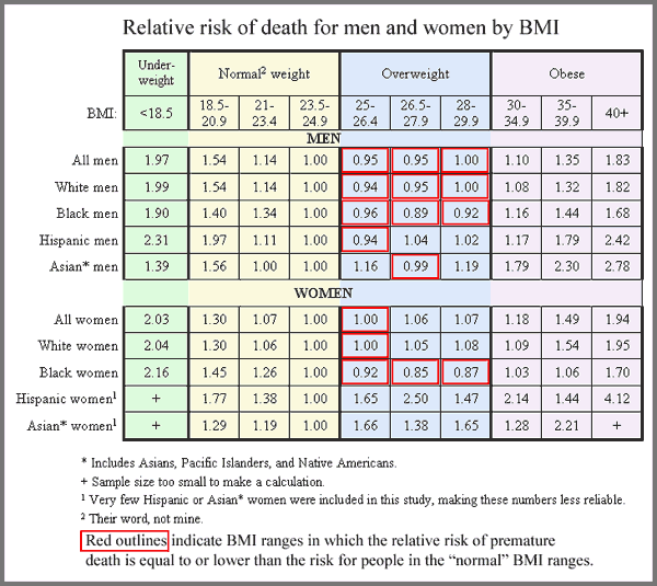
Much of the discourse around the benefits of being thin revolves around the assumption that extra pounds are harmful to health.  Ampersand at Alas A Blog posted about a study in the New England Journal of Medicine (citation below) that shows that  those who are overweight (according to the BMI scale) are not at a higher risk of premature death than those who are deemed of “normal” weight.   The boxes in red are categories in which the risk for premature death is equal to or less than the reference group (normal weight people).

rr_by_bmi_large

This is Ampersand’s conclusion (and his table, too).

The authors of the study, as commenter A.C. pointed out,  come to the opposite conclusion.  They argue, after looking at the data in different ways, say that overweight persons are at a higher risk for death.

Ampersand doesn’t buy it.  He offers a critique here where, among other things, he points out:

In order to produce the finding that “overweight” is less healthy than “normal weight,” Dr. Adams did a very dishonest statistical manipulation – he compared just one “normal” BMI range, representing the heaviest people in the “normal” range, to the entire “overweight” range. This is because the majority of people in the “normal weight” categories had a greater risk of death than the majority of people in the “overweight” category.

This might be a great way to discuss how methods and statistics never speak for themselves.

Relatedly, this post offers a really great visual critique of the BMI scale.

Citation:  Adams, K., et al., “Overweight, Obesity, and Mortality in a Large Prospective Cohort of Persons 50 to 71 Years Old.” New England Journal of Medicine, 2006. 355(8): p. 763-8.  Here if you have a subscription to ProQuest.

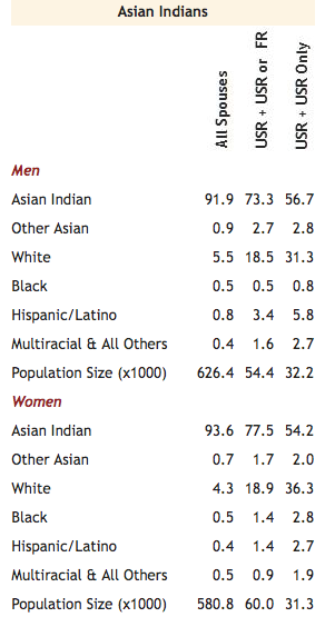
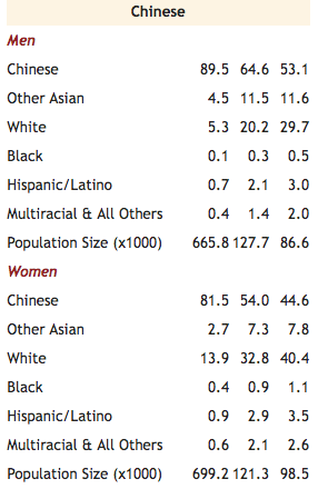
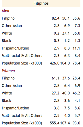
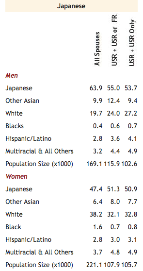
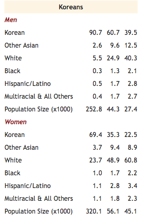
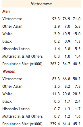
I just discovered the entirely excellent website Asian Nation, run by C.N. Le and full of great information about the Asian American community. Here are some tables showing what percent of various Asian American groups are married to spouses of the same or other groups, updated as of October 2007 using Census data (an explanation of the three columns follows):

Ok, now to explain the three columns of numbers. The first one presents data for all marriages that include at least one Asian American spouse–this will include large numbers of immigrants who were married before they moved to the U.S. The second column includes only those marriages where at least one spouse was raised in the U.S., defined as either born here or moved here by age 13. The third column includes only those marriages where both spouses were raised in the U.S. According to Le, this group represents less than 25% of all marriages including an Asian partner, but “…has the advantage of including only those who were raised and socialized within American society and its racial dynamics. It is this U.S.-raised population that best represents young Asian Americans, since they are the ones who have the most exposure to prevailing American cultural images and media.”

Not surprisingly, endogamous (in-group) marriage rates drop off significantly among U.S.-raised Asian Americans. There are other interesting gender patterns as well. Notice, for instance, that Chinese, Vietnamese, Korean, and Filipina women are quite a bit more likely to be married to a White partner (the most common out-group spouses) than are men, and for the remaining groups, women are slightly more likely to be married to a White spouse. You might discuss the social and historical factors that might cause that pattern, and compare it to the trend in marriages with a Black and a White spouse, in which the gender pattern is usually reversed–Black men are more likely to be married to Whites than are Black women. It might also be worth noting that Korean and Filipina women are significantly less likely to marry endogamously than the other Asian American ethnic groups.

I’ve posted about the phenomenon of what I’ve called leftist balkanization or the way in which leftist causes tend to be narrowly focused such that they undermine other leftist causes (see here for my original post and here and here for two follow-ups).  Perhaps the opposite of such balkanization is social movements that try to bring together issues that find themselves on opposite sides of the political spectrum.  Below are two advertisements for the pro-environment anti-immigration movement.  The argument is that restricting immigration is good for the environment.

This first commercial from the Californians for Population Stabilization makes exactly this point:

You might be asking yourself whether this pro-environment anti-immigration message is really just an anti-immigration message shrouded in leftist rhetoric.   In this case, at least based on the commercial below from the same organization, the answer appears to be “yes.”

Of course, it’s not necessarily true that all anti-immigrant pro-environment messages are secretly simply xenophobic. For a great discussion of this troubled movement, see Leslie King’s great article that shows how challenging it is to mobilize a grass roots movement when one half of your message offends one half of the population and the other half of your message offends the other.

Via copyranter.

This website contains links to a lot of Census Bureau maps showing where different racial and ethnic groups (including White ethnics) are concentrated in the U.S. They also have “absence of” maps showing counties with less than 25 people from different racial grops, which are fascinating. They’re all available from the Census, but it’s nice to have them all collected here for easy access and comparison.

Thanks to Kelly V. for pointing it out!