demography

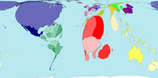
The U.S. population is becoming less and less overwhelmingly white. Projections suggest that, by 2050, whites will compromise less than half of the population. This trend, according to the New York Times today, is being driven by our kids. Below, a map shows the percentage of non-white children in each state of the Union.

race-minority-children.jpg

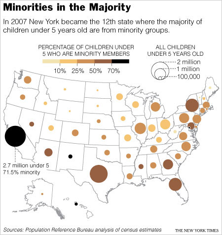
Among other things interesting to me about this discussion is the tendency to compare the proportion of the population that is “white” with the proportion of the population that is “not white.” This reinforces the notion that white is somehow pure and important, and everything else is just… something else. While some say that we will no longer be a “white nation” (for better or worse) when whites are outnumbered by non-whites, whites will still be the majority insofar as the non-white group is comprised of an incredibly diverse group of people by race, ethnicity, and immigration-status.

Worldmapper offers maps in which the actual land area is morphed to represent various disproportionalities across the globe. The website has over 300 maps! Thanks 73man for the tip!

I borrowed a few examples and pasted them in below. The first map is an actual land area map for reference.

Territory size shows the proportion of worldwide net exports of toys (in US$) that come from there. Net exports are exports minus imports. When imports are larger than exports the territory is not shown.

Territory size shows the proportion of worldwide net imports of toys (in US$) that are received there. Net imports are imports minus exports. When exports are larger than imports the territory is not shown.

Territory size shows the proportion of carbon dioxide emissions in 1980 that were directly from there.

Territory size shows the proportion of all territory level decreases in carbon dioxide emissions between 1980 and 2000, that occurred there.

Territory size shows the proportion of state military spending worldwide that was spent by that territory in 2002.

Territory size shows the proportion of species worldwide that became extinct between 1500 current era and 2004, that became extinct there.

Territory size shows the proportion of all people over 15 in the world living with diabetes who live there.

Territory size shows the proportion of all people aged 15-49 with HIV (Human Immunodeficiency Virus) worldwide, living there.

See more alternative maps here.

.

This image demonstrates the disproportionality in the marriage market across the United States (found here). Basically, if you’re a single, heterosexual woman on the west coast or a single, heterosexual man in the New York area, you’re in luck!

NEW! This map is now available in an interactive form in which you can choose which age group to look at.  Below I’ve pasted in screen shots of my current dating pool (30-45) and what I have to look forward to (yikes!).  Click here to interact with the map yourself.

Here is a website where you can quickly get U.S. Census Bureau data for a particular zip code. I use it to get information for my classes to help students make a connection to things we’re talking about sometimes. It has things like racial breakdown, educational levels, and average income.

Image via: Sports Image Times

The U.S. Border Patrol is focusing its new recruiting efforts in the Southeast, the region that just happens to have had the largest Hispanic population growth over the last few years.

How is the U.S. Border Patrol marketing itself to possible recruits in Southern states? Yup, by sponsoring the #28 NASCAR race car.

Click here for a “world clock” (by http://www.poodwaddle.com/) that constantly updates the total number of, well, lots of stuff: births, abortions, deaths of different types, prisoners, marriages, divorces, extinct species, gallons of oil pumped, and computers, cars, and bicycles built. You can choose to display it by how much has happened in the last year, month, day, or even from a moment, like right… now.

Thanks, Mom!