Search results for The

Flashback Friday.

I have borrowed the information and images below from Jeff Fecke at Alas A Blog.  His discussion, if you’re interested, is more in depth.

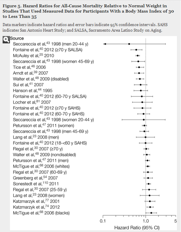
There is a winding line of counties stretching from Louisiana to South Carolina, a set of states that largely voted for McCain in 2008, that went for Obama.  The map below shows how counties voted in blue and red and you can clearly see this interesting pattern.


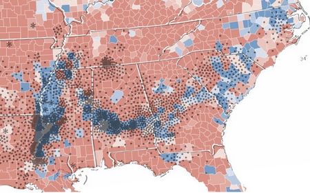
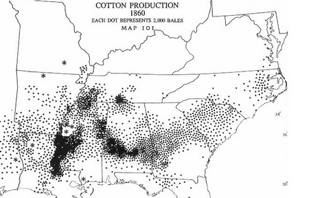
These counties went overwhelmingly for Obama in part because there is large black population.  Often called the “Black Belt,” these counties more so than the surrounding ones were at one time home to cotton plantations and, after slavery was ended, many of the freed slaves stayed.  This image nicely demonstrates the relationship between the blue counties and cotton production in 1860:


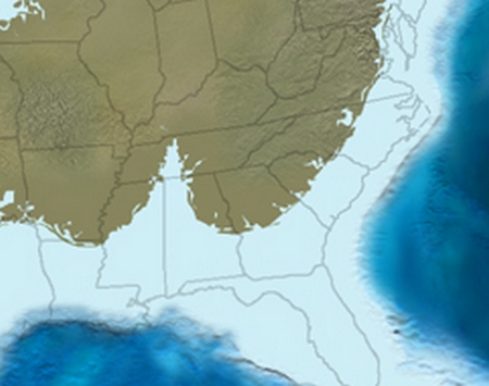
But why was there cotton production there and not elsewhere?  The answer to this question is a geological one and it takes us all the way back to 65 million years ago when the seas were higher and much of the southern United States was under water.  This image illustrates the shape of the land mass during that time:

I’ll let Jeff take it from here:

Along the ancient coastline, life thrived, as usually does. It especially thrived in the delta region, the Bay of Tennessee, if you will. Here life reproduced, ate, excreted, lived, and died. On the shallow ocean floor, organic debris settled, slowly building a rich layer of nutritious debris. Eventually, the debris would rise as the sea departed, becoming a thick, rich layer of soil that ran from Louisiana to South Carolina.

65 million years later, European settlers in America would discover this soil, which was perfect for growing cotton.

So there you have it: the relationship between today’s political map, the economy, and 65 million years ago.

Lisa Wade, PhD is an Associate Professor at Tulane University. She is the author of American Hookup, a book about college sexual culture; a textbook about gender; and a forthcoming introductory text: Terrible Magnificent Sociology. You can follow her on Twitter and Instagram.

Last year the Journal of the American Medical Association released a study aiming to determine the relationship between body mass index and the risk of premature death. Body mass index, or BMI, is the ratio between your height and weight. According to the National Institutes of Health, you are “normal weight” if your ratio is between 18.5-24.9.  Everything over that is “overweight” or “obese” and everything under is “underweight.”

This study was a meta-analysis, which is an analysis of a collection of existing studies that systematically measures the sum of our knowledge.  In this case, the authors analyzed 97 studies that included a combined 2.88 million individuals and over 270,000 deaths.  They found that overweight individuals had a lower risk of premature death than so-called normal weight individuals and there was no relationship between being somewhat obese and the rate of early death. Only among people in the high range of obesity was there a correlation between their weight and a higher risk of premature death.

Here’s what it looked like.

This is two columns of studies plotted according to the hazard ratio they reported for people.  This comparison is between people who are “overweight” (BMI = 25-29.9) and people who are “normal weight” (BMI = 18.5-24.9).  Studies that fall below the line marked 1.0 found a lower rate of premature death and studies above the line found a higher rate.

25-29

Just by eyeballing it, you can confirm that there is not a strong correlation between weight and premature death, at least in this population. When the scientists ran statistical analyses, the math showed that there is a statistically significant relationship between being “overweight” and a lower risk of death.

Here’s the same data, but comparing the risk of premature death among people who are “normal weight” (BMI = 18.5-24.9) and people who are somewhat “obese” (BMI = 30-34.9).  Again, eyeballing the results suggest that there’s not much correlation and, in fact, statistical analysis found none.

30-34.9

Finally, here are the results comparing “normal weight” (BMI = 18.5-24.9) and people who are quite “obese” (BMI = 35 or higher). In this case, we do see a relationship between risk of premature death in body weight.

35

It’s almost funny that the National Institutes of Health use the word normal when talking about BMI. It’s certainly not the norm — the average BMI in the U.S. falls slightly into the “overweight” category (26.6 for adult men and 25.5 for adult women) — and it’s not related to health. It’s clearly simply normative. It’s related to a socially constructed physical ideal that has little relationship to what physicians and public health advocates are supposed to be concerned with.  Normal is judgmental, but if they changed the word to healthy, they have to entirely rejigger their prescriptions.

So, do we even have an obesity epidemic? Perhaps not if we use health as a marker instead of some arbitrary decision to hate fat.  Paul Campos, covering this story for the New York Times, points out:

If the government were to redefine normal weight as one that does not increase the risk of death, then about 130 million of the 165 million American adults currently categorized as overweight and obese would be re-categorized as normal weight instead.

That’s 79%.

It’s worth saying again: if we are measuring by the risk of premature death, then 79% of the people we currently shame for being overweight or obese would be recategorized as perfectly fine. Ideal, even. Pleased to be plump, let’s say, knowing that a body that is a happy balance of soft and strong is the kind of body that will carry them through a lifetime.

Cross-posted at Adios Barbie.

Lisa Wade, PhD is an Associate Professor at Tulane University. She is the author of American Hookup, a book about college sexual culture; a textbook about gender; and a forthcoming introductory text: Terrible Magnificent Sociology. You can follow her on Twitter and Instagram.

Thanks to Holly Robin at The Robin Head for letting us know about a great comic on our obsession with a gender binary. Click over to read the whole thing.

Lisa Wade, PhD is an Associate Professor at Tulane University. She is the author of American Hookup, a book about college sexual culture; a textbook about gender; and a forthcoming introductory text: Terrible Magnificent Sociology. You can follow her on Twitter and Instagram.

Flashback Friday.

The images below are all screen shots from the fantastic American Anthropological Association website on race.  They are designed to show how we take what is in reality a nuanced spectrum of skin color and turn it into racial categories.  In this first image, they show how we could, conceivably, separate human beings into short, medium, and tall based on height:

In this second image, they show how, by adding two additional figures, both taller than the tallest in the previous image, the way in which we designate people can easily change.

And this third image demonstrates how, when we actually consider all potential heights, where we draw the line between short and medium and medium and tall is arbitrary and, ultimately, not very useful.

Skin color is like height.  If we just look at three groups with very different skin colors, there appears to be a significant and categorical difference between those three groups of people.

But, if we consider a wide range of people, it becomes clear that skin color comes in a spectrum, not in categories (such as the five from which U.S. citizens are forced to choose on the census).

Much more on the social construction of race at our Pinterest board.

This post originally appeared in 2008.

Lisa Wade, PhD is an Associate Professor at Tulane University. She is the author of American Hookup, a book about college sexual culture; a textbook about gender; and a forthcoming introductory text: Terrible Magnificent Sociology. You can follow her on Twitter and Instagram.

Last week CNN triumphantly reported that the job market has recovered to its 2008 peak.  Here’s the headline:

1

Not so fast, though.

Sociologist Philip Cohen observes that the real news is hidden in the fourth paragraph. There the author of the piece acknowledges that the job data are numbers, not proportions.  The numbers have bounced back but, because of the addition of almost 12 million people to the U.S. population, the percent of Americans who have jobs or are in school remains lower than it was in 2008.

From CNN:

Given population growth over the last four years, the economy still needs more jobs to truly return to a healthy place. How many more? A whopping 7 million, calculates Heidi Shierholz, an economist with the Economic Policy Institute.

Using the Bureau of Labor Statistics, Cohen offers us a clearer look at where we’re at:

1a

Lisa Wade, PhD is an Associate Professor at Tulane University. She is the author of American Hookup, a book about college sexual culture; a textbook about gender; and a forthcoming introductory text: Terrible Magnificent Sociology. You can follow her on Twitter and Instagram.

In the lasts 15 years, student debt has grown by over 1,000% and the debt held by public colleges and universities has tripled.  Where is the money going?

The scholars behind a new report, Borrowing Against the Future: The Hidden Costs of Financing U.S. Higher Education, argue that profit is the culprit.  They write:

Scholars have offered several explanations for these high costs including faculty salaries, administrative bloat, and the amenities arms race. These explanations, however, all miss a crucial piece of the puzzle.

Sociologist Charlie Eaton and his colleagues crunched the numbers and found that spending on actual education has stagnated, while financial speculators have been taking an increasing amount of money off of the top.

Higher education fills the pockets of investors in three ways:

  • Interest on student loans, paid by students and parents.
  • Interest paid by colleges who take out loans to fund projects — everything from new academic buildings to luxury dorms and stadiums — ultimately repaid with tuition hikes and higher taxes.
  • And profit from for-profit colleges (with “dismal graduation rates, by the way).

Take a look at this figure breaking down the sources of the rise in the cost of higher education.  Interest on debt — taken on by both students and the colleges they attend — has risen.  Meanwhile, direct profits from for-profit colleges have skyrocketed.

3

Overall, Eaton and his colleagues found that Americans are spending $440 billion dollars a year on higher education and that 10% of that goes into the pockets of investors who are skimming profit off of all forms of higher education.

Want more?  Read their report or watch their summary:

Cross-posted at Pacific Standard.

Lisa Wade, PhD is an Associate Professor at Tulane University. She is the author of American Hookup, a book about college sexual culture; a textbook about gender; and a forthcoming introductory text: Terrible Magnificent Sociology. You can follow her on Twitter and Instagram.

1 (2)

Since their invention in 1913, and since this Kelvinator ad first ran in 1955, refrigerators became bigger, better, and went from a luxury to a necessity. It’s nearly impossible to imagine life today without having somewhere to store your vegetables and a place to keep your leftovers: in the one hundred years it’s been around, the fridge altered our grocery shopping habits and our attitudes towards food.

Appliance companies and advertisers worked hard to transform refrigerators from “a brand new concept in luxurious living” to an everyday household object. They succeeded in the 1960s, after years of fine-tuning its features to appeal to the middle-class housewife, writes historian Shelley Nickles. Besides ensuring the fridges were spacious, easy to clean, and had adjustable shelving, designers even took care of minutiae such as including warmer compartments – so that the butter kept in them would be easier to spread. Having attracted the housewives’ attention and become affordable with ideas such as government-sponsored fridges floating around, the appliances made their way into middle-class homes.

Buying too many perishable items suddenly became a minor concern. Buy one, get one free! Get more value for your money – purchase a bigger container! As the number of fridge compartments increased, so did the number of refrigeration-dependent foods and “supersize” deals offered in stores (or the other way around). Ultimately, grocery shoppers – mainly women – returned home with more food than they otherwise would have. Fridges enabled families to stock up, and the major weekend grocery haul was born. Now we have this.

But while having a fridge to store all the groceries made it possible to save more on “deals” at the supermarket, it also enabled us to waste more later on. That is because the fridge operates much like a time machine, but not without its limits. Sociologists Elizabeth Shove and Dale Southerton describe freezers as appliances that allow us to manage time: in addition to no longer having to shop multiple times per week, we can now prepare our meals in advance. The same holds for refrigerators.

Food has its own rhythm, however, and a fridge can only delay the inevitable for so long. Leftovers simultaneously get pushed down in the hierarchy of what we’d like to eat, and pushed back on refrigerator shelf, only to be forgotten and perhaps rediscovered when it’s already too late. An exotic fruit rots in the produce compartment after its exciting novelty wore off, and we were no longer sure what to do with it. And so they all end up in the trash. Domestic food waste only represents part of all the food thrown away in the U.S. today – about a third of all that is produced – but the way fridges altered out food purchasing and consumption habits is partly to blame.

Not all is bad, however. Fridges not only allow us to eat a greater variety of foods and be more efficient in our everyday lives, we use them as centers of communication and managing household life. And as they become smarter, more energy-efficient, and with some individuals refusing to use them altogether, these cultural objects will doubtless have more stories to tell in the next hundred years.

Teja Pristavec is a graduate student in the sociology department, and an IHHCPAR Excellence Fellow,  at Rutgers University. She blogs at A Serving of Sociology, where this post originally appeared.

“But what would you put on the door?!” said a facility manager at an airport, his concern echoed by an administrator at a university: “When people are looking for a restroom, they look for the ‘man or woman’ icon. It’s what we know to look for that means restroom.”

We can’t have gender neutral bathrooms, you see, because there’s no symbol for it… or is there?

This is the symbol used at the University of Colorado, Colorado Springs.  Sam Killermann, the social justice activist at which the above statements were aimed, doesn’t prefer it.  “Even if you’re familiar with gender identity and diversity,” he writes, “the literal interpretation of this image (a half “man” half “woman”) is a disconcerting representation of ‘gender neutral.’”

1

So, what is there to do?  Killermann has an innovative solution.  “I had this breakthrough moment,” he says, “where I was like, ‘If I was urgently in need of a toilet, what visual cue that a room contained a toilet could I use?'”

Tada!

1a

“It’s really not that hard.”

Killermann wants us to replace all the man and woman signs on one-person, private public restrooms with this one — or with the British-inspired W.C., which he has decided stands for “who cares.” Print yours here.

Lisa Wade, PhD is an Associate Professor at Tulane University. She is the author of American Hookup, a book about college sexual culture; a textbook about gender; and a forthcoming introductory text: Terrible Magnificent Sociology. You can follow her on Twitter and Instagram.