We’re in the home stretch of the presidential election here in the U.S. Many of us now live in states that allow early voting or mail-in absentee voting, but Tuesday, November 6th, is officially Election Day.

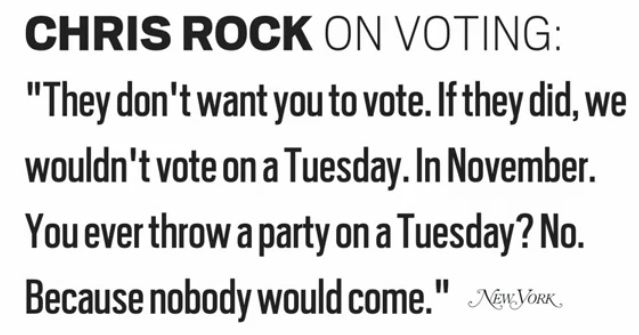
But why Tuesday? It doesn’t seem like the most obvious or convenient day to go to the polls; Saturday might seem like a better candidate.

In this short talk, Jacob Soboroff explains the history of why we vote on Tuesdays: in 1845, Congress passed a law setting an official voting day, and didn’t want people to have to travel on Sundays or miss Wednesday market days and so on and so forth, and eventually they settled on Tuesday as the best day to accommodate the travel times required to get places in horse-drawn buggies so people could vote with the minimum disruption to their lives.

And so we still vote on Tuesdays more than a century and a half later, even though, as Selena Simmons-Duffin of NPR pointed out in a story this morning, a lot of critics argue that it reduces voter turnout due to the difficulty of getting off of work to go vote in states that don’t allow any type of early voting.

Gwen Sharp is an associate professor of sociology at Nevada State College. You can follow her on Twitter at @gwensharpnv.

The Russell Sage Foundation and the Stanford Center on Poverty and Inequality have put together Recession Trends, an interactive website that lets you create graphs about issues related to the recession. It takes a couple of steps to get to the database (you have to agree to the terms before entering), but once you’re there, you can choose data about a variety of topics — crime, housing, immigration, income, political attitudes, family life, and a lot more. It’s a great way to quickly get an overview of many aspects of life in the U.S.

I looked at the ratio of median family income between African American and White families. Between the early 1970s and 2010, we’ve seen a consistent gap in earnings, with Black median household income hovering between about 52 and 60% that of Whites:

The graph of the mean net worth of the individuals on Forbes’s list of the 400 richest people in the U.S. shows that while they certainly saw their wealth take a tumble during the recession — it fell to a mere $3.3 billion or so — they’re recovering well:

Unsurprisingly, the number of job seekers per job opening went up sharply after 2007; it’s finally starting to drop off slightly, though we still have about 5 people looking for every 1 job that’s available:

You can add more than one dataset for many topics. Here’s the growth in the prison population since 1980, by gender:

There’s lots, lots more. Whatever topic you’re particularly interested in, there’s a good chance there’s something there that’ll grab your attention for a bit.

Gwen Sharp is an associate professor of sociology at Nevada State College. You can follow her on Twitter at @gwensharpnv.

We’ve posted before about how our changing collective awareness of homosexuality in the U.S. over the last several decades often leads us to see implicit(or even explicit) gay themes in vintage ads and photos that likely wouldn’t have carried those connotations at the time. My colleague Gregory R. sent in a set of ads from the 1940s for Cannon Towels that perfectly illustrate this. The ads, part of their True Towel Tales campaign, focus on the experiences of U.S. soldiers fighting in various parts of the world during World War II. They seem intensely homoerotic by today’s standards:


Found at Retronaut.

Editor’s Note: This post inspired me to put together a “Before Homosexuality” Pinterest Board.  You can see our whole collection there.

The Census Bureau has created an interactive map that lets you see median household income by county. Median household income for the entire U.S. is $51,914, but of course there is enormous variety around the country. The map lets you select an amount and see which counties have medians below that level.

Three counties — Owsley and Breathitt in Kentucky and Brooks in south Texas — have median household incomes below $20,000 a year (the white spot in Louisiana is water):

So half of households in those areas are living on less than $20,000 a year.

If we go up to $30,000 a year, we see a clear pattern. The counties are particularly concentrated in the South, especially along the Mississippi River, in Appalachia, in southern Texas, a few areas of New Mexico, and several counties in South Dakota that include Native American reservations:

If we look at the $52,000 mark — right at the overall U.S. median — we see, unsurprisingly, a lot of counties on the coasts or that have at least mid-sized cities in them, though there are certainly some counties that don’t fit that pattern:

On the upper end, there are six counties where the median household income is above $100,000 — Hunterdon, in New Jersey; Howard, in Maryland; Los Alamos, New Mexico; and three Virginia counties, Fairfax, Falls Church, and Loudoun:

You can see the Census Bureau’s table of median household income in every county in the U.S. here.

Mark Fischetti has posted an interactive graphic at Scientific American that lets you look at the prevalence of several behaviors or characteristics measured on the Centers for Disease Control and Prevention’s survey on risk factors. The graphic includes data on exercise, tobacco use, heavy drinking, binge drinking, and obesity. Commenters on the post suggested it’s unnecessarily snarky about obesity; that said, it provides a quick snapshot of several behaviors demographers often use to judge general trends in health. For each topic, a graph shows the state where it is highest and lowest; you can also select up to 3 additional states to compare.

For instance, the percent of people who took part in a physical activity in the last month is highest in Oregon and lowest in Mississippi; I added my home state of Oklahoma (dark blue) and current residence of Nevada (light blue) too:

You also get a map for each topic that shows where it’s most or least common. Here’s the map for smoking:

Sconnies, you may not be surprised to know that Wisconsin leads the nation in binge drinking:

I can’t embed the graphic, so you’ll have to go to Scientific American’s post to play around and compare your own state.

New York City’s stop-and-frisk policy has gotten intensified scrutiny recently. A stop and frisk refers to police officers stopping and searching individuals who are out in public. These stops don’t require a warrant; the police officer has to have reasonable cause to believe the person is engaged in criminal activity.

Critics point out that these stops are incredibly inefficient, and that relying on cops’ evaluations of who is suspicious opens the door to widespread racial profiling. The New York Civil Liberties Union analyzed the NYPD’s own data, which they are required to record about all stops. Over the past decade, literally millions of people have been the targets of stop-and-frisks, with steady growth in the use of the program. I made a chart of the data from 2002 through the first 6 months of 2012:

Yet all these stops have led to little discovery of actual crime. Overall, about 87-89% of stops lead to no evidence of wrong-doing.

These stops have also disproportionately affected minorities. Here’s a breakdown by race/ethnicity, based on the NYPD data:

You can read more about the data on stop-and-frisks at the NYCLU website.

The Nation recently posted a video that discusses the impacts of stop-and-frisk on the lives of those targeted and on perceptions of the police, as well as police officers discussing the pressure to complete stop-and-frisks. The clip includes an audio recording that a 17-year-old made when he was being targeted for a stop-and-frisk after having just been stopped a couple of blocks earlier. As the video makes clear, these stops are about more than an inconvenience in citizens’ lives; they involve real harassment and fear of violence for those who find themselves the target of police suspicions:

Tricia Mc.T. sent in a video that illustrates the tendency to associate non-White women’s bodies with curves. Fruit of the Loom’s “Flawless” commercial celebrates women’s bodies, offering the message that they’re flawless at any size. But as Tricia points out, though there is variety in the bodies of the women in the commercial, “women of color are the only ones with ‘curves’,” and the woman whose body is farthest from the thinness ideal is an African American woman:

It’s a small example of a larger pattern in which non-White women are associated with curviness and we’re comfortable depicting women of color as larger — think of all the TV shows you’ve seen where the only plump female character is the African American woman.

For more on this pattern, see our post on who has curves in a Levi’s ad, an ad for shapewear to get “Latino curves,” Vogue emphasizes Beyonce’s body, fetishizing African American women’s butts, and conflating “ethnic” with “curvy.

In Lies Across America: What Our Historic Sites Get Wrong, James Loewen looks at monuments, highway markers, historic museums, and other physical sites that commemorate elements of U.S. history. Loewen argues that the information that is included or ignored, and the language used to describe the people or events such sites are dedicated to, often distort or even actively rewrite history, reaffirming or justifying current beliefs in the process.

Sometimes these distortions are amusing. As we’ve posted about before, the sculptor of a statue of Civil War general John H. Morgan sitting on his favorite horse, Bess, added testicles to her because he felt that a female horse just wasn’t a sufficiently heroic mount, though she carried Morgan safely through the war well enough. In other cases, museums and monuments actively obscure the extent of racial oppression or largely ignore the voices of non-Whites. For instance, Almo, Idaho, features a monument to 295 immigrants who supposedly “lost their lives in a most horrible Indian massacre” in 1861 (p. 89). Loewen points out that this event was likely entirely invented, but fit discourses about savage Indians who simply could not live peacefully alongside vulnerable, civilized Whites that were still quite resonant when the monument was erected in 1938.

The documentary Monumental Myths takes a close look at some sites of this type It features Loewen, Howard Zinn, and others discussing the stories our historical monuments tell us and the consequences of the often very distorted narratives they construct about U.S. history:

Also check out our post on whose history monuments tell.