
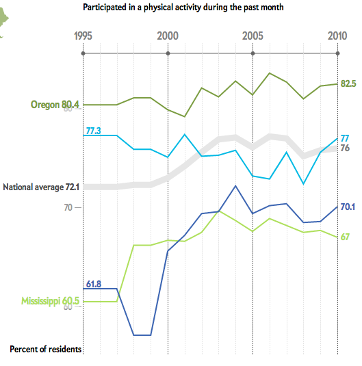
Mark Fischetti has posted an interactive graphic at Scientific American that lets you look at the prevalence of several behaviors or characteristics measured on the Centers for Disease Control and Prevention’s survey on risk factors. The graphic includes data on exercise, tobacco use, heavy drinking, binge drinking, and obesity. Commenters on the post suggested it’s unnecessarily snarky about obesity; that said, it provides a quick snapshot of several behaviors demographers often use to judge general trends in health. For each topic, a graph shows the state where it is highest and lowest; you can also select up to 3 additional states to compare.
For instance, the percent of people who took part in a physical activity in the last month is highest in Oregon and lowest in Mississippi; I added my home state of Oklahoma (dark blue) and current residence of Nevada (light blue) too:
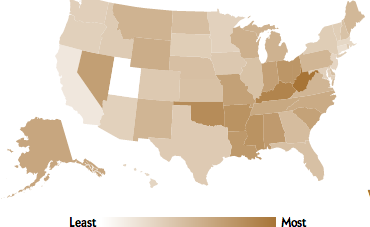
You also get a map for each topic that shows where it’s most or least common. Here’s the map for smoking:
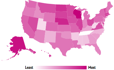
Sconnies, you may not be surprised to know that Wisconsin leads the nation in binge drinking:
I can’t embed the graphic, so you’ll have to go to Scientific American’s post to play around and compare your own state.
Comments 223
INTERACTIVE GRAPHICS OF HEALTH HABITS « Welcome to the Doctor's Office — October 16, 2012
[...] from SocImages [...]
Sariel — October 17, 2012
This is actually kind of fun. I like that Colorado leads the States in least obese, but is about middle of the road for the others (excepting exercise). Oddly enough Oregon is more active but has a higher obesity rate. Which would contradict most of the explanations I've heard for Colorado's lack of obesity since it's almost always attributed to an "active lifestyle" rather than diet.
Guest — October 17, 2012
That is seriously strange phrasing: "Took part in a physical activity". Um, breathing? Sleeping? Blinking? All of those are physical activities. Why are they avoiding the term "exercise", "sport" or whatever it is exactly that they mean?
guest — October 19, 2012
I'm sadly not at all surprised to know that Wisconsin leads the U.S. in binge drink. I am surprised you used what I've always felt was a somewhat dismissive and derogatory term, "Sconnies." This is not really used outside of the context of UW-Madison (and in my experience at UW, used mostly by non-Wisconsin natives). We are Cheeseheads or Badgers but never Sconnies.
Angry Metal Guy — October 25, 2012
I went to UW-Madison, I am acutely aware that WI leads the US in binge drinking.
Aiden Aiden1 — July 15, 2021
It sometimes scares me that these medications can cause serious health issues to my dog. Until I discovered the Dog pain relief. They made my dog feel so much better and he recovered instantly because of this.
Anthony Morgan — October 25, 2021
Thank you for sharing, this good information, by the way, to anyone here looking for a supplement for slim body and smoother digestion please check this product called Bio X4, check their ingredients here. It is a powerful four way defensive strategy against unhealthy cravings, digestive issues, and more!
Joshua — July 21, 2023
That was so much information, Thank you. If you or a loved one are seeking a convenient and reliable mode of transportation, I wholeheartedly recommend considering a mobility scooter for adults These fantastic devices are specially designed to provide comfort and ease of movement, allowing individuals to regain their independence and explore the world around them.
Jazmin McDonald — January 24, 2024
Medical Ozone Therapy service in Los Angeles stands out with its holistic healing approach utilizing ozone to enhance overall well-being immune function and detoxification. This specialized service offers a distinct path to health differentiating itself from traditional treatments in the Los Angeles area.
Hazel Hawthorne — May 25, 2024
While we are talking about health I'd want to point out that most people have hyperpigmentation in their private parts. If you have you should attempt this hyperpigmentation vagina treatment because I had a positive outcome with it which is why I am telling you.
Sueann Perez — July 4, 2024
The information provided is exceptionally clear and highly informative, enhancing understanding significantly. if you are finding
how to find a medical director for a med spa so ypu can visit our site and forword this information to more people.
Ibrahim Sadour — August 23, 2024
Spatial Drama: Bernini’s architectural designs are renowned for tture: Bernini dramatic facades, and elabora spatial قطع غيار سيارات .into his architectural projects,
Ibrahim Sadour — August 23, 2024
Spatial projects: Bernini’s architectural designs are renowned for tture: Bernini dramatic facades, and elabora spatial كراج متنقل .into his architectural projects,
Ibrahim Sadour — August 23, 2024
Spatial architectural : architectural Bernini’s architectural designs Bernini are renowned for tture: Bernini dramatic facades, and elabora spatial Verhuisbedrijf Zaandam.into architectural architectural projects
Ibrahim Sadour — August 23, 2024
Spatial architectural : architectural Bernini’s architectural designs Bernini are renowned for tture: Bernini dramatic facades, and elabora spatial website laten maken amsterdam .into designs architectural facades
Spatial architectural : architectural Bernini’s architectural designs Bernini are renowned for tture: Bernini dramatic facades, and elabora spatial website laten maken rotterdam.into designs architectural facades
Ibrahim Sadour — August 23, 2024
Spatial architectural : Bernini’s architectural designs Bernini are renowned for tture: Bernini renowned facades, and elabora spatial Besnijdenis Centrum .into architectural architectural projects
Ibrahim Sadour — August 23, 2024
architectural : architectural Bernini’s architectural designs Bernini are renowned for tture: Bernini dramatic facades, and elabora spatial كراج متنقل الكويت
Ibrahim Sadour — August 23, 2024
architectural Bernini’s architectural designs Bernini are renowned for tture: Bernini dramatic facades, and elabora spatial ونش الكويت
Ibrahim Sadour — August 23, 2024
Bernini’s architectural designs Bernini are renowned for tture: Bernini dramatic facades, and elabora spatial فني تكييف الكويت
Ibrahim Sadour — August 23, 2024
Good article about fashion You may like تصليح معاونات هيدروليكHow to get Natural Silky Hair with Homemade
Ibrahim Sadour — August 23, 2024
architectural designs are renowned for their grandeur and theatricality. of Sculpture: Bernini seamle His buildings often feature sweeping curves, dramatic facades, and elabora spatial تصليح غسالة.into his architectural projects, beauty.
Lenore K. Andrews — August 27, 2024
These interactive graphics on health habits are really insightful! For those in need of monthly rv sites in midland texas, there are some great options to consider.
mohamd — September 4, 2024
بنشر متنقل الكويت ساعة في الكويت لدينا أفضل الخبرة في صيانة السيارات 24 ساعة يوميا طوال أيام الأسبوع مما يؤهلنا للعناية بسيارتك وصيانتها.
mohamdd — November 2, 2024
خدمة بنشر متنقل الكويت 24/7 تُقدم صيانة السيارات الحديثة دون الحاجة للتنقل. نقدم خدمة تبديل الإطارات بجميع المقاسات بدقة وجودة عالية. اتصل الآن وسنصل إليك في أي مكان بسرعة فائقة.
mohamdd — November 2, 2024
خدمة بنشر متنقل 24/7 تُقدم صيانة السيارات الحديثة دون الحاجة للتنقل. نقدم خدمة تبديل الإطارات بجميع المقاسات بدقة وجودة عالية. اتصل الآن وسنصل إليك في أي مكان بسرعة فائقة.
mohamdd — November 2, 2024
خدمة خدمة بنشر متنقل 24/7 تُقدم صيانة السيارات الحديثة دون الحاجة للتنقل. نقدم خدمة تبديل الإطارات بجميع المقاسات بدقة وجودة عالية. اتصل الآن وسنصل إليك في أي مكان بسرعة فائقة.
mohamdd — November 2, 2024
خدمة بنشر الكويت 24/7 تُقدم صيانة السيارات الحديثة دون الحاجة للتنقل. نقدم خدمة تبديل الإطارات بجميع المقاسات بدقة وجودة عالية. اتصل الآن وسنصل إليك في أي مكان بسرعة فائقة.
mohamdd — November 19, 2024
هل تبحث عن سكراب سيارات؟ قطع غيار سيارات يوفر لك الحل السريع والأقرب. تجد لدينا جميع قطع غيار السيارات من السكراب الياباني، الأوروبي، الأمريكي، والألماني، بما في ذلك سكراب بي ام دبليو، بأرخص الأسعار.
mohamdd — November 23, 2024
اتصل بنا على رقم تصليح تكييف، وسنأتي إلى موقعك لتقديم أفضل خدمات الصيانة والإصلاح على مدار الساعة، بالإضافة إلى تركيب وحدات التكييف في جميع مناطق الكويت.
mohamdd — December 17, 2024
خدمة بنشر صباح السالم 24/7 تُقدم صيانة السيارات الحديثة دون الحاجة للتنقل. نقدم خدمة تبديل الإطارات بجميع المقاسات بدقة وجودة عالية. اتصل الآن وسنصل إليك في أي مكان بسرعة فائقة.
mohamdd — December 27, 2024
خدمة تبديل بطارية 24/7 تُقدم صيانة السيارات الحديثة دون الحاجة للتنقل. نقدم خدمة تبديل الإطارات بجميع المقاسات بدقة وجودة عالية. اتصل الآن وسنصل إليك في أي مكان بسرعة فائقة.
mohamdd — December 27, 2024
خدمة بنشر متنقل 24/7 تُقدم صيانة السيارات الحديثة دون الحاجة للتنقل. نقدم خدمة تبديل الإطارات بجميع المقاسات بدقة وجودة عالية. اتصل الآن وسنصل إليك في أي مكان بسرعة فائقة.
Ghulam — February 6, 2025
"Explore interactive graphics revealing fascinating insights into health habits, while
Prime services
crafts innovative digital experiences and customized designs to elevate your brand and connect with your audience."
Guillermo Fontenot — February 11, 2025
Interactive graphics are a great way to visualize health habits and make it easier to track progress. They can really help in understanding how daily routines impact overall well-being. Balancemedspa offers holistic services that align perfectly with such tools, helping individuals maintain healthy habits through personalized wellness treatments. It's a fantastic way to make health a more engaging and manageable journey!
Monica Belle — April 21, 2025
Just grabbed a Marlboro Jacket and it instantly leveled up my fit. Vintage style that actually hits right.
Cheryl Red — April 21, 2025
These interactive graphics are super helpful—it’s so cool to actually see how small habits add up over time. It really motivates me to stay consistent with both daily routines and self-care. I’ve even started looking into treatments like chemical peels in Lake Forest as part of my skin health journey. Love seeing tools like this that make wellness more engaging and visual!
Anonymous — June 13, 2025
This is a great blog with really useful information that’s easy to understand and follow. I appreciate the clear explanations and practical tips you shared. After reading, I even started thinking about ways to simplify my life—like deciding to sell my iphone and focus on what really matters. Keep up the excellent work!
iBo Tube — August 10, 2025
خدمة تصليح سيارات 24 ساعة للسيارات في الكويت هي خدمة مبتكرة ومريحة تتيح لأصحاب السيارات الاستفادة من خدمات الصيانة والإصلاح في موقعهم الخاص.
iBo Tube — August 10, 2025
خدمة كراج تصليح سيارات 24 ساعة للسيارات في الكويت هي خدمة مبتكرة ومريحة تتيح لأصحاب السيارات الاستفادة من خدمات الصيانة والإصلاح في موقعهم الخاص.
iBo Tube — August 10, 2025
خدمة صيانة سيارات 24 ساعة للسيارات في الكويت هي خدمة مبتكرة ومريحة تتيح لأصحاب السيارات الاستفادة من خدمات الصيانة والإصلاح في موقعهم الخاص.
iBo Tube — August 13, 2025
خدمة تصليح سيارات 24 ساعة للسيارات في الكويت هي خدمة مبتكرة ومريحة تتيح لأصحاب السيارات الاستفادة من خدمات الصيانة والإصلاح في موقعهم الخاص.
iBo Tube — August 13, 2025
خدمة كراج تصليح سيارات 24 ساعة للسيارات في الكويت هي خدمة مبتكرة ومريحة تتيح لأصحاب السيارات الاستفادة من خدمات الصيانة والإصلاح في موقعهم الخاص.
iBo Tube — August 13, 2025
خدمة صيانة سيارات 24 ساعة للسيارات في الكويت هي خدمة مبتكرة ومريحة تتيح لأصحاب السيارات الاستفادة من خدمات الصيانة والإصلاح في موقعهم الخاص.
iBo Tube — August 14, 2025
خدمة معاونات بلستن 24 ساعة للسيارات في الكويت هي خدمة مبتكرة ومريحة تتيح لأصحاب السيارات الاستفادة من خدمات الصيانة والإصلاح في موقعهم الخاص.
iBo Tube — August 14, 2025
خدمة معاونات بروفندر 24 ساعة للسيارات في الكويت هي خدمة مبتكرة ومريحة تتيح لأصحاب السيارات الاستفادة من خدمات الصيانة والإصلاح في موقعهم الخاص.
iBo Tube — August 14, 2025
خدمة معاونات اولد مان 24 ساعة للسيارات في الكويت هي خدمة مبتكرة ومريحة تتيح لأصحاب السيارات الاستفادة من خدمات الصيانة والإصلاح في موقعهم الخاص.
iBo Tube — August 14, 2025
خدمة ماص الصدمات 24 ساعة للسيارات في الكويت هي خدمة مبتكرة ومريحة تتيح لأصحاب السيارات الاستفادة من خدمات الصيانة والإصلاح في موقعهم الخاص.
iBo Tube — August 14, 2025
خدمة معاونات 24 ساعة للسيارات في الكويت هي خدمة مبتكرة ومريحة تتيح لأصحاب السيارات الاستفادة من خدمات الصيانة والإصلاح في موقعهم الخاص.
iBo Tube — August 15, 2025
خدمة سيرفس مرسيدس 24 ساعة للسيارات في الكويت هي خدمة مبتكرة ومريحة تتيح لأصحاب السيارات الاستفادة من خدمات الصيانة والإصلاح في موقعهم الخاص.
iBo Tube — August 15, 2025
خدمة كراج تصليح مرسيدس 24 ساعة للسيارات في الكويت هي خدمة مبتكرة ومريحة تتيح لأصحاب السيارات الاستفادة من خدمات الصيانة والإصلاح في موقعهم الخاص.
iBo Tube — August 15, 2025
خدمة سكراب مرسيدس 24 ساعة للسيارات في الكويت هي خدمة مبتكرة ومريحة تتيح لأصحاب السيارات الاستفادة من خدمات الصيانة والإصلاح في موقعهم الخاص.
iBo Tube — August 16, 2025
خدمة صيانة تويوتا 24 ساعة للسيارات في الكويت هي خدمة مبتكرة ومريحة تتيح لأصحاب السيارات الاستفادة من خدمات الصيانة والإصلاح في موقعهم الخاص.
iBo Tube — August 16, 2025
خدمة سيرفس نيسان 24 ساعة للسيارات في الكويت هي خدمة مبتكرة ومريحة تتيح لأصحاب السيارات الاستفادة من خدمات الصيانة والإصلاح في موقعهم الخاص.
iBo Tube — August 17, 2025
خدمة سيرفس لكزس 24 ساعة للسيارات في الكويت هي خدمة مبتكرة ومريحة تتيح لأصحاب السيارات الاستفادة من خدمات الصيانة والإصلاح في موقعهم الخاص.
iBo Tube — August 17, 2025
خدمة صيانة لكزس 24 ساعة للسيارات في الكويت هي خدمة مبتكرة ومريحة تتيح لأصحاب السيارات الاستفادة من خدمات الصيانة والإصلاح في موقعهم الخاص.
iBo Tube — August 17, 2025
خدمة سيرفس كيا 24 ساعة للسيارات في الكويت هي خدمة مبتكرة ومريحة تتيح لأصحاب السيارات الاستفادة من خدمات الصيانة والإصلاح في موقعهم الخاص.
iBo Tube — August 17, 2025
خدمة صيانة كيا 24 ساعة للسيارات في الكويت هي خدمة مبتكرة ومريحة تتيح لأصحاب السيارات الاستفادة من خدمات الصيانة والإصلاح في موقعهم الخاص.
iBo Tube — August 18, 2025
خدمة قطع غيار تكييف 24 ساعة للمنازل في الكويت هي خدمة مبتكرة ومريحة تتيح لأصحاب البيوت الاستفادة من خدمات الصيانة والإصلاح في موقعهم الخاص.
iBo Tube — August 18, 2025
خدمة تصليح تكييف 24 ساعة للمنازل في الكويت هي خدمة مبتكرة ومريحة تتيح لأصحاب البيوت الاستفادة من خدمات الصيانة والإصلاح في موقعهم الخاص.
iBo Tube — August 18, 2025
خدمة فني تكييف 24 ساعة للمنازل في الكويت هي خدمة مبتكرة ومريحة تتيح لأصحاب البيوت الاستفادة من خدمات الصيانة والإصلاح في موقعهم الخاص.
iBo Tube — August 19, 2025
خدمة تنظيف شقق 24 ساعة للمنازل في الكويت هي خدمة مبتكرة ومريحة تتيح لأصحاب البيوت الاستفادة من خدمات تنظيف في موقعهم الخاص.
iBo Tube — August 19, 2025
خدمة تنظيف الحدائق 24 ساعة للمنازل في الكويت هي خدمة مبتكرة ومريحة تتيح لأصحاب البيوت الاستفادة من خدمات تنظيف الحدائق في موقعهم الخاص.
iBo Tube — September 1, 2025
خدمة بنشر متنقل 24 ساعة للسيارات في الكويت هي خدمة مبتكرة ومريحة تتيح لأصحاب السيارات الاستفادة من خدمات الصيانة والإصلاح في موقعهم الخاص.
iBo Tube — September 1, 2025
خدمة بطارية امارون 24 ساعة للسيارات في الكويت هي خدمة مبتكرة ومريحة تتيح لأصحاب السيارات الاستفادة من خدمات الصيانة والإصلاح في موقعهم الخاص.
iBo Tube — September 1, 2025
خدمة تواير 24 ساعة للسيارات في الكويت هي خدمة مبتكرة ومريحة تتيح لأصحاب السيارات الاستفادة من خدمات الصيانة والإصلاح في موقعهم الخاص.
iBo Tube — September 1, 2025
خدمة كمبروسر مكيف سيارة 24 ساعة للسيارات في الكويت هي خدمة مبتكرة ومريحة تتيح لأصحاب السيارات الاستفادة من خدمات الصيانة والإصلاح في موقعهم الخاص.
iBo Tube — September 9, 2025
للحصول على خدمة سطحه صباح الاحمد من المهم أن يكون لديك رقم الاتصال بالخدمة.
iBo Tube — September 9, 2025
خدمة ونش سيارات وسطحة لسحب السيارات متواجدين 24/7 لخدمتك وتقديم افضل ونش سطحه دائما لتسهيل عمليات سحب ورفع السيارات على جميع طرق الكويت.
iBo Tube — September 9, 2025
خدمة ونش وسطحة لسحب السيارات متواجدين 24/7 لخدمتك وتقديم افضل ونش سطحه دائما لتسهيل عمليات سحب ورفع السيارات على جميع طرق الكويت.
iBo Tube — September 9, 2025
خدمة ونش الكويت وسطحة لسحب السيارات متواجدين 24/7 لخدمتك وتقديم افضل ونش سطحه دائما لتسهيل عمليات سحب ورفع السيارات على جميع طرق الكويت.
iBo Tube — September 11, 2025
شيالات السيارة نحن المكان المناسب لكل ما يتعلق بمجال تشليح السيارات والسكراب والصيانة وتجارة قطع الغيار
iBo Tube — September 11, 2025
عند البحث عن زيت هيدروليك ، ننصح بالتركيز على المصادر الموثوقة والتي توفر مجموعة واسعة من الخيارات بأسعار تنافسية.
iBo Tube — September 14, 2025
تقدم خدمة سكراب السالمي الدعم على مدار 24 ساعة يومياً، مما يضمن توافر المساعدة للسائقين في أي وقت،
iBo Tube — September 14, 2025
للحصول على خدمة قطع غيار نيسان من المهم أن يكون لديك رقم الاتصال بالخدمة.
iBo Tube — September 14, 2025
خدمة سكراب كيا وسطحة لسحب السيارات متواجدين 24/7 لخدمتك وتقديم افضل ونش سطحه دائما لتسهيل عمليات سحب ورفع السيارات على جميع طرق الكويت.
iBo Tube — September 14, 2025
خدمة قطع غيار الشويخ وسطحة لسحب السيارات متواجدين 24/7 لخدمتك وتقديم افضل ونش سطحه دائما لتسهيل عمليات سحب ورفع السيارات على جميع طرق الكويت.
iBo Tube — September 17, 2025
تقدم خدمة كراج صيني الدعم على مدار 24 ساعة يومياً، مما يضمن توافر المساعدة للسائقين في أي وقت،
iBo Tube — September 17, 2025
للحصول على خدمة اخصائي صيني من المهم أن يكون لديك رقم الاتصال بالخدمة.
iBo Tube — September 17, 2025
خدمة سيرفس صيني وسطحة لسحب السيارات متواجدين 24/7 لخدمتك وتقديم افضل ونش سطحه دائما لتسهيل عمليات سحب ورفع السيارات على جميع طرق الكويت.
iBo Tube — September 18, 2025
خدمة مركز صيانة بي ام دبليو وسطحة لسحب السيارات متواجدين 24/7 لخدمتك وتقديم افضل ونش سطحه دائما لتسهيل عمليات سحب ورفع السيارات على جميع طرق الكويت.
iBo Tube — September 18, 2025
للحصول على خدمة سيرفس بي ام دبليو من المهم أن يكون لديك رقم الاتصال بالخدمة.
iBo Tube — September 18, 2025
تقدم خدمة كراج متخصص بي ام دبليو الدعم على مدار 24 ساعة يومياً، مما يضمن توافر المساعدة للسائقين في أي وقت،
iBo Tube — September 20, 2025
تقدم خدمة بنشر متنقل الرياض الدعم على مدار 24 ساعة يومياً، مما يضمن توافر المساعدة للسائقين في أي وقت،
iBo Tube — September 20, 2025
للحصول على خدمة كراج متنقل الرياض من المهم أن يكون لديك رقم الاتصال بالخدمة.
iBo Tube — September 22, 2025
تقدم خدمة فتح اقفال الدعم على مدار 24 ساعة يومياً، مما يضمن توافر المساعدة للسائقين في أي وقت،
iBo Tube — September 23, 2025
تقدم خدمة سطحه الدعم على مدار 24 ساعة يومياً، مما يضمن توافر المساعدة للسائقين في أي وقت،
iBo Tube — September 23, 2025
للحصول على خدمة ونش رخيص من المهم أن يكون لديك رقم الاتصال بالخدمة.
iBo Tube — September 23, 2025
خدمة ونش هندي وسطحة لسحب السيارات متواجدين 24/7 لخدمتك وتقديم افضل ونش سطحه دائما لتسهيل عمليات سحب ورفع السيارات على جميع طرق الكويت.
Mohamed — September 25, 2025
يقدم لكم نجار فتح ابواب خدمات متكاملة على مدار الساعة، تشمل صيانة الأقفال المعطلة، إصلاح الأعطال المختلفة، بالإضافة إلى تركيب أقفال جديدة مع المفاتيح الأصلية الخاصة بها. يمكنكم الاعتماد علينا للتعامل مع أي مشكلة طارئة دون قلق، فنحن نوفر حلولاً فورية تغطي جميع مناطق ومحافظات الكويت.
iBo Tube — September 27, 2025
تقدم خدمة قطع غيار ماليبو الدعم على مدار 24 ساعة يومياً، مما يضمن توافر المساعدة للسائقين في أي وقت،
iBo Tube — September 29, 2025
تقدم خدمة كمبروسر مكيف سيارة الدعم على مدار 24 ساعة يومياً، مما يضمن توافر المساعدة للسائقين في أي وقت،
iBo Tube — September 29, 2025
للحصول على خدمة بنشر جمعية الرحاب من المهم أن يكون لديك رقم الاتصال بالخدمة.
iBo Tube — September 29, 2025
خدمة تصليح كمبروسر مكيف السيارة وسطحة لسحب السيارات متواجدين 24/7 لخدمتك وتقديم افضل ونش سطحه دائما لتسهيل عمليات سحب ورفع السيارات على جميع طرق الكويت.
iBo Tube — September 30, 2025
تقدم خدمة تصليح جام السيارات الدعم على مدار 24 ساعة يومياً، مما يضمن توافر المساعدة للسائقين في أي وقت،
iBo Tube — September 30, 2025
للحصول على خدمة تنجيد سيارات الكويت من المهم أن يكون لديك رقم الاتصال بالخدمة.
iBo Tube — September 30, 2025
خدمة تعبئة غاز مكيف السيارة وسطحة لسحب السيارات متواجدين 24/7 لخدمتك وتقديم افضل ونش سطحه دائما لتسهيل عمليات سحب ورفع السيارات على جميع طرق الكويت.
iBo Tube — October 1, 2025
تقدم خدمة سكراب نيسان الدعم على مدار 24 ساعة يومياً، مما يضمن توافر المساعدة للسائقين في أي وقت،
iBo Tube — October 1, 2025
للحصول على خدمة قطع غيار سيارات من المهم أن يكون لديك رقم الاتصال بالخدمة.
iBo Tube — October 1, 2025
خدمة سكراب كوري وسطحة لسحب السيارات متواجدين 24/7 لخدمتك وتقديم افضل ونش سطحه دائما لتسهيل عمليات سحب ورفع السيارات على جميع طرق الكويت.
iBo Tube — October 6, 2025
خدمة تنسيق حدائق تصل إليك أينما كنت في الكويت! 🌳✨نحوّل حديقتك إلى مساحة خضراء جميلة بأفضل التصاميم والأسعار، سواء كانت حديقتك صغيرة أو كبيرة. خدمة فورية إلى باب منزلك أو موقعك مباشرة!
iBo Tube — October 6, 2025
خدمة تنسيق حدائق الكويت تصل إليك أينما كنت في الكويت! 🌳✨نحوّل حديقتك إلى مساحة خضراء جميلة بأفضل التصاميم والأسعار، سواء كانت حديقتك صغيرة أو كبيرة. خدمة فورية إلى باب منزلك أو موقعك مباشرة!
iBo Tube — October 6, 2025
خدمة شركة تنسيق حدائق تصل إليك أينما كنت في الكويت! 🌳✨نحوّل حديقتك إلى مساحة خضراء جميلة بأفضل التصاميم والأسعار، سواء كانت حديقتك صغيرة أو كبيرة. خدمة فورية إلى باب منزلك أو موقعك مباشرة!
iBo Tube — October 7, 2025
هل تعطلت غسالتك فجأة؟ هل تواجه مشكلة في دوران الغسالة؟ أو تسمع صوتاً غريباً أثناء التشغيل؟ لا داعي للقلق، نحن نوفر لك خدمة تصليح غسالات الكويت بسرعة وكفاءة وعلى مدار الساعة، وبأسعار مناسبة لجميع العملاء.
iBo Tube — October 7, 2025
هل تعطلت غسالتك فجأة؟ هل تواجه مشكلة في دوران الغسالة؟ أو تسمع صوتاً غريباً أثناء التشغيل؟ لا داعي للقلق، نحن نوفر لك خدمة تصليح غسالات في الكويت بسرعة وكفاءة وعلى مدار الساعة، وبأسعار مناسبة لجميع العملاء.
iBo Tube — October 7, 2025
هل تعطلت غسالتك فجأة؟ هل تواجه مشكلة في دوران الغسالة؟ أو تسمع صوتاً غريباً أثناء التشغيل؟ لا داعي للقلق، نحن نوفر لك خدمة فني غسالات في الكويت بسرعة وكفاءة وعلى مدار الساعة، وبأسعار مناسبة لجميع العملاء.
iBo Tube — October 7, 2025
هل تعطلت غسالتك فجأة؟ هل تواجه مشكلة في دوران الغسالة؟ أو تسمع صوتاً غريباً أثناء التشغيل؟ لا داعي للقلق، نحن نوفر لك خدمة صيانة غسالات في الكويت بسرعة وكفاءة وعلى مدار الساعة، وبأسعار مناسبة لجميع العملاء.
Adam Jhon — October 8, 2025
يتميز نجار فتح اقفال بتقديم خدمات احترافية تعتمد على مهارات عالية وتقنيات متطورة. تتيح الأقفال الإلكترونية مستوى متقدمًا من الراحة والأمان باستخدام رموز سرية، بطاقات خاصة، أو حتى أنظمة التحكم عن بعد. يتعامل فريق شركة آنلوك كويت بفاعلية مع هذه التقنيات المتقدمة، حيث يقومون بفتحها بدقة وسرعة دون إلحاق أي ضرر بالأقفال.
فتح اقفال — October 9, 2025
تقدم شركة فتح اقفال الكويت مجموعة متنوعة من خدمات تصليح وتغيير الاقفال، بالإضافة إلى تركيب واستبدال الاقفال القديمة باقفال حديثة.
iBo Tube — October 9, 2025
هل تعطلت ثلاجتك فجأة؟ هل تواجه مشكلة في التبريد؟ أو تسمع صوتاً غريباً من الثلاجة؟ لا داعي للقلق، نحن نوفر لك خدمة تصليح ثلاجات الكويت بسرعة وكفاءة وعلى مدار الساعة، وبأسعار مناسبة لجميع العملاء.
iBo Tube — October 9, 2025
هل تعطلت ثلاجتك فجأة؟ هل تواجه مشكلة في التبريد؟ أو تسمع صوتاً غريباً من الثلاجة؟ لا داعي للقلق، نحن نوفر لك خدمة تصليح ثلاجات في الكويت بسرعة وكفاءة وعلى مدار الساعة، وبأسعار مناسبة لجميع العملاء.
iBo Tube — October 9, 2025
هل تعطلت ثلاجتك فجأة؟ هل تواجه مشكلة في التبريد؟ أو تسمع صوتاً غريباً من الثلاجة؟ لا داعي للقلق، نحن نوفر لك خدمة فني ثلاجات في الكويت بسرعة وكفاءة وعلى مدار الساعة، وبأسعار مناسبة لجميع العملاء.
iBo Tube — October 9, 2025
هل تعطلت ثلاجتك فجأة؟ هل تواجه مشكلة في التبريد؟ أو تسمع صوتاً غريباً من الثلاجة؟ لا داعي للقلق، نحن نوفر لك خدمة صيانة ثلاجات في الكويت بسرعة وكفاءة وعلى مدار الساعة، وبأسعار مناسبة لجميع العملاء.
iBo Tube — October 9, 2025
هل تعطلت ثلاجتك فجأة؟ هل تواجه مشكلة في التبريد؟ أو تسمع صوتاً غريباً من الثلاجة؟ لا داعي للقلق، نحن نوفر لك خدمة مصلح ثلاجات في الكويت بسرعة وكفاءة وعلى مدار الساعة، وبأسعار مناسبة لجميع العملاء.
iBo Tube — October 11, 2025
هل توقفت طباختك عن العمل فجأة؟ هل تواجه صعوبة في تشغيلها أو لاحظت مشاكل في الحرارة؟ لا داعي للقلق، نحن نقدم لك خدمة تصليح طباخات الكويت بسرعة وكفاءة على مدار الساعة، وبأسعار تناسب جميع العملاء.
iBo Tube — October 11, 2025
هل توقفت طباختك عن العمل فجأة؟ هل تواجه صعوبة في تشغيلها أو لاحظت مشاكل في الحرارة؟ لا داعي للقلق، نحن نقدم لك خدمة تصليح طباخات في الكويت بسرعة وكفاءة على مدار الساعة، وبأسعار تناسب جميع العملاء.
iBo Tube — October 11, 2025
هل توقفت طباختك عن العمل فجأة؟ هل تواجه صعوبة في تشغيلها أو لاحظت مشاكل في الحرارة؟ لا داعي للقلق، نحن نقدم لك خدمة فني طباخات في الكويت بسرعة وكفاءة على مدار الساعة، وبأسعار تناسب جميع العملاء.
iBo Tube — October 11, 2025
هل توقفت طباختك عن العمل فجأة؟ هل تواجه صعوبة في تشغيلها أو لاحظت مشاكل في الحرارة؟ لا داعي للقلق، نحن نقدم لك خدمة صيانة طباخات في الكويت بسرعة وكفاءة على مدار الساعة، وبأسعار تناسب جميع العملاء.
iBo Tube — October 11, 2025
هل توقفت طباختك عن العمل فجأة؟ هل تواجه صعوبة في تشغيلها أو لاحظت مشاكل في الحرارة؟ لا داعي للقلق، نحن نقدم لك خدمة مصلح طباخات في الكويت بسرعة وكفاءة على مدار الساعة، وبأسعار تناسب جميع العملاء.
iBo Tube — October 12, 2025
نوفّر لك خدمات تركيب كاميرات مراقبة الكويت ، من العاصمة وحولي، لين الجهراء والأحمدي والفروانية ومبارك الكبير. شغلنا مو بس تركيب كاميرات
iBo Tube — October 12, 2025
نوفّر لك خدمات تركيب كاميرات مراقبة ، من العاصمة وحولي، لين الجهراء والأحمدي والفروانية ومبارك الكبير. شغلنا مو بس تركيب كاميرات
iBo Tube — October 12, 2025
نوفّر لك خدمات تركيب كاميرات ، من العاصمة وحولي، لين الجهراء والأحمدي والفروانية ومبارك الكبير. شغلنا مو بس تركيب كاميرات
iBo Tube — October 14, 2025
استمتع بخدمات حداد مظلات الكويت الشاملة، حيث نصنع الفرق في عالم المظلات والسواتر والبرجولات بجودة عالية وأسعار تنافسية.
iBo Tube — October 14, 2025
استمتع بخدمات حداد مظلات الكويت الكويت الشاملة، حيث نصنع الفرق في عالم المظلات والسواتر والبرجولات بجودة عالية وأسعار تنافسية.
iBo Tube — October 14, 2025
استمتع بخدمات حداد الكويت الكويت الشاملة، حيث نصنع الفرق في عالم المظلات والسواتر والبرجولات بجودة عالية وأسعار تنافسية.
iBo Tube — October 14, 2025
استمتع بخدمات حداد عام الكويت الشاملة، حيث نصنع الفرق في عالم المظلات والسواتر والبرجولات بجودة عالية وأسعار تنافسية.
iBo Tube — October 15, 2025
استمتع بخدمة ريموت تلفزيون اصلية في الكويت بلا حدود، الشريك الموثوق الذي يضمن راحتك دوماً.
iBo Tube — October 15, 2025
استمتع بخدمة توصيل ريموت تلفزيون اصلية في الكويت بلا حدود، الشريك الموثوق الذي يضمن راحتك دوماً.
iBo Tube — October 15, 2025
استمتع بخدمة توصيل ريموت الكويت اصلية في الكويت بلا حدود، الشريك الموثوق الذي يضمن راحتك دوماً.
iBo Tube — October 15, 2025
استمتع بخدمة توصيل ريموتات اصلية في الكويت بلا حدود، الشريك الموثوق الذي يضمن راحتك دوماً.
iBo Tube — October 16, 2025
تعاني من وجود حشرات في البيت أو الحديقة أو المكتب؟ لا تشيل هم، نوصل لك فني رش حشرات بالكويت بسرعة ونعالج المشكلة بأحدث الطرق والمواد الآمنة. نقضي على جميع أنواع الحشرات مثل الصراصير، النمل، البق، الفئران وغيرها، مع ضمان خدمة سريعة وأسعار تناسب الجميع.
iBo Tube — October 16, 2025
تعاني من وجود حشرات في البيت أو الحديقة أو المكتب؟ لا تشيل هم، نوصل لك فني مكافحة حشرات بالكويت بسرعة ونعالج المشكلة بأحدث الطرق والمواد الآمنة. نقضي على جميع أنواع الحشرات مثل الصراصير، النمل، البق، الفئران وغيرها، مع ضمان خدمة سريعة وأسعار تناسب الجميع.
iBo Tube — October 16, 2025
تعاني من وجود حشرات في البيت أو الحديقة أو المكتب؟ لا تشيل هم، نوصل لك فني شركة رش حشرات بالكويت بسرعة ونعالج المشكلة بأحدث الطرق والمواد الآمنة. نقضي على جميع أنواع الحشرات مثل الصراصير، النمل، البق، الفئران وغيرها، مع ضمان خدمة سريعة وأسعار تناسب الجميع.
iBo Tube — October 16, 2025
تعاني من وجود حشرات في البيت أو الحديقة أو المكتب؟ لا تشيل هم، نوصل لك فني مكافحة حشرات الكويت بسرعة ونعالج المشكلة بأحدث الطرق والمواد الآمنة. نقضي على جميع أنواع الحشرات مثل الصراصير، النمل، البق، الفئران وغيرها، مع ضمان خدمة سريعة وأسعار تناسب الجميع.
iBo Tube — October 18, 2025
عندك مشكلة في الكهرباء؟ الأنوار تطفي وتشتغل؟ في فيوزات محترقة أو مفاتيح خربانة؟ لا تشيل هم، نوصل لك كهربائي منازل الكويت بسرعة لحل جميع مشاكل الكهرباء باحترافية عالية وبأسعار تناسب الجميع.
iBo Tube — October 18, 2025
عندك مشكلة في الكهرباء؟ الأنوار تطفي وتشتغل؟ في فيوزات محترقة أو مفاتيح خربانة؟ لا تشيل هم، نوصل لك كهربائي منازل هندي الكويت بسرعة لحل جميع مشاكل الكهرباء باحترافية عالية وبأسعار تناسب الجميع.
iBo Tube — October 18, 2025
عندك مشكلة في الكهرباء؟ الأنوار تطفي وتشتغل؟ في فيوزات محترقة أو مفاتيح خربانة؟ لا تشيل هم، نوصل لك فني كهربائي الكويت بسرعة لحل جميع مشاكل الكهرباء باحترافية عالية وبأسعار تناسب الجميع.
iBo Tube — October 18, 2025
عندك مشكلة في الكهرباء؟ الأنوار تطفي وتشتغل؟ في فيوزات محترقة أو مفاتيح خربانة؟ لا تشيل هم، نوصل لك كهربائي منازل الكويت بسرعة لحل جميع مشاكل الكهرباء باحترافية عالية وبأسعار تناسب الجميع.
iBo Tube — October 20, 2025
تواجه مشكلة في الستلايت أو الإشارة ضعيفة؟ لا تشيل هم! نوفر لك خدمة فني ستلايت الكويت بأعلى مستوى احترافي، نوصل لك فني متخصص بتركيب وصيانة الستلايت والرسيفر بكل أنواعه، ونقدم حلول فورية لأي عطل تواجهه، مع سرعة استجابة وأسعار مريحة تناسب الجميع.
iBo Tube — October 20, 2025
تواجه مشكلة في الستلايت أو الإشارة ضعيفة؟ لا تشيل هم! نوفر لك خدمة صيانة ستلايت الكويت بأعلى مستوى احترافي، نوصل لك فني متخصص بتركيب وصيانة الستلايت والرسيفر بكل أنواعه، ونقدم حلول فورية لأي عطل تواجهه، مع سرعة استجابة وأسعار مريحة تناسب الجميع.
iBo Tube — October 20, 2025
تواجه مشكلة في الستلايت أو الإشارة ضعيفة؟ لا تشيل هم! نوفر لك خدمة فني ستلايت الكويت بأعلى مستوى احترافي، نوصل لك فني متخصص بتركيب وصيانة الستلايت والرسيفر بكل أنواعه، ونقدم حلول فورية لأي عطل تواجهه، مع سرعة استجابة وأسعار مريحة تناسب الجميع.
iBo Tube — October 23, 2025
هل تحتاج إلى نقل أثاث منزلك أو مكتبك بسرعة وأمان؟ لا داعي للقلق! نقدم لك خدمة نقل عفش الكويت بأعلى مستوى من الاحترافية.
iBo Tube — October 23, 2025
هل تحتاج إلى نقل أثاث منزلك أو مكتبك بسرعة وأمان؟ لا داعي للقلق! نقدم لك خدمة نقل اثاث الكويت بأعلى مستوى من الاحترافية.
iBo Tube — October 26, 2025
نوفر خدمة كهربائي سيارات متنقل في الكويت 24 ساعة، فحص وبرمجة وتصليح أعطال كهربائية لجميع السيارات.
iBo Tube — October 26, 2025
نوفر خدمة كهربائي سيارات متنقل في الكويت 24 ساعة، فحص وبرمجة وتصليح أعطال كهربائية لجميع السيارات.
iBo Tube — October 26, 2025
نوفر خدمة كهربائي سيارات الكويت متنقل 24 ساعة، فحص وبرمجة وتصليح أعطال كهربائية لجميع السيارات.
iBo Tube — October 29, 2025
يوفر سيرفس دودج الكويت جميع خدمات الصيانة والتصليح المتخصصة لسيارات دودج بجميع موديلاتها.
iBo Tube — October 29, 2025
يوفر سيرفس دودج الكويت جميع خدمات الصيانة والتصليح المتخصصة لسيارات دودج بجميع موديلاتها.
iBo Tube — October 29, 2025
يوفر سيرفس دودج الكويت جميع خدمات الصيانة والتصليح المتخصصة لسيارات دودج بجميع موديلاتها.
iBo Tube — October 31, 2025
يوفر سيرفس فورد الكويت جميع خدمات الصيانة والتصليح المتخصصة لسيارات فورد بجميع موديلاتها.
iBo Tube — October 31, 2025
يوفر كراج فورد الكويت جميع خدمات الصيانة والتصليح المتخصصة لسيارات فورد بجميع موديلاتها.
iBo Tube — October 31, 2025
يوفر صيانة فورد الكويت جميع خدمات الصيانة والتصليح المتخصصة لسيارات فورد بجميع موديلاتها.
iBo Tube — October 31, 2025
يوفر تصليح فورد الكويت جميع خدمات الصيانة والتصليح المتخصصة لسيارات فورد بجميع موديلاتها.
iBo Tube — November 2, 2025
يوفر سيرفس بورش الكويت جميع خدمات الصيانة والتصليح المتخصصة لسيارات بورش بجميع موديلاتها.
iBo Tube — November 2, 2025
يوفر كراج بورش الكويت جميع خدمات الصيانة والتصليح المتخصصة لسيارات بورش بجميع موديلاتها.
iBo Tube — November 4, 2025
يوفر تصفية المكينة الكويت جميع خدمات الصيانة والتصليح المتخصصة لسيارات فورد بجميع موديلاتها.
iBo Tube — November 4, 2025
يوفر تصليح مجمع سكان الكويت جميع خدمات الصيانة والتصليح المتخصصة لسيارات فورد بجميع موديلاتها.
iBo Tube — November 4, 2025
يوفر تجفيت قيرات الكويت جميع خدمات الصيانة والتصليح المتخصصة لسيارات فورد بجميع موديلاتها.
Oh My Geez — November 5, 2025
Thanks for visiting ohmygeez, a reliable source of useful business information, trends, and strategies. Businesses, startups, and businesses all need the right advice to stay ahead in today's fast-paced and competitive world. That's exactly what we offer: trustworthy tools and material crafted by industry experts to help you understand how business is changing andmake better choices.
iBo Tube — November 5, 2025
يوفر سيرفس فورد الكويت جميع خدمات الصيانة والتصليح المتخصصة للمكيفات بجميع موديلاتها.
iBo Tube — November 5, 2025
يوفر كراج فورد الكويت جميع خدمات الصيانة والتصليح المتخصصة للمكيفات بجميع موديلاتها.
iBo Tube — November 5, 2025
يوفر صيانة فورد الكويت جميع خدمات الصيانة والتصليح المتخصصة للمكيفات بجميع موديلاتها.
iBo Tube — November 5, 2025
يوفر تصليح فورد الكويت جميع خدمات الصيانة والتصليح المتخصصة للمكيفات بجميع موديلاتها.
Khola Pakistan — November 6, 2025
Real Pakistani Lawn Suits in USA are amazing. Khola.pk offers excellent embroidery, vibrant patterns, and high-quality materials in New York, Houston, Chicago, Los Angeles, and other cities. Our grass line helps you to seem current while remembering your history. We have everything from daily clothing to beautiful party dresses.
iBo Tube — November 8, 2025
يوفر تصليح طباخات الكويت جميع خدمات الصيانة والتصليح المتخصصة للادوات الكهربائية بجميع موديلاتها.
iBo Tube — November 9, 2025
يوفر دليل الكويت الكويت جميع خدمات الصيانة والتصليح المتخصصة لسيارات بجميع موديلاتها.
iBo Tube — November 11, 2025
يوفر معاونات بلستين الكويت جميع خدمات الصيانة والتصليح المتخصصة لسيارات بجميع موديلاتها.
iBo Tube — November 11, 2025
يوفر معاونات بروفندر الكويت جميع خدمات الصيانة والتصليح المتخصصة لسيارات بجميع موديلاتها.
iBo Tube — November 15, 2025
خدمة بنشر متنقل 24 ساعة للسيارات في الكويت هي خدمة مبتكرة ومريحة تتيح لأصحاب السيارات الاستفادة من خدمات الصيانة والإصلاح في موقعهم الخاص.
eminent roof — November 25, 2025
Get reliable asphalt shingle roofing services in Red Deer. Quality installation, repairs, and replacements from trusted local roofing experts. Red Deer’s top choice for asphalt shingle roofing. Professional installation, durable materials, and affordable roofing solutions you can count on.
kelownafornialandscapes — November 25, 2025
Professional landscape cleaning in Kelowna. Keep your yard spotless with debris removal, trimming, and seasonal cleanups done by local experts. Landscape cleaning Kelowna Kelowna’s trusted landscape cleaning services. We refresh your outdoor spaces with thorough debris removal, pruning, and yard maintenance.
best idea cabinets — November 25, 2025
Discover timeless kitchen designs in Burnaby. Elegant layouts, quality craftsmanship, and modern upgrades tailored to your home. Timeless Kitchen Designs Burnaby Burnaby’s experts in timeless kitchen designs. We create beautiful, functional spaces with lasting style and premium workmanship.
Callie Cooke — November 25, 2025
Wear the same inspired style with the Carlos Alcaraz 2025 US Open purple jacket, perfect for fans and fashion-forward athletes. Find the latest Carlos Alcaraz 2025 US Open purple jacket and enjoy premium comfort with a standout tournament-ready design. Upgrade your tennis style with the Carlos Alcaraz 2025 US Open purple jacket, built for mobility, comfort, and iconic color. Shop the exclusive carlos alcaraz 2025 us open purple jacket featuring modern detailing and high-performance materials.
iBo Tube — November 30, 2025
يوفر قطع غيار تويوتا الفحيحيل الكويت جميع خدمات الصيانة والتصليح المتخصصة لسيارات بجميع موديلاتها.
iBo Tube — November 30, 2025
يوفر تصليح تكييف تويوتا الكويت جميع خدمات الصيانة والتصليح المتخصصة لسيارات بجميع موديلاتها.
iBo Tube — November 30, 2025
يوفر كراج تويوتا الكويت جميع خدمات الصيانة والتصليح المتخصصة لسيارات بجميع موديلاتها.
iBo Tube — December 8, 2025
خدمة بطارية كيا 24 ساعة للسيارات في الكويت هي خدمة مبتكرة ومريحة تتيح لأصحاب السيارات الاستفادة من خدمات الصيانة والإصلاح في موقعهم الخاص.
iBo Tube — December 8, 2025
يوفر قطع غيار كيا الكويت جميع خدمات الصيانة والتصليح المتخصصة لسيارات بجميع موديلاتها.
iBo Tube — December 8, 2025
يوفر سكراب كيا الكويت جميع خدمات الصيانة والتصليح المتخصصة لسيارات بجميع موديلاتها.
iBo Tube — December 11, 2025
خدمة فتح سيارات 24 ساعة للسيارات في الكويت هي خدمة مبتكرة ومريحة تتيح لأصحاب السيارات الاستفادة من خدمات الصيانة والإصلاح في موقعهم الخاص.
iBo Tube — December 13, 2025
يوفر قلص طراد الكويت جميع خدمات الصيانة والتصليح المتخصصة لسيارات بجميع موديلاتها.
iBo Tube — December 13, 2025
يوفر أقرب سطحة من موقعي الكويت جميع خدمات الصيانة والتصليح المتخصصة لسيارات بجميع موديلاتها.
iBo Tube — December 14, 2025
عند البحث عن زيت هيدروليك ، ننصح بالتركيز على المصادر الموثوقة والتي توفر مجموعة واسعة من الخيارات بأسعار تنافسية.
iBo Tube — December 14, 2025
شيالات السيارة نحن المكان المناسب لكل ما يتعلق بمجال تشليح السيارات والسكراب والصيانة وتجارة قطع الغيار
iBo Tube — December 16, 2025
تقدم خدمة تبديل تواير الدعم على مدار 24 ساعة يومياً، مما يضمن توافر المساعدة للسائقين في أي وقت،
iBo Tube — December 16, 2025
للحصول على خدمة تبديل تواير متنقل من المهم أن يكون لديك رقم الاتصال بالخدمة.
iBo Tube — December 16, 2025
خدمة أسعار إطارات دنلوب في الكويت وسطحة لسحب السيارات متواجدين 24/7 لخدمتك وتقديم افضل ونش سطحه دائما لتسهيل عمليات سحب ورفع السيارات على جميع طرق الكويت.
iBo Tube — December 16, 2025
خدمة تواير مستعملة الشويخ وسطحة لسحب السيارات متواجدين 24/7 لخدمتك وتقديم افضل ونش سطحه دائما لتسهيل عمليات سحب ورفع السيارات على جميع طرق الكويت.
iBo Tube — December 20, 2025
تقدم خدمة كراج تصليح سيارات صينية الدعم على مدار 24 ساعة يومياً، مما يضمن توافر المساعدة للسائقين في أي وقت،
iBo Tube — December 20, 2025
للحصول على خدمة مكاين صيني من المهم أن يكون لديك رقم الاتصال بالخدمة.
iBo Tube — December 20, 2025
خدمة برمجة سيارات صينية وسطحة لسحب السيارات متواجدين 24/7 لخدمتك وتقديم افضل ونش سطحه دائما لتسهيل عمليات سحب ورفع السيارات على جميع طرق الكويت.
iBo Tube — December 21, 2025
تقدم خدمة برمجة بي ام دبليو الدعم على مدار 24 ساعة يومياً، مما يضمن توافر المساعدة للسائقين في أي وقت،
iBo Tube — December 21, 2025
للحصول على خدمة سيرفس بي ام دبليو من المهم أن يكون لديك رقم الاتصال بالخدمة.
iBo Tube — December 21, 2025
خدمة تشخيص اعطال بي ام دبليو وسطحة لسحب السيارات متواجدين 24/7 لخدمتك وتقديم افضل ونش سطحه دائما لتسهيل عمليات سحب ورفع السيارات على جميع طرق الكويت.
iBo Tube — December 23, 2025
تقدم خدمة بنشر متنقل الرياض الدعم على مدار 24 ساعة يومياً، مما يضمن توافر المساعدة للسائقين في أي وقت،
iBo Tube — December 23, 2025
للحصول على خدمة كراج متنقل الرياض من المهم أن يكون لديك رقم الاتصال بالخدمة.
iBo Tube — December 28, 2025
تقدم خدمة سطحه الدعم على مدار 24 ساعة يومياً، مما يضمن توافر المساعدة للسائقين في أي وقت،
iBo Tube — December 28, 2025
للحصول على خدمة ونش رخيص من المهم أن يكون لديك رقم الاتصال بالخدمة.
iBo Tube — December 28, 2025
خدمة ونش هندي وسطحة لسحب السيارات متواجدين 24/7 لخدمتك وتقديم افضل ونش سطحه دائما لتسهيل عمليات سحب ورفع السيارات على جميع طرق الكويت.
iBo Tube — December 28, 2025
خدمة قلص طراد وسطحة لسحب السيارات متواجدين 24/7 لخدمتك وتقديم افضل ونش سطحه دائما لتسهيل عمليات سحب ورفع السيارات على جميع طرق الكويت.
iBo Tube — December 31, 2025
تقدم خدمة تشاليح الكويت الدعم على مدار 24 ساعة يومياً، مما يضمن توافر المساعدة للسائقين في أي وقت،
iBo Tube — December 31, 2025
للحصول على خدم سكراب السالمي جمس من المهم أن يكون لديك رقم الاتصال بالخدمة.
iBo Tube — December 31, 2025
خدمة سكراب المطلاع وسطحة لسحب السيارات متواجدين 24/7 لخدمتك وتقديم افضل ونش سطحه دائما لتسهيل عمليات سحب ورفع السيارات على جميع طرق الكويت.
iBo Tube — December 31, 2025
خدمة قطع غيار باجيرو وسطحة لسحب السيارات متواجدين 24/7 لخدمتك وتقديم افضل ونش سطحه دائما لتسهيل عمليات سحب ورفع السيارات على جميع طرق الكويت.
iBo Tube — January 4, 2026
تقدم خدمة قطع غيار انفنتي الدعم على مدار 24 ساعة يومياً، مما يضمن توافر المساعدة للسائقين في أي وقت،
iBo Tube — January 4, 2026
للحصول على خدمة سكراب كامري من المهم أن يكون لديك رقم الاتصال بالخدمة.
iBo Tube — January 4, 2026
خدمة قطع غيار اكسبدشن وسطحة لسحب السيارات متواجدين 24/7 لخدمتك وتقديم افضل ونش سطحه دائما لتسهيل عمليات سحب ورفع السيارات على جميع طرق الكويت.
iBo Tube — January 5, 2026
خدمة سكراب رنج روفر الكويت وسطحة لسحب السيارات متواجدين 24/7 لخدمتك وتقديم افضل ونش سطحه دائما لتسهيل عمليات سحب ورفع السيارات على جميع طرق الكويت.
iBo Tube — January 7, 2026
تقدم خدمة كمبروسر مكيف سيارة الدعم على مدار 24 ساعة يومياً، مما يضمن توافر المساعدة للسائقين في أي وقت،
iBo Tube — January 7, 2026
للحصول على خدمة بنشر جمعية الرحاب من المهم أن يكون لديك رقم الاتصال بالخدمة.
iBo Tube — January 7, 2026
خدمة تصليح كمبروسر مكيف السيارة وسطحة لسحب السيارات متواجدين 24/7 لخدمتك وتقديم افضل ونش سطحه دائما لتسهيل عمليات سحب ورفع السيارات على جميع طرق الكويت.
iBo Tube — January 7, 2026
خدمة تصليح بقيات متنقل وسطحة لسحب السيارات متواجدين 24/7 لخدمتك وتقديم افضل ونش سطحه دائما لتسهيل عمليات سحب ورفع السيارات على جميع طرق الكويت.
iBo Tube — January 7, 2026
خدمة تصليح بقيات متنقل وسطحة لسحب السيارات متواجدين 24/7 لخدمتك وتقديم افضل ونش سطحه دائما لتسهيل عمليات سحب ورفع السيارات على جميع طرق الكويت.
iBo Tube — January 19, 2026
تقدم خدمة تصليح جام السيارات الدعم على مدار 24 ساعة يومياً، مما يضمن توافر المساعدة للسائقين في أي وقت،
iBo Tube — January 19, 2026
للحصول على خدمة تنجيد سيارات الكويت من المهم أن يكون لديك رقم الاتصال بالخدمة.
iBo Tube — January 21, 2026
تقدم خدمة سكراب نيسان الدعم على مدار 24 ساعة يومياً، مما يضمن توافر المساعدة للسائقين في أي وقت،
iBo Tube — January 21, 2026
للحصول على خدمة قطع غيار سيارات من المهم أن يكون لديك رقم الاتصال بالخدمة.
iBo Tube — January 21, 2026
خدمة سكراب السالمي تويوتا وسطحة لسحب السيارات متواجدين 24/7 لخدمتك وتقديم افضل ونش سطحه دائما لتسهيل عمليات سحب ورفع السيارات على جميع طرق الكويت.
iBo Tube — February 5, 2026
خدمة تبديل بطاريات 24 ساعة للسيارات في الكويت هي خدمة مبتكرة ومريحة تتيح لأصحاب السيارات الاستفادة من خدمات الصيانة والإصلاح في موقعهم الخاص.
iBo Tube — February 9, 2026
يوفر غسيل سيارات متنقل الكويت جميع خدمات الصيانة والتصليح المتخصصة لسيارات بجميع موديلاتها.
iBo Tube — February 17, 2026
نحن نوفر خدمات تنظيف واجهات زجاج على مدار 24 ساعة طوال أيام الأسبوع لتلبية جميع احتياجاتك الطارئة والمجدولة. سواء كنت بحاجة لتنظيف فوري قبل مناسبة أو بعد انتقال، فريقنا جاهز لخدمتك في أي وقت.