A while back, David Dismore posted about his archive of suffragist postcards, which appeared in the early 1900s as part of the campaign for women’s right to vote. The postcards got the messages of the movement across in short, clear, and often humorous ways.

Those opposed to women’s suffrage also used postcards to get their message out to the public. The Palczewski Postcard Archive at the University of Northern Iowa, sent to us by Katrin, has a number of great examples that illustrate the frames used to present women’s full political participation as threatening.

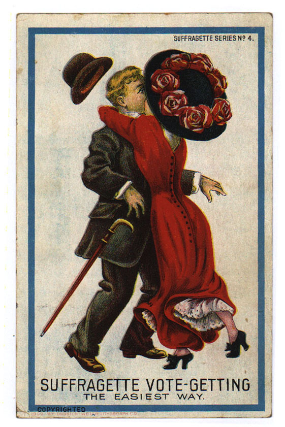
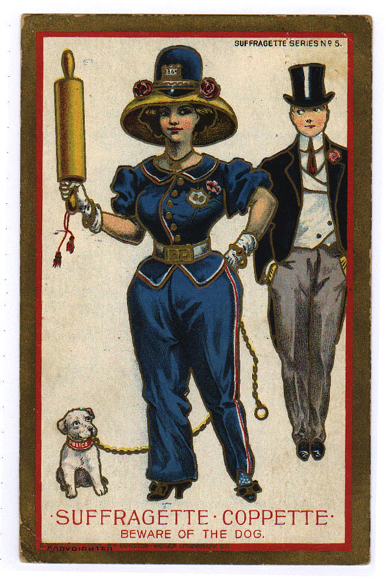
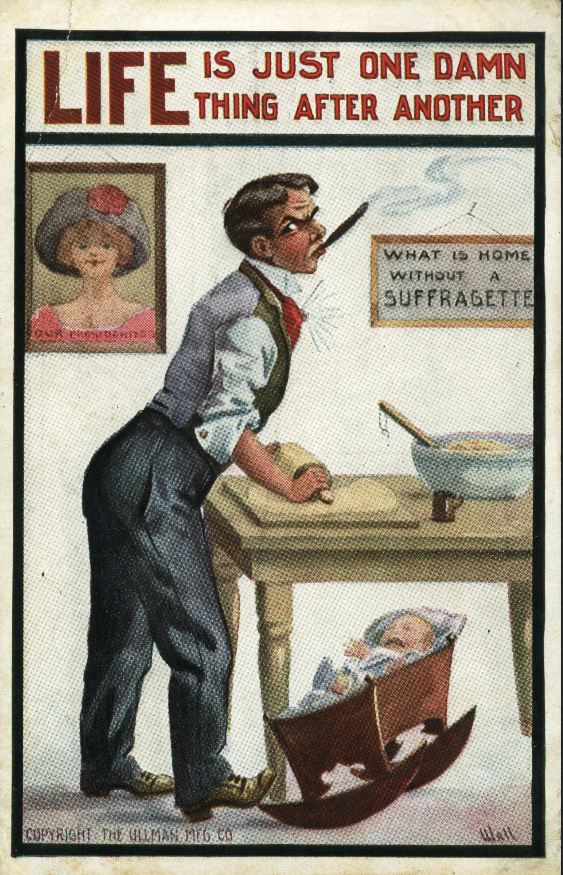
For instance, a 12-card series produced by Dunston-Weiler Lithographic Company presented suffrage as upending the gender order by masculinizing women and feminizing men. Suffragists, the postcards tell us, cause women to abandon their household duties and become aggressive and unladylike:

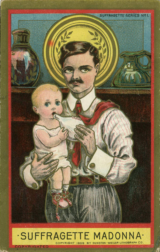
In an effort to win her own rights, then, women make their families suffer — a message complete with visuals that don’t seem out of place among stock images of crying babies and their working mothers today, as Katrin pointed out:

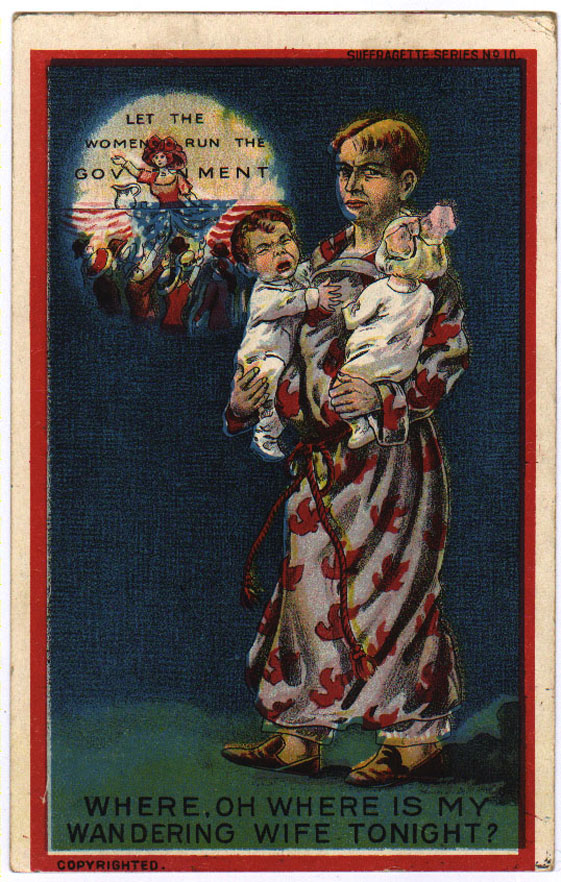
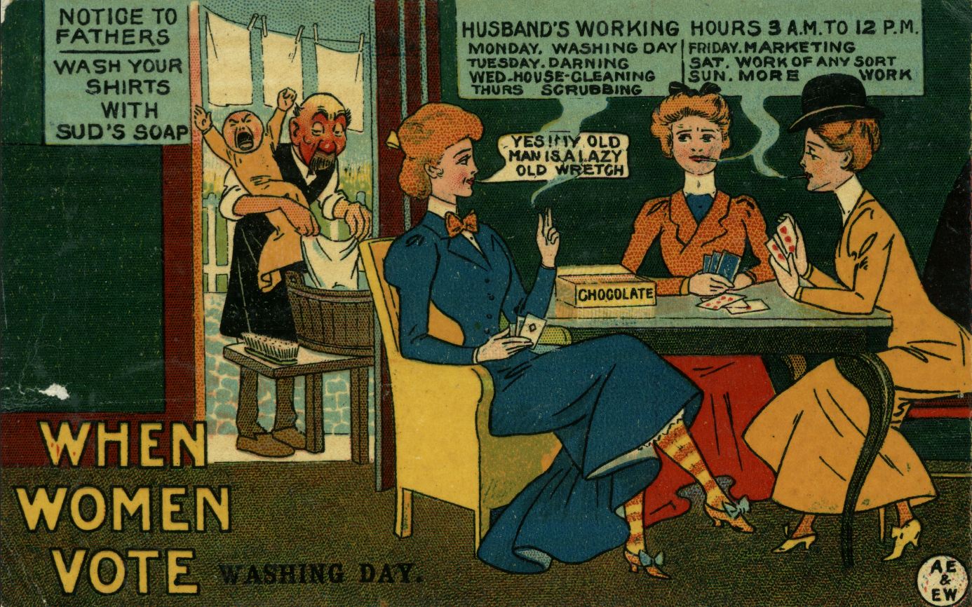
Equality in voting rights is clearly presented as female domination:

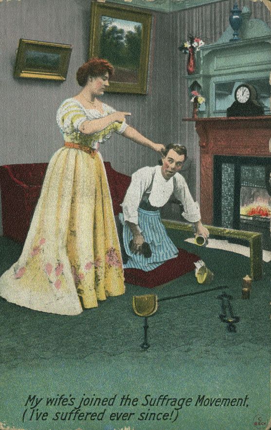
Postcards issued by other groups reflect these same themes. The clear message is that giving women the right to vote threatens men, the family, and the entire natural order of things:

The archive has a bunch more examples, categorized by various themes — including Cats and Suffrage, because lolcats are timeless.

Gwen Sharp is an associate professor of sociology at Nevada State College. You can follow her on Twitter at @gwensharpnv.

Today’s the big day: it’s Election Day in the U.S. This is the day we all go out and select our president.

Sort of. The first Tuesday in November is set as the official day to go to the polls. But many states now allow early voting and/or place few restrictions on absentee voting. ThinkProgress created a map illustrating the availability of early voting:

In Nevada, early voting began October 20th. All registered voters receive a schedule of early voting locations; some are open every day, while additional locations open on weekends.

I voted at a grocery store on the afternoon of the 20th. I was surprised there was a line. A poll worker said they expected more than a thousand people would vote in that location on that day alone, up from about 800 the first day of voting in 2008.

The appeal of early voting is pretty obvious: more time to do it, a greater likelihood that you can vote without having to take off of work, spreading voting out over time means shorter lines and less waiting to cast your vote, convenient locations, and also when a pollster calls and you tell them you already voted, sometimes you get to skip a lot of their questions.

So how many people take advantage of early voting? The Pew Research Center released some data about the 2008 election. A third of voters said they voted early, either in person or by mail:

That’s a third of all voters — but a number of states, especially on the East Coast, don’t offer early voting. In the South, 42% of voters had cast their ballots before Election Day, according to the full report.

Early voting is expected to be more common this year than in 2008. For instance, 56% of all registered voters in Nevada, one of the coveted swing states, went to the polls before early voting ended on Saturday. That will likely be 65-70% of the total turnout.

Voters’ behavior indicates a clear preference for early voting. It can address at least some of the reasons given by those who are registered but do not vote as obstacles to their participation, especially if voting by mail is an option.

We still focus on Election Day as the day, because it’s the end of the election cycle and, for many voters, still their only option for voting (and we may see a shift back in this direction, as states like Florida have restricted early voting). But in some of the all-important swing states that make or break a candidate’s bid for the presidency, the outcome of the election has already been decided; Election Day just determines the margin of victory.

Gwen Sharp is an associate professor of sociology at Nevada State College. You can follow her on Twitter at @gwensharpnv.

Last week I posted about voter turnout patterns. In 2008, about 64% of eligible citizens voted. So what reasons do non-voters give for not taking part in the election? The Census Bureau asked. I created a chart of the data found on p. 14 of the report by Thom File and Sarah Crissey.

UPDATE: Please note this data is for registered non-voters; about 89% of this group votes, significantly higher than that for eligible citizens overall. I apologize that I didn’t make the distinction clearer in my initial post.

Here are the reasons registered non-voters gave:

So the single most common reason (17.5%) for not voting was that the person was too busy or their schedule conflicted with available voting hours (at least those the respondent was aware of). Other common reasons were illness or disability (14.9%), the person just wasn’t interested in the election (13.4%), didn’t like the candidates or issues (12.9%), and other (11.3%).

Many of these barriers to voting could likely be addressed by the same basic changes: expanding voting options. Scheduling conflicts, being too busy or out of town, lack of transportation, and problems caused by illness or disability might all be ameliorated by expanded early voting and/or making it easy to vote by mail.

These issues were not equally problematic for all racial/ethnic groups. For instance, Asian-Americans and Hispanics (of any race) were more likely to report being too busy or that voting conflicted with their schedule than were White non-Hispanics or African Americans:

White non-Hispanics were more likely than other groups to say they didn’t vote because they didn’t like the candidates or issues:

The report also breaks responses down by age and education, so check out p. 14 if you’re interested in the patterns based on those demographics. It also includes data on why people don’t register, either — the most common being lack of interest or involvement in politics.

Gwen Sharp is an associate professor of sociology at Nevada State College. You can follow her on Twitter at @gwensharpnv.

Larry Harnisch, of L.A.’s The Daily Mirror, let us know that 4th Estate analyzed the racial and ethnic breakdown of reporters covering the presidential election for 38 major print media outlets. The analysis included front-page articles published between January 1st and October 12th of this year.

Here’s the key for all of the following images:

For every major topic, the overwhelming majority of front-page articles were written by non-Hispanic Whites, while racial/ethnic minorities were underrepresented compared to the overall U.S. population:

Major newspapers varied in the diversity of those writing their feature articles. The Dallas Morning News was the most diverse, with a particularly large percentage (18.8) of front-page stories written by African American reporters. The San Francisco Chronicle had the least diversity; 100% of its feature political stories were written by White non-Hispanics:

Overall, 93% of the feature articles analyzed in the database were written by White non-Hispanics, 4% by Asian Americans, about 2% by African Americans, and less than 1% by Hispanics. Compare that with each group’s proportion of the overall U.S. population:

These numbers clearly matter in terms of career opportunities and exposure for minorities within the industry. But they also should concern us readers. What does the lack of diversity mean in terms of the issues covered, the political contacts and average-Joe-voters spoken to, the topics seen as important enough to cover?

Also see our earlier post on the gender of those quoted in news stories about the election.

Gwen Sharp is an associate professor of sociology at Nevada State College. You can follow her on Twitter at @gwensharpnv.

As evidence of how mainstream and taken-for-granted dressing up like Native Americans for Halloween (not to mention as a general fashion trend) is, Kari sent in this photo of a costume store, where Native American is a sufficiently popular costume category that it deserves prominent signage:

Via Yo, Is This Racist?

Gwen Sharp is an associate professor of sociology at Nevada State College. You can follow her on Twitter at @gwensharpnv.

Now that we’re in the last full week of the presidential campaign, let’s look at voting patterns in the U.S. Who votes in national elections? And how many of us do so?

Voter turnout data is often somewhat misleading. The turnout rate is often reported as a % of the total voting-age population — that is, what percentage of people over age 18 voted? But that broad measure of voter turnout will be artificially low because it includes non-citizens living in the U.S., who aren’t eligible to vote. A more accurate measure would be to look at turnout among citizens over age 18; as we see in the data from the 2008 presidential election, the difference between these two measures of voter turnout was more than 5 percentage points:

It’s worth noting that the citizen measure doesn’t reflect those citizens who have been disenfranchised because they live in a state where individuals convicted of felonies lose the right to vote, often permanently.

If we look at voter turnout among citizens in 2008, we see significant differences by race/ethnicity. White non-Hispanics have the highest turnout, with African Americans about 5-7 percentage points behind, though the gap narrowed in 2008. Asian Americans and Hispanics are less likely to vote, with just under half of eligible citizens from these two groups voting in 2008:

Both parties are keenly aware of the steady growth in voter turnout among Hispanics; as the largest racial/ethnic minority group in the U.S., increasing participation in elections promises growing political influence in the future, a source of both opportunities and challenges for the parties as they vie for those votes.

Not surprisingly, age and education affect voting behavior. Within every educational level, the voting rate goes up steadily with age.

For more information on voting patterns, the Census Bureau has an interactive website that lets you select elections between 1996 and 2010 and see a map and graphs broken down by sex, race/ethnicity, age, and so on.

Gwen Sharp is an associate professor of sociology at Nevada State College. You can follow her on Twitter at @gwensharpnv.

If you’re paying any attention to the U.S. presidential election, you’ve likely heard a lot about campaign spending on ads. So how much is being spent? And where?

Dmitriy T.C. sent in an interactive graphic that the Washington Post created that allows you to look at one particular type of campaign spending: commercials in various television markets. Spending, and thus exposure to presidential campaign commercials, is very unevenly distributed. Many states get almost no attention from the national campaigns and the interest groups and PACS that support them, since their voting outcomes are seen as all but inevitable.

I, on the other hand, live in the largest city in a swing state; $37 million has been spent on over 47,000 commercials here:

Here’s the key for the map; the darkest green shade indicates more than 20,000 ads, a number roughly equal to how many times I have been called by political pollsters during the past three months:

You can also limit the map to look just at Democratic or Republican spending.

Florida leads the nation in amount spent on TV ads by the two campaigns. The Republicans have outspent the Democrats in all of the top 11 states except New Hampshire:

The site also has a graph that lets you track spending in the most competitive states by week between mid-April and  now.

This is just one element of campaign spending. Add in the cost of all the mailers, campaign trips, online ads, the conventions themselves, and Get out the Vote efforts by the presidential campaigns or interest groups and SuperPACs associated with them, and the amount spent to elect our president is truly mind-boggling.

Gwen Sharp is an associate professor of sociology at Nevada State College. You can follow her on Twitter at @gwensharpnv.

Emilia J. sent in a Fiat ad that illustrates the conflation of women with products. In the commercial, a man sees an attractive woman bending over on the street. She yells at him for staring at her, but the encounter quickly becomes sexualized, with ejaculation imagery as a bonus:

https://thesocietypages.org/socimages/2012/10/24/objectifying-women-sexualizing-cars/

As Emilia points out, the woman is “portrayed as a foreign beauty…exotic and coveted.” An Italian car literally becomes a sexualized, sexually aggressive Italian woman, available for “our own advancement in our ethnosexual adventures.”

We see this depiction of women as things to be consumed, or things as sexy women, often. For other examples, see our posts on sexualizing food, women as the product, an “up-skirt” soap dispenser, products shaped like women’s bodies, women as useful accessories, and lots of stuff shaped like boobs.

Gwen Sharp is an associate professor of sociology at Nevada State College. You can follow her on Twitter at @gwensharpnv.