Today we have an important public service announcement for you from Radi-Aid: Africa for Norway. The campaign has released a song and accompanying music video, imploring Africans to donate radiators to help Norwegians survive the difficult conditions in their country:

The real point of the video, of course, is to point out some of the problems with the images of Africa that are often presented in humanitarian fundraising drives by using a “We Are the World”-style song to turn the tables. The video’s creators argue that the constant depiction of Africa as a place of violence and misery is both counter-productive and generally obscures the actual cause of many of the problems, presenting the West as benevolent saviors while ignoring any role they might have in actually creating the conditions the fundraising campaigns are meant to address.

From the Radi-Aid website:

The pictures we usually see in fundraisers are of poor African children. Hunger and poverty is ugly, and it calls for action. But while these images can engage people in the short term, we are concerned that many people simply give up because it seems like nothing is getting better. Africa should not just be something that people either give to, or give up on…We need to change the simplistic explanations of problems in Africa. We need to educate ourselves on the complex issues and get more focus on how western countries have a negative impact on Africa’s development. If we want to address the problems the world is facing we need to do it based on knowledge and respect.

Erik Evans, one of the people behind the video, spoke to NPR about the video and the intent. You can listen to the segment here.

Thanks to Erin A., Amy H., Katrin, and Autumn S. for sending it in!

Also see this video in which four African men awesomely poke a little fun at stereotypes of African men in U.S. pop culture, Chimamanda Adichie on the “single story of Africa,” and how not to write about Africa.

Gwen Sharp is an associate professor of sociology at Nevada State College. You can follow her on Twitter at @gwensharpnv.

Back in 2009, Lisa posted about microscopes and telescopes in a Toys’R’Us catalog. In both cases, the pink version was the least powerful option.

Reader Claudia, who lives in Ireland, found a similar example. Back in October, a supermarket outside Dublin sent out a mailer that advertised boys’ and girls’ laptops. The boys’ version has 50 functions; the girls get just half as many:

Also, it looks more like a packet of birth control pills than a laptop.

Gwen Sharp is an associate professor of sociology at Nevada State College. You can follow her on Twitter at @gwensharpnv.
Sociologists Arlie Hochschild and Anne Machung used “the second shift” to refer to the responsibilities of childcare and housework borne disproportionately by women, in addition to their paid labor.

A student in Will LaSuer’s class at the University of Akron noticed that a 5-Hour Energy ad explicitly references this idea of a second shift for women. A harried mom with an armful of groceries enters a home full of yelling kids. She talks about getting home from her first job to start her second job, and how worn out this can make her:

Of course, the ad doesn’t actually critique this arrangement or the organization of household duties. The second shift is taken for granted, an unavoidable burden. Consumption provides the answer: buy a product that gives you more energy so you can tackle that second job when you get home. Problem solved!

Gwen Sharp is an associate professor of sociology at Nevada State College. You can follow her on Twitter at @gwensharpnv.
The hidden curriculum refers to the unspoken and unofficial norms, behaviors, and values that kids learn at school in addition to the official curriculum of math, reading, science, and so on. These can include expectations about how to act in public (standing in line), how to interact with non-parental authority figures, patriotism (saying the Pledge of Allegiance each morning), and messages about social hierarchies (who it’s ok to ridicule, what it means to get different grades), and so on.

Gender is an important element of the hidden curriculum. Schools reinforce larger cultural messages about gender, including the idea that gender is an essential characteristic for organizing social life.

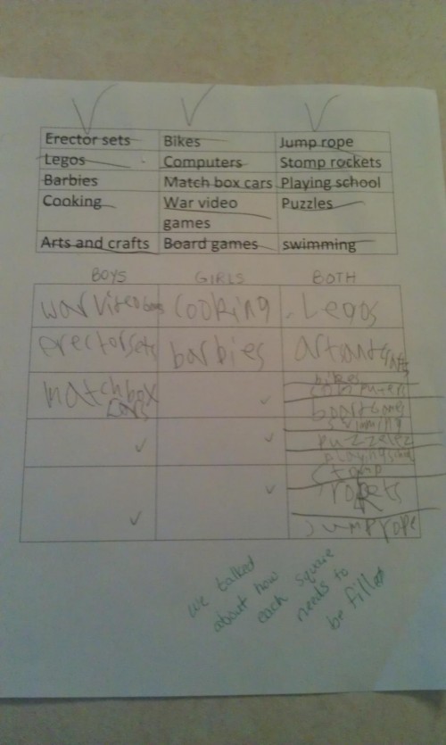
Marissa P. sent in a great example of this. Steve Bowler tweeted a photo of an assignment that his 8-year-old daughter’s teacher said she did incorrectly. The homework assignment had a list of toys or activities, and the kids were supposed to categorize them based on whether they were for boys, girls, or both, with equal numbers in each box. The assignment takes for granted the gendering of toys, and that there is a “correct” answer to the question of which gender they are appropriate for.

Bowler’s daughter did the assignment differently. After placing 3 items in the “boys” category and 2 in the “girls” group, she made additional boxes to add more things in the “both” column:

But at the bottom, the teacher notes that the assignment wasn’t done correctly. The point of the assignment is to categorize; the implicit message — that boys and girls are different types of people who like different types of things — isn’t questioned. A child sees this list of items and doesn’t gender them in the way the lesson took for granted; the reaction wasn’t to acknowledge her innovation and perhaps question the gendering, it was simply to say she did it wrong.

It’s one small example of the way that the hidden curriculum reinforces gendered messages, teaching kids expectations for gender and that gender itself is a coherent, meaningful characteristic.

Bowler, for the record, said he was proud his daughter failed the assignment and just wished she’d done even worse on it.

UPDATE: Reader Kama notes that the assignment accompanied a reading about a girl who wasn’t allowed to play basketball. The overall message of that story challenged the idea that girls can’t play basketball, requiring kids to categorize the toys and activities by gender as part of the lesson:

…this was assigned following reading a book about a girl who wanted to play basketball but was told it’s a boy’s sport.  She kept at it, got better, and earned the respect of the boys who were telling her off earlier.  According to the guy who posted the picture, the teacher was trying to discuss gender bias.  Did the teacher go about it the right way?  No, not really – especially when your end goal is showing that these biases are wrong.  That being said, this particular assignment doesn’t really fit with the idea of a hidden gender curriculum.  The teacher wasn’t trying to say that these are boy and girl toys, the teacher was trying (and failing) to point out that we are biased in our thinking about what’s for boys and what’s for girls.

Sorry for the misunderstanding on my part.

Gwen Sharp is an associate professor of sociology at Nevada State College. You can follow her on Twitter at @gwensharpnv.
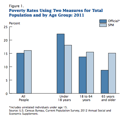
This month the Census Bureau released a supplemental poverty report to provide a broader picture of the poor in the U.S. The official poverty rate is based on a measure developed in the early 1960s. Researchers at the time determined that families spent about 1/3 of their income on food, so they calculated the lowest possible cost of a minimally nutritionally sufficient diet for a particular family size, multiplied it by 3, and the resulting number determined who was defined as poor. The amount has been adjusted for inflation but otherwise the measure is the same.

Critics argue this definition may no longer make sense. Since the 1960s, food has generally gotten cheaper while housing has become a much bigger portion of many families’ budgets. The measure doesn’t account for the different costs of living (especially for housing) in different parts of the U.S. It also doesn’t take government benefits a family might be receiving into account.

The supplemental measure is meant to address some of these problems; it will be released each year along with the standard poverty measure. It attempts to determine how much is needed to cover housing, food, clothing, utilities, and a bit for other needs (transportation, personal care items, etc.), while taking public assistance benefits into account.

The supplemental poverty measure (SPM) showed a somewhat higher poverty rate overall (16.1% vs. 15% with the official poverty rate). Because it takes benefits such as daycare subsidies, nutritional assistance programs, etc., into account, the SPM actually showed a lower poverty rate for children under 18 than the official rate does. However, adults were more likely to be defined as poor with the SPM. This is especially true for older adults. For those over 65, 8.7% are officially poor, but with the SPM, it’s 15.1%:

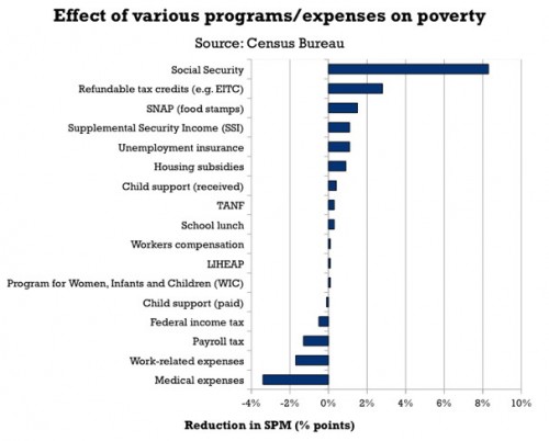
Dylan Matthews, at the Washington Post, created a graph to show the impact of some important expenses and government assistance programs on poverty, since the SPM takes benefits, and a greater range of expenses, into account in its measure. The graph shows how much each program/expense reduced the adjusted poverty rate, based on data presented in the report.

Social Security has the single biggest impact; it reduced the SPM by 8 percentage points. That is, if they had not included Social Security benefits in the measure, the SPM poverty rate would have been 24.1%, not 16.1%. On the other hand, taking Temporary Aid to Needy Families (TANF), the cash assistance program created in the welfare reform process in the 1990s, into account did little to affect the calculated poverty rate, indicating it does little to alleviate poverty (intentionally so, many would argue). Note the axis is percentage points, not percent:

At the bottom of the graph we see several items that increased the supplemental poverty rate: looking at how much income tax people paid (countering the myth that low-income people don’t pay income taxes), payroll axes, expenses related to work, and medical expenses, with out-of-pocket medical expenses being the largest factor.

There’s tons of data in the tables that show which groups would be more or less likely to be defined as poor in the official and supplemental poverty rates. Check out the full report.

Gwen Sharp is an associate professor of sociology at Nevada State College. You can follow her on Twitter at @gwensharpnv.

Yesterday NPR’s Morning Edition included a segment by Alix Spiegel about cultural differences in approaches to teaching and learning. Researchers have found interesting differences in how teachers and parents in the U.S. and Japan encourage kids to learn.

Americans tend to focus on intelligence as the source of school success; you do well because you’re smart, kids learn. But Jim Stigler’s observations in Japan indicated that teachers focused more on effort, on letting kids publicly struggle with problems until they finally got the right answer. From this perspective, learning doesn’t occur because you’re inherently smart; it occurs because you keep working at a difficult problem until you figure it out. Jin Li has also found that parents tend to socialize kids in the U.S. into thinking of their successes as a sign of their intelligence more than their hard work, while Chinese parents focus more on persistence and concentration.

These lead to different perceptions of what it means to struggle to learn. As Stigler explains, in the U.S., we often assume that learning comes easily to you if you’re smart, and if you struggle to learn, that you lack ability. This can lead to fatalism; students who don’t easily grasp a concept can quickly see it as impossible. But as Spiegel says,

Obviously if struggle indicates weakness — a lack of intelligence — it makes you feel bad, and so you’re less likely to put up with it. But if struggle indicates strength — an ability to face down the challenges that inevitably occur when you are trying to learn something — you’re more willing to accept it.

It’s an interesting report on differences in cultural perceptions of learning, what it means if you struggle to grasp something, and the implications this might have for students’ experiences of their own learning process. It’s worth a listen.

I couldn’t get the audio file to upload; you can listen to it at the NPR site. You can read the full transcript here.

Gwen Sharp is an associate professor of sociology at Nevada State College. You can follow her on Twitter at @gwensharpnv.
I know everyone is tired of hearing or thinking about the U.S. presidential election, but Latino Decisions has released an interactive website that shows how Latinos/as in the U.S. voted, as well as the issues they found particularly important.

In many of the swing states, Latinos formed an essential part of President Obama’s winning coalition of voters. As you may have heard by now, Latinos voted overwhelmingly Democratic, with about 3/4 voting for President Obama:

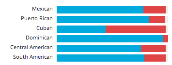
But this varied by ancestry. Among Cuban Americans, only 44% supported Obama, while he received 96% of votes cast by Dominican Americans, 78% by Mexican Americans, 83% by Puerto Ricans, 76% by Central Americans, and 79% by South Americans (hover over the graph here to see the %s):

Language also made a difference. Among those who speak primarily English, Obama got 70% of the vote; among those who speak Spanish, it was 83%:

Religion was an even bigger factor. While 81% of Catholic Latinos voted for President Obama, he got a much smaller majority — 54% — among those who identified as born-again Christians:

The website also lets you get specific data on a number of swing states or states with large or growing Latino populations, as well as breakdowns of the issues that Latino voters said were most important to them. It’s an interesting website with a lot of breakdowns, so it’s worth clicking over and looking around.

Gwen Sharp is an associate professor of sociology at Nevada State College. You can follow her on Twitter at @gwensharpnv.

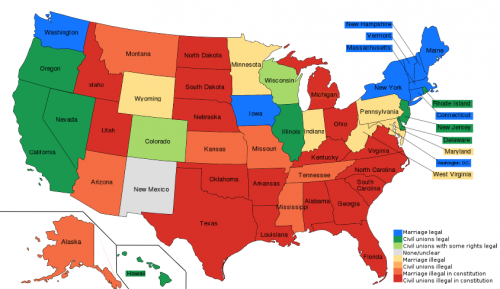
Last spring I posted a map of the legal status of same-sex marriage in the U.S. Given the results of the election, it’s time to update that map.

Greg Stoll posted an interactive map that lets you look at changes in in statutes regarding same-sex marriage from 1990 to now. On Tuesday, voters in Maine and Maryland approved referendums legalizing same-sex marriage, reaffirmed marriage equality in Washington, and defeated an effort to put a ban on same-sex marriages in the Minnesota constitution. That makes this this first time same-sex marriage was legalized by voters, rather than a legislature or the courts. (NOTE: As a reader pointed out, there’s an error in the map; Maryland should be colored blue now.)

Here’s the current map, with blue states having full marriage equality and red states banning both same-sex marriage as well as civil unions in their constitutions:


Gwen Sharp is an associate professor of sociology at Nevada State College. You can follow her on Twitter at @gwensharpnv.