Dalton Conley’s newest animated video provides an overview of the social construction of race: the categories we define as race aren’t based in biology, yet they’re incredibly important factors that influence our opportunities, constraints, and life outcomes.

The Massachusetts Senate race between Scott Brown and Elizabeth Warren has brought heightened attention to claims of Native American ancestry in the U.S.. Warren appears to have at times claimed such ancestry, Cherokee and Delaware in particular. The Washington Post provided a thorough round-up of the issue. From what we know thus far, there’s no clear evidence of her claim. Like many families, especially in Oklahoma, her family has a vague account of one or more American Indian ancestors. The vagueness doesn’t necessarily mean it isn’t true, nor does a lack of tribal records. However, there’s a well-known “Indian princess” syndrome, where notably large numbers of people in the U.S. claim a distant Native American ancestor, about whom the details are usually sketchy and inconsistent. Certainly some of these family oral histories are based in some truth, but others are likely apocryphal (though the individuals reporting them may truly believe them).

So Warren’s claim to some Native American ancestry is at least unverified, and there’s an interesting issue there in why so many Americans happily accept stories of native ancestry with little question.

But I was struck by opponent Scott Brown’s comment in one of his debates with Warren. Via abc News:

“Elizabeth Warren said she was a Native American, a person of color,” Brown said, gesturing toward Warren. “As you can see, she’s not.”

The statement implies that we can tell, just from looking, whether someone is really Native American. We can see, obviously, that she isn’t. This gets at a bigger issue about judgements of authenticity. Individuals often have preconceived ideas about what a Native American should look and act like; their Indianness is expected to be clearly visible, both physically and culturally.

Given this, I was particularly struck by a video Katrin recently sent in a link to the Represent series created by The 1491s. The videos challenge the viewer to recognize that American Indians and their cultures are still vital and vibrant. But they also illustrate the problem with assuming that anyone can easily tell who is or isn’t Native American, and how they integrate or represent that identity in their daily lives. Here are a few, but I’d check out the full set at the 1491s website.

The Washington Post has a post up by Dylan Matthews that looks at the U.S. gender wage gap over time. It has several charts that illustrate trends in pay very clearly. Here’s a breakdown of median income (in constant 2010 dollars) by gender and race/ethnicity, for all workers, both full- and part-time:

The gap remains for full-time, year-round workers, too. Women have gained ground, but within every racial/ethnic category, women’s median income is lower than men’s and every other group earns significantly less than Asian and White men. However, there’s a clear racial earnings hierarchy visible in the chart as well, which isn’t getting nearly the attention that the gender wage gap is:

Moreover, the income bump received from earning a college degree is still higher for men than for women:

There are additional charts further breaking down differences in pay among men and women in the original post. As Matthews argues, and as Philip Cohen has posted about here at Soc Images, the data just don’t support the “impending female economic dominance” narrative that has become popular recently.

As we enter the home stretch of the presidential campaign, there’s a steady stream of media discussions of potential turnout and differences in early voters and those who vote on Election Day, analysis of the demographics of swing states, and a flood of campaign materials and phone calls aimed at both winning us over and convincing us to actually go vote (those of you not living in swing states may be blessed with less of this).

So who does vote? And how many of us do so?

Demos.org recently released a report on voting rates and access among Native Americans. It contains a breakdown of voting and voter registration by race/ethnicity for the 2008 presidential election. That year, about 64% of all adults eligible to vote in the U.S. did so, but the rates varied widely by group. White non-Hispanics and African Americans had the highest turnout, with every other group having significantly less likely to vote. Half or less of Asians, American Indians/Alaska Natives, and Hispanics voted:

For every group, the vast majority of those who register do go on to vote. But significant numbers of people who have the right to vote aren’t registered to do so, and even among registered voters (the darkest blue columns), turnout is higher among White non-Hispanics and African Americans than other groups. This could reflect lack of interest in or enthusiasm for the election or the candidates, but likely also reflects structural and organizational differences, from poverty to the lack of concerted efforts by campaigns to make voting easier by providing shuttles to the polls and otherwise getting out the vote in these communities.

Katrin sent in a delightful video by the 1491s, a sketch comedy troupe that frequently skewers popular representations of Native Americans and their various cultures. The group recently released a new video featuring footage of 1491s member Ryan Red Corn dancing at the Santa Fe Indian Market interspersed with shots of visitors to the market and examples of appropriation of Native cultures, all set to Irving Berlin’s “I’m an Indian Too,” from Annie Get Your Gun. It’s a great send-up of the whole Native-culture-as-fashion-statement trend:

The National Partnership for Women & Families has posted an interactive map that displays the gender pay gap in each state and in the Congressional districts within the state. It uses Census Bureau data comparing full-time, year-round workers (that is, the scenario in which we’d expect women’s income to be closest to men’s). When you click on any state, it brings up information about it. For instance, in Nevada, women make 85% of what men do. Women working full-time have a median income of $35,484, while men’s median income is $41,803. The gap is smallest in the 1st and 3rd districts (both including parts of the greater Vegas metro area), but significantly larger in District 2, which covers the rest of the state, much of it rural:

Here are the 10 U.S. Congressional districts with the largest gender gap in median pay:

They don’t list the state or districts with the smallest gap. Just from casually and non-systematically clicking around, the state with the most parity that I found was in Washington D.C., where women make 90% as much as men. Let us know in the comments if you find anywhere with an even smaller gap.

The National Hispanic Media Coalition recently released a report, “The Impact of Media Stereotypes on Opinions and Attitudes towards Latinos,” that looked at perceptions of Latinos in the U.S. A survey about views on Latinos, as well as media representations of them, was administered by phone to a national sample of 900 non-Latinos in March 2012.

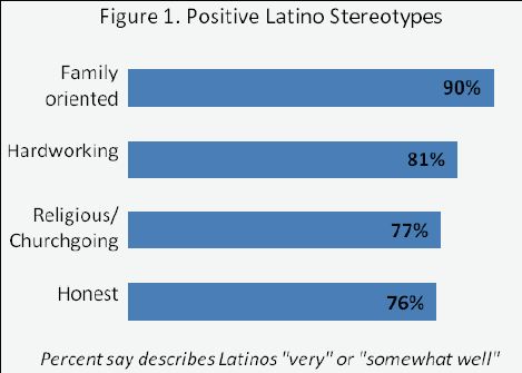
The study found that the overwhelming majority of respondents agreed with a number of positive stereotypes of Latinos, such as the idea that they are hardworking and family-oriented:

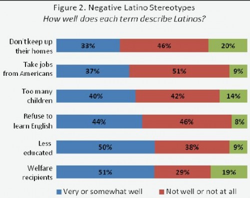
A range of negative stereotypes were persistent as well. Participants were asked how well a number of negative views described Latinos. Fully half agreed that Latinos can generally be described as welfare recipients and poorly educated, while significant minorities agreed with a number of other negative views:

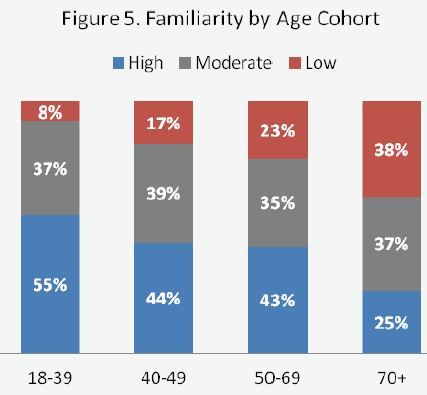
The researchers created a familiarity index based on personal contact with Latinos, frequency of such interactions, and general cultural awareness. Overall familiarity varied significantly by age, with younger adults reporting higher levels than older adults:

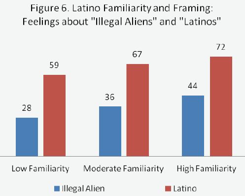
All groups, regardless of level of familiarity, felt generally positively about Latinos. However, when asked about “illegal aliens,” feelings were much more negative. Feelings were based on a scale from 0 (worst possible opinion) to 100 (highest possible opinion). The more familiar a group was with Latinos, the higher their average rating of both “Latinos” and “illegal aliens,” but every group had distinctly more negative opinions when asked about illegal aliens:

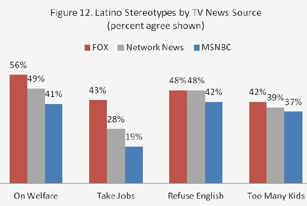
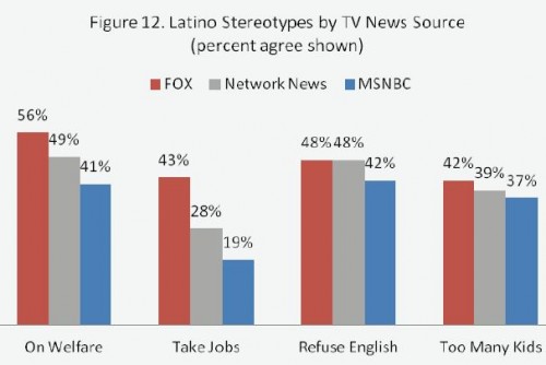
Which news source a person favored affected their perceptions of Latinos, with those who listed FOX News and conservative talk radio reporting more belief in negative stereotypes than those who rely on other TV sources or NPR for their news. However, though the gap was significant, it often wasn’t as large as you might expect given common perceptions of the wide divergence among, say, MSNBC and FOX News fans:

The researchers also conducted an online experiment on the impacts of negative media images on individual’s perceptions of Latinos. You can read the results of that aspect of the study in the full report (and read more about the research firm’s methods here).

Salon posted a video by Benjamin Wheelock that illustrates changing voting patterns in the U.S. over the last century. He assigned each state a color based on voting for presidents, governors, and Congress for each year there were elections. Red indicates Republican, blue is Democratic; the darker the color, the more overwhelming the vote was for that party.

The video starts with 2011 and moves backward to 1912. What’s perhaps most striking today is that through the late 1970s, the South was a swath of Democratic blue. In the 1980s much of it turns purple, as presidential elections increasingly go Republican but Dems remain competitive in state elections. By the 2000s, it becomes much more solidly, and brightly, red as Republicans consolidate their popularity in the region.

It’s a quick way to highlight many major trends and turning points in U.S. political history, including changing stances on racial issues within the parties, the Democrats’ overwhelming dominance during the late ’30s as the country struggled to emerge from the Great Depression, and the clear shifts in the South and on the coasts over time.


Thanks to my colleague Pete for pointing it out!