
The Russell Sage Foundation and the Stanford Center on Poverty and Inequality have put together Recession Trends, an interactive website that lets you create graphs about issues related to the recession. It takes a couple of steps to get to the database (you have to agree to the terms before entering), but once you’re there, you can choose data about a variety of topics — crime, housing, immigration, income, political attitudes, family life, and a lot more. It’s a great way to quickly get an overview of many aspects of life in the U.S.
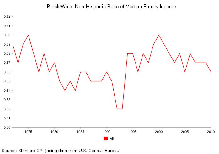
I looked at the ratio of median family income between African American and White families. Between the early 1970s and 2010, we’ve seen a consistent gap in earnings, with Black median household income hovering between about 52 and 60% that of Whites:
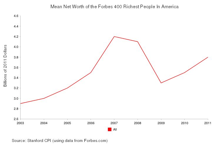
The graph of the mean net worth of the individuals on Forbes’s list of the 400 richest people in the U.S. shows that while they certainly saw their wealth take a tumble during the recession — it fell to a mere $3.3 billion or so — they’re recovering well:
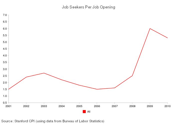
Unsurprisingly, the number of job seekers per job opening went up sharply after 2007; it’s finally starting to drop off slightly, though we still have about 5 people looking for every 1 job that’s available:
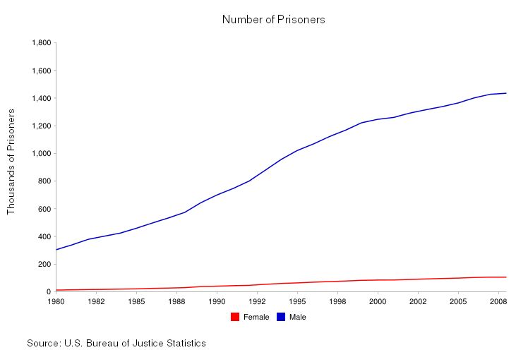
You can add more than one dataset for many topics. Here’s the growth in the prison population since 1980, by gender:
There’s lots, lots more. Whatever topic you’re particularly interested in, there’s a good chance there’s something there that’ll grab your attention for a bit.
Gwen Sharp is an associate professor of sociology at Nevada State College. You can follow her on Twitter at @gwensharpnv.
Comments 1
INTERACTIVE GRAPHS OF RECESSION TRENDS « Welcome to the Doctor's Office — October 23, 2012
[...] from SocImages [...]