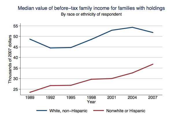
NEWS:

Last month Lisa posted about some interesting, if subtle, differences in a Spanish- and English-language pamphlet for pregnant women at Kaiser.  Siobhan O’Connor at GOOD put up her own blog post about the pamphlets and called Kaiser to see what was up.  A representative, Socorro Serrano, visited our site and replied in the comments.  Check out her reply, now in the post, here.  Thanks for chiming in, Socorro!

Join our fandom at our Facebook page!

NEW FEATURE!  FROM THE ARCHIVES:

Sometimes we get nostalgic for our old posts.  So, each month we’re going to resurrect a post from one year ago.  (In July we turn two-years-old and we’ll start resurrected two!)

From March 2008:  The marketers behind the Brazilian yogurt ads in this post counted on their viewers being disgusted by, gasp, fat women!  But some of us thought the women looked great.  What do you think?

NEWLY ENRICHED POSTS:

We added another Postsecret postcard to our post on confessions of true feelings about interracial sex.  Also in race and sex:  We updated our post on Resident Evil 5 again, this time adding an image of an African woman from the game attired in a sexualized animal-print outfit.

Nearly a year ago we argued that a promo poster for Gossip Girl represented the “pornification” of everyday life.  The stars are on the new cover of Rolling Stone and, well, we still think it’s pretty porny.  Speaking of: Breck C. sent us another image of things shaped like boobs, which we added to our extensive boobs post.

We published a post about a Dutch bus-stop bench that is a also a scale and publicly displays your weight when you sit on it.  We went back and added images of a design for a toilet seat that does the same thing

We added images of a man’s electric back hair shaver and a Nads commercial about a woman whose life was transformed when she was able to wax away her beard to this post about our growing disgust with body hair, even on men.  Also in hygiene: Kim D. sent us in another vintage Lysol douche ad, which we added to a post with several others.

Bri a sent in four ads to add to one of our posts discussing how people of color are included in ads aimed primarily at white people.  See the whole series starting here or check out the newly enriched post that discusses how people of color are used to represent “spice,” “flavor,” and, literally, “color.”

Bri also sent us an awesome Ralph Lauren ad that romanticizes colonialism, we added it to a previous fashion spread that did the same.  Relatedly, to our post about using third world people in fashion ads, we added a set of images advertising Suit Supply, sent in by Geerte S.

Matt W. sent us a map that overlaid concentrations of rural poverty with rates of religious adherents, and we added it to our post about religion and geography.

We added a floral-print hammer to this post about gendering products.  Speaking of gendering products: We added another strip from the Sheldon Comics “Make-up But for Dudes” series and an SNL sketch about make-up for men to this post.

We added an advertisement for Cessna’s fleet of private jets to this post in which private air travel is linked with ideal fatherhood.

Our post on what “organic” means now has a link to the Cornucopia Institute’s photo gallery, which has lots of photos from large containment livestock facilities that sell to Horizon and other companies.

We, of course, had a new ad for our post on sexualizing food, this time a Three Olives vodka ad about your “O Face” sent in by Tiffany L.  We also added more images of how the green “female” M&M is sexualized (sent in my Kristi) to this post.  Also related to food: We added a link to the mock commercial for Powerthirst 2 to our original post about this hilarious send-up of energy drinks and masculinity.

Finally, to our post about various companies trivializing women’s power, we added print ads for Nuvaring (“Let Freedom Ring”) and Spanx’s new “power panties.”   We also added another image of women sexually dominating men to our post on the theme.  It’s a doozy, too.

Yes, it’s another table from Nate Silver at FiveThirtyEight. He’s had some great stuff up lately. Here we have changes in compensation (per employee) between 1992 and 2007 for various industries, based on Bureau of Labor Statistics data:

finpay2

I do question some of these classifications–for instance, is “performing arts, spectator sports, museums, and related activities” really a coherent category? Nonetheless, it provides a relatively consistent measurement of compensation, which is useful for comparing change over time.

I wandered over to the BLS website and ended up on their Occupational Injuries and Illnesses page. There I discovered this in the National Census of Fatal Occupational Injuries in 2007:

picture-18

Along with the graph, we learn,

Workplace homicides involving police officers and supervisors of retail sales workers both saw substantial increases in 2007.

Police officers makes sense. But retail supervisors? Huh. I wonder what the actual numbers are.

From the same report we get the number and rate of fatalities by industry:

picture-19

The extraction industries (mining, forestry, farming, fishing, hunting) are noticeable outliers here, with significantly higher fatality rates (though not overall numbers) than any other industries.

So there’s some totally unconnected information about the labor force for you.

Nate Silver at FiveThirtyEight put up this graph of U.S. household debt (from the 2007 Survey of Consumer Finances):

debt2

Silver says,

Per-family household debt increased by about 130% in real dollars between 1989 and 2007, from roughly $42,000 per family in 1989 to $97,000 eighteen years later. Most of that increase has come during the past six or seven years — household debt increased by 52% between 2001 and 2007 alone. Almost all of the debt (about 85%) falls into the category that the Fed calls “secured by residential property” — which means mortgages and home-equity loans.

Some other images from the SCF Chartbook (available here)–and pay attention to the y axis, since the scale isn’t the same in all of them:

picture-16

picture-23

picture-3

picture-4

This next one is for rural (non-MSA) and urban (MSA) areas:

picture-5

picture-6

The Chartbook has images of the mean values for all these calculations as well, I just prefer the median to reduce the effects of outlier incomes.

Way back in December Sadie McC. sent in this Canadian ad for Tetley Red Tea, a variety that apparently originated in southern Africa:

We get several of the standard signifiers of “Africa”: tribal music with drums, elephants, and huts with thatched roofs (rooves? What’s the spelling consensus these days?). Both what mostly struck Sadie and I is our feeling that if we were marketing a food product, probably we would go with not choosing imagery that made the product look an awful lot like blood. My usual argument to students is that things in ads are not accidental; millions are spent on ad campaigns, and they are scrutinized, focus-grouped, and every detail is poured over by many individuals, all to add to the overall design. But in this case, I’m going to assume that somehow nobody noticed that the commercial kinda makes it look like wisps of blood creating scenes of Africa.

Anyway, I was looking around online for information about tea cultivation in Africa and found this short video about tea production in Kenya, including images of workers harvesting the tea:

[youtube]https://www.youtube.com/watch?v=zyP-l6eP_sE[/youtube]

It might be a good video to show if you’re talking about globalization and agricultural labor, to get students thinking about how our food gets to us and who is doing the often non-mechanized, back-breaking labor required for us to have such a wide variety of foods available year-round. In the video, the men don’t look obviously miserable, but my guess is that picking leaves with your bare hands for hours at a time, while carrying bags of leaves on your back, is pretty unpleasant, physically demanding work that probably isn’t highly paid. And I could be wrong, but I’m betting workers don’t wear protective gear to keep them from coming into contact with chemicals when the crop has been sprayed with fertilizers, pesticides, herbicides, or whatever else they might spray on the fields.

Apparently, due to the perceived healthiness of green teas, imports to the U.S. were up 7% in 2008, to about 257 million pounds. I was surprised, however, to learn that we’re only the 7th biggest consumer of tea. Having grown up in Oklahoma, where sweet tea was ubiquitous and nearly mandatory, and is the only beverage served at my family’s get-togethers, I sort of have this idea that everyone drinks iced tea, all the time, and expected us to rank higher.

Random tea-and-Gwen-related story: I was a waitress in Wisconsin for a while, and one time a woman ordered “regular” tea. I brought her a glass of unsweetened tea in a glass. She stared at it and said “I just wanted plain tea.” I assured her I had brought the unsweetened kind, but she insisted again that she just wanted “normal” tea. I was pretty confused at this point and explained again it wasn’t the raspberry-flavored tea and it wasn’t sweetened, it was just plain. She then very slowly, in that extra-loud and enunciated voice people use to talk to people they think are either not too bright or maybe don’t speak their language very well, that she wanted “the kind that comes hot, in a teapot,” making exaggerated gestures like she was pouring tea into a cup. I called my mom later and she was as befuddled as I was to think that anyone would mistake that kind of tea for normal tea.

And then I found out the Brits drink milk in tea.

UPDATE: Commenter Christine says,

…red tea is not just from southern Africa, but very specifically South Africa, with strong historical ties to colonialism in the area. Even the other name the tea is known by, rooibos, is an Afrikaans word; the Afrikaans language developed among Dutch settlers in South Africa. Cultivation of the plant began in the 1930s; commercial production came about around WWII; apartheid laws were enacted in 1948.

And reader Steve W. sent in two photos of some coffee he saw for sale at Panera Bread, where the package assures buyers that “every detail matters” and that the coffee is made from “handpicked beans that are carefully selected”:

cimg2816

cimg2817

As Steve points out, for most of us, when we see descriptions like “handpicked,” we usually don’t connect it to actual people doing actual work. It’s also interesting that the phrase “handpicked” is used to imply that the product is somehow special and carefully produced. But the video above shows handpicked tea, and I don’t think you can argue it was being carefully chosen (the workers, after all, need to pick as quickly as possible to increase their pay), but also you’ll see the phrase used in situations where most of the crop is harvested by hand, meaning that it doesn’t indicate any special production process at all.

Gwen Sharp is an associate professor of sociology at Nevada State College. You can follow her on Twitter at @gwensharpnv.

Katie M. sent in a link to a post at Vast Public Indifference about gender in Pixar films, specifically how they tend to focus on male characters, with female characters in smaller or supporting roles. As Caitlin says in the original post,

The Pixar M.O. is (somewhat) subtler than the old your-stepmom-is-a-witch tropes of Disney past. Instead, Pixar’s continued failure to posit female characters as the central protagonists in their stories contributes to the idea that male is neutral and female is particular. This is not to say that Pixar does not write female characters. What I am taking issue with is the ad-nauseam repetition of female characters as helpers, love interests, and moral compasses to the male characters whose problems, feelings, and desires drive the narratives.

Here are some images showing main characters from a number of Pixar films. Clearly there are a lot I left out; I chose these both because they were mentioned in the original post by Caitlin, because I’ve seen them, and because they illustrate the general trend.

From “Cars,” a movie in which almost all the characters are male and female characters are mostly car-groupies who swoon over the main character (though there is a female attorney car who doesn’t fall into that category):

200px-cars_2006

“Monsters, Inc.,” where the two central characters are male:

200px-movie_poster_monsters_inc_2

“Toy Story,” same as above:

200px-movie_poster_toy_story

“A Bug’s Life,” in which not only is the main character male, the actual behaviors of male and female ants have been switched to fit in with our ideas of appropriate gender roles (for another example of changing the behavior of animals to fit human gender norms, see this post on “Bee Movie”):

a_bugs_life

We do see a Pixar film with a female main character, however: the upcoming”The Bear and the Bow”:

bearandthebow-designs

According to Wikipedia, this is Pixar’s “first fairy tale.” So apparently though we get a female lead here, she’s of the spunky-princess type often found in fairy tales.

I have read, in discussions of gender in children’s films, that there is a general belief in the industry that everyone will watch a movie with a male lead character, but boys will be turned off by movies with a female lead. So we see the pattern Caitlin points out: males are the neutral category that are used when the movie is meant to appeal to a broad audience, while females get the lead mostly when the movie is specifically geared toward girls. The assumption here is that girls learn to look at the world through the male gaze (identifying with and liking the male lead, even though he’s male), while boys aren’t socialized to identify with female characters (or actual girls/women) in a similar manner.

I’m torn as to whether I think boys would avoid movies that had female leads. On the one hand, a big part of masculinity is rejecting all things feminine, so I can imagine boys deciding they hated any movie that seemed to be for or about girls. On the other hand, I wonder what would happen if we had more films aimed at kids that had female leads but didn’t fall into the traditional “girl’s movie” categories (such as fairy tales). If “A Bug’s Life” had a female lead but was otherwise the same type of movie–one aimed at a general audience, not specifically girls–would boys reject it? Most of the animated movies I can think of that had females as the main character were focused around romance and other topics deemed feminine (except maybe “Mulan,” where that’s not the main focus), which obscures the issue of whether boys would watch a movie with a female character if it was treated as a general-audience movie. [Note: See the comments for some other examples of movies with female leads that weren’t necessarily romantic-centered, such as “Lilo & Stitch” and “Alice in Wonderland,” as well as some non-animated ones.]

I dunno. Thoughts?

UPDATE: In the comments, Benjamin L. makes a great point:

Something to consider is that most of the people working on Pixar films are men. It’s possible that they might feel unable to successfully create and write dialog for compelling female characters. Take a look at this list: http://en.wikipedia.org/wiki/List_of_Pixar_films Out of the all the writers and directors of Pixar’s films, one is female–Rita Hsiao. Significantly, the films she has worked on, Mulan and Toy Story 2,  are unique in that they both have prominent female characters.

If you’re looking for a documentary about the U.S. porn industry, PBS now has the entire documentary “American Porn” available for free online.

Anna sent in a link to Courage beer’s “take courage” ad campaign, in which men are shown in various situations where they are told to”take courage” in the face of a proctology exam, ugly sweater, and the following:

bom04267-havecourage-48-5191

Both Anna and I are a little confused by this one. What’s he supposed to be needing courage for, exactly? Is it that his girlfriend is asking if her butt looks big? Or that she thinks she looks good and he’ll have to be seen with her dressed like that? When I first glanced at it I thought it was her thinking she looked good and him being grossed out, but when I looked closer, I think it’s the “does my butt look big?” scenario. Is he supposed to take courage and lie, or take courage and tell the truth?

Notice how the ad uses a not-super-skinny woman in it, but ridicules how she looks. Clearly the answer to “does my butt look big in this?” is supposed to be “yes,” and we’re supposed to find her laughable in that outfit. What I’m not quite sure about is whether she’s being presented as inherently laughable, or as a woman who is attractive and it’s only the dress that makes her unappealing. Thoughts?

Anna was also interested in how the ad portrays relationships between men and women. For some reason it reminds me a little of the last video in this post of Errol Morris Miller beer commercials, in which men clearly find women trivial and annoying.

UPDATE: In a comment, Christian suggests, “It’s about him drinking her beautiful. Get a Courage and you get over it (the butt) or her attitude “does my butt look big?”.”

And Trevira adds,

I think this ad directly refers to the ‘insecure woman’ character played by Arabella Weir in the popular UK tv sketch show ‘The Fast Show.’  The character’s catchphrase was ‘does my bum look big in this?’ (Weir even ended up writing a novel with the same title!).

So there may be a cultural reference here that escapes us non-Brits.

The Cornucopia Institute provides a link to Dr. Phil Howard’s webpage, which has all kinds of awesome graphics to illustrate concentration in the organic food sector. This one shows acquisitions by several major food corporations (sorry the images are small–there’s a link after each one that takes you to a bigger version, or you can easily see all of them at Dr. Howard’s website). For all but the third image, the color scheme is yellow = multinational processor, green = organic brand, blue = investment firms, and red = organic versions of mainstream brands.

who_owns_071

Click for a larger version.

Creation of private-label organic lines for particular retailers:

organicplabeljul072

Larger version.

Concentration of organic labels:

retail

Larger version. Dr. Howard has also created an  animated version of consolidation in the organic food sector, which I highly recommend, unless you are easily made dizzy.

Major independent organic processors:

organicindjan082

Larger version.

NEW! John found some updated information at Phil Howard’s site. Introductions of new organic brands:

organict30intjan08

Acquisitions, as of June 2009:

organict30j091

For an article providing more detail and more graphics see: Howard, Philip H. 2009. “Consolidation in the North American Organic Food Processing Sector, 1997 to 2007.” International Journal of Sociology of Food and Agriculture 16(1), 13-30. [online at
http://www.ijsaf.org/archive/16/1/howard.pdf]