
Yes, it’s another table from Nate Silver at FiveThirtyEight. He’s had some great stuff up lately. Here we have changes in compensation (per employee) between 1992 and 2007 for various industries, based on Bureau of Labor Statistics data:
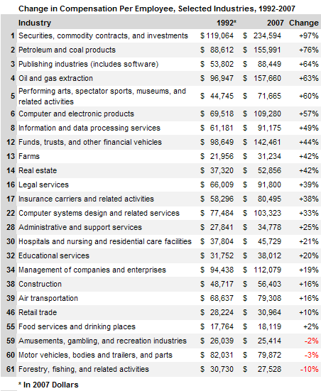
I do question some of these classifications–for instance, is “performing arts, spectator sports, museums, and related activities” really a coherent category? Nonetheless, it provides a relatively consistent measurement of compensation, which is useful for comparing change over time.
I wandered over to the BLS website and ended up on their Occupational Injuries and Illnesses page. There I discovered this in the National Census of Fatal Occupational Injuries in 2007:
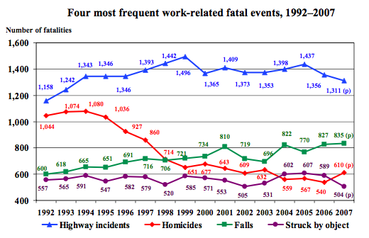
Along with the graph, we learn,
Workplace homicides involving police officers and supervisors of retail sales workers both saw substantial increases in 2007.
Police officers makes sense. But retail supervisors? Huh. I wonder what the actual numbers are.
From the same report we get the number and rate of fatalities by industry:
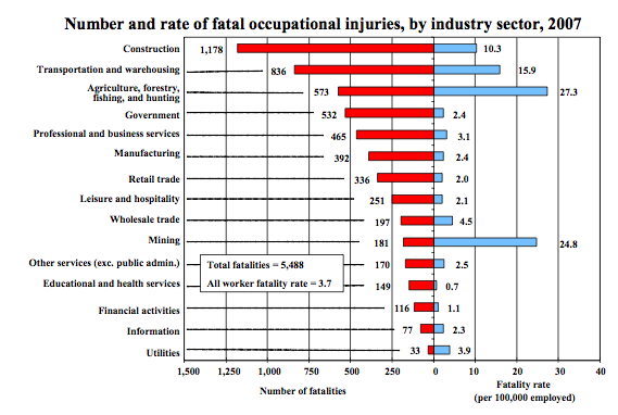
The extraction industries (mining, forestry, farming, fishing, hunting) are noticeable outliers here, with significantly higher fatality rates (though not overall numbers) than any other industries.
So there’s some totally unconnected information about the labor force for you.
Comments 13
Kim — March 31, 2009
It makes sense that there would be a high rate of homicides for *some* retail supervisors. Anyone who works in the kind of store that is likely to be robbed at gunpoint. Especially if that person might be able to open the safe.
Titanis walleri — March 31, 2009
Is hunting really an "industry", as such?
chuk — April 1, 2009
Fatalities are one thing, but I would be really interested in seeing more attention given to a category like "life-altering injury." When I used to work in construction there was a very strong sense that the likelihood of getting maimed was pretty high--mostly just a matter of time. A few guys made it to retirement, but they were lucky. I've seen this also brought up in some of the anthropology of work literature.
The first time I handled an air powered nail gun, I was told, "You're going to shoot yourself; try not to shoot anything important." Sure enough, it didn't take long.
chuk — April 1, 2009
I should add, one of the luxuries of being an academic, and I suspect middle class (or higher) in general, is not having to weigh and make potentially life and health compromising decisions on a fairly regular basis.
Moreover, this practice makes its effects felt on the way people think about themselves and their world.
buy acomplia 20mg online — April 29, 2009
Well-mannered condition! Sum to favorite
eddie007 — July 4, 2018
Sound and audio issues are common for Windows 10 users, but how do you fix them visit audio troubleshooting this website and learn how to fix audio problems
kakbrus — July 31, 2018
Thank you for this wonderful Article! fnaf
thor — November 17, 2018
the nice game
Gregory Hankins — January 27, 2019
Buy Mens Leather Jackets. Get Latest Fashion Sheep Leather Jacket, Cow Nappa Leather Pants https://www.tigerleatherjacket.com/
Gregory Hankins — January 27, 2019
Smart Candle Value Amber LED Tea Light – Pack 10 (SC9682-10) ludela
jenny — May 4, 2019
This is good for everyone
Daisy Yardley — December 17, 2019
Informative stats and facts! Looking forward to more such informative posts.
Geek Squad Tech Support
crack sz — December 25, 2020
wow
Driver Booster Pro 8.1.0.276 Crack + Serial Key 2021 New Here