Way back in 1703, French settlers in Mobile, Alabama – at the time, the capital of French Louisiana and not much more than a tiny settlement attached to Fort Louis de la Mobile – decided to celebrate Shrove Tuesday with a feast and a party. Over the next few years, the celebrations grew more elaborate, with the first known parade taking place in 1711: the Boeuf Gras (“fatted ox”) society put together a large papier mache cow’s head and rolled it through town on a cart, which I’m sure made a lot of sense at the time.

(It is at this point that native Mobilians, like myself, like to point out that New Orleans wasn’t even founded until 1718, and that New Orleans’ oldest continually-parading organization, the Mistick Krewe of Comus, was founded by six guys from Mobile. Ahem.)

And so today we celebrate Fat Tuesday – the last hurrah before Lent – by dressing up in funny clothes, drinking to excess, dancing in the streets, and hurling moonpies at each other. To celebrate, I thought I’d share an interesting symbol and recommend an excellent documentary film on Mobile Mardi Gras, director Margaret Brown’s The Order of Myths.

oom

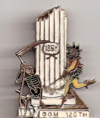
What we have here is Folly chasing Death around a broken Ionic column, while whacking Death with gilded pig bladders; seeing as how during Mardi Gras the normal social order is overturned, why not the natural order as well? Here’s a similar image from a float:

2318194724_3ac36be568

To me, these images sum up a lot of what’s great about Mardi Gras: it’s a finger in the eye of mortality and a celebration of a kind of genial lunacy. But what about that Ionic column? Well, the decoding gets a little stickier there.

I’ve heard a couple of different explanations: one is that the column represents time, the other that it represents the Confederacy or the Old South more generally. It gets a little more complicated when you look at it in context: this particular image is the emblem float of the Order of Myths, and is pulled by donkeys mules and lit by gaslight lamps – which are carried by young African-American men – in the same manner it has been since the founding of the organization shortly after the Civil War. Mobile’s mystic societies, you see, remain firmly segregated, which brings me to Margaret Brown’s excellent film.

Brown – whose first full-length documentary, Be Here To Love Me, is an excellent if crushingly depressing film about Texas songwriter Townes Van Zandt – is a fellow Mobile expat, and her film examines the complexities of race, class, and collective memory in Mobile as embodied in the 2007 Mardi Gras season. She focuses primarily on the two parallel Mardi Gras courts and documents some tentative steps toward integrating the two. I won’t say much more, for fear of spoiling the film for you, except to remark that the past is very much present in the film, in ways that both William Faulkner and Pierre Bourdieu would appreciate. And I’d also add that Brown eschews a heavy-handed or didactic approach in favor of laying the situation out for the viewer and letting them draw their own conclusions, with a few subtle editorial decisions and one late-in-the-game revelation that throws much of the previous hour and a half into a new and intriguing light. Here’s a trailer for the film:

My only real criticism of The Order of Myths is that Brown focuses primarily on the Mardi Gras elite – a little of Joe Cain Day (held the Sunday before Fat Tuesday and known as “the People’s Parade” because pretty much anybody can be in it if they can get a slot) would have gone a long way: class in Mobile is not quite coterminous with race, after all. There’s a lot more to Mobile Mardi Gras than the royal courts, and we don’t really get to see much of that. Similarly, the school featured in the film is more integrated than you’d think, as are the crowds along the parade routes, given what’s shown in the film.

But these are relatively minor points – by and large, Brown tackles the subject with a keen and incisive eye, and I’d highly recommend it to anyone teaching a class on race in the United States.

———————-

For the record, the title of the post translates as “time flies, remember you are mortal, party on.”

Burk and Paul I.-M. both sent me this video that sums up the current credit crisis:

[youtube]https://www.youtube.com/watch?v=w4gcdQA33aI[/youtube]

It’s helpful for understanding the situation, but I can’t help pointing out a few issues, like the gendering–almost all the bankers, investors, brokers, and other members of the financial systems are male (I believe one of the investors was female). Also, I found the image of families interesting: “responsible” families are thin and have one kid while irresponsible ones smoke, drink, get fat, and have tons of kids.

Also, it didn’t explain too much about the types of loans made available to the subprime market, particularly the fact that monthly payments often went up significantly after a couple of years, so you might want to throw that in if you show the video–it wasn’t always that people got loans they couldn’t afford at the initial rate, it’s that when the interest rate changed and their payments increased, they couldn’t afford the higher rates. And of course many perfectly “responsible” families took subprime loans, planning on flipping the property for a nice profit, driving real estate prices up for everyone…and now often going into foreclosure along with everybody else.

Those caveats aside, it’s a pretty useful video for boiling down some basic causes behind the credit crisis.

NEW! (Mar. ’10): Caity sent in this video by Westpac, an Australian bank, in which they attempt to explain the credit crisis in a way that some have felt was self-serving and condescending. Caity explains,

Nearly all Australian home loans are on variable interest rates. Our reserve bank recently put up the national rate by 0.25%. Usually, the banks raise (or lower) their rates about in line with the reserve bank’s changes, but this time Westpac (one of our biggest banks) put theirs up by 0.45% – and then emailed this video to all of their home loan customers to explain why.


Gwen Sharp is an associate professor of sociology at Nevada State College. You can follow her on Twitter at @gwensharpnv.

Daniel T. Lichter and Domenico Parisi provide a couple of interesting images using 2000 Census data in a recent article about rural poverty. They use Census block-group data (block-groups are significantly smaller than counties) to identify non-metro areas of concentrated poverty. This map shows all block-groups with more than 20% poverty in 2000:

picture-17

If you overlaid this map onto a map of American Indian reservations, you’d notice that many of these high-poverty block-groups are on reservations–particularly in the Dakotas, Idaho, Montana, Arizona, and New Mexico.

UPDATE: Here’s a map of state and federal reservations put out by Pearson (you can find very detailed maps of individual reservations at the Census Bureau):

indian91

And TOTALLY AWESOME reader Matt Wirth overlaid the poverty map on the reservations map. The two maps weren’t exactly the same so some of the state outlines don’t line up perfectly, but you can get a good sense of how high-poverty block-groups (blue areas) and reservations (red areas) overlap:

poverty-over-20-and-indian-reservations

Clearly there are many poor block-groups in the west that aren’t associated with reservations, but we see an awful lot of overlap of blue on red, as well as in the regions directly surrounding reservations. Thanks so much, Matt!

We also see a band of high-poverty block-groups in border counties in Texas with high numbers of Latino residents, and of course the band along the Mississippi River and through the Black Belt up to North Carolina, and the ever-present Appalachian section.

Another note about the map: As Lichter and Parisi point out, if they had mapped poverty at the county level instead of the block-group level, many of these areas of high poverty would not have shown up. These are areas of concentrated poverty in counties that are not, overall, particularly poor. The authors note that studies of poverty that look at county-level data often miss isolated rural areas with extremely high poverty rates.

On a side note, see that little blotch of brown in north-central Oklahoma? That’s where I grew up! According to the 2000 Census, my specific hometown has a 17.6% individual poverty rate and the median home value is $24,400. That doesn’t matter to you, I know, but it does make me acutely aware of the problems of rural poverty.

The following bar graph shows how geographically concentrated poverty is among three racial groups. The graph shows what percent live in Census blocks of concentrated poverty–that is, areas where 20% or more of the population is poor (20% is the standard baseline among researchers for defining an area as “high poverty”):

picture-26

Clearly, in both metro and non-metro areas, a much higher percentage of all Blacks and Hispanics (both the poor and non-poor) than Whites live in areas of concentrated poverty. Notice (in the last two sets of bars) that less than 40% of poor Whites live in neighborhoods with such high proportions of poverty, whereas the vast majority of both Blacks and Hispanics who are poor live in areas where many of their neighbors are poor as well.

Lichter and Parisi argue that the concentration of poverty matters, particularly when it indicates that the poor are socially isolated. Such isolation can mean lack of access to social services, decent schools, and the types of social networks that provide job leads, recommendations, and so on. This type of social isolation can be much more harmful than being poor in and of itself, a topic also investigated by William Julius Wilson in When Work Disappears: The World of the New Urban Poor and The Truly Disadvantaged.

From “Concentrated Rural Poverty and the Geography of Exclusion,” Rural Realities, Fall 2008, p. 1-7, available from the Rural Sociological Society.

Nate Silver, over at FiveThirtyEight.com, points out that whereas sales of beer have generally been relatively unaffected by economic conditions, the current financial situation led to a rather dramatic decrease in beer sales in late 2008:

beer4

I don’t have any sociological point here. I just think it’s interesting, and since I thought so, I thought I’d make you look at it too. Nate Silver (who I have a bit of a geek crush on) hazards a few theories (in particular, perhaps people are substituting cheaper beers for more expensive ones, meaning they’re drinking as much or more, but spending less); it’s worth checking his post out.

As I said, absolutely no point to this post other than “Huh. Look at that.”

Over at Ferris State University’s Jim Crow Museum of Racist Memorabilia, I found a page about depictions of the Jezebel stereotype, which included a number of fascinating/horrifying images. The Jezebel was, of course, a sexually promiscuous African or African American woman, wanton and lustful. Here’s a topless grass-skirted Jezebel ashtray:

ash

According to the website, this license plate with a pregnant Black woman came out after Lyndon B. Johnson won the 1964 Presidential election (he used the phrase “All the way with LBJ” in his campaign):

lbj2

A Virgin Fishing Lucky Lure:

virgin

This is a set of swizzle sticks shaped like African women:

swizzle

I found an image of a full set for sale at Go Antiques:

tyw5032go825

Note that the swizzle sticks supposedly show the woman at different ages; the age is in that cutout area in their butt. The text next to the figures:

Nifty at 15, Spiffy at 20, Sizzling at 25, Perky at 30, Declining at 35, Droopy at 40

If you look carefully you’ll see that their boobs and butts sag as they age. I wonder if this same aging scheme applies to White women? At 33, apparently I’m just about to leave the last decent stage of my life and enter my declining years. Of course, in modern America we have cosmetic surgery, so I guess I could stave off droopiness for at least a few years.

Anyway, they’re good examples of the way Black women’s bodies have often been sexualized, and how people were comfortable showing them naked even when the idea of women’s sexuality in general wasn’t considered appropriate for polite company. The Jezebel stereotype reemerged in a slightly different form  in the 1980s with the idea of the “welfare queen,” a poor black woman (on public assistance, of course) who has lots of kids with various men just to get more welfare payments, an image President Reagan used to further reduce public support for the welfare state.

This cartoon is currently causing quite a stir in both the political realm and the blogosphere (thanks to Sewell C. and Franklin S. for pointing it out):

18delonas2_480

The question is, is this a racist cartoon? According to the NYT,

The chimpanzee was an apparent reference to the 200-pound pet chimpanzee that was shot dead by a police officer  in Stamford, Conn., on Monday evening, after it mauled a friend of his owner.

You can read another account of it at Gawker.

So what is the implication? That the bill is so messed up a chimp must have written it? That he mauled the budget the way he mauled his owner’s friend? Given that the stimulus bill is widely associated with Obama (despite the fact that he, of course, did not write it–a bunch of Congressional staffers and policy geeks did, I suspect), it seems likely that many people will make a jump from the supposed author of the stimulus bill to Obama, meaning the chimp is a stand-in for the President.  Is that the cartoonist’s intent? If so, is that intent inherently racist?

Of course, there’s some historical context here. As this post illustrates, there is a long history of Africans and African Americans being portrayed as ape-like, or even as a link between apes and Europeans in the Great Chain of Being. Can we use monkeys as caricatures of African American public figures without bringing some of the old racist overtones along as well?

Again from the NYT:

In a statement, Col Allan, editor in chief of The Post, denied Mr. Sharpton’s assertion that the cartoon was “racially charged.” Mr. Allan said:

The cartoon is a clear parody of a current news event, to wit the shooting of a violent chimpanzee in Connecticut. It broadly mocks Washington’s efforts to revive the economy. Again, Al Sharpton reveals himself as nothing more than a publicity opportunist.

The cartoon brings up some interesting issues surrounding artistic intent and reader interpretation. The cartoonist may or may not have meant to be in any way drawing on the older association between African Americans and apes. It’s likely that a fair number of readers will interpret the image that way, though, regardless of what the intent might be. Some will laugh and others will be offended at the implication. This gets at the crux of many conflicts over media images, TV shows, etc.: which matters, the stated intent of the creator, or what consumers of the material interpret it to be or what they do with it? And of course, the stated intent of the creator might be a bit disingenuous too; you can certain claim to have no racist intent while using imagery that is very much associated with racism, racial violence, etc.

Anyway, it’s a conversation starter, I guess.

Also, for the record, chimps make bad pets! They’re really strong and have sharp teeth. The live a long time. They reach sexual maturity and get frustrated and aggressive. Just go adopt a dog!

Bri A. sent sent in photos of two ads found in complimentary magazines provided on a recent flight she took (she doesn’t remember the names of the magazines). Both have some interesting gender aspects.

The first is for Magnolia Hotels:

second1

Notice the suggested reasons women might be visiting the hotel: party, wedding, reunion, shopping, weekend, date, meeting, girl’s night, skiing (maybe? They’re light purple…). For men: big contract, date, presentation. Bri says,

The only professional woman presented to us in the ad is a woman who is going to a “meeting”. The woman’s shoes however, are a little racy for business and unlike her male colleagues, one of which is doing some sort of jig and the other which has forgotten his pants, she is giving us a little flirty heel raise rather than being humorous or professional. Another interesting difference that stuck out to me was the attire of the man and woman going on a date. The man going on a date is wearing a nice white suit, while the woman is wearing a much less formal and good deal more provocative outfit.

Actually, almost all the female feet are doing flirty little heel raises or half-kicks or something, which somehow doesn’t have quite the same effect as the kick the “big contract” guy is doing.

From another complimentary magazine Bri found on the same trip, an ad for Selective Search, a dating service for the business class:

first

The company technically serves men and women. But notice that the image only depicts women, and in the second paragraph we learn that “we hand select the must-meet women for our clients.” Close-ups of the lists for “selectively single” men and women:

picture-14

picture-22

Notice the men are described as “clientele,” while the women are described as “candidates.” Here are two screenshots from the website, the first from the women’s section, the second from the men’s section:

picture-21

picture-13

So ladies, they’ll find you a guy who is commitment-minded, but there aren’t many other specifics–he’ll be a quality, eligible guy, but that could mean a lot of things. Guys get some more specifics–she’ll be attractive and desirable. Somehow a “guy who brings just as much to the table as you do” doesn’t sound quite the same to me as a woman “who meets your exacting standards and criteria.” Bringing as much to the table as you do implies equality. But having exacting standards that must be met doesn’t imply anything about equality–you can have standards for other people even though you couldn’t meet most of them yourself.

Aside from the specifics of the two images themselves, you might talk about the seeming assumption that though the dating service caters to both male and female customers, the people most likely to be reading an ad placed in a business magazine on an airline will be male, and thus the ad should target a male audience (by having images only of women and stressing meeting women in the text). The presumption is either that business people who fly aren’t women, or that women remember to bring their own reading material so they aren’t stuck reading the complimentary magazines the airlines provide.

Thanks, Bri!

UPDATE: In a comment, OP Minded says,

My brother has been in the dating service industry for about 10 years and he tells me that their internal research on this stuff is compelling and very very clear. In searching for a date on a dating service:

95% of women care most about 1) Educational level, and 2) Income.
95% of men  care most  about 1) Looks, and 2) Weight.

Other issues come in to play later in the process, but at the beginning, this is what most of the folks are looking for.

In another comment, Sandra points out,

…I do remember being taught in my undergrad speech department classes that, for instance, in studies on gender effects, when asked to fill out surveys on the street by either a male or a female, women are more likely to respond to the women poll-takers, but the men are also more likely to respond to the women poll-takers [than] men [poll-takers]. So perhaps the marketing move behind the photograph in this dating service ad was based on the idea that, women appeal to women, and women appeal to men. Hence, the women in the image.  It could be the women are intended to see themselves in the photos, as people using this service, and men are intended to see the women as possible dates. 

Good point, Sandra!

In a comment to Lisa’s post on being a dog or cat person, a. brown pointed out Alpo’s new Get that Dog Some Alpo campaign, in which dogs who enjoy stereotypically high-maintenance feminine activities (pedicures, massages, fancy food, expensive accessories) need to be turned back into “real,” authentic dogs by eating meat, in the form of Alpo. I’ll leave comments about whether or not Alpo has what can realistically be defined as meat in it to others. Here are some screenshots from the site. Notice the language is always “he” or “his” if a gender is specified:

picture-11

Here are two questions from a quiz you can take to find out if your dog is a Fido or a Fifi:

picture-5

picture-61

I’ll just say, for the record, there’s no way that a vegan doggie spa just let someone in to feed Alpo to customers’ dogs without their permission. Absolutely and entirely no way. Their customers would freak out. Also, they would have a horrid, horrid mess to clean up about a half hour later.

What I find interesting here is the association between masculinity and authenticity, while femininity is associated with the upper class, superficiality, and high-maintenance luxury. So “real” dogs like sports and sex (and meat), while dogs who are pampered are somehow less authentic dogs (and presumably don’t care about sex or sports).

And I don’t know where my dogs fit in! They aren’t super-pampered, so at first I thought they’re “real dogs,” but then I realized they’re both neutered, so they don’t care about sex. Are they Fifis or Fidos? [Note: I went through and randomly selected answers in the quiz without even reading the questions and the response was that my dogs are “Vegas” dogs; given that’s where we live, I guess it’ll do.]

Anyway, you might use this to talk about the associations between a certain working-class masculinity and authenticity, in opposition to the way femininity is often connected to artifice and fakeness.

Thanks for the tip, a. brown!

Gwen Sharp is an associate professor of sociology at Nevada State College. You can follow her on Twitter at @gwensharpnv.