race/ethnicity

A month or two ago I commented on the New York Times Upfront magazine for high school kids. I recently came across their latest, which features a cover story titled “What We Eat.” The story is really just an interesting collection of photographs of families from nations all over the world, but with each family sitting with all the food in their house.

However, although the title of the article inside the magazine is “What We Eat,” the title listed on the cover of the magazine is “What They Eat.” The picture selected for the cover is not one of the family photos, but is, instead, a photo apparently selected to elicit the maximum negative visceral response possible from American kids:

what-they-eat

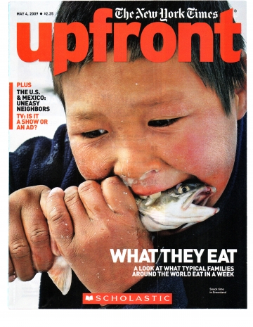
So the cover separates an “us” and a “them,” and shows the American high school students how gross and weird “they” are.

Check out the issue that preceded this one by just two or three weeks:

gun

Here American high school students learn that people around the world with dark skin are violent, dirty, and poorly dressed.

No wonder American kids grow up to be American adults whose voting habits reflect the view that American foreign policy should be paternalistic.

——————–

Missives from Marx is an Assistant Professor of Religious Studies.

If you would like to write a post for Sociological Images, please see our Guidelines for Guest Bloggers.

Gwen Sharp is an associate professor of sociology at Nevada State College. You can follow her on Twitter at @gwensharpnv.

frankie-bioThis post is dedicated to Frankie Manning.  Frankie died this morning of complications related to pneumonia   He was one month shy of his 95th birthday.  I will really miss him.  Frankie is a lindy hop legend.  He choreographed the clip below and is the dancer in the overalls.

In the 1980s, there was a lindy hop revival.  Lindy hop is a partner dance invented by African American youth in Harlem dancing to swing music in the early 1930s. Named after the “hopping” of the Atlantic by Charles Lindbergh Jr., it became wildly popular in the 1930s and ‘40s, traveling from the East to the West Coast and from black to white youth. Since its resurgence, Lindy Hoppers have enjoyed a national scene with websites, workshops, competitions, and city-wide social events that draw national and international crowds.

Though lindy hop was invented by African Americans, lindy hoppers today are primarily white.  These contemporary dancers look to old movie clips of famous black dancers as inspiration.  And this is where things get interesting:  The old clips feature profoundly talented black dancers, but the context in which they are dancing is important. Professional black musicians, choreographers, and dancers had to make the same concessions that other black entertainers at the time made. That is, they were required to capitulate to white producers and directors who presented black people to white audiences. These movies portrayed black people in ways that white people were comfortable with: blacks were musical, entertaining, athletic (even animalistic), outrageous (even wild), not-so-smart, happy-go-lucky, etc.

So what we see in the old clips that contemporary lindy hoppers idolize is not a pure manifestation of lindy hop, but a manifestation of the dance infused by racism. While lindy hoppers today look at those old clips with nothing short of reverance, they are mostly naive to the fact that the dancing they are emulating was a product made to confirm white people’s beliefs about black people.  Let’s look at how this plays out:

This clip, from the movie Hellzapoppin’ (1941) is perhaps the most inspirational clip in the contemporary lindy hopper’s arsenal:

By the way, the dancers are in “service” outfits because of the way lindy hop scenes featuring black dancers were included in movies.   Typically they would have no relationship to the plot; they would occur out of nowhere and then disappear.  This was so that the movie studios could edit out the scene when the movie was going to be shown to those white audiences that were hostile to seeing any positive representation of black people at all.  If you want to see how the scene above emerged (black “help” suddenly discovering musical instruments and spontaneously congregating), you can watch the extended clip here.

The clip features a dance troop called Whitey’s Lindy Hoppers. You can see other famous dance segments in Boy! What A Girl! and Day At The Races.

The clip below, from the Ultimate Lindy Hop Showdown (2006), reveals how powerfully contemporary lindy hoppers have been influenced by clips like the ones above.  Watch for how the styling, moves, and trick reflects the clips above:

Another good example can be found here (but the angle, audio, and visual quality are not very good).

So we have a set of (mostly) white dancers who naively and wholeheartedly emulate a set of black dancers whose performances, now 70 to 80 years old, were produced for mostly white audiences and adjusted according to the racial ethos of the time.  On the one hand, it’s neat that the dance is still alive; it’s wonderful to see it embodied, and with so much enthusiasm, so many years later.  And certainly no ill will can be fairly attributed to today’s dancers.  On the other hand, it’s troubling that the dance was appropriated then (for white audiences) and that it is that appropriation that lives on (for mostly white dancers).  Then again, without those dancers, there would likely be no revival at all.  And without those clips, however imperfect, the dance might have remained in obscurity, lost with the bodies of the original dancers.

As a white lindy hopper myself, for over ten years now, who desperately loves this dance, I find this to be a deep conundrum.

I don’t know what Frankie would have had to say about this critique.  But I do know that he loved lindy hop to his last days and he was grateful for the revival.  Here he is dancing with Dawn Hampton, another legend of lindy hop, at the age of 94:

I’lll miss you, Frankie. And I’ll keep on dancing, embodying, with ambivalence, all the great contradictions of the dance and the history of this country.


UPDATE: A couple commenters asked how, exactly, the dance was changed in order to appeal to white audiences.  This is actually really difficult to say, since few films of social dancing (black dancers dancing only for other black dancers) exist.  But we have some theories.  Evan, in the comments, had this suggestion:

For white audiences of the time, Jazz was Hot Black jungle music – Black people were sex crazy hedonists, and you can see it in the moves, the exaggerated body undulation. the speed. the sweat. the rhythmical drum.

It was like watching a tribe around a fire.

I’m with Evan.  I’d like to also add that, as a person with a trained eye for lindy hop, I see two things in those clips:

(1) I see incredibly effective technique. Unbelievable strength and precision. It’s fantastic.  (By the way, Frankie explained that, by the time they got to the take you see in the Hellzapoppin’ clip, they’d performed that routine more than 20 times in a row… they were amazing athletes.)

(2) But I also see, layered onto and facilitated by that technique, an effort to make the dance appear more out-of-control than it is. They are wild-ing the dance.

At least, that’s how it looks to me.

More than that, though.  As a dancer who has also been inspired by those clips, I know how to do that.  I know how to exaggerate the out-of-control look.  I won’t go into the technical details (I did, and then deleted!), but it’s do-able.  And it’s not that it’s not cool… adding the drama is fun and exciting to watch… but there’s a historical reason why lindy hop has that dimension and that is worth thinking about.

Lisa Wade, PhD is an Associate Professor at Tulane University. She is the author of American Hookup, a book about college sexual culture; a textbook about gender; and a forthcoming introductory text: Terrible Magnificent Sociology. You can follow her on Twitter and Instagram.

We have posted previously about how ethnic difference is made available for consumption through products (see here, here, and here).  This product, Nestea’s red tea, suggests that you can consume other people, not just their culture.

nesteaad

Text:

Tasty and foreign, like we bottled an exchange student. Liquid awesomeness.

Via Shakesville.

Environmental sociologists have noted that environmental toxicity is most concentrated in communities that include a disproportionate proportion of poor, working class, and non-white people. The map below compares the locations of toxic release facilities (green) with the percentage of people of color in neighborhoods in and near Los Angeles (yellow = 0-40 percent people of color; red = 80-100 percent of color).  The overlap is striking.
2651199629_ab93bd190f_o

Hat tip to Jose at Thick Culture.

Also in race and the environment, check out our post on the anti-immigrant/pro-environment movement, our post on lead poisoning and poor children, and our post on the use of American Indians as environment mascots.

NEW! Katherine O. sent us a link to a Canadian study showing how poverty and pollutants overlap in the city of Toronto. A map of air pollutants released from pollutant inventory facilities in Toronto in 2005, in kilograms:

picture-22

The green dots show where releasing facilities that must take part in the inventory are located; not surprisingly, there are more pollutants in areas with facilities. Of course, the siting of polluting facilities is often fraught with class and race issues, as we saw above.

There are three different measures of air pollution in the report, so you might check the others out too–this one is apparently conservative. While we can see here where there are higher levels of air pollutants, I couldn’t find in the report (which, granted, I didn’t read word-for-word) an absolute level above which pollution is considered harmful to human health, so this graph could be more helpful there.

Poverty rates in Toronto Census tracts, from 2001:

picture-33

From lightest to darkest, the ranges are 0.1 to 4.4%, 4.5 to 12.0%, 12.1 to 21.3%, and 21.4 to 72.8%. The overall Canadian poverty rate at the time was 11.8%.

Finally, neighborhoods defined as high in both poverty and pollutants (in 2005):

picture-41

Again, there are other maps showing overlaps of poverty and pollution when pollution is measured somewhat differently–I chose a more conservative one.

Katherine says,

I would add that these areas are also ones with a high proportion of recent immigrants and racialized individuals/families, although this is not shown.

Ryan sent in a story about the video game Border Patrol, in which you try to keep three types of Mexicans from crossing the border: drug dealers, Mexican nationalists, and “breeders,” who are of course pregnant women on their way to the welfare office:

borderpatrol2

According to Kotaku,  a city representative in Georgia emailed it to colleagues with the following note:

THIS IS WAY TOO MUCH FUN!!!!!!!!!!!! Makes you feel better anyway, I did my part today, I kept a few from coming over!!! GET READY —- THEY ARE FAAAST! ! !

Classy.

And the Star of David on the American flag is a nice touch.

NOTE: A number of commenters have made various suggestions about what the Star of David might mean–support for Israel, a conflation of Jewish and Christian values as “American,” etc. I don’t know for sure, but my best guess is that it’s an added little bit of racism. If a few of my relatives are any indication, anti-immigrant and anti-Semitic sentiments often seem to go well together. One of my relatives who is virulently anti-immigrant also once gave my mom a video to watch and when she turned it on she realized it was this anti-Semitic thing about how Jews are trying to institute a New World Order. So I tend to think it’s supposed to indicate, as one commenter said, that the U.S. has been weakened and taken over by ineffectual liberalized Jews who are letting all the immigrants in as part of their master plan to….well, I don’t really know what the master plan is. I will see if I can find out when I visit my family members and let you know so we can all prepare. Or, for our Jewish readers, take part, I guess. Oh, wait, duh. Our Jewish readers already know. I forgot. One of my long-lost relatives from Arkansas explained to my mom how Jews communicate through all the symbols on packaging (you know, like TM, (R), and so on) to spread instructions for…well, again, since I don’t know the Mysterious Master Plan, I don’t know what the instructions are about. My poor mother has asked me on multiple occasions why people seem to think she’d want to hear bad things about Jewish people. My mother has her faults, but anti-Semitism isn’t one of them, so I’m going to have to chalk it up to the bad luck of being related to a lot of crazy racist people.

Anyway, that was my rambling way of saying I don’t think the Star of David on the flag is a pro-Israel thing.

NEW! (Oct. ’09) Katie J. sent us a link to the video game El Emigrante, in which you (in sombrero) ride a bike and try to avoid the police after you jump the border wall:

Picture 1

Picture 3

In this ad, the National Organization for Marriage appears to be trying to capitalize on the idea that people of color do not support gay marriage.  Wait till the end for the direct appeal:

Found at Feminocracy.

These screenshots of the anti-gay marriage, Californian “Yes on 8” website also appeal to a multicultural (if segregated) constituency.  See also this post challenging the idea that Black people and gay people are always at odds or even, of course, categorically different groups.

Lisa Wade, PhD is an Associate Professor at Tulane University. She is the author of American Hookup, a book about college sexual culture; a textbook about gender; and a forthcoming introductory text: Terrible Magnificent Sociology. You can follow her on Twitter and Instagram.

Toban B. wrote in with an observation about Facebook avatars. The default avatar is “white” and appears to be male:

d_silhouette

In contrast to the individual avatar, Facebook’s illustration of global connection uses orange avatars of both sexes:

capture12

“Evidently,” Toban writes, “the orange is supposed to be a sort of compromise skin colour.”

So when Facebook wants to represent global humanity, the avatars are orange and of mixed sex; when Facebook is charged with representing an individual, the avatar is white and male.  This is not random or accidental.  Globally, as Facebook, ironically, reminds us, people are not “white.”  Representing people in this way centers men, Western countries, and whiteness (because there are non-white people in Western countries, too) and marginalizes women, non-Western countries, and non-whites (though one might argue that at least ALL of the avatars aren’t white and male).

UPDATE: I write this update in August of 2010.  Since then it appears that Facebook has added a generic female avatar.  This one was sent in by Amber F. (it’s her mom, Ginger’s, profile):

See our other posts on how whiteness and maleness are the characteristics we attribute to “person,” unless there are reasons to do otherwise, herehere, and here.

ABC News has a segment where they recreated the famous 1940s experiment by Mamie and Kenneth Clark, in which African American children overwhelmingly preferred to play with a lighter-skinned doll than a darker-skinned one, saying the white doll was prettier. The ABC News experiment results were very different, with the vast majority of African American kids preferring the darker-skinned doll.

On the other hand, in Kiri Davis’s 2006 documentary “A Girl Like Me,” Black teen girls indicate that they still feel that “White” features (such as straight hair) are seen as more attractive and that even other African Americans reinforce the idea that lighter skin and straight hair are preferable (notice the girl talking about her mom’s comments about her hair starting at about a minute in):

[youtube]https://youtu.be/YWyI77Yh1Gg[/youtube]

This might lead to an interesting discussion about beauty standards and the idea of internalized racism–that is, that minority groups in the U.S. (as well as many other nations) are socialized into a set of cultural beauty standards that often depict their physical features as unattractive, or at least less attractive, than Whites, and that non-Whites may apply those beauty standards among themselves (for example, see this post about an African American club promoter who planned a party to which light-skinned girls would get in free).

Of course, there is also evidence that beauty standards among some U.S. racial and ethnic groups may differ from the general standard seen in fashion magazines, on TV, etc. So that brings up an interesting inconsistency: how do we explain the existence of different beauty standards (such as less emphasis on women being very thin) and internal racism? It would be a great topic to open up for discussion–how can both co-exist at the same time? Is it that different sub-groups hold each of those positions, with some groups having more varied beauty standards and others upholding mainstream standards? Or do individuals often express both positions at various times, perhaps finding a wider range of body sizes attractive but also preferring “White” hair and facial features? If you know of scholars that have specifically tried to explain this, I’d love to know about them.

UPDATE: Commenter Dubi adds,

In addition, it should be noted that the two dolls in the experiment were identical in all but skin colour, so things like hairstyle or facial features don’t get factored it. It is wholly possible that people do not judge people anymore by the colour of their skin, but things that are more “changeable” like hair colour and style are still seen as indicative of other qualities. This, of course, requires further study.

Gwen Sharp is an associate professor of sociology at Nevada State College. You can follow her on Twitter at @gwensharpnv.