race/ethnicity: Whites/Europeans

Over at Everyday Sociology, Janis Inniss posted about interracial relationships and she offered a graph showing 30 years of marriages of white men to black women and black men to white women.  Describing it, she writes:

Looking at the graph below, you will see that the black female/white male pairings of today are about what they were 30 years ago for black male/white female dyads. (The blue line represents black husband/white wife). In other words, today, white men and black women marry at about the same rate that black men and white men married about three decades ago.

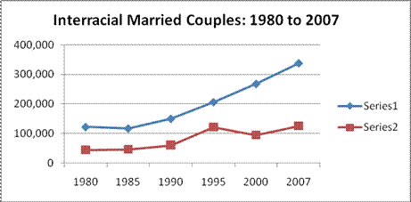
So, why would there be a difference in the marriages between white men/black women and black men/white women? I suspect that this has to do with the intersection of gender and race. Consider: according to American cultural stereotypes, black people, both men and women, are more masculine than white people. Black men are seen as, somehow, more masculine than white men: they are, stereotypically, more aggressive, more violent, larger, more sexual, and more athletic. Black women, too, as seen as more masculine than white women: they are louder, bossier, more opinionated and, like men, more sexual and more athletic.

If men are supposed to be sexy by virtue of their masculinity and women sexy by virtue of their femininity, then black men and white women will be seen as the more sexually attractive than white men and black women.  So, while white men may not find black women particularly attractive, white women may very well find black men attractive.  In this is so, we might see the patterns that Inniss demonstrates with her table.

These concrete statistics, as well as the cultural stereotypes that position black women as undesirable, help explain why interracial dating is politicized by many in the black community.  It is not trivial that black men can date outside of their race and black women are less able to do so.  It means that many black women have less opportunity to form long-term relationships.

Natasha L. sent in another example of stereotypes tied to nationality/region in the form of a set of comical visual distinctions between “Westerners” and “Asians,” found here, by an artist named Yang Liu. [Note: Natasha and I both assume they’re supposed to be comical or even satirical, particularly of the way that non-Western countries are generally stereotyped as being less professional, less punctual, less rational, and so on, though we might be wrong.] Some examples:

“Opinion”:

picture-13

“Punctuality”:

picture-21

“Traveling”:

picture-5

“In the Restaurant”

picture-41

“Queue when Waiting”

picture-3

Regardless of the artist’s intent (whether they’re supposed to be satires of this type of thinking, etc.), I’m sure many people will laugh and see some elements of truth to some of the images. But I’m betting you could tell people they represent almost any set of nationalities and people would also laugh and say “OMG, it’s totally true!” It’s Germany and Spain! It’s the U.S. and Mexico! It’s Venezuela and Greece! You could also probably change this to “men” and “women” and get the same reaction. It’s the stereotypical categorization we think is funny–the idea that groups of people are systematically different, whether it’s based on gender, class, race, nationality, region within a country, and so on (particularly if these differences might lead to sitcom-like hijinx and misunderstandings!).

For a fun little activity to get across the way in which stereotypes are inconsistent and meaningless, you might present these images, not tell your students what they’re supposed to represent, and ask them what groups they think are being portrayed (either out loud or in writing), then use their guesses, which will probably vary widely and draw on lots of different human categories such as class, gender, race, and so on, to talk about stereotyping (which may or may not be negative, of course) and how little we pay attention to what the actual contents of our stereotypes are. Another good example of this would be the way that ethnic groups are often defined as having uniquely loud and boisterous families–I think of it as the “My Big Fat Greek Wedding” syndrome. Well, if Italians, Irish, Greeks, Jews, Russians, Mexicans, Spaniards, Chinese, people from the Southern U.S., New Yorkers, etc. etc. etc., all have big loud families…doesn’t that kind of indicate that lots of families are just big and loud, regardless of background?

Thanks, Ashley and Natasha!

NEW! Robin sent in a link to an article in the Guardian about a Czech artist who pulled off a hoax by creating a set of sculpture that represent stereotypes of various European countries, which he said were created by 27 different artists.

Romania

gallery-eu-artwork-eu-art-011

Luxembourg is made of gold…and is for sale:

gallery-eu-artwork-eu-art-008

Poland has priests raising a rainbow flag. I didn’t know if the rainbow flag has the same association with gay rights in Poland as it does here, but Spiegel Online says it’s a gay pride flag:

gallery-eu-artwork-eu-art-0071

Bulgaria is apparently supposed to be the floor of a urinal, though Spiegel Online says it’s a Turkish toilet, apparently also called a squat toilet:

gallery-eu-artwork-eu-art-0062

Bulgaria’s not happy about it and has demanded the sculpture be taken down.

Holland has been flooded, but minarets stick out of the water to remind us about increasing concerns expressed by many Dutch about the Muslim community in the Netherlands since tension increased after the Mohammad cartoon incident:

gallery-eu-artwork-eu-art-004

There is ongoing debate about whether this image of Germany, showing the country’s many autobahns, is supposed to look like a swastika:

gallery-eu-artwork-eu-art-002

And of course France has a large banner that says “Strike!”

gallery-eu-artwork-eu-art-0011

Apparently Great Britain was represented simply as a blank space.

A Daily Mail story reports that women lawyers are being told by “image consultants’ that to appear “professional” they should enhance their femininity by wearing skirts and stilettos, but avoid drawing attention to their breasts.  Thoughts about the word “professional” after the screenshot (thanks to Jason S. for the link):

A spokesman for the company doling out this advice says that it’s about being “professional.”  This is a great term to take apart.  What do we really mean when we say “professional”?

How much of it has to do with proper gender display or even, in masculinized workplaces, simply masculine display?

How much of it has to do with whiteness?  Are afros and corn rows unprofessional?   Is speaking Spanish?  Why or why not?

How much of it has to do with appearing attractive, heterosexual, monogamous, and, you know, not one of those “unAmerican” religions?

For that matter, how much of it has to do with pretending like your work is your life, you are devoted to the employer, and your co-workers are like family (anyone play Secret Santa at work this year)?

What do we really mean when we say “professional”?  How does this word get used to coerce people into upholding normative expectations that center certain kinds of people and marginalize others?

In this series I have offered five explanations of why people of color are included in advertising. Start with the first in the series and follow the links to the remaining four here.

I am now discussing how they are included. Already I have shown that people of color are often whitewashed and that they tend to be chaperoned.  Here I show that, when people of color are included, they are often subordinated through placement and action.  That is, they tend to be literally background or arranged so that the focal point (visually or through action) is the white person or people in the ad.  You’ll see a lot of this in the previous posts in this series if you go back and look again.

Darin F. sent in this example from a poster for McDonalds Happy Meals. He noted the way in which the women were arranged, closest to furthest, by skin color:

NEW! I found another example of this skin color hierarchy, this time on a CD cover:

p1010018

More instances in which people of color are background:

In the next two ads, the center of attention–or the action–is where the white woman is: 

Notice how in this ad, while there are three women of color (an exception to the tendency for people of color to be chaperoned), the woman front-and-center is clearly white:

Something similar is going on in these next two ads:

The hierarchy of height:

As Jean Kilbourne points out in her docmentary, Killing Us Softly, this visual representation of racial hierarchy tends to be found unless another axis of hierarchy is at work:

NEW (Mar. ’10)! Anina H. sent in this New York State flier advising mothers on feeding their babies.  Notice that the flier includes women of three different races, but the ideal mother (“YOUR PRICELESS BREASTMILK!!!”) is white:

NEW (July ’10)! Naomi D. saw this welcome banner at the entrance of a Methodist Church.  Notice how the racial hierarchy is represented on the banner with a White woman and child on the top, an Asian man below her, and a Black woman at the bottom of the banner:

As always, I welcome your comments!

Next up: Interracial dating, the last taboo.

Also in this series:
(1) Including people of color so as to associate the product with the racial stereotype.
(2) Including people of color to invoke (literally) the idea of “color” or “flavor.”
(3) To suggest ideas like “hipness,” “modernity,” and “progress.”
(4) To trigger the idea of human diversity.
(5) To suggest that the company cares about diversity.

How are they included?
(6) They are “white-washed.”
(7) They are “chaperoned.”

In this ad, the copy, which reads “Who said you can’t have it both ways,” refers explicitly to both “play[ing] it safe” with condoms and having “a great time” with “great sex.”  Of course, implicitly, it also means not choosing between black and white women.  Women are, in the subtext, objects to “have” and black and white women are very different kinds of objects. 

Robin B. sent us a link to a story in the New York Times magazine chronicling one woman’s decision to have a surrogate carry her biological child.  Surrogacy is, from one perspective, extremely expensive and, from another perspective, extremely lucrative.  The photos accompanying the story illustrate, almost as if by design, how “mothering” is being spread out in systematic ways to different kinds of women. Robin note that the accompanying article bought up lots of issues, but did little to think them through.   In contrast, she points to a set of letters written in response.

Lisa Wade, PhD is an Associate Professor at Tulane University. She is the author of American Hookup, a book about college sexual culture; a textbook about gender; and a forthcoming introductory text: Terrible Magnificent Sociology. You can follow her on Twitter and Instagram.

Ben O. brought our attention to this set of vintage ads (from Found in Mom’s Basement) that all use images of Black male servants.

This one for Cream of Kentucky bourbon was illustrated by Norman Rockwell. I can’t quite figure out what the expression on the Black servant’s face is supposed to convey:

Miller Beer:

Cream of Wheat:


Glider shaving cream:

Part of the text reads, “Why did Grand-dad so often take the trouble to get water from the rain barrel for his shave?” For some reason I have a feeling it wasn’t Grand-dad getting the water.

Thanks, Ben O.!

Ben O. sent in this poster (from Found in Mom’s Basement), which uses images of Native Americans (or First Peoples) to encourage Canadians to contribute to the Canadian Patriotic Fund, which was set up during World War I to support wives and children of enlisted men:

It’s a great example of the white/non-white dichotomy, where whiteness implies morality while darkness/blackness is associated with evil or immorality. In this case, his heart is “white” (i.e., he’s a good, moral being) because he does the right thing by caring for war widows. I guess the morality of his act overpowers the misfortune of his skin tone.

Thanks, Ben O.!

On a side note, I’m off to Oklahoma for the next 12 days. I’ll still be posting–Verizon’s internet access program means I can get a weak signal even at the farm–but I won’t be able to check in on comments as often as usual or update posts with information commenters or readers send in.

You will most likely not notice any difference. Just be aware that when you insult me, it’ll take a little longer before I know about it.

Cheers!