race/ethnicity: Whites/Europeans

In Race, Ethnicity, and Sexuality, Joane Nagel talks about the role that the intersections between ethnicity and sexuality play in nationalist projects–that is, how they are used as groups define who is and isn’t part of the entity defined as “the nation.” Those who are part of the nation are part of “us,” and those outside it are the Other. She brings up the example of Nazi Germany. Clearly ethnicity played a huge part in definitions of nationhood as the Nazis saw it. But as Nagel points out, it went beyond that; individuals were also included or excluded from membership based on other characteristics, including sexuality. Specifically, homosexuals were marked as unworthy of inclusion and were also sent to concentration camps.

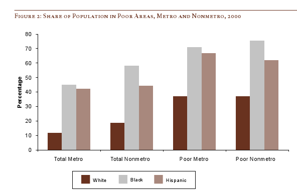
This image, found at The Pink Triangle, illustrates the intersection ethnicity and various categories, including sexuality. It shows the various markers Nazis used to identify prisoners.

nazi_camp_marks-th1

The bottom row of seven triangles clearly represents different categories of Jews. The fifth column of triangles (they look tan but they were pink) identified homosexuals. The third column (blue) was for immigrants. I believe the first column (red) was for political dissenters, but I’m not certain. We see other specified groups of Jews in the three partly-yellow triangles at the bottom, as well as triangles for Poles and Czechs. I don’t know enough German to figure the others out.

It’s a great example of a nationalist project: we can visibly see here the clear effort to define some groups as Others and the way that both ethnicity and sexuality (and the intersections) can be an important part of that, and even mark individuals as multiply stigmatized.

UPDATE: In comments philoserine and xac offered translations. Here’s xac’s:

[Columns]
red: political
green: professional criminal
blue: emigrant
purple: Jehovah’s Witnesses
pink: homosexual
black: work-shy Reich (not 100% sure wether the meaning here is “rich” or “member of the Third Reich” – more likely the last one though)
black: work-shy
[I thought I read somewhere that black might stand for antisocial, so maybe work-shy was how they defined that?]
[Rows]
1. row (triangles) base colour
2. row: label for reoffenders
3. row: penal camp
4. row: jews
5. row:
yellow triangle/black bordered triangle: jewish race desecrator
red circle with white border: under suspicion to escape
grey ring: ?? prisoner
6. row: left: Example: political jew, reoffender, penal camp
middle: special campaign Wehrmacht (?)
7. row: Pole
Czech

Thanks!

And Zeitzeuge says that “Special campaign Wehrmacht is a deserter from the Wehrmacht.”

Toban B. sent in a link to UkraineDate, a website that lets men find hot Ukrainian women. Two images:

picture-12

picture-2

Of course, the site could be targeting men in any part of the world. However, it seems likely that it aims at men in wealthier nations in the West, particularly western Europe, the U.S., and Canada. Incidentally, these are the same regions that are the source of the vast majority of male sex tourists. Immigration from the Ukraine to the U.S. has also increased in the past decade; Ukraine is now in the top 10 nations of origin for immigrants to the U.S., with nearly 23,000 immigrants in 2005. And here in Vegas, the number of women from the Ukraine and Russia found to have been trafficked into the country and forced into prostitution (as well as those who came willingly to work in a range of jobs) is increasing. That’s a bit of rambling, but the point is, women from the former Soviet Union are marketed to men in the West in a number of ways.

As Toban points out, the dating site plays on the exotic qualities often attributed to Ukrainian and Russian women. Toban says, “the Ukranian women are presented as sex objects — and in accordance with certain standards of sex and beauty.” Certainly the site makes it clear that men aren’t supposed to to be interested in these women because of their intellect, personalities, or anything other than their beauty.

It’s a good example of the way that certain nationalities, races, ethnic groups, etc., are exoticized and portrayed as particularly attractive and sexual. In some cases, as with Asian women, part of the attraction is the stereotype that they are submissive and undemanding. I’m not certain, but I don’t think that particular stereotype is applied to Ukrainian and Russian women–in fact, I’ve seen them portrayed as high-maintenance and materialistic…but worth it because they’re hot.

Thanks, Toban!

NEW! Elizabeth C. let us know about a protest against sex tourism in Ukraine, which included slogans such as “Ukraine is not a brothel.”

12015-1

They did so, however, by adopting PETA’s infamous tactic of using scantily-clad women, which may or may not have helped make their point.

From the Pew Center on the States report, One in 31: The Long Reach of American Corrections, “Adding up all probationers and parolees, prisoners and jail inmates, you’ll find America now has more than 7.3 million adults under some form of correctional control. That whopping figure is more than the populations of Chicago, Philadelphia, San Diego and Dallas put together, and larger than the populations of 38 states and the District of Columbia. During Ronald Reagan’s first term as president, 1 in every 77 adults was under the control of the correctional system in the United States. Now, 25 years later, it is 1 in 31, or 3.2 percent of all adults.”

7millioncorrectional-mathcorrectional-ratesSee the press release for a quick summary and the full report for much more data.

A great example of how humor can be used to reveal the absurdity of certain social patterns that we take-for-granted:

asian-teen-r1

“I can’t explain it,” said Nakajima, dressed in a pleated miniskirt and pure white knee socks. “There’s just something about American men who are at least twice my age and nearly three times my body weight that totally drives me wild.”

Added Nakajima, “They’re so hot.”

“I like it when they dress up like middle managers,” said Nakajima, twirling her girlish pigtails with one alabaster finger.

Drawn by her curiosity, Nakajima has scheduled a vacation to St. Louis for early March.


More at The Onion.

For a very real example of the flip side  of this fetish, see this post on sex tourism in Thailand.

Way back in 1703, French settlers in Mobile, Alabama – at the time, the capital of French Louisiana and not much more than a tiny settlement attached to Fort Louis de la Mobile – decided to celebrate Shrove Tuesday with a feast and a party. Over the next few years, the celebrations grew more elaborate, with the first known parade taking place in 1711: the Boeuf Gras (“fatted ox”) society put together a large papier mache cow’s head and rolled it through town on a cart, which I’m sure made a lot of sense at the time.

(It is at this point that native Mobilians, like myself, like to point out that New Orleans wasn’t even founded until 1718, and that New Orleans’ oldest continually-parading organization, the Mistick Krewe of Comus, was founded by six guys from Mobile. Ahem.)

And so today we celebrate Fat Tuesday – the last hurrah before Lent – by dressing up in funny clothes, drinking to excess, dancing in the streets, and hurling moonpies at each other. To celebrate, I thought I’d share an interesting symbol and recommend an excellent documentary film on Mobile Mardi Gras, director Margaret Brown’s The Order of Myths.

oom

What we have here is Folly chasing Death around a broken Ionic column, while whacking Death with gilded pig bladders; seeing as how during Mardi Gras the normal social order is overturned, why not the natural order as well? Here’s a similar image from a float:

2318194724_3ac36be568

To me, these images sum up a lot of what’s great about Mardi Gras: it’s a finger in the eye of mortality and a celebration of a kind of genial lunacy. But what about that Ionic column? Well, the decoding gets a little stickier there.

I’ve heard a couple of different explanations: one is that the column represents time, the other that it represents the Confederacy or the Old South more generally. It gets a little more complicated when you look at it in context: this particular image is the emblem float of the Order of Myths, and is pulled by donkeys mules and lit by gaslight lamps – which are carried by young African-American men – in the same manner it has been since the founding of the organization shortly after the Civil War. Mobile’s mystic societies, you see, remain firmly segregated, which brings me to Margaret Brown’s excellent film.

Brown – whose first full-length documentary, Be Here To Love Me, is an excellent if crushingly depressing film about Texas songwriter Townes Van Zandt – is a fellow Mobile expat, and her film examines the complexities of race, class, and collective memory in Mobile as embodied in the 2007 Mardi Gras season. She focuses primarily on the two parallel Mardi Gras courts and documents some tentative steps toward integrating the two. I won’t say much more, for fear of spoiling the film for you, except to remark that the past is very much present in the film, in ways that both William Faulkner and Pierre Bourdieu would appreciate. And I’d also add that Brown eschews a heavy-handed or didactic approach in favor of laying the situation out for the viewer and letting them draw their own conclusions, with a few subtle editorial decisions and one late-in-the-game revelation that throws much of the previous hour and a half into a new and intriguing light. Here’s a trailer for the film:

My only real criticism of The Order of Myths is that Brown focuses primarily on the Mardi Gras elite – a little of Joe Cain Day (held the Sunday before Fat Tuesday and known as “the People’s Parade” because pretty much anybody can be in it if they can get a slot) would have gone a long way: class in Mobile is not quite coterminous with race, after all. There’s a lot more to Mobile Mardi Gras than the royal courts, and we don’t really get to see much of that. Similarly, the school featured in the film is more integrated than you’d think, as are the crowds along the parade routes, given what’s shown in the film.

But these are relatively minor points – by and large, Brown tackles the subject with a keen and incisive eye, and I’d highly recommend it to anyone teaching a class on race in the United States.

———————-

For the record, the title of the post translates as “time flies, remember you are mortal, party on.”

Daniel T. Lichter and Domenico Parisi provide a couple of interesting images using 2000 Census data in a recent article about rural poverty. They use Census block-group data (block-groups are significantly smaller than counties) to identify non-metro areas of concentrated poverty. This map shows all block-groups with more than 20% poverty in 2000:

picture-17

If you overlaid this map onto a map of American Indian reservations, you’d notice that many of these high-poverty block-groups are on reservations–particularly in the Dakotas, Idaho, Montana, Arizona, and New Mexico.

UPDATE: Here’s a map of state and federal reservations put out by Pearson (you can find very detailed maps of individual reservations at the Census Bureau):

indian91

And TOTALLY AWESOME reader Matt Wirth overlaid the poverty map on the reservations map. The two maps weren’t exactly the same so some of the state outlines don’t line up perfectly, but you can get a good sense of how high-poverty block-groups (blue areas) and reservations (red areas) overlap:

poverty-over-20-and-indian-reservations

Clearly there are many poor block-groups in the west that aren’t associated with reservations, but we see an awful lot of overlap of blue on red, as well as in the regions directly surrounding reservations. Thanks so much, Matt!

We also see a band of high-poverty block-groups in border counties in Texas with high numbers of Latino residents, and of course the band along the Mississippi River and through the Black Belt up to North Carolina, and the ever-present Appalachian section.

Another note about the map: As Lichter and Parisi point out, if they had mapped poverty at the county level instead of the block-group level, many of these areas of high poverty would not have shown up. These are areas of concentrated poverty in counties that are not, overall, particularly poor. The authors note that studies of poverty that look at county-level data often miss isolated rural areas with extremely high poverty rates.

On a side note, see that little blotch of brown in north-central Oklahoma? That’s where I grew up! According to the 2000 Census, my specific hometown has a 17.6% individual poverty rate and the median home value is $24,400. That doesn’t matter to you, I know, but it does make me acutely aware of the problems of rural poverty.

The following bar graph shows how geographically concentrated poverty is among three racial groups. The graph shows what percent live in Census blocks of concentrated poverty–that is, areas where 20% or more of the population is poor (20% is the standard baseline among researchers for defining an area as “high poverty”):

picture-26

Clearly, in both metro and non-metro areas, a much higher percentage of all Blacks and Hispanics (both the poor and non-poor) than Whites live in areas of concentrated poverty. Notice (in the last two sets of bars) that less than 40% of poor Whites live in neighborhoods with such high proportions of poverty, whereas the vast majority of both Blacks and Hispanics who are poor live in areas where many of their neighbors are poor as well.

Lichter and Parisi argue that the concentration of poverty matters, particularly when it indicates that the poor are socially isolated. Such isolation can mean lack of access to social services, decent schools, and the types of social networks that provide job leads, recommendations, and so on. This type of social isolation can be much more harmful than being poor in and of itself, a topic also investigated by William Julius Wilson in When Work Disappears: The World of the New Urban Poor and The Truly Disadvantaged.

From “Concentrated Rural Poverty and the Geography of Exclusion,” Rural Realities, Fall 2008, p. 1-7, available from the Rural Sociological Society.

Stephen W. sent in a link to a music video promoting the National Guard.   He saw the video before a screening of Taken in Sioux Falls, SD. At the moment, the National Guard website (warning: noisy) features Kid Rock and Dale Earnhardt Jr.  The opening graphics, set to a snippet of Rock’s Warrior, feature a military helicopter followed by a race car and then a picture of an anonymous African-American National Guard member with the rock star and car star:

capture

A few clicks into the website leads you to this music video:

[youtube]https://www.youtube.com/watch?v=QeVt4j_T7-8[/youtube]

In the photographs made available, pictures of Kid Rock’s life as a rock star are mixed with pictures of people in the National Guard, and the lines between the two blur:

captureh
capturex

capturel

capturez

capturep1

Some observations on the marketing of military service:

First, the glorification of military service is an American phenomenon.  (See this post which features an American and a Swedish military recruitment commercial back-to-back.  The difference is quite amazing.)  In this video, the glorification is particularly acute when the light-skinned driver of the Hummer manages to avoid hitting the blue-eyed, olive-skinned, dark-haired boy and then comes out with his giant gun to kick the ball back to him, inspiring a look of awe from the child who’s country he is likely (given the politics in the last 8 years) invading.  We’re left, assured, that the U.S. military are all around good folk.

Second, in this case we have military service being marketed with celebrity tie-ins.  The website deliberately blurs the line between being a famous rock star, a celebrated race car driver, and a member of the National Guard.  Similarly, this Air Force recruitment ad blurs the line between various extreme sports and military service:

These links between military service, skateboarding, and being a rock star are disingenuous, to say the least.  And it reminds me of a series of recruitment ads I’ve been seeing lately that highlight the super cool jobs you could end up doing in the Air Force (like being a fighter pilot). I don’t know about you, but both of my family members who joined the military (in their cases, the Army) ended up being bus drivers.

Third, which celebrities are being used to market the National Guard tells us something about who they are trying to recruit.  Clearly, they are reaching out to young, working class, perhaps rural, white men.  This is not part of the National Guard marketing aimed specifically at this group, the entire National Guard website (warning: noisy), at this time, is entirely devoted to this theme. It speaks to who fights American wars?  Studies have shown that, while once military service was required of elites, this changed during Vietnam.  Today military service is overwhelmingly performed by working- and middle-class men.

Finally, the re-framing of the role from “soldier” to “warrior,” one who wages war, is very interesting.  I’d love to hear your thoughts about this.

More fodder for discussion, if you need it:

Lisa Wade, PhD is an Associate Professor at Tulane University. She is the author of American Hookup, a book about college sexual culture; a textbook about gender; and a forthcoming introductory text: Terrible Magnificent Sociology. You can follow her on Twitter and Instagram.

Matt S. has pointed us to the controversy over the casting of The Last Airbender (to be released 2010).  One blogger, comic book artists Derek Kirk Kim, describes the Nickelodeon cartoon series on which the life-action movie is based as follows:

[The cartoon is] wholly and inarguably built around Asian (and Inuit) culture. Everything from to the costume designs, to the written language, to the landscapes, to martial arts, to philosophy, to spirituality, to eating utensils!—it’s all an evocative, but thinly veiled, re-imagining of ancient Asia. (In one episode, a region is shown where everyone is garbed in Korean hanboks—traditional Korean clothing—the design of which wasn’t even altered at all.) It would take a willful disregard of the show’s intentions and origins to think this wouldn’t extend to the race of the characters as well.

The series–which I have never seen–does indeed seem to be inspired by various Asian cultures. Here are some images from the cartoon series (from the same blog post):

The controversy is regarding the casting of the lead characters.  All four leads are white (imdb).

Jackson Rathbone (image at imdb):

Jesse McCartney (image here):

Nicola Peltz (image here):

I couldn’t find a picture of the fourth lead, Noah Ringer.

Kim quotes Gene Yang saying:

It’s like a white Asian fetishist’s wet dream. All the Asian culture they want, without any of the Asian people.

Ampersand, at Alas a Blog, puts it nicely:

…the best roles for people of color are reserved for actors who appear white — and the best roles for white people are also reserved for actors who appear white.