methods/use of data

Last year the Journal of the American Medical Association released a study aiming to determine the relationship between body mass index and the risk of premature death. Body mass index, or BMI, is the ratio between your height and weight. According to the National Institutes of Health, you are “normal weight” if your ratio is between 18.5-24.9.  Everything over that is “overweight” or “obese” and everything under is “underweight.”

This study was a meta-analysis, which is an analysis of a collection of existing studies that systematically measures the sum of our knowledge.  In this case, the authors analyzed 97 studies that included a combined 2.88 million individuals and over 270,000 deaths.  They found that overweight individuals had a lower risk of premature death than so-called normal weight individuals and there was no relationship between being somewhat obese and the rate of early death. Only among people in the high range of obesity was there a correlation between their weight and a higher risk of premature death.

Here’s what it looked like.

This is two columns of studies plotted according to the hazard ratio they reported for people.  This comparison is between people who are “overweight” (BMI = 25-29.9) and people who are “normal weight” (BMI = 18.5-24.9).  Studies that fall below the line marked 1.0 found a lower rate of premature death and studies above the line found a higher rate.

25-29

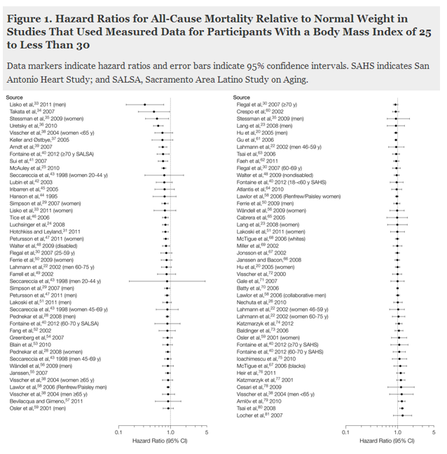
Just by eyeballing it, you can confirm that there is not a strong correlation between weight and premature death, at least in this population. When the scientists ran statistical analyses, the math showed that there is a statistically significant relationship between being “overweight” and a lower risk of death.

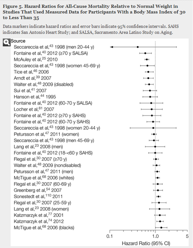
Here’s the same data, but comparing the risk of premature death among people who are “normal weight” (BMI = 18.5-24.9) and people who are somewhat “obese” (BMI = 30-34.9).  Again, eyeballing the results suggest that there’s not much correlation and, in fact, statistical analysis found none.

30-34.9

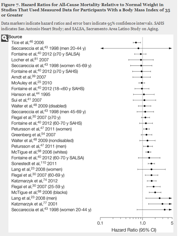
Finally, here are the results comparing “normal weight” (BMI = 18.5-24.9) and people who are quite “obese” (BMI = 35 or higher). In this case, we do see a relationship between risk of premature death in body weight.

35

It’s almost funny that the National Institutes of Health use the word normal when talking about BMI. It’s certainly not the norm — the average BMI in the U.S. falls slightly into the “overweight” category (26.6 for adult men and 25.5 for adult women) — and it’s not related to health. It’s clearly simply normative. It’s related to a socially constructed physical ideal that has little relationship to what physicians and public health advocates are supposed to be concerned with.  Normal is judgmental, but if they changed the word to healthy, they have to entirely rejigger their prescriptions.

So, do we even have an obesity epidemic? Perhaps not if we use health as a marker instead of some arbitrary decision to hate fat.  Paul Campos, covering this story for the New York Times, points out:

If the government were to redefine normal weight as one that does not increase the risk of death, then about 130 million of the 165 million American adults currently categorized as overweight and obese would be re-categorized as normal weight instead.

That’s 79%.

It’s worth saying again: if we are measuring by the risk of premature death, then 79% of the people we currently shame for being overweight or obese would be recategorized as perfectly fine. Ideal, even. Pleased to be plump, let’s say, knowing that a body that is a happy balance of soft and strong is the kind of body that will carry them through a lifetime.

Cross-posted at Adios Barbie.

Lisa Wade, PhD is an Associate Professor at Tulane University. She is the author of American Hookup, a book about college sexual culture; a textbook about gender; and a forthcoming introductory text: Terrible Magnificent Sociology. You can follow her on Twitter and Instagram.

Last week CNN triumphantly reported that the job market has recovered to its 2008 peak.  Here’s the headline:

1

Not so fast, though.

Sociologist Philip Cohen observes that the real news is hidden in the fourth paragraph. There the author of the piece acknowledges that the job data are numbers, not proportions.  The numbers have bounced back but, because of the addition of almost 12 million people to the U.S. population, the percent of Americans who have jobs or are in school remains lower than it was in 2008.

From CNN:

Given population growth over the last four years, the economy still needs more jobs to truly return to a healthy place. How many more? A whopping 7 million, calculates Heidi Shierholz, an economist with the Economic Policy Institute.

Using the Bureau of Labor Statistics, Cohen offers us a clearer look at where we’re at:

1a

Lisa Wade, PhD is an Associate Professor at Tulane University. She is the author of American Hookup, a book about college sexual culture; a textbook about gender; and a forthcoming introductory text: Terrible Magnificent Sociology. You can follow her on Twitter and Instagram.

Mean and median are two measures of “average.”  The mean is the average as we typically think of it: the sum of things divided by the total number of things.  The median, in contrast, is literally the number in the middle if we align all the quantities in order.  People often use median instead of mean because it is insensitive to extreme outliers which may skew the mean in one direction or another.

For a quick illustration of the difference, I often use the example of income. I choose a plausible average (mean) for the classroom population and review the math. “If Bill Gates walks into the room,” I say, “the average income is now in the billions. The median hasn’t moved, but the mean has gone way up.” So has the Gini coefficient.

Here’s a more realistic and global illustration – the net worth of people in the wealthier countries.  The U.S. ranks fourth in mean worth – $301,000 per person…

1 (2) - Copy

…but the median is far lower – $45,000, 19th out of the twenty nations shown.  (The graph is from Credit Suisse via CNN.)

The U.S. is a wealthy nation compared with others, but  “average” Americans, in the way that term is generally understood, are poorer than their counterparts in other countries. 

Jay Livingston is the chair of the Sociology Department at Montclair State University. You can follow him at Montclair SocioBlog or on Twitter.

I’d hope that someone who has written a book about “What Shapes Our Fortunes” would have had Sociology 101 where he would have learned the fundamentally different ways that income and wealth work in our economy.  But apparently not.

In Rags to Riches to Rags Again,  Mark Rank writes that because of a great deal of turbulence in household earning over a lifetime “we have much more in common with one another than we dare to realize.”

One of the reasons for such fluidity at the top is that, over sufficiently long periods of time, most American households go through a wide range of economic experiences, both positive and negative. Individuals we interviewed spoke about hitting a particularly prosperous period where they received a bonus, or a spouse entered the labor market, or there was a change of jobs. These are the types of events that can throw households above particular income thresholds.

Ultimately, this information casts serious doubt on the notion of a rigid class structure in the United States based upon income. It suggests that the United States is indeed a land of opportunity, that the American dream is still possible — but that it is also a land of widespread poverty. And rather than being a place of static, income-based social tiers, America is a place where a large majority of people will experience either wealth or poverty — or both — during their lifetimes.

All together now:  Income, that comes in *household* paychecks, regardless of how many earners are contributing to that household income, is not wealth.  Wealth is how much money a household has in the bank and in investments and the assets they own, like real estate, businesses, land, cars, boats, and planes.

Wealth inequality is much greater than income inequality. It looks like this:

1

And breaking it down by race:

1

It is no small thing for any household to attain an annual income of a million dollars for even one year.

But it is an entirely different experience to have enough wealth that one can no longer worry about income at all, can work the tax system to mask enormous amounts of income,  can essentially withdraw from everyday contact with everyday Americans, can use one’s wealth to leverage political and economic power, and can know that the children in one’s household will never, ever want for a thing.

The “1%” was never about income alone.

Jane Van Galen, PhD, is a professor of education at the University of Washington, Bothell.  Her research focus is on socioeconomic class, education, and digital media. She writes for Education and Class, where this post originally appeared.

Emotional Contagion is the idea that emotions spread throughout networks. If you are around happy people, you are more likely to be happy. If you are around gloomy people, you are likely to be glum.

The data scientists at Facebook set out to learn if text-based, nonverbal/non-face-to-face interactions had similar effects.  They asked: Do emotions remain contagious within digitally mediated settings? They worked to answer this question experimentally by manipulating the emotional tenor of users’ News Feeds, and recording the results.

Public reaction was such that many expressed dismay that Facebook would 1) collect their data without asking and 2) manipulate their emotions.

I’m going to leave aside the ethics of Facebook’s data collection. It hits on an important but blurry issue of informed consent in light of Terms of Use agreements, and deserves a post all its own. Instead, I focus on the emotional manipulation, arguing that Facebook was already manipulating your emotions, and likely in ways far more effectual than algorithmically altering the emotional tenor of your News Feed.

First, here is an excerpt from their findings:

In an experiment with people who use Facebook, we test whether emotional contagion occurs outside of in-person interaction between individuals by reducing the amount of emotional content in the News Feed. When positive expressions were reduced, people produced fewer positive posts and more negative posts; when negative expressions were reduced, the opposite pattern occurred.

In brief, Facebook made either negative or positive emotions more prevalent in users’ News Feeds, and measured how this affected users’ emotionally expressive behaviors, as indicated by users’ own posts. In line with Emotional Contagion Theory, and in contrast to “technology disconnects us and makes us sad through comparison” hypotheses, they found that indeed, those exposed to happier content expressed higher rates of positive emotion, while those exposed to sadder content expressed higher rates of negative emotion.

Looking at the data, there are three points of particular interest:

  • When positive posts were reduced in the News Feed, people used .01% fewer positive words in their own posts, while increasing the number of negative words they used by .04%.
  • When negative posts were reduced in the News Feed, people used .07% fewer negative words in their own posts, while increasing the number of positive words by.06%.
  •  Prior to manipulation, 22.4% of posts contained negative words, as compared to 46.8% which contained positive words.

1 (1)

Let’s first look at points 1 and 2 — the effects of positive and negative content in users’ News Feeds. These effects, though significant and in the predicted direction, are really really tiny. None of the effects even approach 1%. In fact, the effects are all below .1%. That’s so little! The authors acknowledge the small effects, but defend them by translating these effects into raw numbers, reflecting “hundreds of thousands” of emotion-laden status updates per day. They don’t, however, acknowledge how their (and I quote) “massive” sample size of 689,003 increases the likelihood of finding significant results.

So what’s up with the tiny effects?

The answer, I argue, is that the structural affordances of Facebook are such users are far more likely to post positive content anyway. For instance, there is no dislike button, and emoticons are the primary means of visually expressing emotion. Concretely, when someone posts something sad, there is no canned way to respond, nor an adequate visual representation. Nobody wants to “Like” the death of someone’s grandmother, and a Frownie-Face emoticon seems decidedly out of place.

The emotional tenor of your News Feed is small potatoes compared to the effects of structural affordances. The affordances of Facebook buffer against variations in content. This is clear in point 3 above, in which positive posts far outnumbered negative posts, prior to any manipulation. The very small effects of experimental manipulations indicates that  the overall emotional makeup of posts changed little after the study, even when positive content was artificially decreased.

So Facebook was already manipulating your emotions — our emotions — and our logical lines of action. We come to know ourselves by seeing what we do, and the selves we perform through social media become important mirrors with which we glean personal reflections. The affordances of Facebook therefore affect not just emotive expressions, but reflect back to users that they are the kind of people who express positive emotions.

Positive psychologists would say this is good; it’s a way in which Facebook helps its users achieve personal happiness. Critical theorists would disagree, arguing that Facebook’s emotional guidance is a capitalist tool which stifles rightful anger, indignation, and mobilization towards social justice. In any case, Facebook is not, nor ever was, emotionally neutral.

Jenny Davis is an Assistant Professor of Sociology at James Madison University and a weekly contributor to Cyborgology, where this post originally appeared. You can follow her on Twitter.

In Generation Me and The Narcissism Epidemic, psychologist Jean Twenge argues that we’re all becoming more individualistic.  One measure of this is our willingness to go against the crowd.  She offers many types of evidence, but I was particularly intrigued by her discussion of the afterlife of a famous experiment in psychology.

In 1951, social psychologist Solomon Asch placed eight male Swarthmore students around a table for an experiment in conformity.  They were asked to consider two cards, one with three lines of differing lengths and another with one line.  He asked each student, one by one, which line on the card of three was the same length as the lone line on the second card. Each group looked at 18 pairs of cards like this:

1.jpg

Asch was only interested in the last student’s response.  The first seven were confederates. In six trials, Asch instructed all the confederates to give the correct answer.  In twelve, however, the other seven would all choose the same obviously wrong answer.  Asch counted how often the eighth student would go against the crowd in these cases, breaking consensus and offering up a solitary, but correct answer.

He found that conformity was surprisingly common.  Three-quarters of the study subjects incorrectly went with the majority in at least one trial and a third did so half the time or more.  This was considered a stunning example of people’s willingness to lie about what they are seeing with their own eyes in order to avoid rocking the boat.

But then there was Vietnam and anti-war protesters, hippies and free love, the women’s and gay liberation movement, and civil rights victories.  By the 1960s, it was all about rejecting the establishment, saying no, and envisioning a more authentic life.  Things changed. And so did this experiment.

By the mid-1990s, there were 133 replications of Asch’s study.  Psychologists Rod Bond and Peter Smith decided to add them all up.  They found that the tendency for individuals to conform to the group fell over time.

One of the abstract take-away points from this is that our psychologies — indeed, even our personalities — are malleable.   In fact, the results of many studies, Twenge writes, suggest that “when you were born has more influence on your personality than the family who raised you.” When encountering claims of timeless and cultureless truths about human psychology, then, it is always good to ask ourselves what scientists might find a few decades later.

Cross-posted at Pacific Standard.

Lisa Wade, PhD is an Associate Professor at Tulane University. She is the author of American Hookup, a book about college sexual culture; a textbook about gender; and a forthcoming introductory text: Terrible Magnificent Sociology. You can follow her on Twitter and Instagram.

At Sociological Images, we make research methods fun!

Not really.

But here we go!

Scholars testing a research hypothesis have to be worried about two kinds of errors. Type I is failing to reject a false hypothesis.  The hypothesis is wrong, but it looks right to you.  That’s a false positive.

Type II is rejecting a true hypothesis incorrectly.  In fact, your hypothesis is correct, but your data suggests that it’s false. That’s a false negative.

Test time!

Which one is which?

1

You’re welcome everybody!

Here’s as far back as I could trace the source. If anyone knows where this came from, please let me know. :)

Lisa Wade, PhD is an Associate Professor at Tulane University. She is the author of American Hookup, a book about college sexual culture; a textbook about gender; and a forthcoming introductory text: Terrible Magnificent Sociology. You can follow her on Twitter and Instagram.

At Pew Social Trends, Gretchen Livingston has a new report on fathers staying at home with their kids. They define stay at home fathers as any father ages 18-69 living with his children who did not work for pay in the previous year (regardless of marital status or the employment status of others in the household). That produces this trend:

1 (2) - Copy

At least for the 1990s and early-2000s recessions, the figure very nicely shows spikes upward of stay-at-home dads during recessions, followed by declines that don’t wipe out the whole gain — we don’t know what will happen in the current decline as men’s employment rates rise.

In Pew’s numbers 21% of the stay at home fathers report their reason for being out of the labor force was caring for their home and family; 23% couldn’t find work, 35% couldn’t work because of health problems, and 22% were in school or retired.

It is reasonable to call a father staying at home with his kids a stay at home father, regardless of his reason. We never needed stay at home mothers to pass some motive-based criteria before we defined them as staying at home. And yet there is a tendency (not evidenced in this report) to read into this a bigger change in gender dynamics than there is. The Census Bureau has for years calculated a much more rigid definition that only applied to married parents of kids under 15: those out of the labor force all year, whose spouse was in the labor force all year, and who specified their reason as taking care of home and family. You can think of this as the hardcore stay at home parents, the ones who do it long term, and have a carework motivation for doing it. When you do it that way, stay at home mothers outnumber stay at home fathers 100-to-1.

I updated a figure from an earlier post for Bryce Covert at Think Progress, who wrote a nice piece with a lot of links on the gender division of labor. This shows the percentage of all married-couple families with kids under 15 who have one of the hardcore stay at home parents:

SHP-1. PARENTS AND CHILDREN IN STAY-AT-HOME PARENT FAMILY GROUPS

That is a real upward trend for stay at home fathers, but that pattern remains very rare.

See the Census spreadsheet for yourself here.  Cross-posted at Pacific Standard.

Philip N. Cohen is a professor of sociology at the University of Maryland, College Park, and writes the blog Family Inequality. You can follow him on Twitter or Facebook.