methods/use of data


Watch how this 60 Minutes clip from August 2006 manages to completely confuse three very different things: sex identity (believing you are biologically female or male), gendered behavior (conforming to cultural rules about girls/women and boys/men are supposed to do and like), and sexual orientation (which sex you are attracted to sexually). For examples, you know your boy is going to grow up wanting to have sex with men because he likes to “help out in the kitchen” or thinks he’s a girl. These are all very different things. It also includes some wretched study design.

Part I

[youtube]https://www.youtube.com/watch?v=IoZoRbP-0WM[/youtube]

Part II

[youtube]https://www.youtube.com/watch?v=WTLAof9oXCI[/youtube]

By the way, funny story: When my nephew was about 2 years old he loved brooms and vacuums. My parents told me that it was because he liked “tools.”

Thanks to Joseph DeM. for the tip!

Lisa Wade, PhD is an Associate Professor at Tulane University. She is the author of American Hookup, a book about college sexual culture; a textbook about gender; and a forthcoming introductory text: Terrible Magnificent Sociology. You can follow her on Twitter and Instagram.

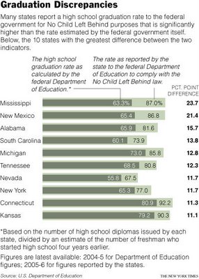
This image is from a New York Times article on how different ways of measuring graduation rates produce very different results and turn out to be, no surprise, political.

The article discusses some of the varying measures and it, along with the image, could make for a great example in a Methods or Statistics class.

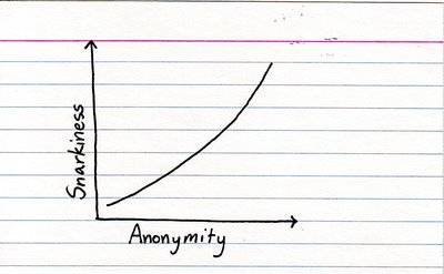
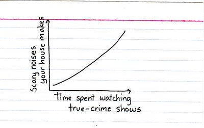
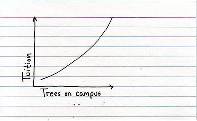
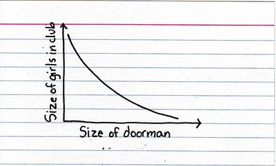
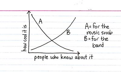
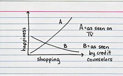
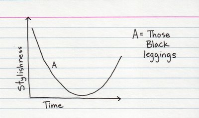
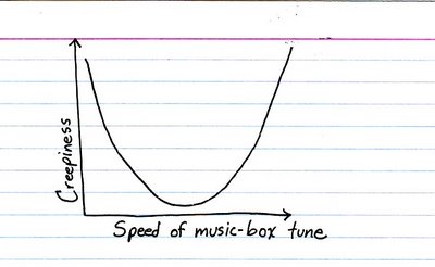
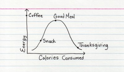
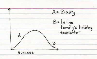
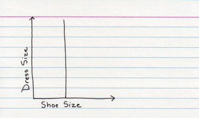
More entertaining figures for your methods classes! These are from Indexed and were suggested by Moonsinger. Thanks!

Positive:

Negative:

Positive and Negative:

U-shaped:

Bell curve:

No correlation:

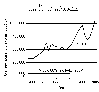
This first graph shows the relative increase in the incomes (inflation adjusted) of the top 1% of income earning households, the middle 60% and the lowest 20% (percentages, presumably, approximate) since 1979.

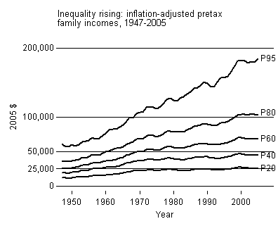
This second graph shows a more detailed picture of the relative increase in the incomes (inflation adjusted) of households in the 95th , 80th, 60th, 40th, and 20th percentile since 1949. Note how household incomes were rising at about the same rate prior to 1970, at which point those households in the 95th percentile started out growing other percentiles, those in the 20th stayed stagnant, and those in between were somewhere in between.

I borrowed these graphs from Lane Kenworthy, who also offers a truly excellent and detailed explanation of the measures.

.

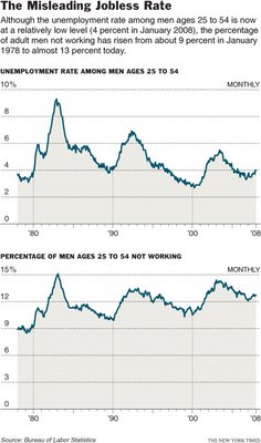
The graph below shows the different results when using two different measures of joblessness (notice how the use of two different scales on these graphs–10% and 15%–visually interrupts a fair comparison). Visit the New York Times story that accompanied this image for a historically-grounded discussion of the problematics and politics of measuring joblessness.

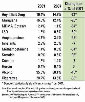
Chris Uggen has a nice discussion of this graph (see here) showing the (it turns out more or less linear) change in drug use between 2001 and 2007. In particular, he offers a nice idea for how to use it to talk about the difference between cohort, age, and period effects.


Graph originally found here.

This post is dedicated to Gary Sandefur and all my other long lost UW karaoke kids.

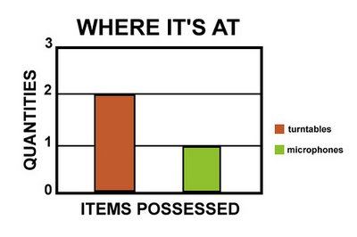
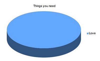
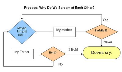
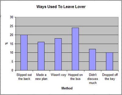
If you teach methods, you might find these figures will add a little pizzazz to your discussions of how to present findings. They may not all be exactly, perfectly, like totally accurate. :)

Nelly – Air Force Ones:

Beck – Where It’s At:

The Beatles – All You Need Is Love:

Aqua – Barbie Girl:

Prince – When Doves Cry:

Various Artists – Don’t Cry For Me Argentina (why not Sinead O’Connor?)

Simon and Garfunkel – 50 Ways To Leave Your Lover

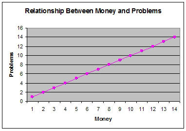
Notorious B.I.G. – Mo Money Mo Problems:

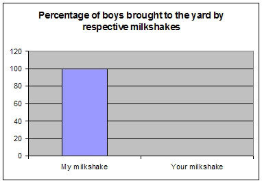
Kelis – Milkshake:

Gloria Gaynor – I Will Survive:

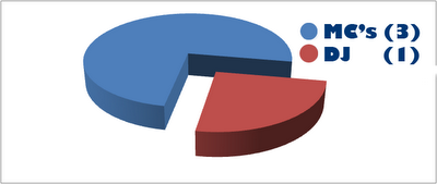
Beastie Boys – Three MC’s and One DJ:

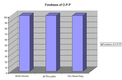
Naughty By Nature – O.P.P.:

50 Cent – In Da Club:

All these and more can be found here and here.

.