methods/use of data

For the last week of December, we’re re-posting some of our favorite posts from 2012. Cross-posted at Global Policy TV and Pacific Standard.

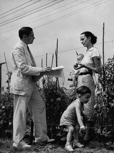
Publicizing the release of the 1940 U.S. Census data, LIFE magazine released photographs of Census enumerators collecting data from household members.  Yep, Census enumerators. For almost 200 years, the U.S. counted people and recorded information about them in person, by sending out a representative of the U.S. government to evaluate them directly (source).

By 1970, the government was collecting Census data by mail-in survey. The shift to a survey had dramatic effects on at least one Census category: race.

Before the shift, Census enumerators categorized people into racial groups based on their appearance.  They did not ask respondents how they characterized themselves.  Instead, they made a judgment call, drawing on explicit instructions given to the Census takers.

On a mail-in survey, however, the individual self-identified.  They got to tell the government what race they were instead of letting the government decide.  There were at least two striking shifts as a result of this change:

  • First, it resulted in a dramatic increase in the Native American population.  Between 1980 and 2000, the U.S. Native American population magically grew 110%.  People who had identified as American Indian had apparently been somewhat invisible to the government.
  • Second, to the chagrin of the Census Bureau, 80% of Puerto Ricans choose white (only 40% of them had been identified as white in the previous Census).  The government wanted to categorize Puerto Ricans as predominantly black, but the Puerto Rican population saw things differently.

I like this story.  Switching from enumerators to surveys meant literally shifting our definition of what race is from a matter of appearance to a matter of identity.  And it wasn’t a strategic or philosophical decision. Instead, the very demographics of the population underwent a fundamental unsettling because of the logistical difficulties in collecting information from a large number of people.  Nevertheless, this change would have a profound impact on who we think Americans are, what research about race finds, and how we think about race today.

See also the U.S. Census and the Social Construction of Race and Race and Censuses from Around the World. To look at the questionnaires and their instructions for any decade, visit the Minnesota Population Center.  Thanks to Philip Cohen for sending the link.

Lisa Wade, PhD is an Associate Professor at Tulane University. She is the author of American Hookup, a book about college sexual culture; a textbook about gender; and a forthcoming introductory text: Terrible Magnificent Sociology. You can follow her on Twitter and Instagram.

For the last week of December, we’re re-posting some of our favorite posts from 2012. Originally cross-posted at Family Inequality.

The other day the New York Times had a Gray Matter science piece by the authors of a study in PLoS One that showed some people could identify gays and lesbians based only on quick flashes of their unadorned faces. They wrote:

We conducted experiments in which participants viewed facial photographs of men and women and then categorized each face as gay or straight. The photographs were seen very briefly, for 50 milliseconds, which was long enough for participants to know they’d seen a face, but probably not long enough to feel they knew much more. In addition, the photos were mostly devoid of cultural cues: hairstyles were digitally removed, and no faces had makeup, piercings, eyeglasses or tattoos.

…participants demonstrated an ability to identify sexual orientation: overall, gaydar judgments were about 60 percent accurate.

Since chance guessing would yield 50 percent accuracy, 60 percent might not seem impressive. But the effect is statistically significant — several times above the margin of error. Furthermore, the effect has been highly replicable: we ourselves have consistently discovered such effects in more than a dozen experiments.

This may be seen as confirmation of the inborn nature of sexual orientation, if it can be detected by a quick glance at facial features.

Sample images flashed during the “gaydar” experiment:

There is a statistical issue here that I leave to others to consider: the sample of Facebook pictures the researchers used was 48% gay/lesbian (111/233 men, 87/180 women). So if, as they say, it is 64% accurate at detecting lesbians, and 57% accurate at detecting gay men, how useful is gaydar in real life (when about 3.5% of people are gay or lesbian, when people aren’t reduced to just their naked, hairless facial features, and you know a lot of people’s sexual orientations from other sources)? I don’t know, but I’m guessing not much.

Anyway, I have a serious basic reservation about studies like this — like those that look for finger-lengthhair-whorltwin patterns, and other biological signs of sexual orientation. To do it, the researchers have to decide who has what sexual orientation in the first place — and that’s half the puzzle. This is unremarked on in the gaydar study or the op-ed, and appears to cause no angst among the researchers. They got their pictures from Facebook profiles of people who self-identified as gay/lesbian or straight (I don’t know if that was from the “interested in” Facebook option, or something else on their profiles).

Sexual orientation is multidimensional and determined by many different things — some combination of (presumably many) genes, hormonal exposures, lived experiences. And for some people at least, it changes over the course of their lives. That’s why it’s hard to measure.

Consider, for example, a scenario in which someone who felt gay at a young age married heterogamously anyway — not too uncommon. Would such a person self-identify as gay on Facebook? Probably not. But if someone in that same situation got divorced and then came out of the closet they probably would self-identify as gay then.

Consider another new study, in the Archives of Sexual Behavior, which used a large sample of people interviewed 10 years apart. They found changes in sexual orientation were not that rare. Here is my table based on their results:Overall, 2% of people changed their response to the sexual orientation identity question. That’s not that many — but then only 2.5% reported homosexual or bisexual identities in the first place.

In short, self identification may be the best standard we have for sexual orientation identity (which isn’t the same as sexual behavior), but it’s not a good fit for studies trying to get at deep-down gay/straight-ness, like the gaydar study or the biological studies.

And we need to keep in mind that this is all complicated by social stigma around sexual orientation. So who identifies as what, and to whom, is never free from political or power issues.

Philip N. Cohen is a professor of sociology at the University of Maryland, College Park, and writes the blog Family Inequality. You can follow him on Twitter or Facebook.

This post originally appeared on Sociological Images in 2009.

Emily D. sent us a link to a post by Flowing Data linking to multiple efforts to visualize crime data. One of them featured an illustration (I split it into four parts for easy viewing).  I’m sure the graphic elides details in the data, but I still think it’s interesting.  I challenged some of my preconceived notions about who dies by gun, and you may find it surprising too.

The data is from 2004.  That year, an average of 81 people died from a gunshot wound each day.  In the figures below, each bullet represents 81 deaths; grey bullets are homicides, pink suicides, and yellow accidents or being killed by a police officer.

(Methodological note: Differences in gun deaths by age group could be a matter of lifecycle or it could be a cohort effect.  Since this data is a snapshot and not longitudinal, it’s hard to tell.  Also, when you’re comparing age groups, it’s important to remember that people in these four age groups are not evenly distributed across the population.)

17

Five percent of the people who died due to guns was age 17 or younger (I say “only” advisedly).  People under 18 make up about 24% of the population.  Black men and white men are murdered at about the same rate (one a day, or one every 30 hours, respectively) which means that blacks are disproportionately victims of murder because they make up 12-13 percent of the population as opposed to the 80 percent of the population that is white.  Men are four times as likely as women to be killed. There were about half as many suicides as there were murders, and half as many accidents/police killings as well.

18-25

About 21 percent of all gun deaths were among people ages 18 to 25.  About 90 percent of all murder victims are men, and about half of those are black men.  Accidents/police action are occurring at about the same rate, but suicides have skyrocketed.  There are five times more suicides among people 18 to 25 than there were among those 17 and under.  Four-fifths of the people who choose to take their own life are white men (who make up less than 40% of the population).

26-391

People 26 to 39 years old accounted for 26 percent of gun deaths.  The murder rate has a similar racial distribution.  Like before, the rate of accidents/police killings have stayed the same.  But suicide rates have continued to climb.  There are nearly twice as many suicides among this age group as there were in the previous one.  The majority of these are white men.  One in nine was a woman.

40

Among those 40 and over (48 percent of all gun deaths occur to someone over 40), there is a stark increase in the number of suicides.  There were 2,430 suicides, compared to 1,215 suicides among all other age groups combined.   Eighty-three percent of these suicides are committed by white men.  Murder has finally decreased and the racial and gender distribution is less uneven than before.  There are twice as many accidents/police killings among this cohort.

Media portrayals of gun violence tends to highlight women who are murdered (especially if you watch crime and law TV shows), black on white violent crime (if you watch the news), youth violence (take your pick), and murder over suicide.   This graphic challenges all of those notions.

This site lets you parse out data for homicides in Philadelphia by gender, age, time of day, and weapon, and this site lets you parse out similar data for homicide in Los Angeles county.

Lisa Wade, PhD is an Associate Professor at Tulane University. She is the author of American Hookup, a book about college sexual culture; a textbook about gender; and a forthcoming introductory text: Terrible Magnificent Sociology. You can follow her on Twitter and Instagram.

A message written in 1914 and curled into a corked bottle was scooped out of the North Atlantic last month (NatGeo).  Not a love note, but a research instrument.The Glasgow School of Navigation sent 1,890 such bottles adrift, hoping to map deep ocean currents.  They were weighted to float just above the ocean floor.  The message inspires me to contemplate just how far our research methods have come in the last 98 years.

Via BoingBoing.

Lisa Wade, PhD is an Associate Professor at Tulane University. She is the author of American Hookup, a book about college sexual culture; a textbook about gender; and a forthcoming introductory text: Terrible Magnificent Sociology. You can follow her on Twitter and Instagram.

I watched the first U.S. Presidential debate of the election last night and I noticed something interesting about the coverage at CNN.  Notice that the live viewer information along the bottom includes the degree to which female (yellow) and male (green) Colorado undecided voters like or dislike what each candidate is saying (measured by the middle bar).

By choosing to display data by gender, CNN gives us some idea of how men and women agree or disagree on their evaluations of the candidates, but it also makes gender seem like the most super-salient variable by which to measure support.  They didn’t, for example, offer data on how upper and middle class undecided voters in Colorado perceived the debate, nor did they offer data on immigrant vs. non-immigrant, White vs. non-white, gay vs. straight, or any number of demographic variables they could have chosen from.

Instead, by promoting gender as the relevant variable, they also gave the impression that gender was the relevant variable.  This makes it seem like men and women must be really different in their opinions (otherwise, why would they bother highlighting it), strengthening the idea that men and women are different and, even, at odds.  In fact, men and women seemed to track each other pretty well.

It’s not that I don’t think gender is an interesting variable, it’s just that I don’t think it’s the only interesting one and making it seem so is problematic.  I would have loved to have seen the data parsed in other ways too, perhaps by rotating what variables they highlighted.  This would have at least given us a more nuanced view of public opinion (among undecided voters in Colorado) instead of reifying the same old binary.

Lisa Wade, PhD is an Associate Professor at Tulane University. She is the author of American Hookup, a book about college sexual culture; a textbook about gender; and a forthcoming introductory text: Terrible Magnificent Sociology. You can follow her on Twitter and Instagram.

Cross-posted at Family Inequality.

You can’t get 18 pages into Hanna Rosin’s blockbuster myth-making machine The End of Men, before you get to this (on page 19):

One of the great crime stories of the last twenty years is the dramatic decline of sexual assault. Rates are so low in parts of the country — for white women especially — that criminologists can’t plot the numbers on a chart. “Women in much of America might as well be living in Sweden,* they’re so safe,” says criminologist Mike Males.

That’s ridiculous, as I’ll show. Rape is difficult to measure, partly because of limiting state definitions, but the numbers are consistent enough from different sources to support the conclusion that reported rape in the United States has become less common in the last several decades — along with violent crime in general. This is good news. Here is the rate of reported “forcible rape” (of women) as defined by the FBI’s crime reporting system, the Uniform Crime Reports.**  See the big drop — and also that the rate of decline slowed in the 2000s compared with the 1990s:

(Source: Uniform Crime Reports, 2010)

The claim in Rosin’s book — which, like much of the book, is not sourced in the footnotes — is almost too vague to fact-check. What is “much of the country,” and what is a number “so low” that a criminologist “can’t plot” it on a chart? (I’m no criminologist, but I have even plotted negative numbers on a chart.)

Even though she makes things up and her publisher apparently doesn’t care, we must resist the urge to just ignore it. The book is getting a lot of attention, and it’s climbing bestseller lists. Just staying with the FBI database of reported rates, they do report them by state, so we can look for that “much of the country” she’s talking about. I made a map using this handy free tool.

(Source: FBI Uniform Crime Reports, 2010, Table 47)

The lowest state rate is 11.2 per 100,000 (New Jersey), the highest is 75 (Alaska). You can also get the numbers for 360 metropolitan areas. For these, the average rate of forcible rape reported was 31.5 per 100,000 population. One place, Carson City, Nevada, had a very low rate (just one reported in 2010), but no place else had a rate lower than 5.1. (you can see the full list here). I have no trouble plotting numbers that low. I could even plot numbers as low as those reported by police in Europe, where, according to the European Sourcebook of Crime and Criminal Justice Statistics, for 32 countries in 2007, the median rate was just 5 per 100,000 — which is lower than every U.S. metropolitan area for 2010 (except Carson City, Nevada).

These police reports are under-counts compared with population surveys that ask people whether they have been the victim of a crime, regardless of whether it was reported to police. According to the government’s Crime Victimization Survey (CVS), 65% of rape/sexual assault is not reported. The CVS rate of rape and sexual assault (combined) was 70 per 100,000 in 2010. That does reflect a substantial drop since 2001 (although there was also a significant increase from 2009 to 2010).

And what about the “for white women especially” part of Rosin’s claim? According to the Crime Victimization Survey (Table 9), the white victimization rate is the same as the national average: 70 per 100,000.

I hope it’s true, as Rosin says, that “what makes [this era] stand out is the new power women have to ward off men if they want to.” But it’s hard to see how that cause is served by inventing an end of rape.

—————————

*That is an unintentionally ironic reference, because Sweden actually has very high (for Europe) rate reported rape, which has been attributed to its broad definition and aggressive attempts at prosecution and data collection.

** Believe it or not, this was their definition: “the carnal knowledge of a female forcibly and against her will. Attempts or assaults to commit rape by force or threat of force are also included; however, statutory rape (without force) and other sex offenses are excluded.” That is being changed to include oral and anal penetration, as well as male victims, but data based on those changes aren’t reported yet.

Check the Hanna Rosin tag for other posts in this series.

I’m supervising senior theses this semester and so I have to be a super stickler about something that makes most students’ eyes roll back in their heads: operationalization.  Wait!  Keep reading!

The term refers to a careful definition of the variable you’re measuring and it can have dramatic influences on what you find.  Dmitriy T.C. sent in a great example.  It involves whether you include church donations in your definition of “charity.”   Friendly Atheist breaks it down.

If you include church donations, the South appears to be the most generous U.S. region:

But if you don’t, everyone looks a whole lot stingier and the Northeast comes out on top:

All you budding sociologists out there remember!  Think long and hard about how to define what you’re measuring.  It can make a huge difference in your results.

Lisa Wade, PhD is an Associate Professor at Tulane University. She is the author of American Hookup, a book about college sexual culture; a textbook about gender; and a forthcoming introductory text: Terrible Magnificent Sociology. You can follow her on Twitter and Instagram.

Cross-posted at Family Inequality.

In 2010, 28% of wives were earning more than their husbands. And wives were 8-times as likely as their husbands to have no earnings.

I still don’t have my copies of The End of Men, by Hanna Rosin, or The Richer Sex, by Liza Mundy. But I’ve read enough of their excerpts to plan out some quick data checks.

Both Rosin and Mundy say women are rapidly becoming primary earners, breadwinners, pants-wearers, etc., in their families. It is absolutely true that the trend is in that direction. Similarly, the Earth is heading toward being devoured by the Sun, but the details are still to be worked out. As Rosin wrote in her Atlantic article:

In feminist circles, these social, political, and economic changes are always cast as a slow, arduous form of catch-up in a continuing struggle for female equality.

Which is right. So, where are we now, really, and what is the pace of change?

For the question of relative income within married-couple families, which is only one part of this picture — and an increasingly selective one — I got some Census data for 1970 to 2010 from IPUMS.

I selected married couples (called “heterogamous” throughout this post) in which the wife was in the age range 25-54, with couple income greater than $0. I added husbands’ and wives’ incomes, and calculated the percentage of the total coming from the wife. The results show and increase from 7% to 28% of couples in which the wife earns more than the husband (defined as 51% or more of the total income):

(Thanks to the NYTimes Magazine for the triumphant wife image)

Please note this is not the percentage of working wives who earn more. That would be higher — Mundy calls it 38% in 2009 — but it wouldn’t describe the state of all women, which is what you need for a global gender trend claim. This is the percentage of all wives who earn more, which is what you need to describe the state of married couples.

But this 51% cutoff is frustratingly arbitrary. No serious study of power and inequality would rest everything on one such point. Earning 51% of the couple’s earnings doesn’t make one “the breadwinner,” and doesn’t determine who “wears the pants.”

Looking at the whole distribution gives much more information. Here it is, at 10-year intervals:

These are the points that jump out at me from this graph:

  • Couples in which the wife earns 0% of the income have fallen from 46% to 19%, but they are still 8-times as common as the reverse — couples where the wife earns 100%.
  • There have been very big proportionate increases in the frequency of wives earning more — such as a tripling among those who earn 50-59% of the total, and a quadrupling among those in which the wife earns it all.
  • But the most common wife-earning-more scenario is the one in which she earns just over half the total. Looking more closely (details in a later post) shows that these are mostly in the middle-income ranges. The poorest and the richest families are most often the ones in which the wife earns 0%.

Maybe it’s just the feminist in me that brings out the stickler in these posts, but I don’t think this shows us to be very far along on the road to female-dominance.

Previous posts in this series…

  • #1 Discussed The Richer Sex excerpt in Time (finding that, in fact, the richer sex is still men).
  • #2 Discussed that statistical meme about young women earning more than young men (finding it a misleading data manipulation), and showed that the pattern is stable and 20 years old.
  • #3 Debunked the common claim that “40% of American women” are “the breadwinners” in their families.
  • #4 Debunked the description of stay-at-home dads as the “new normal,” including correcting a few errors from Rosin’s TED Talk.
  • #5 Showed how rare the families are that Rosin profiled in her excerpt from The End of Men