methods/use of data

Sociologists spend a lot of time thinking about lives in social context: how the relationships and communities we live in shape the way we understand ourselves and move through the world. It can be tricky to start thinking about this, but one easy way to do it is to start collecting social facts. Start by asking, what’s weird about where you’re from?

I grew up on the western side of the Lower Peninsula of Michigan, so my eye naturally drifts to the Great Lakes every time I look at a map of the US. Lately I’ve been picking up on some interesting things I never knew about my old home state. First off, I didn’t realize that, relative to the rest of the country, this region is a hotspot for air pollution from Chicago and surrounding industrial areas.

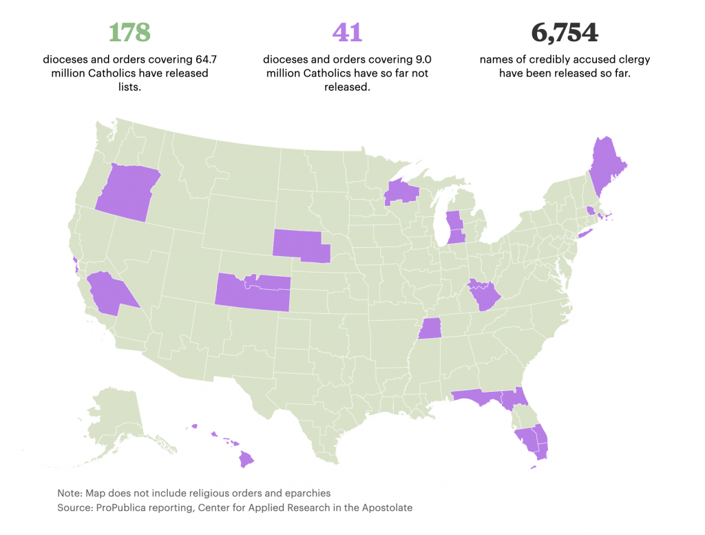
Second, I was looking at ProPublica’s reporting of a new database of Catholic clergy credibly accused of abuse, and noticed that the two dioceses covering western MI haven’t yet disclosed information about possible accusations. I didn’t grow up Catholic, but as a sociologist who studies religion it is weird to think about the institutional factors that might be keeping this information under wraps.
Third, there’s the general impact of this region on the political and cultural history of the moment. West Michigan happens to be the place that brought you some heavy hitters like Amway (which plays a role in one of my favorite sociological podcasts of last year), the founder of Academi (formally known as Blackwater), and our current Secretary of Education. In terms of elite political and economic networks, few regions have been as influential in current Republican party politics.

I think about these facts and wonder how much they shaped my own story. Would I have learned to like exercise more if I could have actually caught my breath during the mile run in gym class? Did I get into studying politics and religion because it was baked into all the institutions around me, even the business ventures? It’s hard to say for sure.

What’s weird about where YOU’RE from? Doing this exercise is great for two reasons. First, it helps to get students thinking in terms of the sociological imagination — connecting bigger social and historical factors to their individual experiences. Second, it also helps to highlight an important social research methods point about the ecological fallacy by getting us to think about all the ways that history and social context don’t necessarily force us to turn out a certain way. As more data become public and maps get easier to make, it is important to remember that population correlates with everything!

Evan Stewart is an assistant professor of sociology at University of Massachusetts Boston. You can follow his work at his website, or on BlueSky.

Sociologists
studying emotion have opened up the inner, private feelings of anger, fear,
shame, and love to reveal the far-reaching effects of social forces on our most
personal experiences. This subfield has given us new words to make sense of shared
experiences: emotional labor in our professional lives, collective
effervescence at sporting events and concerts, emotional capital as a resource
linked to gender, race, and class, and the relevance of power in shaping
positive and negative emotions.

Despite
these advances, scholars studying emotion still struggle to capture emotion
directly. In the lab, we can elicit certain emotions, but by removing context,
we remove much of what shapes real-life experiences. In surveys and interviews,
we can ask about emotions retrospectively, but rarely in the moment and in
situ.

One
way to try to capture emotions as they unfold in all of their messy glory is
through audio diaries (Theodosius 2008). Our team set out to use audio
diaries as a way to understand the emotions of hospital nurses—workers on the
front lines of healthcare. We asked nurses to make a minimum of one recording
after each of 6 consecutive shifts. Some made short 10-minute recordings. Some
talked for hours in the midst of beeping hospital machines and in break rooms,
while walking to their cars, driving home, and as they unplugged after a long
day. With the recorders out in the world, we couldn’t control what they
discussed. We couldn’t follow-up with probing questions or ask them to move to
a quieter location to minimize background noise.

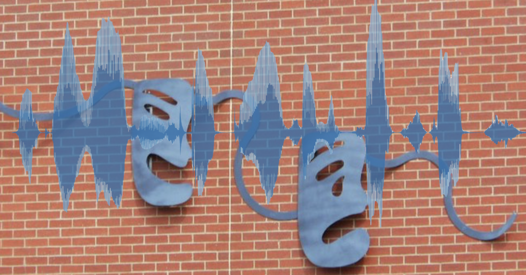
But what this lack of control gave us was a trove of emotions and reflections, experienced and processed while recording. One fruitful way to try to distill these data, we found, was through visuals. We created wavelength visualizations in order to augment our interpretation of diary transcripts. Pairing the two reintroduces some of the ‘texture’ of spoken word often lost in the transcription process (Smart 2009:296). The following is from our new article in the journal, Qualitative Research (Cottingham and Erickson Forthcoming).

In this first segment, Tamara (all participant names are pseudonyms) describes a memorable situation in which a patient’s visitor assumed that Tamara was a lower-level nursing aid rather than a registered nurse (the full event is discussed in greater detail in Cottingham, Johnson, and Erickson 2018). This caused her to feel “ticked” (angry), which is the word she uses after a quick, high-pitched laugh that peaks the wavelength just after the 30-s mark (Figure 1). The wavelength peak just after the 1:15 mark is as she says the word ‘why’ with notable agitation in ‘I’m not sure why. Maybe cuz I’m Black. I don’t know.’

Figure 1. Tamara’s “Ticked” Segment (shift 2, part 1)

We can compare Figure 1 that visualizes Tamara’s feelings of
anger with the visualization of emotion in Figure 2. “Draining” is the
description Tamara gives at the beginning of this second segment. The peak just
after the 15-second mark is from a breathy laugh as she describes her sister “who
has MS is sitting on the bedside commode” when she gets home from work. After
the 45-second mark, she has a similar breathy laugh but in conjunction with the
word ‘compassionate’ as she says ‘I’m trying to be as empathetic and
compassionate as I want to be, but I know I’m really not. So I feel kinda
crappy, guilty maybe about that.’ Just before the 1:30 mark she draws out the
words ‘draining’ and ‘frustrating’ before finishing: ‘because you leave it and
you come home to it…you know…yeah.’ We can see that the segment ends with
longer pauses, muted remarks, and sighs, suggesting low energy and representing
the drained feelings she expresses, particularly in comparison to the lively
energy seen in the first segment when she discusses feeling angry.

Figure 2. Tamara’s “Draining” Segment (shift 2, part 2)

A second example comes from Leah, recorded while driving to work. Here she is angry (“pissed off”) because she has to work on a day that she was not originally scheduled to work. This segment is visualized in the waveform shown in Figure 3.

Figure 3. Leah’s ‘Righteous Indignation’ Segment (shift 2, part 1)
Figure 4. Leah’s ‘I Don’t Want to Stay’ Segment (shift 2, part 3)

In contrast to her discussion of being pissed off and working to ‘retain enough righteous indignation’ to confront her boss later (in figure 3), we see a different wavelength visualization in her second segment (figure 4). In that segment, she describes her lack of enthusiasm for continuing the shift. She reflects on this lack of desire (‘I don’t want to stay’) by stepping outside her own feelings and contrasting them with the dire circumstances of her young patient. This reflexivity leads her to conclude that she has reached the limits of her ability to be compassionate.

To
be sure, waveform visualizations are only meaningful in tandem with what our nurses say. And they do not
provide definitive proof of certain emotions over others. They can’t fully
identify the sighs, deep inhales, uses of sarcasm, or other subtle features of
spoken diary entries. They do, however, offer some insight into how speed,
pitch, and pauses correspond to different emotional expressions and, arguably,
levels of emotional energy (Collins 2004) that vary across time and interactions.

While
there is little that can serve as a substitute for hearing the recordings
directly, the need to protect participants’ confidentiality compels us to turn
to other means to convey the nuances of these verbalizations. Visualization of
wavelengths, in combination with transcripts, can lend themselves to further
qualitative interpretation of these subtleties, conveying the dynamics of a
segment to others who do not have direct access to the recordings themselves.

Check
out the full, open-access article on this topic here and more on the experiences of nurses
here.

Marci Cottingham is assistant professor of sociology at the University of Amsterdam. She researches emotion and inequality broadly and their connection to healthcare and biomedical risk. She is a 2019-2020 visiting fellow at the HWK Institute for Advanced Study. More on her research can be found here: www.uva.nl/profile/m.d.cottingham

References:

Collins, Randall.
2004. Interaction Ritual Chains. Princeton, New Jersey: Princeton
University Press.

Cottingham,
Marci D. and Rebecca J. Erickson. Forthcoming. “Capturing Emotion with Audio
Diaries.” Qualitative Research. https://doi.org/10.1177/1468794119885037

Cottingham,
Marci D., Austin H. Johnson, and Rebecca J. Erickson. 2018. “‘I Can Never Be
Too Comfortable’: Race, Gender, and Emotion at the Hospital Bedside.” Qualitative
Health Research
28(1):145–158. https://doi.org/10.1177/1049732317737980

Smart,
Carol. 2009. “Shifting Horizons: Reflections on Qualitative Methods.” Feminist
Theory
10(3):295–308.

Theodosius,
Catherine. 2008. Emotional Labour in Health Care: The Unmanaged Heart of
Nursing
. NY: Routledge.
[

Social scientists rely on the normal distribution all the time. This classic “bell curve” shape is so important because it fits all kinds of patterns in human behavior, from measures of public opinion to scores on standardized tests.

But it can be difficult to teach the normal distribution in social statistics, because at the core it is a theory about patterns we see in the data. If you’re interested in studying people in their social worlds, it can be more helpful to see how the bell curve emerges from real world examples.

One of the best ways to illustrate this is the “Galton Board,” a desk toy that lets you watch the normal distribution emerge from a random drop of ball-bearings. Check out the video below or a slow motion gif here.

The Galton Board is cool, but I’m also always on the lookout for normal distributions “in the wild.” There are places where you can see the distribution in real patterns of social behavior, rather than simulating them in a controlled environment. My absolute favorite example comes from Ed Burmila:

The wear patterns here show exactly what we would expect a normal distribution to tell us about weightlifting. More people use the machine at a middle weight setting for the average strength, and the extreme choices are less common. Not all social behavior follows this pattern, but when we find cases that do, our techniques to analyze that behavior are fairly simple.

Another cool example is grocery shelves. Because stores like to keep popular products together and right in front of your face (the maxim is “eye level is buy level“), they tend to stock in a normally-distributed pattern with popular stuff right in the middle. We don’t necessarily see this in action until there is a big sale or a rush in an emergency. When stores can’t restock in time, you can see a kind of bell curve emerge on the empty shelves. Products that are high up or off to the side are a little less likely to be picked over.

Paul Swansen, Flickr CC

Have you seen normal distributions out in the wild? Send them my way and I might feature them in a future post!

Evan Stewart is an assistant professor of sociology at University of Massachusetts Boston. You can follow his work at his website, or on BlueSky.

What do college graduates do with a sociology major? We just got an updated look from Phil Cohen this week:

These are all great career fields for our students, but as I was reading the list I realized there is a huge industry missing: data science and analytics. From Netflix to national policy, many interesting and lucrative jobs today are focused on properly observing, understanding, and trying to predict human behavior. With more sociology graduate programs training their students in computational social science, there is a big opportunity to bring those skills to teaching undergraduates as well.

Of course, data science has its challenges. Social scientists have observed that the booming field has some big problems with bias and inequality, but this is sociology’s bread and butter! When we talk about these issues, we usually go straight to very important conversations about equity, inclusion, and justice, and rightfully so; it is easy to design algorithms that seem like they make better decisions, but really just develop their own biases from watching us.

We can also tackle these questions by talking about research methods–another place where sociologists shine! We spend a lot of time thinking about whether our methods for observing people are valid and reliable. Are we just watching talk, or action? Do people change when researchers watch them? Once we get good measures and a strong analytic approach, can we do a better job explaining how and why bias happens to prevent it in the future?

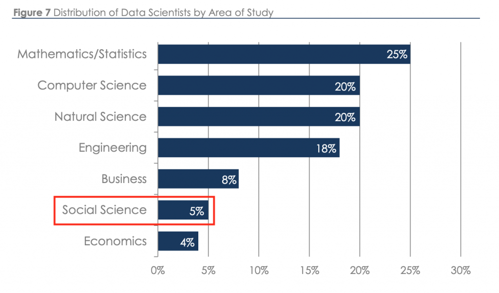
Sociologists are well-positioned to help make sense of big questions in data science, and the field needs them. According to a recent industry report, only 5% of data scientists come out of the social sciences! While other areas of study may provide more of the technical skills to work in analytics, there is only so much that the technology can do before companies and research centers need to start making sense of social behavior. 

Source: Burtch Works Executive Recruiting. 2018. “Salaries of Data Scientists.” Emphasis Mine

So, if students or parents start up the refrain of “what can you do with a sociology major” this fall, consider showing them the social side of data science!

Evan Stewart is an assistant professor of sociology at University of Massachusetts Boston. You can follow his work at his website, or on BlueSky.

If Cosmo and Buzzfeed have taught us anything, it’s that we love personality quizzes. Sure, many of them aren’t valid measures of personality, but it can still be fun to find out what kind of Disney princess you are or what your food truck preference says about the way you handle rejection in life. 

Vintage Quiz from “The Girl Friend and the Boy Friend” Magazine May 1953 – via Envisioning the American Dream

But the logic behind these fun quizzes can has a big impact in social science, because they are all based on looking for patterns in how people answer questions. We can reverse-engineer the process; instead of going in with a set of personality types and designing a survey, researchers can use a method called Latent Class Analysis to look at completed surveys and see which patterns of answers emerge from the data. By comparing those patterns to existing theories, they can come up with new categories that explain how people think, especially people who fall in between the strong or obvious categories.

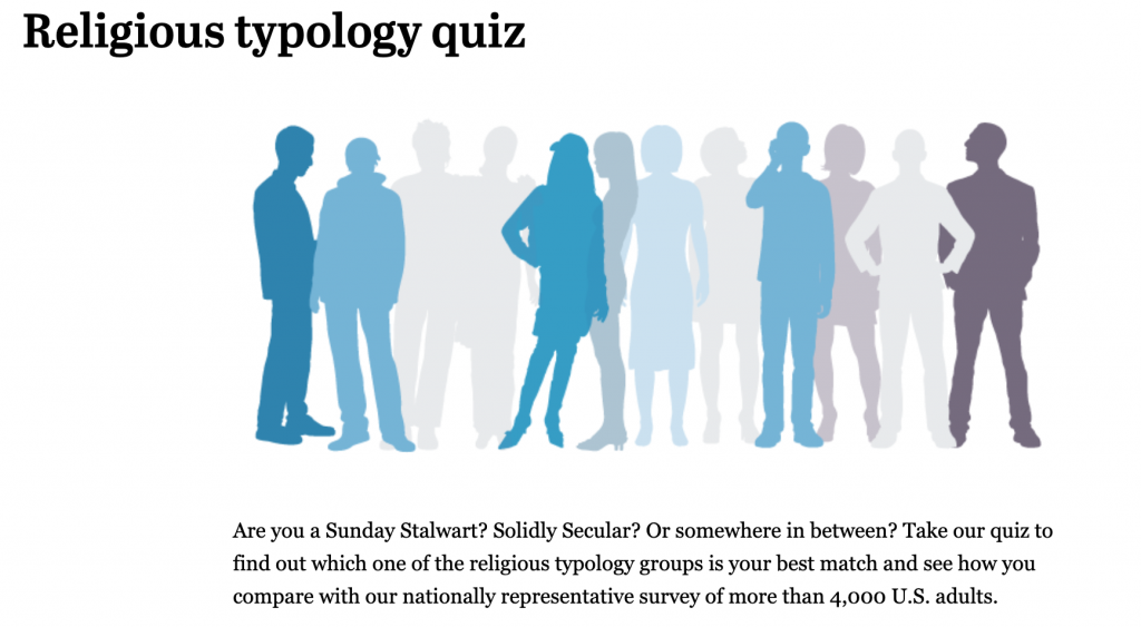
The Pew Research Center has done this with different styles of religious experiences, and you can take a quiz to see which type best fits you. 

Bart Bonikowski and Paul DiMaggio use this approach to identify different kinds of nationalism in the U.S. There are ardent nationalists and people who are disengaged from nationalism, but the middle is more interesting. Between these two groups, there are also people with relatively moderate national pride who still think only certain people are “truly American,” and there are folks who have higher national pride, but a more inclusive vision of who belongs.

I also used this method in a recent paper with Jack Delehanty and Penny Edgell looking at different kinds of religious expression in the public sphere. In a new paper coming soon, our team also finds patterns in how people think about who shares their vision for American society.

Religion, nationalism, and even racism? These are heavier topics than the typical personality quiz covers, but the cool part about this method is that it is less intrusive than directly asking people what they think about these topics. When we ask simpler questions—but more of them—and then look for patterns in the answers, we can learn a lot more about what they actually think.

Evan Stewart is an assistant professor of sociology at University of Massachusetts Boston. You can follow his work at his website, or on BlueSky.

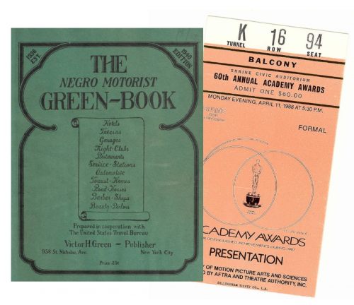
Last month, Green Book won Best Picture at the 91st Academy Awards. The movie tells the based-on-a-true-story of Tony Lip, a white working-class bouncer from the Bronx, who is hired to drive world-class classical pianist Dr. Don Shirley on a tour of performances in the early-1960s Deep South. Shirley and Lip butt heads over their differences, encounter Jim Crow-era racism, and, ultimately, form an unlikely friendship. With period-perfect art direction and top-notch actors in Mahershala Ali and Viggo Mortensen, the movie is competently-crafted and performed fairly well at the box office.

Still, the movie has also been controversial for at least two reasons. First, many critics have pointed out that the movie paints a too simple account of racism and racial inequality and positions them as problem in a long ago past. New York Times movie critic Wesley Morris has called Green Book the latest in a long line of “racial reconciliation fantasy” films that have gone on to be honored at the Oscars.

But Green Book stands out for another reason. It’s an unlikely movie to win the Best Picture because, well, it’s just not very good.

Source: Wikimedia Commons

Sociologists have long been interested in how Hollywood movies represent society and which types of movies the Academy does and doesn’t reward. Matthew Hughey, for example, has noted the overwhelming whiteness of Oscar award winners at the Oscars, despite the Oscars A2020 initiative aimed at improving the diversity of the Academy by 2020. But, as Maryann Erigha shows, the limited number of people of color winning at the Oscars reflects, in part, the broader under-representation and exclusion of people of color in Hollywood.

Apart from race, past research by Gabriel Rossman and Oliver Schilke has found that the Oscars tend to favor certain genres like dramas, period pieces, and movies about media workers (e.g., artists, journalists, musicians). Most winners are released in the final few months of the year and have actors or directors with multiple prior nominations. According to these considerations, Green Book had a lot going for it. Released during the holiday season, it is a historical movie about a musician, co-starring a prior Oscar winner and a prior multiple time Oscar nominee. Sounds like perfect Oscar bait.

And, yet, quality matters, too. It’s supposed to be the Best Picture after all. The problem is what makes a movie “good” is both socially-constructed and a matter of opinion. Most studies that examine questions related to movies measure quality using the average of film critics’ reviews. Sites like Metacritic compile these reviews and produce composite scores on a scale from 0 (the worst reviewed movie) to 100 (the best reviewed movie). Of course, critics’ preferences sometimes diverge from popular tastes (see: the ongoing box office success of the Transformers movies, despite being vigorously panned by critics). Still, movies with higher Metacritic scores tend to do better at the box office, holding all else constant.

If more critically-acclaimed movies do better at the box office, how does quality (or at least the average of critical opinion) translate into Academy Awards? It is certainly true that Oscar nominees tend to have higher Metacritic scores than the wider population of award-eligible movies. But the nominees are certainly not just a list of the most critically-acclaimed movies of the year. Among the films eligible for this year’s awards, movies like The Rider, Cold War, Eight Grade, The Death of Stalin, and even Paddington 2 all had higher Metacritic scores than most of the Best Picture nominees. So, while nominated movies tend to be better than most movies, they are not necessarily the “best” in the eyes of the critics.

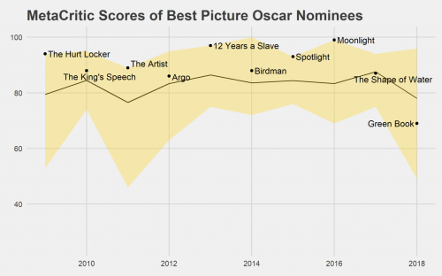
Even among the nominees, it is not the case that the most critically-acclaimed movie always wins. In the plot below, I chart the range of Metacritic scores of the Oscars nominees since the Academy Awards reinvented the category in 2009 (by expanding the number of nominees and changing the voting method). The top of the golden area represents the highest-rated movie in the pool of nominees and the bottom represents the worst-rated film. The line captures the average of the pool of nominees and the dots point out each year’s winner.

Click to Enlarge

As we can see, the most critically-acclaimed movie doesn’t always win, but the Best Picture is usually above the average of the pool of nominees. What makes Green Book really unusual as a Best Picture winner is that it’s well below the average of this year’s pool and the worst winner since 2009. Moreover, according to MetaCritic (and LA Times’ film critic Justin Chang), Green Book is the worst winner since Crash in 2005.

Green Book’s Best Picture win has led to some renewed calls to reconsider the Academy’s ranked choice voting system in which voters indicate the order of preferences rather than voting for a single movie. The irony is that when Moonlight, a highly critically-acclaimed movie with an all-black cast, won in 2016, that win was seen as a victory made possible by ranked choice voting. Now, in 2019, we have a racially-controversial and unusually weak Best Picture winner that took home the award because it appears to have been the “least disliked” movie in the pool.

The debate over ranked choice voting for the Academy Awards may ultimately end in further voting rule changes. Until then, we should regard a relatively weak movie like Green Book winning Best Picture as the exception to the rule.   

Andrew M. Lindner is an Associate Professor at Skidmore College. His research interests include media sociology, political sociology, and sociology of sport.

When I teach social statistics, I often show students how small changes in measurement or analysis can make a big difference in the way we understand the world. Recently, I have been surprised by some anger and cynicism that comes up when we talk about this. Often at least one student will ask, “does it even matter if you can just rig the results to say whatever you want them to say?”

I can’t blame them. Controversy about manufactured disagreement on climate change, hoax studies, or the rise of fake news and “both side-ism” in our politics can make it seem like everyone is cooking the books to get results that make them happy. The social world is complicated, but it is our job to work through that complexity and map it out clearly, not to throw up our hands and say we can’t do anything about it. It’s like this optical illusion:

The shape isn’t just a circle or a square. We can’t even really say that it is both, because the real shape itself is complicated. But we can describe the way it is built to explain why it looks like a circle and a square from different angles. The same thing can happen when we talk about debates in social science.

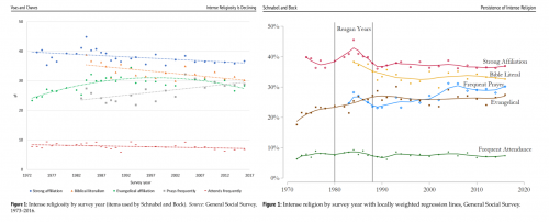
A fun example of this popped up recently in the sociology of religion. In 2016, David Voas and Mark Chaves published an article in the American Journal of Sociology about how rates of religious commitment in the United States are slowly declining. In 2017, Landon Schnabel and Sean Bock published an article in Sociological Science responding to this conclusion, arguing that most of the religious decline was among moderate religious respondents—people with very strong religious commitments seemed to be holding steady. Just recently, both teams of authors have published additional comments about this debate (here and here), analyzing the same data from the General Social Survey.

So, who is right?

Unlike some recent headlines about this debate, the answer about religious decline isn’t just “maybe, maybe not.” Just like the circle/square illusion, we can show why these teams get different results with the same data.

Parallel Figures from Voas & Chaves (2018) and Schnabel & Bock (2018) (Click to Enlarge)

When we put the charts together, you can see how Voas and Chaves fit straight and smoothly curved lines to trends across waves in the GSS. This creates the downward-sloping pattern that fits their conclusions about slow religious decline over time. Schnabel and Bock don’t think a single straight line can accurately capture these trends, because the U.S. saw a unique peak in religious commitment that happened during the Regan years and may have receded more quickly. Their smoothing technique (LOESS smoothing) captures this peak and a quick decline afterwards, and doing so flattens out the rest of the trends after that period.

The most important lesson from these charts is that they don’t totally get rid of the ambiguity about religious change. Rather than just ending the debate or rehashing it endlessly, this work helps us see how it might be more helpful to ask different questions about the historical background of the case. I like this example because it shows us how disagreement among experts can be an invitation to dig into the details, rather than a sign we should just agree to disagree. Research methods matter, and sometimes they can help us more clearly explain why we see the world so differently.Evan Stewart is an assistant professor of sociology at University of Massachusetts Boston. You can follow his work at his website, or on BlueSky.

Social institutions are powerful on their own, but they still need buy-in to work. When people don’t feel like they can trust institutions, they are more likely to find ways to opt out of participating in them. Low voting rates, religious disaffiliation, and other kinds of civic disengagement make it harder for people to have a voice in the organizations that influence their lives.

And, wow, have we seen some good reasons not to trust institutions over the past few decades. The latest political news only tops a list running from Watergate to Whitewater, Bush v. Gore, the 2008 financial crisis, clergy abuse scandals, and more.

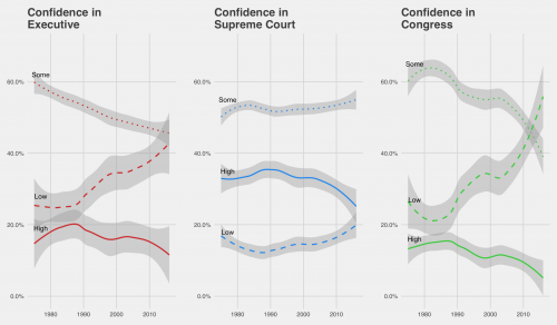
Using data from the General Social Survey, we can track how confidence in these institutions has changed over time. For example, recent controversy over the Kavanaugh confirmation is a blow to the Supreme Court’s image, but strong confidence in the Supreme Court has been on the decline since 2000. Now, attitudes about the Court are starting to look similar to the way Americans see the other branches of government.

(Click to Enlarge)
Source: General Social Survey Cumulative File
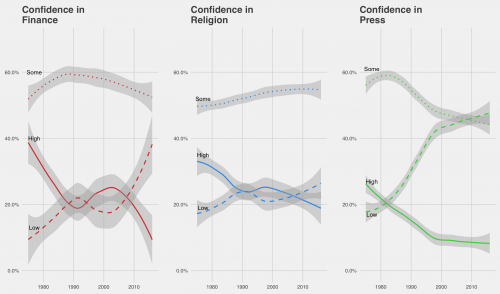
LOESS-Smoothed trend lines follow weighted proportion estimates for each response option.

Over time, you can see trust in the executive and legislative branches drop as the proportion of respondents who say they have a great deal of confidence in each declines. The Supreme Court has enjoyed higher confidence than the other two branches, but even this has started to look more uncertain.

For context, we can also compare these trends to other social institutions like the market, the media, and organized religion. Confidence in these groups has been changing as well.

(Click to Enlarge)
Source: General Social Survey Cumulative File

It is interesting to watch the high and low trend lines switch over time, but we should also pay attention to who sits on the fence by choosing some confidence on these items. More people are taking a side on the press, for example, but the middle is holding steady for organized religion and the Supreme Court.

These charts raise an important question about the nature of social change: are the people who lose trust in institutions moderate supporters who are driven away by extreme changes, or “true believers” who feel betrayed by scandals? When political parties argue about capturing the middle or motivating the base, or the church worries about recruiting new members, these kinds of trends are central to the conversation.

Inspired by demographic facts you should know cold, “What’s Trending?” is a post series at Sociological Images featuring quick looks at what’s up, what’s down, and what sociologists have to say about it.Evan Stewart is an assistant professor of sociology at University of Massachusetts Boston. You can follow his work at his website, or on BlueSky.