international comparisons

The phrase “service economy” — commonly used to describe the U.S. economic profile these days — refers to a decrease in manufacturing (where we make things for people) and an increase in the service sector (where we do stuff for people).

Planet Money put together stacked bar graphs to illustrate the increasing importance of service in our economy (1972 on the left, 2012 on the right).  Manufacturing (making things) is in yellow, so you can clearly see its decline in prominence.  Service sectors include “professional and business services,” “leisure and hospitality,” and “education and health services.”

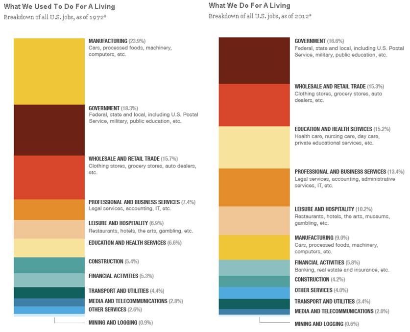
So, when people talk about the move to a service economy, these are the changes they’re talking about.  We also see the “servitization of products” (don’t you love academics?), or a tendency for products to come with more and more service.  A restaurant, for example, offers a product (made by the chef), but also a degree of service (offered by the wait staff).  Both the quality of the food and the service vary as you move from fast food restaurants to high end eateries. When we see a servitization of products, we see a ratcheting up of the level of expected service that attends any given product.

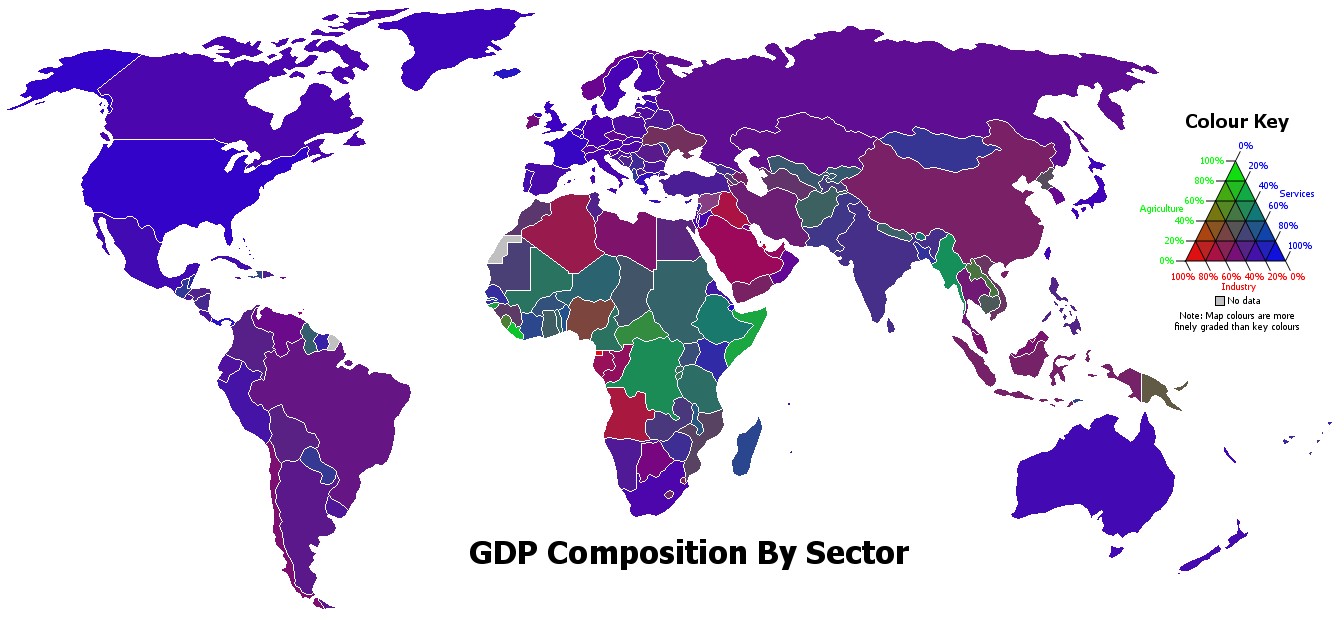
The U.S. economy, by the way, is more heavily characterized by service than most of the world.  The map below is colored to indicate the relative balance between service (blue), manufacturing (red), and agricultural (green) industries in each state.  You can see that the U.S. is among the bluest country on the map:

One of the concerns with the move to a service economy is that service jobs on the low end of the occupational hierarchy tend to be “bad” jobs, while manufacturing jobs, even when they’re on the low end, tend to be “good.”  Service jobs are “bad” in the sense that they tend to have low wages, underemployment, little chance for advancement, and poor or no benefits.  We’re talking, here, about jobs in sales, cashiering, food preparation, and the like.  Because of this tendency, the move to a service economy is taking some of the blame for the shrinking of the middle class.

Lisa Wade, PhD is an Associate Professor at Tulane University. She is the author of American Hookup, a book about college sexual culture; a textbook about gender; and a forthcoming introductory text: Terrible Magnificent Sociology. You can follow her on Twitter and Instagram.

A new 8-part Times Picayune series on the prison industry in Louisiana starts off with these foreboding sentences:

Louisiana is the world’s prison capital. The state imprisons more of its people, per head, than any of its U.S. counterparts. First among Americans means first in the world. Louisiana’s incarceration rate is nearly five times Iran’s, 13 times China’s and 20 times Germany’s.

One out of every 86 Louisianans is in prison.

The motivation is money.   Most prisoners in Louisiana are in for-profit prisons.  The state spends $663 million a year on imprisonment; $182 million of that goes to for-profit correctional companies or contracted local sheriffs.  Many small towns depend on the prisons to fund their law enforcement.

Burk Foster, a criminologist who’s been studying Louisiana prisons, explains:

They don’t want to see the prison system get smaller or the number of people in custody reduced, even though the crime rate is down, because the good old boys are all linked together in the punishment network, which is good for them financially and politically.

State Rep. Joseph Lopinto (R-Metairie) agrees:

The bottom line is, if locking everybody up and throwing away the key works, then we should have the lowest crime rate in the United States. We don’t. So then you have to really look at your policies. In my opinion, it’s strictly a fiscal issue.

Those who benefit from the prison industry have pushed through some of the severest sentencing laws in the country and aggressively resist reform.  “Few lobbies in Louisiana,” writes reporter Cindy Chang, “are as powerful as the sheriffs association.”  As a result, Louisiana’s sentencing laws are out-of-step with the rest of the country:

All life sentences are, automatically, without any chance of parole and more than one in ten Louisiana prisoners are serving life sentences (the majority of lifers were convicted before age 30):

Harsh where other states are lenient, and harsh where other states are harsh, Louisiana has “a much higher percentage behind bars for [non-violent] drug offenses.”  In 2009, 82% of the 17,223 new admissions to Louisiana prisons were convicted of non-violent felonies.

Tomorrow I’ll follow up with a post on why there are so many for-profit prisons in Louisiana and how it’s affected the lives of prisoners both during and after incarceration.

Lisa Wade, PhD is an Associate Professor at Tulane University. She is the author of American Hookup, a book about college sexual culture; a textbook about gender; and a forthcoming introductory text: Terrible Magnificent Sociology. You can follow her on Twitter and Instagram.

Urban Demographics posted some graphs from the UN’s State of the World’s Cities 2010/2011 report on global urbanization trends. A snapshot of urbanization in 11 countries:

You can see a few other notable trends here that illustrate various national trajectories, as Phil McDermott at Cities Matter points out. For instance, notice that while Russia underwent rapid urbanization between 1950 and 1980, it has leveled off since then. Similarly, Indonesia’s urbanization slowed significantly in the late ’90s and has continued at a much slower pace since then. We also see quite different patterns between the world’s two most populous nations: While China’s urbanization rate sped up in the early ’90s (after urbanization actually dipped in the ’70s), India has experienced fairly slow urbanization.

Credit Suisse released a report on urbanization and emerging markets, if you’re interested in the impacts of urbanization on a wide array of economic development indicators, from electricity and steel consumption to projections of future housing needs to incomes and standards of living.

The Paris School of Economics has posted a database, compiled by Facundo Alvaredo, Tony Atkinson, Thomas Piketty, and Emmanuel Saez, of the distribution of top incomes in a number of nations, with more on the way. Using income tax records, they provide a quick glance at concentration of income among the wealthy over decades (and in some cases, data extends back over a century). As the authors point out, there are limitations to using tax info to measure inequality, so it’s important to be aware of the limitations of this data series. Most obviously, individuals may take steps to hide their income to evade taxes, and the very wealthy may be particularly able to do so through the use of tax havens, etc. Also, tax policies change, so what counts as “income” at one point might not at another. The authors also had to contend with differences in the taxation unit (households vs. individuals) in different countries to provide some level of comparability.

The database allows you to select a country, a time period, and a variable (top 5% income share, etc.), and get a table showing the results for all years in which data were available. Here, for instance, is part of the table for the share of income earned by the top 1% in Singapore:

Of course, this includes only data on income. In many countries, including the U.S., wealth (value of all assets) is significantly more concentrated than income.

Looking at the dataset, you can see patterns over time. For instance, here’s part of the data from the U.S. (notice there are time gaps between the end of each column and the beginning of the next–I was just grabbing some illustrative screencaps), showing how the percent of income earned by the top 0.1% decreased significantly starting in the 1940s, but began creeping up again by the late 1980s and has grown since then:

The site also allows you to create graphs. They provide a comparison of the share of income earned by the top 1% in 2005 in the U.S., Japan, Australia, and France, but you can look at data for individual nations:

It’s worth playing around a bit, but keeping in mind the caveats about what these data do and don’t tell us. Thanks to Shamus Khan for the tip!

In an earlier post we reviewed research by epidemiologists Richard Wilkinson and Kate Pickett showing that income inequality contributes to a whole host of negative outcomes, including higher rates of mental illness, drug use, obesity, infant death, imprisonment, and interpersonal trust.

She summarizes these findings in this quick nine-minute talk at a Green Party conference:

See Dr. Pickett making similar arguments as to why raising the average national income in developed countries doesn’t make people happier or enable them to live longer, why unequal societies are more violent, and how status inequality increases stress.

And see more about income inequality and national well-being at Equality Trust.

Lisa Wade, PhD is an Associate Professor at Tulane University. She is the author of American Hookup, a book about college sexual culture; a textbook about gender; and a forthcoming introductory text: Terrible Magnificent Sociology. You can follow her on Twitter and Instagram.

The mysterious SocProf, who writes The Global Sociology Blog, offered a nice review of Richard Wilkinson and Kate Pickett‘s book, The Spirit Level: Why More Equal Societies Almost Always Do Better.  Wilkinson and Pickett offer transnational research showing how, exactly, income inequality is related to bad outcomes on average.  In other words, as SocProf puts it, “…egalitarianism is not a bleeding heart’s wet dream but rather the only rational course of action in terms of public policy.”  The 11 graphs, available at the Equality Trust website, speak for themselves.

Societies with more income inequality have higher infant death rates than other societies:

Societies with more income inequality have higher rates of mental illness than other societies:

Societies with more income inequality have a higher incidence of drug use than other societies:

Societies with more income inequality have a higher high school drop out rate than other societies:

Societies with more income inequality imprison a larger proportion of their population than other societies:

Societies with more income inequality have a higher rate of obesity than other societies:

Individuals in societies with more income inequality are less likely to be in a different class than their parents compared to other societies:

Individuals in societies trust others less than people in other societies:

Societies with more income inequality have higher rates of homicide than other societies:

Societies with more income inequality give less in foreign aid than other societies:

Children in societies with more income inequality do less well than children in other societies:

The authors sum it up pretty simply: : “Th[e] dissatisfaction [measured in this data is] a cost which the rich impose on the rest of society.”

And they have a clear policy proposal relevant to the current economic crisis.

[This is] a clear warning for those who might want to place low public expenditure and taxation at the top of their priorities. If you fail to avoid high inequality, you will need more prison and more police. You will have to deal with higher rates of mental illness, drug abuse and every other kind of problems. If keeping taxes and benefits down leads to wider income differences, the need to deal with ensuing social ills may  force you to raise public expenditure to cope.

Readers Ana and Dmitriy T.M. sent in a TED talk of Richard Wilkinson discussing the relationship between income inequality and social problems:

Lisa Wade, PhD is an Associate Professor at Tulane University. She is the author of American Hookup, a book about college sexual culture; a textbook about gender; and a forthcoming introductory text: Terrible Magnificent Sociology. You can follow her on Twitter and Instagram.

If you’re looking for basic global demographic information, World Health Rankings provides a great overview, using World Health Organization, World Bank, UNESCO, and other data. The website allows you to select a country, then provides a detailed breakdown of many demographic details, such as population pyramids (you can select different years in the past, or look at predictions for the future), leading causes of death, etc. Here’s the 2010 population pyramid for the U.S.:

You can also easily access all the age pyramids here. The 2020 projections for Brazil show the changing demographics due to the dramatic decrease in the fertility rate, which Lisa posted about this weekend:

There’s an interactive map of the top 15 causes of death in the U.S., allowing you to look at variations by county. Here’s the map of deaths due to heart disease, with Clark County, Nevada, highlighted:

You can also look at life expectancy for different nations for every decade between 1960 and 20101, a “real-time” clock that tracks global deaths (you can look at how many have died in the last year or month, or you can click “now” and reset the clock and watch as the clock estimate how many people die of various causes of death worldwide), and maps showing the prevalence of various causes of death around the world. Lots of neat representations of rather depressing information.

Also, as I wrote this post I realized that now every time I see a population pyramid of the U.S., Community‘s song “Baby Boomer Santa” is going to play through my head.

How does the U.S. compare to other developed countries on measures of social justice? According to the New York Times, not very well.  The visual below compares countries’ poverty rates, poverty prevention measures, income inequality, spending on pre-primary education, and citizen health.  The “overall” rating is on the far left and the U.S. ranks 27th out of 31.


Via Feministing.  See also how the U.S. ranks on measures of equality and prosperity(33 out of 33, for what it’s worth). Thanks to Dolores R. for the link!

Lisa Wade, PhD is an Associate Professor at Tulane University. She is the author of American Hookup, a book about college sexual culture; a textbook about gender; and a forthcoming introductory text: Terrible Magnificent Sociology. You can follow her on Twitter and Instagram.